
Ready reps win. — LinkedIn Wallpaper
 Curated byKory White · Fractional CRO · Maryland
 PULSEKNOWLEDGE LIBRARY
Quality
Certified
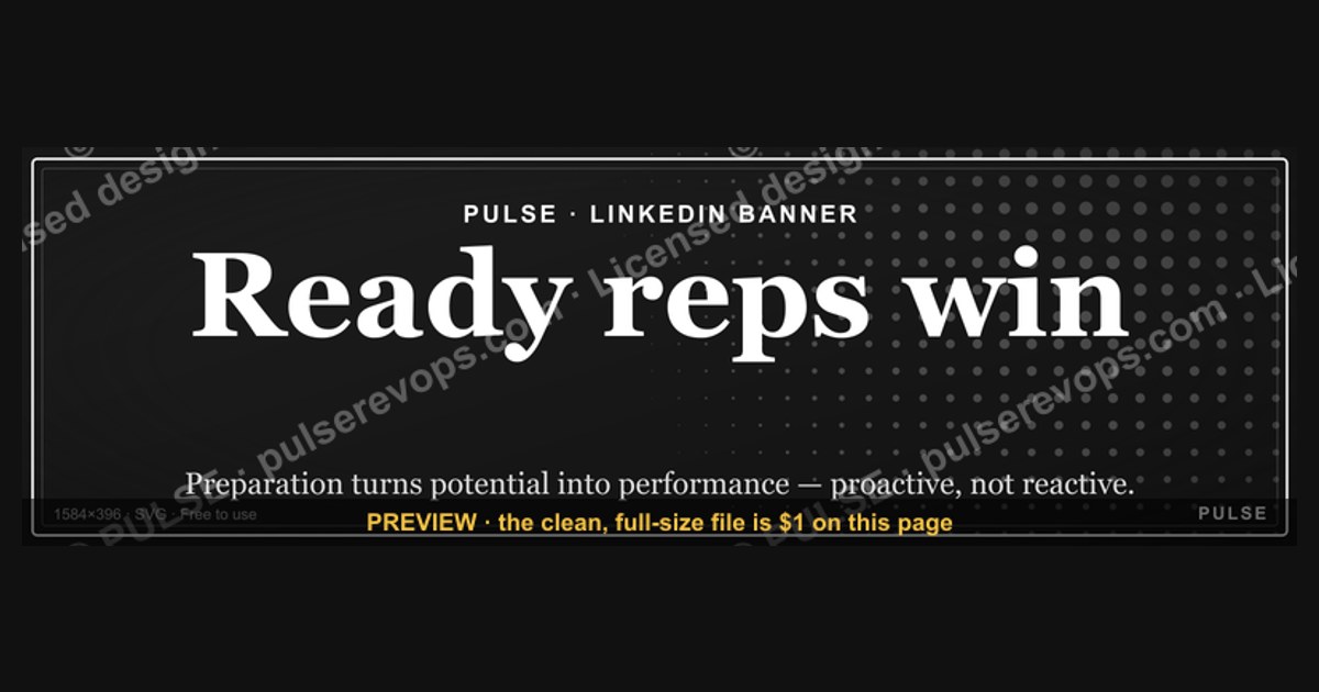
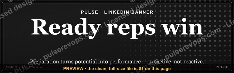
This is a free downloadable LinkedIn banner (1600×500 px PNG) that reads "Ready reps win." in bold type on a dark background, sized for a LinkedIn profile background photo. It's built for sales reps, SDR managers, and RevOps leaders who want their profile to broadcast a preparation-first sales culture the moment a prospect or recruiter clicks through.
What it is and why it matters
The banner is a single, uncluttered composition: the headline "Ready reps win." sits left- or center-aligned in a bold serif or condensed sans face, set large enough to read at LinkedIn's compressed mobile crop, with the attribution "— LinkedIn Wallpaper" carried as a small descriptor rather than printed on the graphic itself. The background is a flat dark tone (near-black or deep navy) chosen specifically because LinkedIn's UI overlays — the profile photo circle, the "Open to work" ring, the Edit pencil icon — all sit on top of the left third of any banner, and a dark, low-detail field is the only background that survives that overlay without looking accidental. There is no logo, no photo of a person, no secondary tagline competing for attention. That restraint is deliberate: a banner that tries to say three things ends up saying none of them once it's compressed into the sliver of space LinkedIn actually renders above the fold.
The message itself — "Ready reps win." — is a preparation claim, not a hustle claim. It doesn't say reps who work the most hours win, or reps who make the most calls win. It ties outcomes to readiness: knowing the account before the call, having the objection answers rehearsed, having the next step already drafted before the meeting ends. For an individual rep, wearing that on a LinkedIn banner is a public commitment device — it's harder to walk into a call unprepared when your own profile is telling every visitor what you stand for. For a sales manager or RevOps leader, rolling the same banner out across a team turns it into a soft culture signal: anyone who visits five reps' profiles in a row and sees the same phrase gets a consistent read on how the team operates, before a single call happens.

Where this earns real estate on a revenue org's toolkit is in the gap between what a sales methodology document says and what a rep actually carries into daily behavior. Playbooks live in a shared drive nobody opens twice. A banner lives on the one page a buyer, a candidate, or a new manager actually looks at first.
The step-by-step process
Getting the banner from this page onto an actual LinkedIn profile is a five-step round trip, and most of the friction lives in step three, not step one.
First, download the file. It ships at 1600×500 px, deliberately larger than LinkedIn's own recommended background-photo size of 1584×396 px, so there's margin to reposition without the file getting upscaled and soft. Second, open the LinkedIn profile in edit mode and select the background/cover photo option — on desktop this is the pencil icon over the existing banner area; on the mobile app it's under the profile photo's edit menu. Third, upload the PNG. LinkedIn will immediately show its own crop frame over the image, and this is the step people skip too fast: LinkedIn does not center the upload automatically, and the platform's own photo-circle overlay will sit on top of the left ~15% of whatever ends up in frame. Fourth, drag the image within the frame until the headline text clears both the profile photo circle and the small pencil/camera icons LinkedIn draws in the corners — on a banner this text-forward, even a 40px miscrop can clip a word. Fifth, before saving, use LinkedIn's own preview (or open the profile in a private/incognito tab) to check both the desktop rendering and the mobile app rendering, because LinkedIn crops the banner differently on each: mobile shows a taller, narrower slice than desktop. If the text reads clean in both, save; if not, go back to step four and shift the crop rather than re-downloading a different file.
The entire round trip takes under five minutes once the file is on a local device. The only step that routinely needs a second pass is the reposition, because the interface gives no numeric crop coordinates — it's drag-and-preview, which means the first save is rarely the final save.

Costs, timelines, and typical ranges
The banner itself is free to download and carries no license restriction for personal or team LinkedIn use — there's no watermark to strip and no attribution requirement beyond what's already printed in the small credit line. The PNG file typically lands in the 200KB–600KB range at 1600×500, well under LinkedIn's 8MB upload ceiling for background photos, so upload time is negligible even on a slow connection.
Where "cost" actually shows up is in customization time, if a team wants to adapt the wording or palette rather than use the stock version as-is. A straight swap — same layout, new headline text, same colors — takes a competent designer 10–20 minutes in any layer-based tool (Canva, Figma, Photoshop) once the source file is available as an editable template rather than a flattened PNG. A fuller re-skin — new color palette to match brand guidelines, a different type family, the addition of a small team or company mark in a corner that doesn't collide with LinkedIn's UI overlays — runs closer to 45–90 minutes per version, because every change has to be re-checked against the same overlay and mobile-crop constraints described above.

For a rollout across a full sales floor, the timeline scales with how much personalization leadership wants, not with headcount. Fifteen reps using the identical file is a same-day rollout: send the PNG, send the five-step install instructions above, done. Fifteen reps each getting their name or quota-club status stamped onto their own version is a half-day to full-day job for whoever owns the design work, because each variant still has to be individually crop-checked rather than assumed identical.
Refresh cadence is worth planning for rather than treating as a one-time asset. A banner that sat unchanged for a year reads as decoration; a banner that rotates — a new phrase for a new quarter, a shoutout to the prior quarter's top performer, a season-specific palette — reads as a living piece of team culture and gives managers a low-cost, recurring reason to re-engage reps with their own profile.

Where teams get it wrong
The single most common failure is rolling the banner out uniformly without checking it against every device the team actually uses. A crop that looks perfect on a 27-inch monitor can clip the final word of "Ready reps win." on a phone, because LinkedIn's mobile app renders a noticeably taller, narrower slice of the same source image than the desktop web view does. Anyone doing a team-wide rollout should preview on at least one phone and one desktop browser before broadcasting install instructions, not after.
The second failure is semantic rather than technical: a manager mandates the banner across a team whose actual working conditions contradict the message. "Ready reps win" as a voluntary, bottom-up signal from reps who believe it reads as culture. The identical phrase, mandated top-down onto a team that's currently under-resourced, under-trained, or being measured on activity volume instead of preparation quality, reads as irony to anyone who knows the team — and prospects occasionally do know, especially in tight-knit industries where buyers and sellers move between companies. A banner is a promise made in public; it should follow a real behavior change, not substitute for one.
Third, teams frequently treat the banner as a one-and-done asset instead of budgeting for the maintenance it actually needs. LinkedIn periodically adjusts its own profile layout — the size and position of the "Open to work" ring, the placement of the Edit pencil, occasional redesigns of the banner aspect ratio itself. A banner that cleared every overlay cleanly in one layout can develop a clipped word or an awkward overlap after a LinkedIn UI update, and nobody notices until a prospect mentions it. Building a quarterly "does the banner still render clean" check into a broader LinkedIn-hygiene routine catches this before it becomes visible to outsiders.
Fourth, and most avoidable: skipping the resize entirely and uploading the file at its native 1600×500 without ever opening LinkedIn's crop tool. LinkedIn will accept the upload and auto-crop it using its own centering logic, which has no idea where the headline text sits — the result is frequently a banner with the words pushed hard against one edge or partially cut off, because the platform's auto-crop optimizes for filling the frame, not for protecting a specific line of text.
Decision framework: when to choose what
Not every profile or every team should default to the stock version, and not every situation calls for a banner at all. The decision tree below is the shortest path to the right call.
For a single rep evaluating the stock file, the test is simple honesty: does "Ready reps win" describe how this person actually prepares for calls, or is it aspirational? If it's true today, upload it as-is — the stock version is fully finished and doesn't need a designer's help. If it's aspirational, that's not necessarily a reason to skip it; some reps use the banner deliberately as a public commitment to the standard they're working toward. But it's worth being clear-eyed about which case applies, because the two produce very different signals to anyone who visits the profile repeatedly.
For a manager considering a team-wide rollout, the gating question is whether the organization is actually backing the behavior the phrase describes — protected prep time before calls, account research resourced and expected, a "ready" checklist that's more than folklore — or whether the banner is being asked to stand in for that investment. If the behavior is real, a uniform rollout is low-risk and worth doing exactly as described in the step-by-step section above, with the device-preview check taken seriously. If the behavior isn't there yet, the better sequence is to fix the operational gap first and treat the banner rollout as a capstone once reps can back the claim in an actual call — shipping the slogan before the substance tends to produce quiet cynicism on the team faster than it produces the intended pride.
A third path worth naming: teams that like the visual system — dark ground, bold type, LinkedIn-safe layout — but want different wording entirely. Nothing about this banner's design is specific to the phrase "Ready reps win." The layout logic (headline clear of the overlay zone, dark low-detail ground, single message) transfers directly to any short team phrase, a quarterly theme, or an individual rep's own motto, using the same file as a starting template.
Related questions
What size should a LinkedIn banner be?
LinkedIn's own recommended background-photo size is 1584×396 px, max 8MB, in JPG, PNG, or GIF format. This banner ships slightly larger at 1600×500 to give repositioning room without upscaling or softening the image.
Can I put my name or photo on this banner?
Yes — treat the stock PNG as a starting template rather than a locked file. Adding a name, team logo, or quota-club badge is a straightforward edit as long as the addition stays clear of LinkedIn's photo-circle and Edit-icon overlay zone.
Does a LinkedIn banner actually affect how prospects perceive a rep?
A banner is a small, secondary signal — most visitors register it in passing rather than studying it — but it's one of the very few customizable elements above the fold on a LinkedIn profile, and consistent, confident presentation there costs nothing to maintain once it's set up correctly.
How often should a sales team update its LinkedIn banners?
There's no fixed rule, but pairing a banner refresh with a natural milestone — new quarter, new campaign theme, a top-performer shoutout — gives it a reason to feel current rather than stale, and forces the periodic device-preview check that catches layout drift from LinkedIn UI updates.
What's the difference between a LinkedIn banner and a LinkedIn wallpaper?
They're the same asset — "background photo" is LinkedIn's official term, "banner" and "wallpaper" are the common informal names for the same 1584×396 px space at the top of a profile.
FAQ
Is this LinkedIn Wallpaper actually free to download and use? Yes. The PNG carries no license restriction for personal or team LinkedIn use, and there's no watermark applied to the downloaded file.
Will "Ready reps win." get cut off on mobile? Not if the crop is checked on a phone before saving. LinkedIn renders a taller, narrower slice of the banner on its mobile app than on desktop web, so a crop that looks perfect on a laptop can clip text on a phone — always preview both before finalizing.
Can I change the wording to fit my own team's slogan? Yes. The file is built as a template — dark ground, bold centered type, overlay-safe layout — and that structure transfers cleanly to any short phrase, not just "Ready reps win."
Do I need design software to customize it? For a straight text swap, a free tool like Canva or a layer-based file in Figma is enough; a competent user can complete a basic re-skin in 10–20 minutes. A fuller brand re-skin with new colors and typography takes longer and benefits from a designer's pass.
Why is the background solid and dark instead of a photo? LinkedIn overlays UI elements — the profile photo circle, status rings, the Edit pencil — on top of the left portion of every banner. A flat, low-detail dark background is the one style that survives that overlay without the composition looking accidental or cluttered.
Should managers mandate this banner across the whole team? Only if the behavior it describes — genuine call preparation — is actually being resourced and practiced. A mandated slogan on a team that isn't supported to be "ready" tends to read as ironic to anyone who knows how the team actually operates.
Sources
- https://www.linkedin.com/help/linkedin
- https://business.adobe.com/products/express/express.html
- https://www.canva.com/learn/
- https://www.figma.com/resource-library/
- https://www.hubspot.com/sales
- https://www.salesforce.com/resources/
- https://www.gartner.com/en/sales
Related on PULSE
- What makes a sales rep "ready" before a call
- Building a pre-call checklist your team will actually use
- LinkedIn profile optimization for sales reps
- How to roll out team-wide branding without it feeling mandated
- Quota-club recognition ideas that don't rely on cash spiffs
- Designing internal culture signals that survive a bad quarter
This page will be disappearing soon. Save it to your device for $1 — or read it free while it is here.
@Kory-White- · if Venmo asks, the last 4 of my number are 2012
 graphicHow to find champions before the first call in 2027
 graphic“Never give without a get.” — LinkedIn Banner
 graphic“Clarity closes.” — LinkedIn Banner
 graphicRenewals Manager — LinkedIn Banner
 graphic“Selling science and scale.” — LinkedIn Banner
 graphic“Hire slow. Ramp fast.” — LinkedIn Banner
 graphicLead from the front. — LinkedIn Wallpaper
 graphic“Process over pressure.” — LinkedIn Banner
 graphic“Champions are made before the call.” — LinkedIn Banner
 graphicSales Coach — LinkedIn Banner