
Head of Sales — LinkedIn Banner
 Curated byKory White · Fractional CRO · Maryland
 PULSEKNOWLEDGE LIBRARY
Quality
Certified
A Head of Sales LinkedIn banner is a 1584 × 396 px cover image that states, in three to five words, what revenue outcome you own. Keep essential text inside the center safe zone, use one dark background plus one accent color, and replace the generic title with a specific claim your profile can back up.
The outcome you should expect
The honest framing first: a banner does not generate pipeline. It is a conversion asset for traffic you have already earned. If nobody visits your profile, the best banner in the world changes nothing. So the outcome to expect is a lift in what happens *after* someone lands — connection acceptance, InMail replies, recruiter follow-through, a candidate deciding your team is worth a conversation.
Think of the profile as a landing page with four stacked elements a visitor sees in the first second: the banner, the photo, the headline, and the first two lines of your About section. The banner occupies the largest surface area of the four and is the only one that renders as a wide horizontal field — which is why it carries disproportionate weight in the "do I know what this person does" judgment. A Head of Sales whose banner says "Sales Leader | Passionate About People" has spent that surface area saying nothing. One that says "I own the forecast" has spent it on a claim, and a claim invites a reaction.
Second-order outcomes matter more than the first-order ones. When your banner names a specific motion — MEDDIC, PLG-assisted enterprise, land-and-expand into mid-market — you pre-qualify inbound. Recruiters sourcing for a transactional inside-sales role will self-select out; recruiters sourcing for a complex enterprise motion will lead with a better opener. That filtering is worth more than raw volume. The same logic applies to vendors: a banner that signals your ACV band and team size cuts the volume of irrelevant SDR outreach because the mismatch is visible before they type.

There is a recruiting outcome too, and it is the one most Heads of Sales underweight. AEs research a sales leader before they interview. Your banner is the first artifact they see, and it tells them whether you are a numbers-only operator or someone who builds people. "Leading 15 AEs" reads differently from "$12M closed." Neither is wrong; they attract different candidates. Decide which problem you are currently solving — hiring or credibility with buyers — and let the banner serve that one. Trying to serve both usually produces a banner that serves neither.
Finally, expect the outcome to be slow and hard to attribute cleanly. LinkedIn gives you profile-view counts and search-appearance counts, not conversion by banner variant. You are working with a noisy signal, and the honest posture is to treat the banner as table stakes you get right once, refresh quarterly, and stop obsessing over.
What drives that outcome
Three things drive whether a banner works: legibility on the device where it will actually be seen, specificity of the claim, and consistency with the rest of the profile.

Legibility is a hard constraint, not a preference. LinkedIn crops the banner differently on desktop and mobile, and on mobile your profile photo sits over the lower-left region and consumes a meaningful chunk of it. The practical rule: treat roughly the center 1128 × 376 px as the safe zone and keep every word, logo, and CTA inside it. Anything in the outer bands is decoration that may vanish. Then check contrast — WCAG AA asks for 4.5:1 for normal text, and a light gray headline over a mid-navy field will fail that on a dim phone screen even though it looked fine on your monitor. Upload it, open LinkedIn on your phone, look at it in daylight. That five-minute test catches most failures.
Specificity is where nearly every banner dies. The default instinct is to write the role — "Head of Sales" — which the profile already displays two lines below in larger type. You have duplicated information and spent your largest visual asset doing it. The fix is to write the *claim* instead: what you own, what you have moved, or how you sell. "I own the forecast." "MEDDIC-driven revenue." "Scaled 3 → 50 reps." Three to five words, no full sentences, no punctuation stack. The banner is a billboard read at 40 mph, not a résumé read at a desk.
Consistency ties it together. If the banner says "enterprise revenue architect" and the headline says "Sales Manager" and the About section opens with a paragraph about your love of golf, the visitor gets three conflicting signals and defaults to the least impressive one. Pick the positioning first, then let the banner, headline, and About opener all say the same thing in different lengths. This is the same discipline you already apply to a sales deck: one message, repeated at three altitudes.

The diagram above is deliberately a funnel, not a checklist, because the failures are sequential. A gorgeous, specific claim that is illegible on mobile fails at step one and never reaches step two. Fix legibility before you agonize over wording.
Benchmarks and realistic ranges
Start with the specifications, since these are the only genuinely fixed numbers in the exercise. The banner slot is 1584 × 396 px — a 4:1 aspect ratio. PNG is the safer export because LinkedIn's compression treats flat color and crisp type more kindly than JPEG does, and JPEG artifacts show up as halos around lettering on a dark background. Keep the file well under the platform's size ceiling; a flat-color banner with type has no business exceeding a couple of megabytes, and if yours does, you are exporting a photograph you probably shouldn't be using. Export in sRGB, since that is what the browser interface assumes; designing in Adobe RGB and exporting without conversion is how a banner that looked rich in Photoshop arrives on the page looking muddy.
For type, a workable hierarchy at this canvas size is a primary line in the 40–60 px range, a secondary supporting line around 20–30 px, and any tertiary detail — a URL, a certification mark — at 14–18 px. Three sizes maximum. The moment you introduce a fourth, the eye stops knowing what to read first. Sans-serif faces read cleanest at banner scale for B2B; a serif can work in finance, legal, or heritage-brand contexts where the visual language expects it.

Color: cap yourself at three. One dark or muted ground (navy, charcoal, deep green), one accent for the thing you want read first, and optionally one neutral for supporting text. Aim for 30–40% negative space. The most common banner failure is not ugliness — it is density. Every certification, every logo, every award crammed into 396 px of height produces a field of noise that the eye skips entirely.
On the claim itself, be careful with numbers. Concrete revenue figures are the most persuasive content you can put on a banner *and* the fastest way to create a problem, because the number ages, and because in many companies the specific figure is not yours to publish. Bands are the safer construction: "$10M–$50M in revenue driven," "50–200% team growth," "scaled 3 → 50 reps." A band is honest, it does not go stale next quarter, and it does not require you to check with legal. If you cannot defend a number in an interview with the context around it, do not put it on your banner.
Refresh cadence: quarterly is a reasonable rhythm — aligned to a product launch, a conference you are attending, or a hiring push. Build the file once as a template with the safe zone locked as a guide layer and the brand elements on their own layer, so the quarterly update is a text swap and a re-export, not a redesign. That is a fifteen-minute job if you set it up right and a two-hour job if you didn't.

One benchmark to treat skeptically: profile-view counts as a measure of banner performance. Views are driven overwhelmingly by your posting activity, comment volume, and who happened to search your name that week. If you change your banner and views rise 30%, the banner is rarely the cause. Judge the banner on whether a stranger can tell what you own in under two seconds — a test you can run by showing it to a colleague outside your function.
Risks, edge cases, and failure modes
The number that outlives its truth. You put "$12M closed" on the banner in Q1 and it is still there eighteen months later at a different company. Now it reads as either a stale brag or a claim about your current role that isn't accurate. Bands and motion-descriptors ("MEDDIC-driven revenue") don't have an expiry date. If you do use a hard number, put a period on it — "FY24" — so it reads as history rather than a current claim.
Publishing figures you don't own. Revenue numbers for a private company are often confidential, and ARR, pipeline, and win-rate figures can fall under an employment agreement or an NDA. Heads of Sales at pre-IPO companies get caught here regularly. The safe version describes your scope rather than the company's financials: team size, segment, geography, sales motion. "Led 15 AEs across EMEA mid-market" says a lot and discloses nothing sensitive.
Designing for the desktop you're sitting at. The single most common technical failure. Your monitor is bright, large, and color-calibrated; the majority of the people looking at your profile are on a phone. Text that sits gracefully in the lower-left on desktop gets covered by your profile photo on mobile. Always upload, always check on a phone, always check both a light and a dark environment.
Stock photography. A staged photo of a diverse team high-fiving around a laptop is instantly recognizable as stock and does active damage — it signals that you reached for the default. If you want imagery, use an abstract graphic, a geometric pattern, or your own product UI. If you can't produce something custom, flat color with good type beats a stock photo every time.
Over-claiming relative to the profile. If the banner says "Revenue Architect | $0 → $200M" and the experience section shows three years as an AE and eight months as a manager, the mismatch is visible and expensive. Buyers and recruiters check. Calibrate the banner to what the profile can substantiate; a modest, specific, verifiable claim outperforms an inflated one that collapses on inspection.
Accessibility as an afterthought. Red-on-green combinations are unreadable for a meaningful share of viewers. Thin light type over a photographic background fails contrast almost universally. If you must set type over an image, put a semi-transparent scrim between them. And add alt text in the profile settings describing the banner content — it costs thirty seconds and serves screen-reader users.

Compliance-sensitive industries. In financial services, insurance, and healthcare, marketing claims on a public profile can trigger review. Language implying guaranteed returns or specific clinical outcomes is a genuine risk, not a hypothetical one. In regulated sectors, run the banner past whoever reviews your other public-facing material, and lean the copy toward process ("systematic sales process," "evidence-based selling") rather than outcomes.
The adjacent-role trap. A Head of Sales banner should not read like a Head of Customer Success banner or a CRO banner. Overlapping roles have overlapping vocabulary — "revenue," "growth," "retention" — and if your banner is generic enough to belong to any of them, it identifies none. Name the thing only your role owns: the forecast, new logo acquisition, quota coverage, the sales team itself.
A practical rollout plan
Here is the sequence that produces a usable banner in about an hour, not an afternoon.
Decide the job first. Write down which single audience the banner serves this quarter: buyers, recruiters/candidates, or peers and the broader industry. One audience. If you are actively hiring, the banner should speak to AEs. If you are in a job search, it should speak to hiring managers. Trying to hit all three produces mush.
Write ten candidate lines, keep one. Constrain yourself to three to five words each. Force variety — one that names a metric band, one that names a methodology, one that names team scale, one that is pure attitude ("I own the forecast"). Read them aloud. The one you can say without wincing is usually the right one.
Build the canvas with the safe zone locked. Set up 1584 × 396 px, drop a guide rectangle for the roughly 1128 × 376 center region, and treat the outer bands as bleed only. On mobile, keep the lower-left quadrant clear for the profile photo overlay. Working at 2× and exporting down keeps type crisp on high-DPI displays; vector logos and icons scale without any of that concern.

Set type, then subtract. Primary line, optional secondary line, done. Then remove one element. Then check whether you can remove another. Negative space is what makes the remaining words read as confident rather than desperate.
Check contrast with a tool, not with your eyes. A contrast checker takes ten seconds and removes the argument. Below 4.5:1 for body-scale text, change the color, not the font weight.
Export, upload, and test on hardware. PNG, sRGB. Upload it. Open LinkedIn on your phone. Open it on a colleague's laptop. Look at how it crops in the search-results preview and on your own posts. Fix what breaks.

Propagate the message. Update the headline and the first two lines of the About section to say the same thing in longer form. This is the step people skip, and it is the one that converts a decorative banner into a coherent positioning.
Set a calendar reminder for 90 days. Refresh the copy, not the design. Keep the template file where you'll find it.
A note on tooling, since it comes up: this does not require a designer. A vector file opened in Figma, Canva, PowerPoint, or Illustrator handles the whole job, and PowerPoint is genuinely fine for a flat-color banner with type — set the slide size to a 4:1 ratio and export as PNG. Starting from a scalable SVG template is easier than starting from a raster file, because you can recolor to your brand palette, swap the headline, and re-export at any size without quality loss. The extension of this: build the same template for your team. If five sales leaders in one company all have coherent, on-brand banners, the company looks organized in a way that a single well-designed profile never does — and it costs the team about an hour total.
Related questions
Does the banner need to match my company's brand colors?
Not strictly. If you're an employee representing the company to buyers, matching helps — it signals you're part of a real organization. If you're building a personal brand across roles, a consistent personal palette travels with you. Pick one and stay with it.
Should I put my email or phone number on the banner?
Generally no. It ages badly, invites spam, and duplicates the contact info section. If you want a CTA, make it directional — "Hiring AEs" or "Open to enterprise conversations" — and let people use LinkedIn's own messaging.
How is a Head of Sales banner different from a CRO or VP Sales banner?
Scope and altitude. A CRO banner should reference the full revenue engine, including marketing and CS. A Head of Sales banner should name the sales motion, team, and forecast specifically. Overlapping vocabulary is exactly what makes both forgettable.
Do animated or video banners work on LinkedIn profiles?
The profile cover slot takes a static image. Don't build motion into it. If you want dynamic content, that belongs in your featured section, in posts, or in a company page's video assets — not the personal profile banner.
Is it worth paying a designer for this?
Rarely, for a flat-color banner with type. A template plus an hour of your own attention gets you 90% of the value. Pay a designer if you need custom illustration, a full personal-brand system, or a set of coordinated banners for an entire leadership team.
FAQ
What size should a Head of Sales LinkedIn banner be?
1584 × 396 pixels, a 4:1 aspect ratio. Keep all critical text, logos, and any CTA within roughly the center 1128 × 376 px, because LinkedIn crops the outer bands differently across desktop and mobile. Design at 2× and export down for crisp rendering on high-DPI screens.
PNG or JPEG?
PNG. LinkedIn compresses uploaded banners, and JPEG compression produces visible halo artifacts around type — especially light type on a dark ground, which is the most common banner construction. PNG holds flat color and lettering cleanly. Export in sRGB so the colors render as you designed them.
Should I include revenue numbers?
Use bands rather than exact figures: "$10M–$50M in revenue driven" instead of "$12,430,000 closed." Bands don't go stale, they don't risk disclosing confidential company financials, and they're easier to defend in an interview. If you use a hard number, date it so it reads as history.
What text actually belongs on the banner?
Three to five words that name what you own — the forecast, the motion, the team scale. "I own the forecast." "MEDDIC-driven revenue." "Scaled 3 → 50 reps." Skip the job title; your profile already displays it directly below in larger type. Skip full sentences entirely.
How often should I update it?
Quarterly is a sensible rhythm, tied to a launch, a conference, or a hiring push. Build it once as a template with the safe zone locked and brand elements on a separate layer, so each refresh is a copy swap and a re-export rather than a redesign from scratch.
Can a banner hurt my profile?
Yes, in three ways: over-claiming beyond what your experience section supports, publishing confidential figures, or illegibility on mobile. Any of the three costs you more than having no custom banner at all. A clean default cover beats a cluttered or inaccurate custom one every time.
Sources
- https://www.linkedin.com/help/linkedin/answer/a570045 — LinkedIn Help: profile background photo requirements
- https://business.linkedin.com/sales-solutions — LinkedIn Sales Solutions: sales leadership resources
- https://www.w3.org/WAI/WCAG21/quickref/ — W3C WCAG 2.1 quick reference, including contrast minimums
- https://webaim.org/resources/contrastchecker/ — WebAIM contrast checker
- https://hbr.org/topic/subject/sales — Harvard Business Review: sales strategy and management
- https://www.bls.gov/ooh/management/sales-managers.htm — U.S. Bureau of Labor Statistics: sales managers occupational outlook
- https://developer.mozilla.org/en-US/docs/Web/SVG — MDN Web Docs: SVG reference for scalable banner assets
- https://www.nngroup.com/articles/f-shaped-pattern-reading-web-content/ — Nielsen Norman Group: scanning patterns in web content
Related on PULSE
- [Head of Customer Success — LinkedIn Banner](/knowledge/gb0238)
- [SaaS Sales Cycle Stages](/knowledge/gb0539)
- [Sales KPI Dashboard — Top 9](/knowledge/gb0517)
- [PLG Sales Overlay Org Chart](/knowledge/gb0513)
- [Enterprise Sales Org Chart](/knowledge/gb0512)
- [Series B Sales Org Chart](/knowledge/gb0511)
This page will be disappearing soon. Save it to your device for $1 — or read it free while it is here.
@Kory-White- · if Venmo asks, the last 4 of my number are 2012
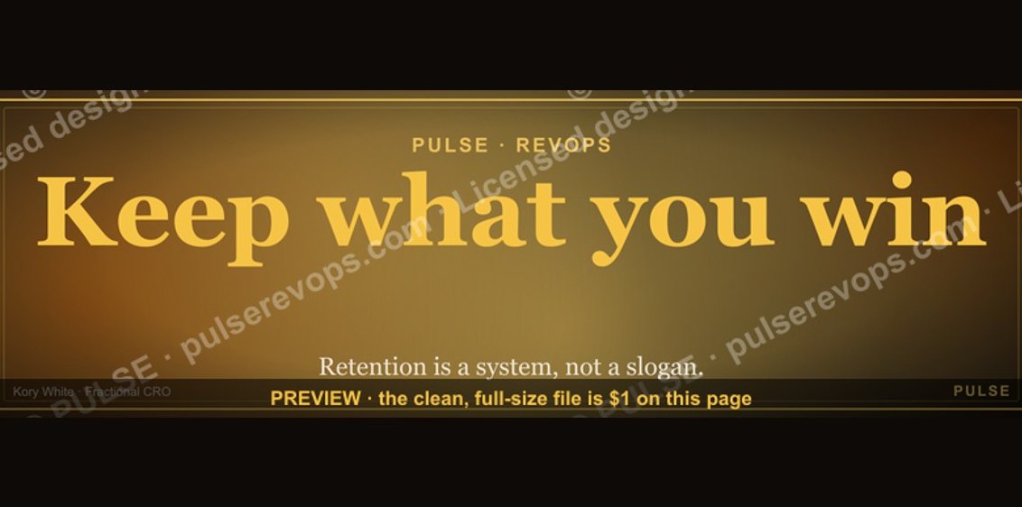 graphicKeep what you win. — LinkedIn Wallpaper
 graphicRevOps Manager — LinkedIn Banner
 graphicHow to build a champion seller playbook in 2027
 graphic“Great reps wanted.” — LinkedIn Banner
 graphic“Champions are made before the call.” — LinkedIn Banner
 graphic“Selling expertise and outcomes.” — LinkedIn Banner
 graphicMake it predictable. — LinkedIn Wallpaper
 graphicHow to find champions before the first call in 2027
 graphicRight market, right motion. — LinkedIn Wallpaper
 graphicFaster deals, fewer leaks. — LinkedIn Wallpaper