


"Win the quarter." — LinkedIn Banner
Quality
Certified
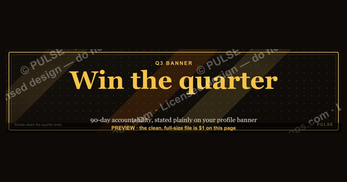
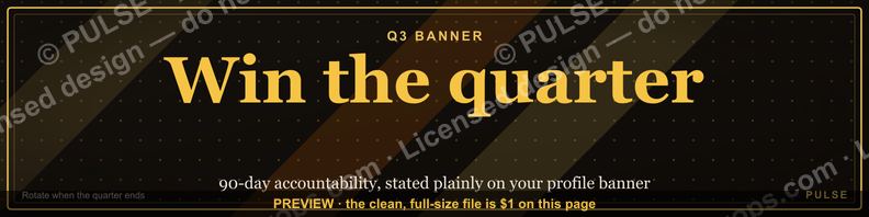
"Win the quarter." works as a LinkedIn banner when your role is measured in 90-day increments — sales, RevOps, fractional leadership. It signals urgency and accountability to anyone scanning your profile. Pair it with a headline naming the same quarter, and rotate it when the quarter ends so it never reads stale.
Win the quarter versus the calmer alternatives
Most people treat banner copy as a one-shot decision. It isn't. There are two families of phrasing, and they attract different attention.
The first family is urgency copy: "Win the quarter.", "Crush Q3", "Close strong", "14 days left." These lines borrow their power from the deadline effect — the well-documented tendency for effort to concentrate as a time boundary approaches. On a LinkedIn banner, urgency copy reads as *I am currently in motion.* It works because the reader supplies the missing context themselves: they know what a quarter is, they know what winning one costs, and they map you onto their own quota calendar in about a second. That's an enormous amount of communication for three words.
The second family is positioning copy: "Pipeline systems for Series B teams", "I fix forecast accuracy", "RevOps for PLG companies." This family trades emotional charge for specificity. Nobody feels anything reading it, but a stranger knows within one line whether to book time with you.
The trade-off is genuinely a trade-off, not a hierarchy. Urgency copy has a shelf life measured in weeks and says nothing about what you actually do. Positioning copy is durable and legible but forgettable — it looks like everyone else's banner, because everyone else also read the same advice about being specific.
There's a third option people underuse: hybrid copy, where the urgency line is the hero and a smaller subline carries the positioning. That's exactly the structure of the "Win the quarter." banner in the Pulse Graphics library — the phrase sits over a "Pipeline Pace Push" line with a pulse motif on a dark field. The big text earns the glance; the small text answers the question the glance provokes. If you only take one thing from this page, take that: a banner needs a hook *and* an answer, and it has room for both.
A fourth path worth naming, because it's the honest default for a lot of people: no copy at all — a texture, a skyline, a product screenshot, your company's brand image. This is the right choice more often than banner-optimization advice admits. If your profile's job is to look credible while someone verifies you exist before a meeting, a clean visual with no claim in it never goes stale and never contradicts your reality. Copy is a commitment. Texture isn't.
Where urgency copy actively backfires: creative teams, R&D, support, research, most of academia, most of healthcare, and any function whose work doesn't resolve on a 90-day clock. Putting "Win the quarter." above a UX researcher's profile reads as borrowed language from a department they don't work in. It's not that it's wrong — it's that it's someone else's uniform.
How to decide between them

The decision is mostly mechanical once you know two things: how your work is measured, and who lands on your profile.
Start with measurement cadence. If your compensation, your forecast, or your board deck resolves quarterly, urgency copy is native to you and costs nothing. If your work resolves annually, per-project, or continuously, urgency copy is costume. Don't wear it.
Then look at traffic composition. Pull thirty days of profile views from LinkedIn's own analytics and sort by what those viewers are. Three rough buckets matter:
- Prospects and buyers. They want to know if you understand their problem. Hybrid or positioning copy wins here — a prospect who sees only "Win the quarter." learns that you have goals, which they assumed.
- Recruiters. They scan for level and function signals. Positioning copy wins decisively; recruiters search by title and skill, not by vibe.
- Peers and your own team. Urgency copy wins. This is the case where the banner functions as internal signage — your reps see it, your network of fellow operators sees it, and it reinforces a shared push.
If one bucket is over half your traffic, write for that bucket and stop deliberating. If traffic is genuinely mixed, hybrid is the safe default because it degrades gracefully: the prospect reads the subline, the peer reads the hero line, nobody reads something irrelevant.
One more input: your last four quarters. If your team has missed repeatedly, "Win the quarter." on the leader's profile reads as either denial or pressure, depending on who's looking. A reset-framed line — something about rebuilding pipeline quality or fixing forecast discipline — is more honest and, oddly, more attractive to buyers, who tend to trust operators who name problems.
Run that once, honestly, and the answer usually falls out in under a minute. The failure mode isn't picking wrong — it's picking a line because it sounded strong and never re-examining it after the quarter it referred to ended.
Concrete numbers behind each option
Design constraints first, because these are fixed and getting them wrong wastes everything else.
LinkedIn's profile background image renders at 1584 × 396 pixels, a 4:1 ratio. That's the number to design to. The uploader accepts PNG, JPG, and GIF up to 8 MB. It does not accept SVG directly — so if you're working from a vector source like the .svg in the graphics library, you export a PNG at native size or 2× (3168 × 792) and upload that. Keep the vector as your master; re-export each time you change the text rather than editing a raster.
Cropping is where most banners die. On desktop, your profile photo sits over the lower-left of the banner and your name block sits beneath it. On mobile and in the app, the banner is cropped tighter and the photo eats a larger proportion of the left side. The practical rule: keep every word inside roughly the center 60% horizontally and out of the bottom-left quadrant entirely. On a 1584-wide canvas that means your text lives roughly between x=320 and x=1270. Anything outside that is a gamble.
Type size: at 1584 wide, a hero line at 90–130 px stays readable when the whole banner is scaled down to the ~640 px width a phone renders. Sublines at 34–48 px. Below about 30 px at native size, the subline turns to mush on mobile — test it by shrinking the export to 640 px wide and looking at it on your actual phone, not a simulator.
Word count: 5–7 words total across hero and subline is the ceiling. "Win the quarter." plus "Pipeline Pace Push" is five. Every word past seven costs you legibility, and the marginal word almost never earns its place.
Contrast: aim for at least a 4.5:1 ratio between text and background — white or near-white on a dark field is the reliable choice, which is why the dark treatment in the library version works. Light text on a mid-tone photograph is the most common self-inflicted wound in banner design; the photo's local brightness varies and half your line disappears.
On effectiveness numbers, be careful. LinkedIn does not report banner-level analytics — there is no impression count, no click data, no view-through for the background image. Any specific conversion figure attached to a banner is someone's guess dressed as data. What you *can* observe is profile view counts and search-appearance counts in LinkedIn's analytics panel, both of which are influenced by everything else you did that week: posts, comments, connection requests, whether your company was in the news. Attributing a change in those numbers to a banner swap is not something a two-week self-test can establish. Treat the banner as a positioning choice you make on judgment, not a variable you optimize on measurement.

Rotation cadence, in practice: four changes a year if you're using quarter-referencing copy — first week of January, April, July, October. Twice a year if you're using positioning copy. Once, and then whenever your job changes, if you're using texture. A banner naming a quarter that ended six weeks ago is worse than no banner, because it's evidence you stopped paying attention to your own profile.
Implementation details and sequencing
Do it in this order. The order matters because the constraints cascade.
Step one — pick the family. Urgency, positioning, hybrid, or texture. Use the decision flow above. Write the line in a plain text file before you open any design tool, because a design tool will tempt you into fixing a weak line with a strong visual, and that never works.
Step two — write the pair. If you're going hybrid, write the hero and the subline together. The subline's job is to answer the question the hero provokes. "Win the quarter." provokes *how?* — so the subline names the mechanism: pipeline pace, deal velocity, forecast discipline, whatever you actually do. Sublines that repeat the hero's energy ("Let's go!") waste the only specific real estate you have.
Step three — build in vector, export to raster. Open the SVG in Figma, Illustrator, Inkscape, or a text editor — SVG is XML, and the <text> elements contain the strings, the <style> block holds sizes, and colors are plain hex values you can find-and-replace. If your graphic has a pulse or line motif, it's typically a <path> with bezier curves; adjusting the control points changes the amplitude. Set your canvas to 1584 × 396 and place a guide box at the center 60%. Export PNG at native or 2×.
Step four — test the crop before you commit. Upload it, then check your own profile on desktop, in the mobile app, and in the "public profile" view a logged-out visitor sees. Those three renders crop differently. If the subline is clipped on mobile, move it up and re-export — don't shrink it.
Step five — align the headline. The banner and the headline directly beneath it are read as one unit. If the banner says "Win the quarter." and the headline says "Passionate about people," the profile contradicts itself. Make the headline carry the specificity: function, segment, and what you actually change. This is the single highest-leverage edit on the page and it takes two minutes.
Step six — diary the rotation. Put a calendar entry on the first business day of the next quarter titled with the new banner text. This is the step everyone skips and it's the one that determines whether the banner ages well.
Two adjacent surfaces are worth updating in the same sitting, since you're already in the file. The featured section directly below your about text is a much stronger conversion surface than the banner — it holds clickable links with their own thumbnails. If your banner makes a claim, put the proof there: a case write-up, a calculator, a template. And your company page banner uses different dimensions than a personal profile; don't reuse the same export across both without checking the crop.
Where the phrase leaks into the rest of the operation
A banner is the cheapest possible version of a much larger decision, which is why it's worth thinking about carefully despite being three words on a graphic.

The same copy shows up in Slack channel topics, in the header of the weekly pipeline deck, in the subject line of the Monday forecast email, on the wall of the sales floor if you still have one. When a leader puts "Win the quarter." on their LinkedIn profile, they've usually already put it in four internal places. The external banner is downstream of an internal decision about what the team is rallying around.
That's where the real risk lives, and it isn't a design risk. Quarterly urgency framing, applied hard, changes seller behavior in predictable ways: heavier end-of-quarter discounting, deals pulled forward that weren't ready, single-threaded closes that churn in month four, and forecast padding early in the quarter to buy room later. None of that shows up on a banner. All of it shows up in next year's net revenue retention.
The mitigation isn't softer language — it's naming the mechanism alongside the goal, which is exactly what the subline does. "Win the quarter." over "Pipeline Pace Push" says *win it by managing velocity*, not *win it by whatever works*. Internally, the equivalent move is publishing what a good quarter looks like on more than one axis: bookings, yes, but also discount depth, multi-threading, and the shape of next quarter's coverage. Teams that only celebrate the bookings number teach their reps that only the bookings number is real.
There's an upstream version of this too. If your quarters are consistently rescued in the final two weeks, the banner isn't the problem and neither is effort — coverage is. A quarter that requires heroics was under-covered ninety days earlier. The unglamorous fix is pipeline generation discipline in the first three weeks of the quarter, when nobody feels urgency and everybody is recovering from the last close.
Two adjacent contexts where this phrasing translates poorly, worth knowing if you work across functions. In customer success, quarterly framing distorts renewals — a CSM pushed to "win the quarter" will chase early renewals and discount to secure them, which just moves revenue and hides churn. In recruiting, it produces rushed hires in the last three weeks of a quarter that unwind two quarters later. In both cases the honest reframe is a leading-indicator goal rather than a lagging one: coverage ratio, health-score movement, pipeline of qualified candidates.
None of that means the phrase is bad. It means the phrase is a promise about how you operate, and a LinkedIn profile is a public place to make it. If the operation behind it is healthy, the banner is a fair signal. If it isn't, the banner is a tell — and the people most likely to notice are the experienced operators you'd most want to hire or sell to.
Related questions
What size should a LinkedIn banner be?
1584 × 396 pixels, a 4:1 ratio, uploaded as PNG or JPG under 8 MB. LinkedIn doesn't accept SVG for the profile background, so export your vector master to PNG at native size or 2×. Keep text in the center 60% to survive mobile cropping.
Does a LinkedIn banner actually affect profile views?
There's no way to know from LinkedIn's own data — it reports profile views and search appearances, but nothing banner-specific. Treat the banner as a positioning decision made on judgment, not something you can A/B test credibly on a personal profile.
How often should I change my banner?
Four times a year if the copy names a quarter, twice a year for positioning copy, and only on role changes for a plain texture. The rule that matters: never leave a banner referencing a quarter that has already ended.
What should the subline say under "Win the quarter."?
The mechanism, not more enthusiasm. Name what you actually manage — pipeline pace, deal velocity, forecast accuracy, territory coverage. The hero line earns the glance; the subline has to answer the *how* that the glance provokes, in three or four words.
Is urgency copy wrong for non-sales roles?
Not wrong, but usually mismatched. If your work doesn't resolve on a 90-day clock, quarterly language reads as borrowed from another department. Positioning copy that names your actual function outperforms it comfortably for engineers, researchers, designers, and support leaders.
FAQ
What does "Win the quarter." signal on a LinkedIn profile?
It signals that you operate on a 90-day performance clock and are currently mid-push. Readers map it onto their own quota calendar instantly, which is why three words carry so much. It communicates urgency and accountability, but nothing about what you do — which is the argument for pairing it with a subline that names your mechanism.
Can I upload an SVG as my LinkedIn banner?
No. LinkedIn's profile background image accepts raster formats — PNG, JPG, GIF — up to 8 MB. Keep the SVG as your editable master, then export a PNG at 1584 × 396 (or 3168 × 792 for a sharper 2× file) each time you change the text. Re-exporting from vector beats editing a raster repeatedly.
How do I stop my banner text from getting cut off on mobile?
Keep every word inside the center 60% horizontally and out of the bottom-left quadrant, where your profile photo overlaps. After uploading, check three renders: desktop, the mobile app, and the logged-out public profile view. They crop differently, and the app is the tightest. If text clips, move it inward rather than shrinking it.
Should a fractional or interim leader use this phrase?
It fits the offer well — fractional CRO and RevOps consulting work is usually sold on speed to impact, and quarterly framing matches that. The caution is the same as for anyone: the banner is a promise. If your engagements run twelve months and are really about system rebuilds, positioning copy describing that will attract better-fit conversations.
What are good alternatives if "Win the quarter." feels too aggressive?
"Close the quarter strong" reads more collaborative. "Own your quarterly goals" works for individual contributors without the competitive edge. If the last several quarters were missed, a reset-framed line about rebuilding pipeline quality or forecast discipline is more honest and tends to land better with buyers, who trust operators willing to name problems.
Does changing my banner help LinkedIn search rankings?
No. LinkedIn's search indexes text fields — headline, about, experience, skills — not pixels in an image. A banner can't be crawled for keywords. If search visibility is the goal, put the specific terms in your headline and about section; use the banner for the emotional or visual hook that makes someone stay once search has already delivered them.
Sources
- https://www.linkedin.com/help/linkedin/answer/a570124 — LinkedIn Help: profile background photo requirements
- https://www.linkedin.com/help/linkedin/answer/a545113 — LinkedIn Help: profile photo and image guidelines
- https://hbr.org/2016/05/the-problem-with-quarterly-earnings-focus — Harvard Business Review on short-termism
- https://www.mckinsey.com/capabilities/strategy-and-corporate-finance/our-insights/where-companies-with-a-long-term-view-outperform-their-peers — McKinsey on long-term vs. short-term orientation
- https://www.sec.gov/answers/form10q.htm — SEC on quarterly reporting requirements
- https://www.w3.org/TR/SVG2/ — W3C SVG 2 specification (text and path elements)
- https://www.w3.org/WAI/WCAG21/Understanding/contrast-minimum.html — WCAG 2.1 minimum contrast (4.5:1)
- https://www.nngroup.com/articles/banner-blindness-old-and-new-findings/ — Nielsen Norman Group on banner blindness
Related on PULSE
This page will be disappearing soon. Save it to your device for $1 — or read it free while it is here.
@Kory-White- · if Venmo asks, the last 4 of my number are 2012
This page is gone.
This one is off the shelf now. $1 keeps it on your phone for good — the whole page, pictures and diagrams included.
 graphicHow to build a champion champion plan in 2027?
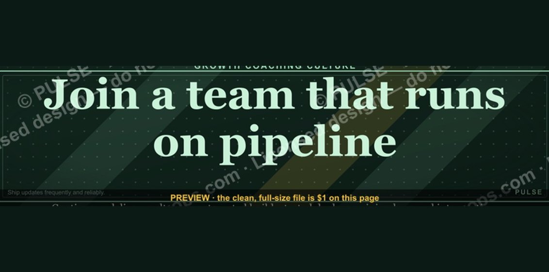 graphic“Join a team that runs on pipeline.” — LinkedIn Banner
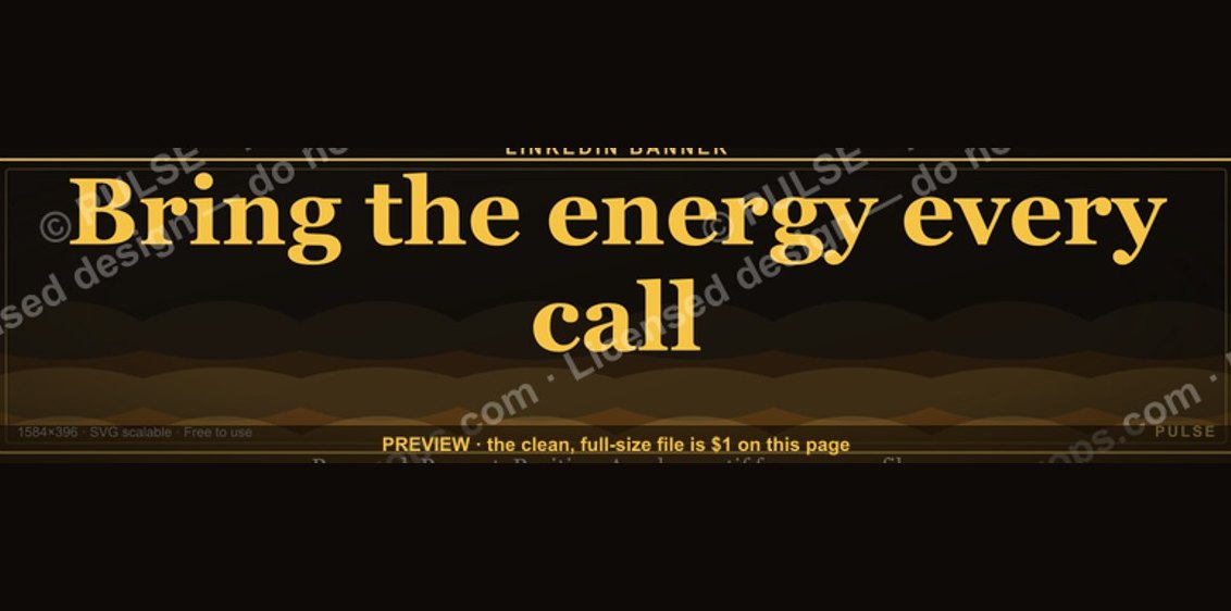 graphic“Bring the energy every call.” — LinkedIn Banner
 graphicCommercial Director — LinkedIn Banner
 graphicHow to design a LinkedIn banner that converts viewers into leads in 2027?
 graphicStartup Founder — LinkedIn Banner
 graphicSales Coach — LinkedIn Banner
 graphicReady reps win. — LinkedIn Wallpaper
 graphic“Available for sales consulting.” — LinkedIn Banner
 graphicRevOps Manager — LinkedIn Banner