


“A forecast you can trust.” — LinkedIn Banner
Quality
Certified
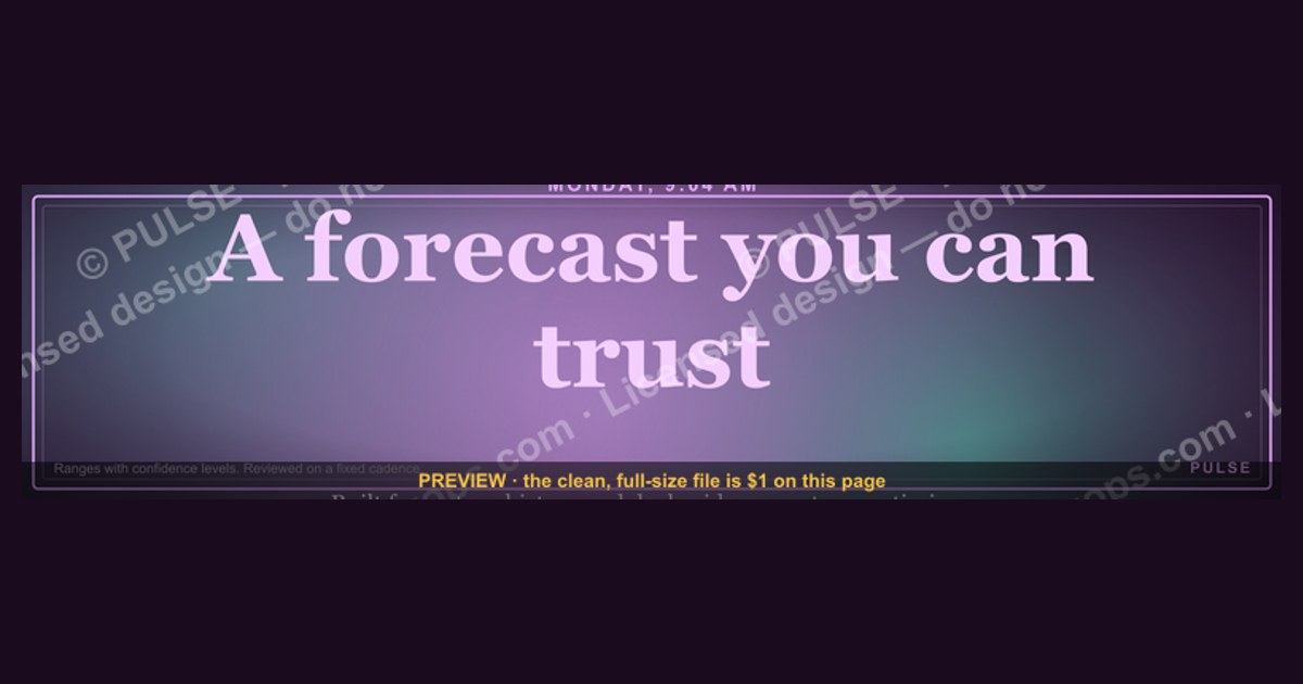
A forecast you can trust is one built from stage-conversion history and deal-level evidence rather than rep optimism, expressed as a range with a stated confidence level, and reviewed on a fixed cadence. On a LinkedIn banner, that phrase works as positioning: it names the buyer's real pain — surprise misses — without overclaiming accuracy.
The Monday morning that makes the phrase land
Picture a VP of Sales on the second Monday of the last month in the quarter. The CRM says $4.2M in commit. The CFO's board deck says $4.2M. Three weeks later the number closes at $3.1M, and nobody can point to the moment it broke. Two deals slipped because a procurement review nobody had logged added four weeks. One deal shrank by 40% because the buyer split the purchase across two fiscal years. And one deal was never real — a champion had said "we love it" in March and the rep had been carrying it at 80% ever since.
That is the scene every "a forecast you can trust" LinkedIn banner is speaking into. The phrase is not a feature claim. It is a recognition claim. It tells a scrolling reader that you know what it feels like to defend a number you privately doubt, and that you have a method for making that feeling go away. Recognition is a much cheaper thing to sell than capability, which is why the line performs on a profile header where you have roughly one second and 1584×396 pixels of attention.
The same dynamic shows up outside sales, which is worth understanding if you are writing the banner for a broader audience. A demand planner defending a supply forecast to operations, a FP&A analyst defending a revenue model to a board, a customer success leader defending a renewal projection — all three live the same loop: build a number, get challenged on it, discover the number was built on soft inputs. The banner phrase generalizes cleanly across those roles, and that portability is part of why it keeps getting reused.

What separates a banner that earns a profile click from one that gets scrolled past is whether the rest of the profile pays the promise off. A banner is a headline; the About section, Featured posts, and Experience bullets are the article. If the banner says "a forecast you can trust" and the About section says "results-driven revenue leader passionate about growth," the reader has already caught you. The banner set an evidentiary expectation and the profile answered with adjectives. Better: name the method in the About section in one sentence — stage-conversion weighting, a three-scenario range, a weekly inspection cadence — and pin one Featured post that walks through a real forecast cycle, including the parts that were wrong.
There is a second scenario worth naming, because it is the one that actually generates inbound. A revenue operations candidate or consultant puts the banner up, and three weeks later a hiring manager who has just lived through their own $1.1M miss lands on the profile. That person is not shopping for a methodology. They are shopping for someone who will make the next board meeting less humiliating. The banner is the only asset on the page that speaks to that emotion directly. Everything else on a LinkedIn profile is credential-shaped; the banner is the one slot where you can be problem-shaped.
How a trustworthy forecast actually gets built

Underneath the banner phrase there has to be a real mechanism, or the profile collapses the moment somebody asks a follow-up question. The mechanism has four moving parts, and they operate in sequence.
Inspect. Every open opportunity gets tested against exit criteria that are observable, not felt. Not "the champion is excited" but "we have met the economic buyer," "we have a written mutual action plan with dates," "we have confirmed the budget line and the fiscal year it sits in," "we have identified the procurement and security review steps and their typical duration." Each criterion is a yes/no that a third party could verify from the CRM record. Deals that fail criteria do not get argued about — they get moved back to the stage whose criteria they actually meet.
Qualify. Stage placement then drives a probability that comes from your own closed-won history, not from a default the CRM shipped with. If deals that reached your Stage 3 closed 34% of the time over the last eight quarters, Stage 3 is 34% — regardless of how good this particular quarter feels. This is the step teams skip most often, and it is the one that does the most work, because it replaces a negotiated number with an observed one.
Commit. Reps still call a number, but the call is now a claim against the model rather than a substitute for it. When a rep commits a deal the model puts at 34%, that is allowed — it just requires a stated reason ("verbal from the CFO, signature scheduled Thursday") that gets logged and later scored. Over two or three quarters you learn which reps' overrides are informative and which are noise, and you weight accordingly.

Reconcile. After the period closes, every override, every slip, and every amount change gets compared to what was predicted. This is the loop that turns a forecasting process into a forecasting *record*, and the record is the only thing that makes the banner phrase defensible. "Trust" on a banner is a claim about a track record; without reconciliation you have no track record, just a spreadsheet.
The reason this sequence matters for the banner specifically is that it gives you three or four concrete sentences to put in your About section, your Featured post, and your interview answers. A banner that promises trust and a profile that can describe a reconciliation loop are a matched pair. A banner that promises trust attached to a profile with no method is worse than no banner, because it invites a question you cannot answer.
Upstream of this loop sits data hygiene, which is unglamorous and decides everything. If close dates get pushed by dragging them a week at a time with no record, your slip rate is invisible. If amounts change without versioning, your shrinkage rate is invisible. Most forecasting failures that get blamed on methodology are actually failures of field-level auditability — the model was fine, but it was reading fields that quietly rewrote themselves.
Numbers worth putting behind the claim
Specific figures are what turn a banner slogan into a credential, so it is worth knowing which ones to track and roughly what healthy looks like. Treat the ranges below as orientation, not gospel — the whole point of the method is that you derive your own from your own history.
Forecast accuracy. The headline metric is absolute percentage error between the committed number and the actual close, measured at a fixed point (commonly the start of the final month of the quarter). Teams that have run a disciplined process for a few quarters typically land inside single-digit to low-teens percentage error at that checkpoint. If your error is regularly above 20%, the problem is almost never the math — it is that stage criteria are not being enforced.

Slip rate. The share of committed deals that push to a later period rather than closing or dying. This is worth measuring separately from loss rate, because slips and losses have completely different fixes. Slips usually trace to an unmapped step — legal, security review, procurement, a signature authority nobody confirmed. Losses trace to qualification.
Amount variance. How much the closed amount differs from the amount carried in the forecast. Enterprise deals in particular tend to shrink at contracting as scope gets trimmed to fit a budget. If your average closed amount runs consistently below your average forecast amount, apply a haircut derived from your own history rather than pretending each deal is the exception.
Coverage ratio. Open pipeline divided by target for the period. The old rule of thumb is 3x, but that number is only meaningful relative to your own win rate — a team winning 33% of qualified deals needs roughly 3x, a team winning 20% needs closer to 5x, and a team winning 50% is fine at 2x. Quoting "3x" without your win rate is exactly the kind of borrowed number that erodes trust.
Stage conversion. Compute the pass-through rate for each stage from your own closed data, over a window long enough to be stable — usually four to eight quarters, depending on volume. Early stages typically convert at a much lower rate than late stages, and the gap between them is where most of the forecast's information lives. A model where Stage 2 and Stage 5 have similar probabilities is telling you your stages are not doing any qualifying work.
Sales cycle length by segment. Median days from creation to close, split by segment and deal size. This is what tells you whether a deal created in week nine of the quarter can mathematically close in-period. A surprising share of forecast misses are just calendar arithmetic nobody did.

For the banner itself, the design numbers are simpler. LinkedIn's cover image slot is 1584×396 pixels — a 4:1 ratio that is unusually wide, which means anything you center vertically has very little vertical room to work with. The profile photo overlaps the lower-left region on desktop and shifts position on mobile, so the left third of the banner should be treated as unusable for critical text. Keep the headline in the center or right-center, keep it under about six words, and check it at small sizes: a meaningful share of LinkedIn viewing happens on phones, where a banner that looked balanced on a 27-inch monitor becomes an illegible strip. Vector formats scale without artifacting; if you export a raster, export at 2x and let the platform downsample.
One more practical note: LinkedIn re-compresses uploaded images, and thin light-weight type on a gradient is what suffers most. If your banner uses a hairline font at small point size, it will look soft after upload. Heavier weights and higher contrast survive the round trip better.
What you give up by leading with trust
Choosing "a forecast you can trust" over the alternatives is a real trade-off, not a free win, and being honest about it is more useful than pretending the phrase is universally optimal.
Trust-led versus offer-led. An offer-led banner — a free assessment, a template, a benchmark report — gives the reader something to *do*. Trust-led gives them something to *feel*. Offer-led will generally pull more raw clicks; trust-led tends to pull a smaller, more self-selected set of people who are actively in pain. If your goal is volume at the top of a funnel, offer-led wins. If your goal is a small number of high-intent conversations — which is usually the goal on a personal LinkedIn profile — trust-led is the better bet. Do not run both at once; a banner that says "a forecast you can trust — download the free template" reads as a discount ad and loses the dignity that made the phrase work.

Trust-led versus proof-led. A proof-led banner puts a number on the canvas: a specific accuracy figure, a specific error reduction, a specific number of quarters called correctly. This is stronger *if* the number is real, defensible, and yours. It is catastrophic if it is borrowed, rounded up, or unverifiable — one skeptical commenter asking "measured how?" undoes the whole page. The rule: only put a number on a banner you would be comfortable being cross-examined about in an interview.
Trust-led versus role-led. A role-led banner just states what you do — "Revenue Operations | Forecasting & Pipeline Analytics." Boring, clear, and unusually effective for job-seekers, because recruiters scan for role keywords. If your primary use case is being found in recruiter search and quickly categorized, role-led beats trust-led. If your primary use case is being remembered by someone who already found you, trust-led wins. Some people run role-led text in the corner and the trust line as the headline, which is a reasonable hybrid as long as the canvas does not get crowded.
Static versus dynamic. A banner you update quarterly signals an active practice; a banner untouched for three years signals a dormant profile. But churn has a cost — people who recognized your profile visually now have to re-learn it. A sensible cadence is to keep the core phrase and refresh the visual treatment, so recognition survives but the page does not look abandoned.

The same trade-off structure applies to adjacent surfaces. An email signature has even less room and should almost always be role-led. A conference slide can carry proof-led numbers because you are there to defend them live. A company website hero can carry trust-led language because the rest of the page provides the proof underneath it. The banner sits in the middle: enough room for a claim, not enough room for evidence, which is exactly why it should make a claim the profile can substantiate one scroll later.
Where this goes wrong
Absolute accuracy claims. "100% accurate," "never miss," "guaranteed forecast." Anyone who has forecast anything knows these are impossible, so the claim identifies you as someone who has not done the work. The honest version is stronger: a range, a confidence level, and a stated error band.
Borrowed statistics. Putting a percentage on a banner that you read in a vendor report and cannot source is the fastest way to lose the exact audience you are trying to reach. Analytical buyers ask where numbers come from. If the answer is "a webinar I attended," you have converted a credibility asset into a liability.
Text in the dead zone. The lower-left corner of the LinkedIn cover is covered by the profile photo, and the crop behaves differently on mobile than desktop. Text placed there gets clipped for some fraction of viewers. Always preview on a phone before committing.
Overcrowding. The strength of a four-word line on a wide canvas is the negative space around it. Adding a logo, a tagline, a URL, three icons, and a stat turns a statement into a slide. If you need all of that, you do not need a banner — you need a Featured post.

Mismatch with the rest of the profile. The most common failure by far. Banner promises rigor, headline says "passionate about growth," Experience section is a list of responsibilities with no outcomes. The reader's brain resolves the contradiction in favor of the boring evidence, not the bold claim, and you end up worse off than a plain banner would have left you.
Confusing the banner with the method. A banner does not make a forecast trustworthy — a reconciliation loop does. If you put the line up while your team is still negotiating stage probabilities in a Friday call, you have written a promissory note against work you have not done. Build the loop, run it for two or three quarters, then make the claim. The sequence matters, and it is the whole difference between positioning and puffery.
Never updating after your method changes. If you move from a single-point commit to a three-scenario range, or you start reporting confidence intervals, that is a genuinely better story — and a stale banner is now understating you. Treat the banner as a versioned artifact tied to your actual practice.
Related questions
How wide should a forecast range be?
Wide enough to contain the actual result most of the time. Derive it from your own historical error: if your commit has landed within 12% of actual in seven of the last eight quarters, a band of roughly ±12% is honest. Narrowing it for optics defeats the purpose.
Should the banner name my company or just my role?
If you are employed and happy, naming the company adds credibility borrowed from a known brand. If you are consulting or open to moves, keep it role- and outcome-focused — a company name dates the banner and has to be changed the moment anything shifts.
How often should I rebuild the forecast within a quarter?

Weekly is the common cadence for most B2B teams. Shorter transactional cycles may warrant more frequent refreshes; long enterprise cycles can run biweekly. The cadence should be fixed and predictable so the review becomes routine rather than reactive.
Can I use the same phrase on a company page banner?
Yes, but the burden of proof rises. A personal profile can carry a claim about judgment; a company page carries a claim about a product, which invites comparison shopping. Pair it with a customer-facing proof point on the page itself.
What if I have no forecasting track record yet?
Do not claim one. Use a role-led or method-led banner instead — naming the approach is honest and still differentiating. Switch to the trust line once you have two or three reconciled cycles you could actually walk someone through.
FAQ
What does "a forecast you can trust" actually mean in practice?
It means the number comes from observable deal evidence and your own historical conversion rates rather than rep sentiment, that it is expressed as a range instead of a single point, and that every past forecast has been reconciled against what actually closed. Trust here is a property of the process and its record, not a property of any single number.
How is this different from what most sales teams already do?
Most teams produce a commit number by aggregating rep judgment, then adjust it based on how the last quarter felt. That is a negotiation, not a model. The difference is enforcement of stage exit criteria, probabilities derived from closed history rather than CRM defaults, and a post-period reconciliation step that most teams skip entirely.

Does a small team have enough data to do this?
Yes, with caveats. With low deal volume your stage conversion rates will be noisy, so widen the window — eight quarters rather than four — and widen your reported range accordingly. Even a few months of consistently tracked opportunities in a spreadsheet beats an untracked gut call, as long as you are honest about the uncertainty.
Will a trust-focused LinkedIn banner get me more profile views?
Probably not more raw views — role and keyword-led banners tend to surface better in search-driven browsing. What it changes is what happens after someone arrives: it gives a self-selected reader a reason to keep scrolling. Optimize for the quality of the conversations that start, not the count of impressions.
What size and format should the banner file be?
LinkedIn's cover slot is 1584×396 pixels. Vector formats scale cleanly to that ratio; if exporting raster, export at 2x and let the platform downsample. Keep critical text out of the lower-left region where the profile photo overlaps, and verify legibility on a phone before publishing.
Does any of this guarantee I hit my number?
No. A forecast is a probability statement, not a commitment device. What a disciplined process buys you is earlier warning — you find out in week three that the quarter is at risk rather than in week twelve — and a credible explanation when the number moves. That earlier warning is usually worth more than the accuracy improvement itself.
Sources
- https://hbr.org/2015/07/why-sales-forecasting-is-so-hard-and-how-to-fix-it
- https://www.linkedin.com/help/linkedin/answer/a563077
- https://www.gartner.com/en/sales/topics/sales-forecasting
- https://www.mckinsey.com/capabilities/growth-marketing-and-sales/our-insights
- https://www.salesforce.com/sales/analytics/sales-forecasting/
- https://hbr.org/2020/07/a-better-way-to-forecast-sales
- https://otexts.com/fpp3/
- https://www.nngroup.com/articles/legibility-readability-comprehension/
Related on PULSE
This page will be disappearing soon. Save it to your device for $1 — or read it free while it is here.
@Kory-White- · if Venmo asks, the last 4 of my number are 2012
This page is gone.
This one is off the shelf now. $1 keeps it on your phone for good — the whole page, pictures and diagrams included.
 graphic“Ready to lead a sales team.” — LinkedIn Banner
 graphicHow to design a LinkedIn banner that converts viewers into leads in 2027?
 graphicRenewals Manager — LinkedIn Banner
 graphicStartup Founder — LinkedIn Banner
 graphic"Pipeline is the product." — LinkedIn Banner
 graphicPipeline cures all. — LinkedIn Wallpaper
 graphicProduct Marketing Lead — LinkedIn Banner
 graphic“Great reps are coached, not born.” — LinkedIn Banner
 graphicHow to build a champion seller playbook in 2027
 graphicRegional Sales Director — LinkedIn Banner