
“Selling science and scale.” — LinkedIn Banner
 Curated byKory White · Fractional CRO · Maryland
 PULSEKNOWLEDGE LIBRARY
Quality
Certified
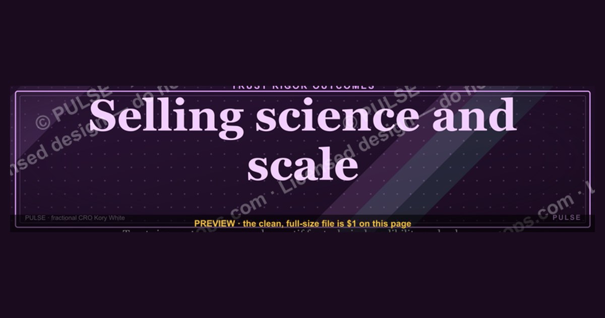
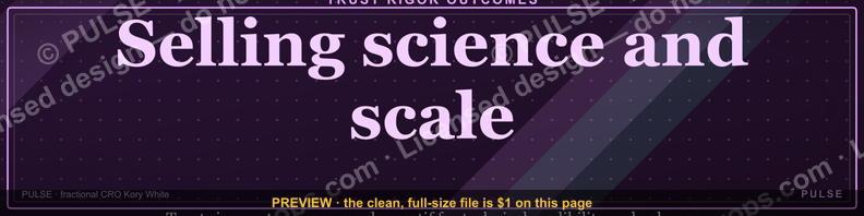
This is a LinkedIn profile banner (1584×396px) that reads "Selling science and scale." in a bold display face against a solid dark ground, sitting directly above your profile photo and headline. It tells a visitor, before they read a word of your bio, that you treat sales as a repeatable discipline rather than a talent contest — and you can download it free as a PNG from this page and drop it straight into your LinkedIn cover-photo slot.
A rep whose profile said nothing about how they sell
Picture two account executives with identical titles, identical company names, identical years of tenure. A prospect researching both before a discovery call lands on each profile for roughly four to six seconds before deciding whether to keep reading. The first profile has LinkedIn's default gray cover photo — the platform's placeholder, unedited, still carrying the faint watermark texture LinkedIn ships by default. The second has this banner: "Selling science and scale." in gold or white serif type on black, filling the full 1584×396 canvas edge to edge.
The default banner communicates nothing. It is neutral space that LinkedIn assumes every user will eventually fill in but that most never touch, because editing a banner feels like a design task rather than a sales task. The second profile has converted that dead real estate into a positioning statement. A buyer who has just been pitched by three other vendors this week, each one promising "results" and "partnership" in interchangeable headline copy, sees a claim that is specific: this person believes selling is a science — testable, measurable, repeatable — and that their job is to make it scale, not just to close one deal and move on. That distinction matters more to a sophisticated buyer than most reps assume. "Science" implies process, data, and a methodology that survives turnover. "Scale" implies the rep is thinking about systems and pipelines, not just their own quota. Together the two words function as a filter: they attract buyers who want a partner who thinks in frameworks, and they mildly repel buyers who want a pure relationship-and-charisma seller — which, for most B2B sales orgs, is the correct trade to make.

The banner does this work passively. Nobody has to remember to say it in a call. It sits at the top of every profile view, every InMail preview, every "who viewed your profile" notification the prospect receives, reinforcing the same four words dozens of times across a sales cycle without the rep lifting a finger after the one-time setup.
What's actually on the banner, element by element
The graphic is built from four layered elements, and each one carries specific, exact wording or a specific function:

- Background field. A solid or near-solid dark ground (charcoal, near-black, or a deep navy) fills the full 1584×396 pixel canvas. Solid color is used instead of a photograph because LinkedIn's own profile photo and name overlay sit on top of the left third of the banner on desktop and shift position on mobile — a busy photographic background creates visual competition with your face and name, while a flat field keeps both legible at every screen size.
- The headline text: "Selling science and scale." This exact phrase, in title case with the closing period intact, is set in a large display serif (or a bold geometric sans if you prefer a more modern, software-adjacent tone) at roughly 60–90pt equivalent, positioned in the right two-thirds of the canvas so it never overlaps the circular profile photo crop LinkedIn applies in the bottom-left corner.
- A hairline rule or single accent mark. Many versions of this banner style include a thin horizontal rule or a single colored underscore beneath the phrase — a restrained accent that keeps the composition from reading as plain stock text, without introducing a logo or a second competing message.
- Generous negative space. Roughly 40–50% of the canvas is intentionally empty. This is not wasted space; it is what makes the four-word phrase readable as a headline rather than as body copy, and it protects the composition from LinkedIn's UI elements — the message button, the "More" button, and the connect button all sit in the lower-right quadrant on desktop and will overlap anything placed there.
The mechanism by which a viewer actually processes this — the order their eye moves in, and why the phrase reads as a claim rather than decoration — follows a predictable scan pattern:

That scan path is why the wording has to be exact and short. A banner that tries to say two things — "Selling science and scale, trusted by 500+ clients" — breaks the single read-and-move-on motion and forces the eye to stop and parse, which on a four-to-six-second glance means the message often doesn't land at all.
Sizing, placement, and where this fits on your profile
LinkedIn's cover photo (banner) slot is a fixed 1584 pixels wide by 396 pixels tall — a 4:1 aspect ratio. That ratio is unusually wide, which is the main reason most people's banners look stretched or off-center: a photo shot at a normal 3:2 or 4:3 ratio gets cropped hard on the top and bottom when LinkedIn forces it into the 4:1 frame. Because this banner is built as flat color plus type rather than a cropped photograph, it renders correctly at the native ratio with no distortion.

A few placement numbers matter in practice:
- Safe zone for text: keep all text at least 60–80px in from every edge. LinkedIn crops the banner slightly differently on mobile versus desktop, and text set flush to an edge on desktop can get clipped on a phone screen.
- Profile photo overlap zone: your circular profile photo (400×400px minimum recommended upload size) sits centered over the bottom-left corner of the banner, roughly the bottom 25% of the canvas height and the left 20% of the width. Never place essential text in that zone — it will be partially or fully covered.
- Mobile crop: LinkedIn's mobile app shows a narrower vertical slice of the same banner than desktop does. Center-weighted or right-weighted compositions (like this one, with the phrase in the right two-thirds) survive the mobile crop far better than left-edge or full-width text.
- File format and size: export as PNG for a flat-color design like this one (JPEG introduces compression banding on solid dark backgrounds that is very visible around large type). LinkedIn accepts up to 8MB; a well-compressed PNG of a 1584×396 flat-color graphic typically lands well under 1MB.
- Where it sits in the profile hierarchy: the banner is the single largest visual element above the fold on both desktop and mobile profile views — larger than the profile photo, larger than the headline text itself. It is the first thing rendered when the page loads, before the About section, before Experience, before any post or article. That first-paint position is exactly why a four-word claim placed there outperforms the same four words buried three paragraphs into an About section that most visitors never scroll to.

Customizing the wording, colors, and roles for your team
The phrase and palette here are a starting point, not a fixed asset. Teams rolling this out across a sales org face a real trade-off between consistency and personalization, and the right choice depends on team size and role mix.
In practice, three variables are safe to change and one is not. Safe to change: the exact wording (swap "science" for "systems," "scale" for "growth," or replace the phrase entirely to match a specific role — an SDR leader might prefer "Pipeline is a discipline, not a guess" while a CS lead might run "Retention is a science too"); the accent color (a single brand color used for the hairline rule or a subtle glow behind the text, which lets each rep's banner feel personal while the layout stays recognizable team-wide); and the type treatment (serif reads as consultative and senior, a bold geometric sans reads as modern and software-native — match it to the buyer persona your reps sell to). Not safe to change without redoing the layout math: the overall composition ratio and text placement zone, because that's what protects the phrase from the profile-photo overlap and the mobile crop described above. A team standardizing this across ten or more reps should lock the canvas template (background treatment, text zone, safe margins) in a shared Canva or Figma file and let individual reps only touch the phrase and accent color — that gets brand consistency without forcing every rep to say something they don't believe.

One frequent mistake in customization is lengthening the phrase to sound more impressive — adding a subtitle, a company name, or a credential line. Every word added past the core four-to-six-word claim measurably slows the four-to-six-second read described earlier, and testimonials from design and personal-branding practitioners consistently note that LinkedIn banners with a single short claim outperform ones crowded with logos, taglines, and contact information, precisely because the banner's job is to be read in a glance, not studied like a resume.
When "Selling science and scale" works — and when it backfires
The phrase works best for individual contributors and leaders in process-heavy, data-literate sales motions: SaaS AEs selling to procurement-savvy buyers, RevOps and sales-ops leaders, sales engineers, and founders selling into technical buying committees. In those contexts "science" reads as a credible, welcome claim — the buyer wants to believe the seller has a repeatable methodology rather than a gut-feel pitch, and "scale" signals the rep is thinking past this one deal toward a partnership that can grow.
It backfires in a handful of predictable situations. In relationship-driven, high-touch sales motions — luxury real estate, certain enterprise consulting practices, long-tenure account management where the entire value proposition is personal trust built over years — leading with "science" can read as cold or transactional, undercutting exactly the warmth the seller is trying to project. It also backfires when the claim isn't backed up anywhere else on the profile: a banner that says "science and scale" sitting above an About section with no mention of process, methodology, playbooks, or metrics creates a credibility gap a sharp buyer will notice within the same short visit. And it can misfire for very early-career reps — a first-year SDR claiming a "science" they haven't yet had time to develop or prove risks sounding like borrowed language rather than earned positioning; for that stage, a banner that signals curiosity and coachability often lands better than one claiming mastery.
The other common failure mode has nothing to do with the wording and everything to do with execution: low-contrast text that fails to render on LinkedIn's own dark-mode interface, banners exported as JPEG with visible compression banding across the dark background, or text set too close to the profile-photo overlap zone so that on mobile the last word of the phrase is invisible behind the user's own photo crop. All three are avoidable by following the safe-zone and PNG-export guidance above, and all three are exactly the kind of small technical error that undermines an otherwise strong positioning claim.
Related questions
Does a LinkedIn banner actually affect response rates on cold outreach?
There's no universal published statistic, but personal-branding practitioners and social-selling coaches consistently report that a profile with a deliberate, on-brand banner and headline sees noticeably higher InMail and connection-request acceptance than a profile with the default gray cover, because it signals the account is active and intentional.
Should the banner match my company's brand colors or my personal brand?
For individual reps, personal brand generally wins engagement — a banner that looks identical to the company's marketing assets can read as corporate rather than as a real person you're about to talk to. Teams can still share a layout template while varying accent color per rep.
How often should I update or refresh my LinkedIn banner?
There's no fixed cadence, but refreshing it whenever your role, focus, or core pitch materially changes keeps the claim honest. A banner claiming a positioning you no longer sell into is worse than no banner at all.
Can I use this same wording on other social profiles like X or a personal website header?
Yes — the phrase itself is platform-agnostic, but you'll need to re-export at each platform's native banner dimensions (X's header, for instance, uses a different aspect ratio than LinkedIn's 4:1), not simply stretch the same PNG.
FAQ
What exact dimensions should I export this LinkedIn banner at? Export at 1584 pixels wide by 396 pixels tall, LinkedIn's native cover-photo ratio of 4:1. Exporting at any other ratio forces LinkedIn to crop the image automatically, which usually cuts text near the edges or shifts the composition off-center.
Why does the banner use a solid background instead of a photo? A flat or near-flat background keeps the four-word phrase legible at a glance and avoids competing with the profile photo and name that LinkedIn overlays on the bottom-left corner of the banner. Photographic backgrounds also crop unpredictably across desktop and mobile, which flat color avoids entirely.
Is "Selling science and scale." the exact wording I have to use? No — the phrase is a template. Swap either half to match your actual positioning (a different verb pair, a role-specific claim) as long as you keep it to roughly four to six words so it still reads in a single glance.
What file format should I download and upload to LinkedIn? PNG. LinkedIn accepts JPEG as well, but JPEG compression introduces visible banding on large flat dark areas like this banner's background, which is much less noticeable on lighter or more textured images.
Will this banner look right on both desktop and mobile LinkedIn? It's designed to, because the text sits in the right two-thirds of the canvas with generous margins, which survives LinkedIn's narrower mobile crop better than text placed near the edges or centered across the full width.
Can a whole sales team use the same banner design? Yes, and it's a common rollout pattern — lock the layout template and color system centrally, then let each rep customize only the phrase (if roles differ) or a single accent color (if the phrase stays constant), so profiles look like one coherent team without looking identical.
Sources
- https://www.linkedin.com/help/linkedin
- https://blog.hootsuite.com/linkedin-banner/
- https://sproutsocial.com/insights/linkedin-cover-photo/
- https://buffer.com/library/linkedin-banner/
- https://www.canva.com/create/linkedin-banners/
- https://www.adobe.com/express/create/banner/linkedin
- https://later.com/blog/linkedin-banner-size/
- https://www.hubspot.com/marketing-statistics
Related on PULSE
- [What should my LinkedIn headline say if my banner already makes a claim?](/knowledge/linkedin-headline-vs-banner-messaging)
- [How do I build a personal brand system across LinkedIn, email signature, and a website header?](/knowledge/personal-brand-system-across-channels)
- [What's the ideal profile photo crop for LinkedIn's circular avatar?](/knowledge/linkedin-profile-photo-crop-guide)
- [How do sales teams standardize LinkedIn branding without making every profile identical?](/knowledge/team-linkedin-branding-standardization)
- [Does an active, well-branded LinkedIn profile actually improve outbound reply rates?](/knowledge/linkedin-profile-branding-outbound-reply-rates)
This page will be disappearing soon. Save it to your device for $1 — or read it free while it is here.
@Kory-White- · if Venmo asks, the last 4 of my number are 2012
 graphicSales Enablement — LinkedIn Banner
 graphicHow do you build a Champions sell motion from scratch in 2027?
 graphicAccount Executive — LinkedIn Banner
 graphicBuild the revenue engine. — LinkedIn Wallpaper
 graphicMake it predictable. — LinkedIn Wallpaper
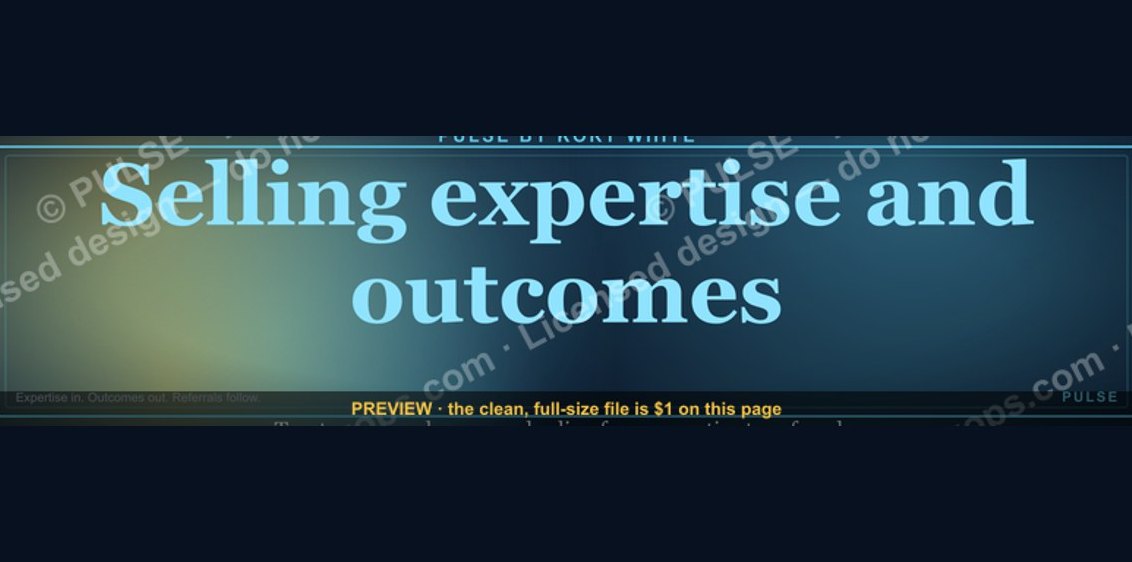 graphic“Selling expertise and outcomes.” — LinkedIn Banner
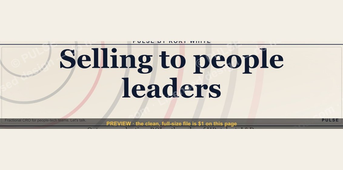 graphic“Selling to people leaders.” — LinkedIn Banner
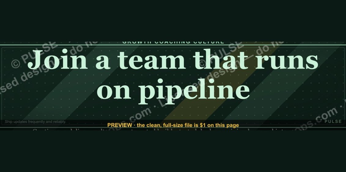 graphic“Join a team that runs on pipeline.” — LinkedIn Banner
 graphicRenewals Manager — LinkedIn Banner
 graphicPipeline Conversion Rate Funnel — Infographic in 2027