


What do top-performing graphic designers do differently in 2027?
Quality
Certified
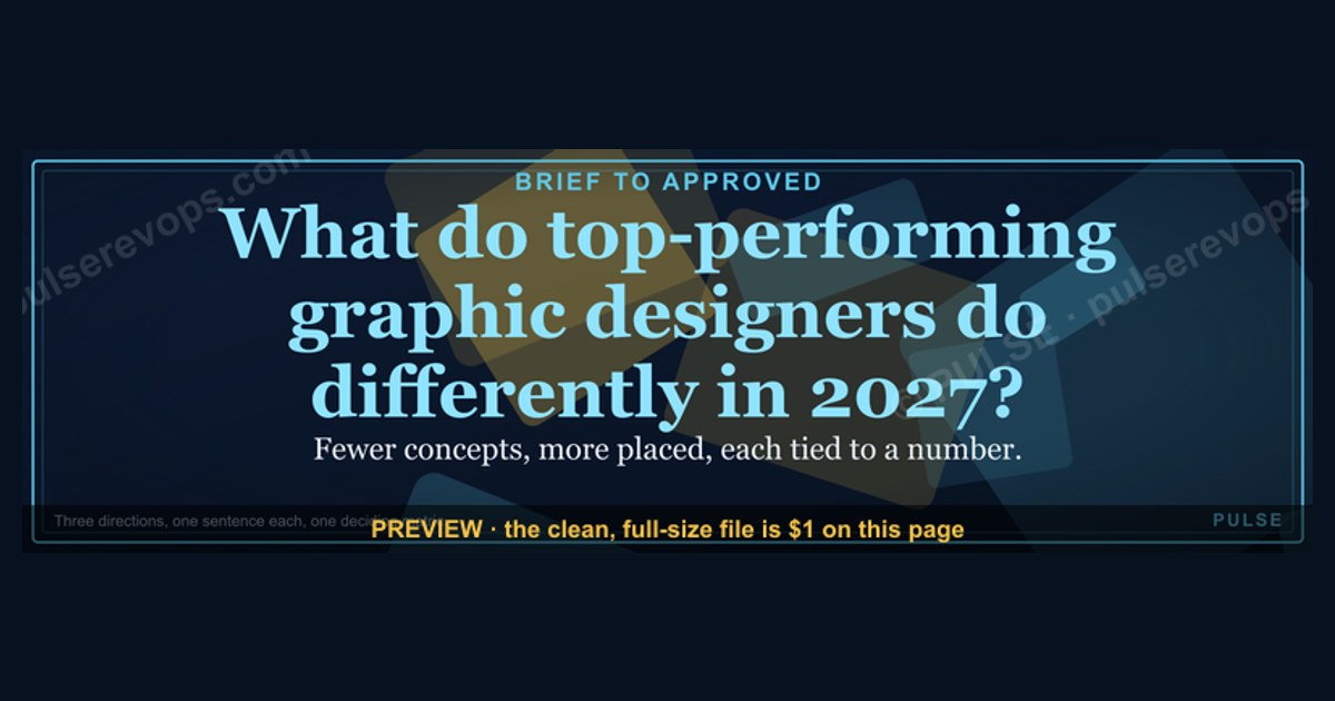
This banner is a 1600x500 px downloadable PNG for LinkedIn and web headers, titled "What do top-performing graphic designers do differently in 2027?" It reads as a single gold headline on a dark field, and it answers its own question by naming the habits that separate the top slice of the field from everyone else.
The outcome you should expect
The outcome this banner points at is not "better taste." It is a measurable gap in how work gets produced. Top-performing graphic designers in 2027 ship fewer concepts but place more of them, and they can prove which ones earned money. In practice that shows up as a designer who can walk into a review with three directions instead of twelve, explain in one sentence why each exists, and point to the number that will decide between them.
The expected result of adopting the habits this banner names is a shorter path from brief to approved asset, a portfolio that reads as a business case rather than a mood board, and a rate that stops being negotiated on hours. Teams that make the shift typically report that review cycles collapse from weeks to days, not because the design gets simpler, but because the decision criteria are agreed before the first pixel moves.
The other half of the outcome is defensive. Designers who cannot connect their work to a metric get cut first when budgets tighten, because they look like a cost with no denominator. The top slice is not immune to layoffs, but they are harder to remove, because removing them removes a number someone upstairs is watching. That asymmetry is the whole point of the banner.

So the outcome to expect is a designer who behaves like a small operator inside a larger business: scoping, pricing, measuring, and then designing. The craft still matters enormously. It just stops being the only thing on the table.
What drives that outcome
The drivers are mostly process, not talent. The first driver is narrowing the brief before designing. Top performers spend real time turning a vague request into a written problem statement with a success condition attached, and they refuse to start until that sentence exists. A designer who skips this step will produce beautiful work that answers the wrong question, and no amount of revision fixes a wrong question.

The second driver is a small, deliberate concept count. Three directions, each with a named strategy, beats ten variations of the same idea. Variation without strategy is decoration, and decoration invites opinion instead of decision. When each option carries a label, the review becomes a choice between strategies rather than a taste contest, and the loudest person in the room loses their advantage.
The third driver is a system behind the work. Top performers build a small set of reusable components, type scales, color tokens, and layout rules that let them assemble a new asset in hours. This is not about templates that make everything look the same. It is about removing the low-value decisions so the high-value ones get attention.
The fourth driver is instrumentation. They define, before launch, what will be measured, and they make sure the measurement is actually available. A landing page variant, a banner, a packaging refresh, a social set, each gets one number attached. If no number is available, they say so out loud rather than pretending.
The fifth driver is communication in the language of the business. They present work with a one-line rationale, a cost, and a risk. They do not apologize for the work, and they do not oversell it. They also document decisions, so the next person who asks "why is it this color" gets an answer instead of a shrug.

The loop matters more than any single step. Top performers treat a shipped asset as the start of a measurement window, not the end of a project. That single reframe changes what they build, because they know they will have to look at the result.
Benchmarks and realistic ranges
Benchmarks here are directional, not universal, because team size, sector, and asset type swing the numbers hard. Still, the ranges below are the ones practitioners tend to recognize when they compare notes, and they are useful as sanity checks rather than targets to hit exactly.
On concept count, the top slice tends to present two to four directions, with three being the most common. Designers earlier in their career often present six to twelve, which feels generous but usually signals that the problem was never narrowed. Fewer options, each defended, consistently wins more often than a wide spread.
On revision rounds, a well-scoped project lands in one to three rounds. Anything past five is almost always a symptom of an undefined success condition rather than a picky stakeholder. When a project hits round six, the productive move is to stop designing and go back to the problem statement, not to produce a seventh variation.

On time allocation, a useful split for a single asset is roughly 20 percent discovery and scoping, 50 percent design and iteration, 20 percent review and revision, and 10 percent documentation and handoff. Most struggling designers invert this, spending almost everything on the middle and nothing on the ends, then wondering why the work keeps getting re-litigated.
On rate, the gap between the middle and the top of the market is wide and mostly explained by positioning rather than raw skill. Designers who sell outcomes, a conversion lift, a launch that lands, a system that saves the team hours, can command multiples of what hour-sellers charge for the same craft. That is not a trick. It is a different product.
On portfolio composition, the strongest portfolios in 2027 tend to show fewer than ten projects, each with a stated problem, a constraint, a decision, and a result. Portfolios that show thirty pretty images with no context read as a gallery, and galleries get hired for production work, not for the work that moves a number.
On tooling, the specific stack matters far less than whether the designer can hand off cleanly. Files that a developer or a print vendor can open without a phone call are worth more than any particular app. The benchmark is not which tool, it is whether the handoff produces zero clarifying questions.
Risks, edge cases, and failure modes

The first failure mode is measurement theater. A designer attaches a number to work, the number moves for reasons unrelated to the design, and everyone draws the wrong lesson. This is common with seasonal traffic, paid boosts, and anything launched during a news cycle. The fix is to be honest about attribution and to prefer comparisons that hold other variables roughly steady.
The second failure mode is over-systematizing. A designer builds so many tokens and rules that every new asset looks like the last one, and the brand goes stale. Systems should remove low-value decisions, not high-value ones. If the system is answering the interesting questions, it has grown too far.
The third failure mode is the three-concept trap. Presenting three options is only better than ten if all three are genuinely viable. If two are straw men propping up a favorite, stakeholders will notice, and trust drops fast. The options must be real, and the designer must be willing to build whichever one wins.

The fourth failure mode is scope creep disguised as helpfulness. Saying yes to every adjacent request feels generous and destroys the schedule. Top performers are explicit about what is in and out of a scope, in writing, before work starts. That single habit prevents most of the resentment that builds on both sides of a project.
The fifth failure mode is the solo hero. Designers who never document, never share files, and never train anyone become a single point of failure, and single points of failure get managed out or burned out. The top slice builds things that survive their vacation.
The sixth failure mode is ignoring the medium. A concept that works on a 1600x500 banner may fail completely as a square social post or a print insert. Top performers test the idea at the actual sizes and in the actual context before committing, because a headline that reads well on a wide banner can become a wall of text in a narrow column.
The seventh is pricing by the hour while doing outcome work. If the value delivered is a launch that earns far more than the fee, hourly billing caps the upside and punishes efficiency. The edge case is a client who genuinely needs a body, not a result, and for that client hourly is fine. Knowing which one is in front of you is the skill.
A practical rollout plan
A rollout should be small and boring. Pick one recurring asset type, apply the full loop once, and see what breaks. Do not attempt to reform an entire design practice in a week.
Start with a single asset class you already produce often, such as a launch banner, a social set, or a one-page sell sheet. Write the problem statement and the success condition for the next one before opening any design tool. If you cannot write the success condition, that is the finding, and it is worth more than the asset.
Then build the smallest possible system for that asset class: a type scale, three or four colors, spacing rules, and one or two reusable layouts. Keep it under a page. The goal is to remove decisions, not to build a design system product.
Next, produce three labeled concepts against the success condition. Label each with its strategy in plain words, not design jargon. Present them together with a recommendation and a stated risk for each. This is the step most designers skip, and it is the step that changes the conversation.
After the review, ship the chosen concept and instrument it. Define the number, confirm it is collectable, and set a date to read it. Then actually read it. Keep, iterate, or kill, and write one paragraph on what you learned. That paragraph becomes the asset that compounds.
Repeat the loop for a quarter and you have four documented cycles, a small system, and a track record. That track record is what lets a designer raise rates, decline bad-fit work, and get invited into conversations earlier. The banner on this page is a shorthand for that loop, and it works best as a reminder rather than a slogan.
Related questions
What separates top-performing graphic designers from the rest in 2027?
They narrow the problem before designing, present a small number of labeled concepts, build a reusable system, and attach a measurable outcome to shipped work. The craft is comparable; the process and the accountability are not.
Do top designers still present multiple concepts?
Yes, but fewer and better. Two to four genuinely distinct directions with named strategies outperform a wide spread of variations, because the review becomes a decision between strategies rather than a taste contest.
How do designers prove their work earned money?

They agree on one number before launch, confirm it can be collected, and read it on a set date. When attribution is muddy, they say so rather than overclaiming, which preserves trust over time.
Is a design system required to perform at the top level?
Not a full system, but a small one. A type scale, a few colors, spacing rules, and a couple of reusable layouts remove enough low-value decisions to matter, without making every asset look identical.
FAQ
Does this banner work for a personal profile as well as a company page? Yes. At 1600x500 it fits LinkedIn profile banners, company page headers, and many blog or newsletter headers. Crop to the safe area if the platform overlays a profile photo on the left, and keep the headline centered so it survives the crop.
Can I change the wording on the banner? Absolutely, and you should if your audience differs. Swap the headline for your own team's version of the question, keep it to one line, and keep the same weight and color contrast so it reads at thumbnail size.

What if my brand colors are light rather than dark? Invert the treatment. Use a light field with a dark headline, and check contrast at small sizes. The banner's job is legibility first, mood second, so test it as a thumbnail before you commit.
How do I use this banner without it looking like a stock template? Change one variable that is yours: the headline, the accent color, or the supporting line. A single specific edit makes it read as your team's artifact rather than a generic download.
Is it safe to attach a number to design work if I cannot prove causation? Use language that matches the evidence. Say the asset shipped alongside a change rather than claiming it caused the change, and prefer before-and-after comparisons where other variables stayed roughly stable.
What size should I export if the platform asks for something else? Keep the 1600x500 master and export platform-specific crops from it. Preserve the aspect ratio where you can, and if you must change it, reposition the headline rather than stretching it.
Sources
- https://www.nngroup.com/articles/
- https://www.smashingmagazine.com/
- https://www.figma.com/blog/
- https://www.aiga.org/
- https://www.linkedin.com/business/marketing/blog
- https://www.interaction-design.org/literature
- https://developer.mozilla.org/en-US/docs/Web/CSS
- https://www.w3.org/WAI/WCAG22/quickref/
Related on PULSE
- How design teams scope work before the first pixel
- Building a small design system that does not flatten the brand
- Attaching metrics to creative work without overclaiming
- Positioning design services around outcomes instead of hours
- Running a review that ends in a decision, not a debate
This page will be disappearing soon. Save it to your device for $1 — or read it free while it is here.
@Kory-White- · if Venmo asks, the last 4 of my number are 2012
This page is gone.
This one is off the shelf now. $1 keeps it on your phone for good — the whole page, pictures and diagrams included.
 graphic“Bring the energy every call.” — LinkedIn Banner
 graphicField Sales Rep — LinkedIn Banner
 graphicHow do you build a Champions sell motion from scratch in 2027?
 graphicBring the energy. — LinkedIn Wallpaper
 graphicFaster deals, fewer leaks. — LinkedIn Wallpaper
 graphicStartup Founder — LinkedIn Banner
 graphicThe Champion's Playbook: 6 Steps to Turn Customers into Sales Advocates in 2027
 graphicPipeline cures all. — LinkedIn Wallpaper
 graphicSales Cycle Timeline Infographic in 2027
 graphic“More pipeline, less panic.” — LinkedIn Banner