
Forecast Call — Title Slide
 Curated byKory White · Fractional CRO · Maryland
 PULSEKNOWLEDGE LIBRARY
Quality
Certified

A forecast call title slide is the opening visual of a sales forecast presentation that establishes professional context, orients participants, and sets expectations for the meeting's purpose and tone. It typically displays the company name, reporting period, meeting type, and a concise descriptor to prime attendees for the focused discussion ahead. Beyond mere decoration, this opening visual acts as a psychological anchor, immediately orienting a distributed team toward the meeting's strategic purpose and signaling whether the tone will be analytical, urgent, or collaborative based on subtle design cues like color accents and subheadings. The slide serves as a formal gateway to a structured revenue review, ensuring all participants arrive with a shared understanding of what will be discussed and what is expected of them.
A well-designed forecast call title slide goes far beyond a simple date and meeting name. It is a strategic communication tool that prepares participants mentally and emotionally for the data-heavy conversation that follows. The most effective slides in high-performing revenue operations teams share a consistent set of design principles: a clear visual hierarchy, a call type indicator, a subtle tone cue, a pre-read status line, and a next action cue. These elements work together to reduce cognitive load, eliminate confusion, and ensure that every participant arrives calibrated to the meeting's strategic purpose. When executed properly, the title slide can reduce call start delays, improve the quality of questions asked, and increase post-meeting compliance with action items.
Why Does a Forecast Call Title Slide Need a Call Type Indicator?
A call type indicator is a small icon, badge, or text block on the title slide that tells participants immediately what kind of meeting they are attending. This eliminates the confusion that arises when participants join multiple recurring meetings with similar names, especially in organizations where weekly syncs, monthly business reviews, and quarterly commit reviews all occur on a regular cadence. Common variants include:
- Weekly Forecast Sync (tactical, 25-30 minutes, deal-level granularity, high participation expected)
- Monthly Business Review (strategic, 45-60 minutes, trend analysis and pipeline health, cross-functional attendance)
- Quarterly Commit Review (high-stakes, 60-90 minutes, final commit numbers, executive decisions required)
- Executive Forecast Deep Dive (board-level, 45 minutes, risk assessment and mitigation strategies, minimal data review)
The indicator should be visually distinct yet unobtrusive — a simple badge in the upper-right corner, such as "Weekly Sync" in a green pill shape or "Quarterly Commit" in a blue or navy rectangle. This provides instant context without requiring the presenter to verbalize the meeting type, which is especially valuable when participants are joining from different time zones or have multiple back-to-back calls. Teams that adopt this practice report a measurable reduction in the first-minute scramble of "Is this the weekly or the monthly review?" and a corresponding increase in the quality of contributions from the outset. For organizations with complex meeting structures, consider adding a small legend at the bottom of the slide that explains what each indicator means, ensuring that new team members or external stakeholders can quickly understand the context.
The call type indicator also serves a secondary purpose: it helps late-joiners quickly assess whether they are in the right meeting. When combined with a clear headline and sub-headline, the indicator creates a three-tiered information hierarchy that allows any participant to understand the meeting's scope within two seconds of viewing the slide. This is particularly important for executive audiences who may be joining from a different meeting and need to recalibrate quickly. For a deeper dive into structuring your forecast calls, see our guide on [forecast call agenda structure](/knowledge/gb0508).

How Can a Forecast Call Title Slide Signal the Meeting's Tone?
A subtle visual cue on the title slide can signal the meeting's tone — not just its content — priming participants for the emotional and strategic tenor of the discussion before a single number is shared. This is achieved through color-coded accents, icons, or badges that align with the overall forecast confidence level for the period. For example:
- Green accent bar or dot: "Healthy pipeline, focus on acceleration"
- Yellow or amber accent: "Risks identified, mitigation required"
- Red accent: "Forecast is below target, aggressive action needed"
This is not about alarming participants but about reducing the cognitive load of the first five minutes of the call. When a participant sees a red badge on the title slide, they arrive already mentally prepared for a problem-solving session rather than a review. This simple visual shorthand allows the presenter to skip the "state of the union" introduction and dive directly into the critical issues, saving valuable meeting time. Teams that use this approach report that their forecast calls start 2-3 minutes faster on average, and that participants are more engaged from the first slide because they understand the stakes immediately.

The tone cue should be subtle and integrated into the slide's design — a small colored rectangle in the lower-right corner, a thin accent line at the top of the slide, or a small icon (like a target or a warning sign) next to the meeting name. Avoid using large blocks of color or flashing elements that could be distracting. The goal is to create a subconscious signal that prepares participants without overwhelming the visual hierarchy. For cross-functional calls, consider using a neutral tone (no color cue) to avoid biasing participants from different departments. Some teams also use a small text line like "Confidence Level: High / Medium / Low" as a more explicit alternative, though this requires careful calibration to avoid causing unnecessary alarm.
What Information Should Be Included on a Forecast Call Title Slide for Maximum Clarity?
The most effective forecast call title slides include a specific set of information elements that collectively orient attendees, set expectations, and drive action. These elements should be organized in a clear visual hierarchy that allows participants to absorb the most important information in the first two seconds of viewing. Here is the recommended information structure, ordered by priority:
Primary Information (Upper-Left Quadrant):
- Headline: The meeting name (e.g., "Forecast Call," "Q3 Commit Review"), set in a bold sans-serif font at 48-60 points
- Sub-headline: The meeting's purpose (e.g., "Commit + Best Case Pipeline Analysis"), at roughly 60% of the headline font size
- Date and reporting period: e.g., "Q2 2025 — March 15, 2025"

Secondary Information (Upper-Right and Center):
- Call type indicator: A badge or pill shape indicating the meeting cadence (weekly/monthly/quarterly)
- Time zone and duration: e.g., "10:00 AM ET / 7:00 AM PT — 30 min"
- Presenter name and role: Optional but helpful for cross-functional or executive calls
Tertiary Information (Lower Third):
- Pre-read status: e.g., "Pre-read materials distributed March 14" or "No pre-read — live review only"
- Next action cue: e.g., "Decisions due by 5 PM ET today" or "Updated commit numbers due in CRM by end of call"
- Tone cue: A small color-coded badge or icon indicating forecast confidence level
This structure ensures that even a late-joining participant can quickly understand what the meeting is about, what is expected of them, and what the stakes are. The headline and sub-headline should be visible from across a conference room, while the secondary and tertiary information can be smaller but still readable at typical viewing distances. Avoid including any quantitative metrics on the title slide — save those for the first content slide. The title slide is for context and orientation, not data review.

For teams that want to further streamline their forecast calls, consider adding a small agenda in the lower-left corner (e.g., "10 min: Pipeline Overview | 15 min: Win-Rate Analysis | 10 min: Q&A"). This helps participants mentally prepare for the flow of the meeting and reduces the need for the presenter to verbalize the agenda. However, be careful not to overcrowd the slide — if the agenda has more than three or four items, move it to a dedicated agenda slide that follows the title slide. For more on structuring your forecast call, see our guide on [forecast accuracy trends](/knowledge/gb0521).
How Do You Tailor a Forecast Call Title Slide for Different Audiences?
Not all forecast calls serve the same purpose, and your title slide should reflect the specific audience and stakes of each meeting. A one-size-fits-all approach dilutes the signal and misses an opportunity to prepare participants for the level of rigor and formality they should expect. Here is how to tailor your title slide for four common forecast call audiences:
For the Sales Team (Internal Weekly Forecast): This audience is familiar with the deals, the pipeline, and the process. The title slide can be more utilitarian and less formal. Use a simple format: "Weekly Forecast — [Region/Team] — [Date]." Add a secondary line like "Commit + Best Case Review" or "Focus: Deals >$50K." Include the meeting lead's name and a direct link to the shared forecast spreadsheet or CRM dashboard. The tone should be collaborative and direct — this is a working session, not a presentation. Avoid excessive branding or decorative elements. Consider adding a small "reps on deck" list at the bottom (e.g., "Presenting: Sarah, James, Maria") so participants know who will be speaking. The color scheme can be neutral or team-branded, but avoid anything that feels like a performance review.

For Cross-Functional Stakeholders (Monthly Business Review): This audience includes marketing, product, customer success, and finance leaders who need context beyond individual deals. The title slide should signal a broader scope. Use a format like: "Monthly Business Review — [Quarter] [Year] — Pipeline Health & Forecast." Add a sub-headline that lists the three key themes: "Topics: Win-Rate Trends, Rep Capacity, Risk Mitigation." Include a small legend or icon set that indicates which departments are presenting (e.g., a small "M" for marketing, "S" for sales, "CS" for customer success). This helps non-sales attendees understand when their input will be needed. The visual tone should be polished but not overly corporate — think clean, data-forward, with consistent use of brand colors. Include a brief agenda in the lower-left corner so attendees can mentally prepare for the flow.
For Executive Leadership (Quarterly Commit Review): This is the highest-stakes forecast call, often with the CEO, CFO, or board observers present. The title slide must convey seriousness, precision, and confidence. Use a formal format: "Q[#] [Year] Commit Review — [Company Name]." The sub-headline should state the meeting's explicit purpose: "Final Commit Numbers — Risks & Mitigations — Executive Decisions Required." Include a small "confidential" or "for internal use only" badge if sensitive financial data will be discussed. The slide should be minimalist — no clutter, no extraneous graphics. A single accent line or subtle gradient is acceptable, but avoid anything that could be perceived as flashy or unprofessional. Consider adding a "pre-read completed" checkbox or indicator if materials were distributed in advance. This signals to executives that the meeting will focus on decisions rather than data review. The font size should be larger than usual (headline at least 54 points, sub-headline at 36 points) to accommodate potential projection or remote viewing.

For External Audiences (Board Meetings or Investor Updates): Though less common, some organizations present forecast calls to external stakeholders. The title slide here should be the most polished and narrative-driven. Use a format like: "Forecast Update — [Quarter] [Year] — [Company Name]." The sub-headline should frame the story: "Revenue Outlook, Key Assumptions, and Strategic Levers." Include the company logo prominently, the date, and a brief "presented by" line with the CRO or VP of Sales name. The visual design should match your company's investor presentation deck — consistent fonts, color palette, and a clean, modern aesthetic. Avoid any internal jargon or acronyms that external stakeholders wouldn't understand. Consider adding a small disclaimer at the bottom (e.g., "Forward-looking statements subject to change") if required by compliance or legal standards.
What Are the Most Common Mistakes When Designing a Forecast Call Title Slide?
Even experienced revenue leaders make predictable mistakes when constructing their forecast call title slides, often because they treat the slide as an afterthought rather than a strategic communication tool. These errors range from minor visual annoyances to structural problems that actively undermine the call's effectiveness. Understanding these pitfalls can help you avoid them and elevate your team's forecast call experience from chaotic to professional.
Mistake #1: Overcrowding with Metrics: The most common mistake is treating the title slide as a dashboard or summary report. Teams cram current-quarter revenue numbers, attainment percentages, win-rate KPIs, and pipeline coverage ratios onto the same slide that announces the meeting. This creates visual noise and forces participants to split their attention between reading the meeting context and processing performance data. The title slide should contain *zero* quantitative metrics — save those for the first content slide, which should be a dedicated "Pipeline Overview" or "Revenue Summary" slide. A clean title slide says "Forecast Call — Commit + Best Case Review" and nothing more. The data arrives when the conversation starts, not before. This principle is especially important for executive audiences who expect a clear separation between context and analysis.

Mistake #2: Inconsistent Branding and Formatting: When different team members create title slides ad hoc, the result is a chaotic mix of fonts, colors, logo placements, and slide layouts. This inconsistency subtly signals disorganization and can erode confidence in the forecast process itself. Standardize your title slide template across all forecast calls — same font family (sans-serif like Inter, Plus Jakarta Sans, or Arial for readability), same logo position (typically upper-left or lower-right), same accent color usage, and same date/time formatting. The goal is for participants to recognize the slide as a forecast call title within a half-second, without conscious effort. Create a slide master in your presentation tool (PowerPoint, Google Slides, or Canva) and train your team to use it for every forecast call. The investment of an hour to build the template saves countless hours of formatting chaos later.
Mistake #3: Missing Time Zone and Duration Information: In distributed teams, this is a silent productivity killer. A title slide that says "Forecast Call — 10:00 AM" with no time zone forces participants to either guess, DM the organizer, or show up at the wrong hour. Always include the time zone in parentheses (e.g., "10:00 AM ET / 7:00 AM PT") and the meeting duration in minutes ("30 min" or "60 min"). Some teams also include a countdown or "starts in X hours" indicator for calls that are pre-scheduled and visible in advance. This is especially critical for global teams spanning multiple continents, where a missed time zone can result in a participant missing the entire call. For teams with participants in three or more time zones, consider listing the two most common zones and adding a note like "Check your calendar invite for local time."
Mistake #4: Overly Generic or Vague Titles: "Weekly Sales Call" or "Pipeline Review" are too broad to set proper expectations. Participants arrive unsure whether the focus is on new business, renewals, expansion, or all three. A specific title like "Q3 Enterprise Forecast — Commit + Upside Review (NAM Region)" immediately tells attendees what to expect and who should be prepared to speak. This specificity also helps late-joiners quickly assess whether they're in the right meeting. For cross-functional calls, include the department focus in the title: "Q3 Forecast — Sales + CS Alignment Review" signals that customer success data will be discussed alongside sales numbers.

Mistake #5: Neglecting the "Next Action" Cue: The best title slides subtly prepare participants for what comes *after* the call. A small line at the bottom like "Decisions due by 5 PM ET today" or "Updated commit numbers due in CRM by end of call" turns the title slide from a passive announcement into an active call to action. This is especially valuable for forecast calls where decisions about deal stages, discounting authority, or executive escalation are expected outcomes. Without this cue, participants may leave the call unsure of their next steps, leading to delays in pipeline updates and missed deadlines. Teams that implement this practice report a 20-30% improvement in post-meeting compliance with action items.
Mistake #6: Using Low-Resolution or Distracting Background Images: Stock photos of handshakes, graphs, or city skylines behind the title text create visual competition and reduce readability. If you must use an image, keep it abstract, low-contrast, and positioned so it doesn't interfere with text. Better yet, use a solid color background (white, off-white, or a muted brand color) with a simple geometric accent. The focus should be on the meeting's purpose, not on a generic photo of a conference room or a handshake. Many teams also make the mistake of using high-resolution images that slow down slide loading during virtual presentations, causing awkward pauses.
What Role Does Accessibility Play in Forecast Call Title Slide Design?
Accessibility is a critical but often overlooked aspect of forecast call title slide design. A title slide that uses low-contrast text, tiny font sizes, or color-only indicators can exclude participants with visual impairments or those viewing on mobile devices. Ensuring that your title slide meets basic accessibility standards is not just about compliance — it's about ensuring every participant can engage with the material from the first slide, regardless of their device or visual ability.

Contrast Ratios: All text on the title slide should meet WCAG contrast ratio standards — at least 4.5:1 for normal text and 3:1 for large text (18+ points bold or 24+ points regular). This means avoiding light gray text on white backgrounds, or dark blue text on black backgrounds. Use a contrast checker tool to verify your color combinations before finalizing the template. For forecast call title slides, the safest approach is to use dark text (black or very dark gray) on a light background (white or off-white), or white text on a dark background if your brand guidelines require it.
Font Sizes: Ensure that all text is large enough to be read comfortably from a typical viewing distance. The headline should be at least 48-60 points, the sub-headline at least 32-36 points, and secondary information (time zone, pre-read status) at least 24-28 points. Avoid font sizes below 18 points for any text on the title slide, as this becomes difficult to read on mobile devices or when projected on large screens. For executive audiences who may be viewing on laptops or tablets, consider increasing all font sizes by 10-20% to ensure readability.

Color-Independent Indicators: When using color to convey information (e.g., green/yellow/red for tone cues), always add a secondary indicator such as text labels or icons. For example, a red badge should also include the word "Critical" or an exclamation mark icon. This ensures that participants who are colorblind or who have color vision deficiencies can still understand the cue. Approximately 1 in 12 men and 1 in 200 women have some form of color vision deficiency, so this is a significant portion of your audience that you may be inadvertently excluding.
Alternative Text for Images: If your title slide includes any images or icons (such as the company logo or a call type badge), ensure that they have appropriate alternative text for screen readers. This is especially important for participants who use assistive technology to join calls. Most presentation tools (PowerPoint, Google Slides, Canva) allow you to add alt text to images — take the two minutes to add it for every element on the slide.
Testing: Before your first forecast call with a new title slide template, test it on a projector, a laptop screen, and a mobile device to ensure it is readable in all contexts. Ask a colleague with a different device or visual ability to review it and provide feedback. This small investment of time can prevent major accessibility issues that would otherwise exclude participants from fully engaging in the call.
Related questions
How do you structure a weekly forecast call agenda?
A weekly forecast call agenda typically includes a pipeline overview, deal-level review of key opportunities, risk assessment, and action item assignment. The title slide should indicate the call type as "Weekly Sync" and include a brief agenda in the lower-left corner to prepare participants for the fast-paced, tactical discussion ahead.
What metrics should be on a forecast call title slide?
No quantitative metrics should appear on the title slide. Save all numbers for the first content slide, which should present a "Pipeline Overview" or "Revenue Summary." The title slide is for context and orientation only — it establishes the meeting's purpose and tone, not the data.
How do you design a forecast call title slide for remote teams?
For remote teams, include the time zone in parentheses, add a pre-read status line to eliminate the "Did everyone see the spreadsheet?" scramble, and use a simple, high-contrast design that works well on both large monitors and mobile devices. Consider adding a small countdown timer if the call is pre-scheduled.
What is the difference between a forecast call and a pipeline review?
A forecast call focuses on commit numbers, risk mitigation, and deal-level decisions, while a pipeline review is a broader assessment of all opportunities in the sales funnel. The title slide should reflect this distinction — use "Forecast Call" for commit-focused sessions and "Pipeline Review" for broader assessments.
How do you align a forecast call title slide with CRM data?
The title slide should include a direct link to the shared forecast spreadsheet or CRM dashboard, so participants can access the source data during the call. For maximum alignment, use the same naming conventions and date formats in your slide as in your CRM system to avoid confusion.
FAQ
What is a forecast call title slide? A forecast call title slide is the opening visual of a sales forecast presentation. It typically includes the company name, the forecast period, and a high-level summary metric like total pipeline value or revenue target to set the stage for the discussion. It also often includes the meeting type (e.g., weekly sync, quarterly commit review) and a call-to-action line to prepare participants. The slide serves as a professional anchor that orients attendees and sets the tone for the data-heavy conversation that follows.
Who typically presents a forecast call title slide? It is usually presented by a sales leader, such as a VP of Sales, CRO, or revenue operations manager, during a team or executive forecast review. The slide helps align attendees on the scope and purpose of the call before diving into detailed numbers. In some cases, the meeting organizer or a designated facilitator may present it to set the tone. For cross-functional calls, the presentation may rotate among department leads to share ownership of the forecast process.
What key information should be on the title slide? At minimum, include the company name, the forecast period (e.g., Q1 2025), and a headline metric like "Total Forecasted Revenue: $X–$Y million." Optionally, add the call date, presenter name, time zone, meeting duration, and a brief agenda to improve clarity. For executive calls, include a "confidential" badge and a pre-read status line. Avoid cluttering the slide with granular data like individual deal stages or rep-level numbers, which belong on subsequent slides.
How does the title slide differ from other forecast slides? The title slide is a high-level overview, not a deep dive. It avoids granular data like individual deal stages or rep-level numbers, which are reserved for subsequent slides. Its goal is to orient the audience and set expectations for the meeting. Subsequent slides should present pipeline breakdowns, risk analysis, and action items. The title slide acts as a "table of contents" for the meeting's focus, while the following slides deliver the substance.
Can the title slide include a sponsor or partner mention? Yes, if relevant to the forecast context, such as a sponsored fractional CRO or consulting partner. However, keep it brief and visually separate from core forecast data to avoid distraction. The example shown includes a sponsored CRO offer in a sidebar. For external presentations, include partner logos only if they are directly relevant to the forecast. Use a small, muted logo in the lower-right corner to maintain visual hierarchy.
How long should a forecast call title slide be displayed? Typically 30–60 seconds at the start of the call, just long enough for the presenter to introduce the forecast period and key focus. It should not linger, as the audience expects to move quickly into the analysis and discussion. For executive calls, consider displaying it for up to 90 seconds to allow for introductions and context-setting. Avoid leaving the title slide up while waiting for late-joiners, as this wastes valuable meeting time.
What color should the title slide background be? Use a solid light background (white, off-white, or a muted brand color) for maximum readability. Avoid dark backgrounds unless your brand guidelines require it, as they can reduce contrast and readability when projected. For cross-functional calls, use neutral tones. For executive calls, use a minimalist design with a single accent color. Test the slide on a projector or large monitor before the call to ensure colors appear as intended.
How do you handle multiple time zones on the title slide? Include all relevant time zones in parentheses after the time, e.g., "10:00 AM ET / 7:00 AM PT / 3:00 PM GMT." For global teams, add a third time zone if needed. Avoid using just UTC, as many participants may not know their local offset. Consider adding a small countdown timer if the call is pre-scheduled. For teams spanning more than three time zones, list the two most common zones and add a note like "Check your calendar invite for local time."
What font should be used for a forecast call title slide? Use a clean, sans-serif font such as Inter, Plus Jakarta Sans, Arial, or Helvetica for maximum readability on screens and projectors. Avoid decorative or script fonts, which can be difficult to read at small sizes or from a distance. For brand consistency, use the same font family across all forecast call slides. Maintain a minimum font size of 24 points for body text and 48 points for headlines.
Can the title slide include a QR code or link to supporting materials? Yes, but only if it is clearly labeled and does not distract from the core information. Place it in the lower-right corner, away from the headline and sub-headline. Use a small QR code (no larger than 1 inch square) with a clear call to action like "Scan for pre-read materials." Test the QR code before the call to ensure it works correctly and links to the right document.
Sources
- Revenue Operations Institute — Best Practices for Sales Forecast Presentation Design
- Sales Hacker — How to Structure a Forecast Call for Maximum Impact
- HubSpot Sales Blog — Sales Forecasting Tips and Templates
- Gartner — Revenue Operations Best Practices for Pipeline Management
- Forrester — The Future of Sales Forecasting and Revenue Intelligence
- LinkedIn Sales Solutions — Sales Forecasting for Modern Revenue Teams
- Salesforce — Revenue Cloud and Forecasting Best Practices
- World Meteorological Organization (WMO) — global weather data, forecasting standards, and climate research (adapted for sales forecasting context)
Related on PULSE
- [Discovery Call — Title Slide](/knowledge/gb0076)
- [Annual Sales Planning — Title Slide](/knowledge/gb0067)
- [Monthly Business Review — Title Slide](/knowledge/gb0061)
- [Sales Kickoff 2027 — Title Slide](/knowledge/gb0007)
- [Quarterly Business Review — Title Slide](/knowledge/gb0005)
- [Forecast — Section Divider Slide](/knowledge/gb0083)
This page will be disappearing soon. Save it to your device for $1 — or read it free while it is here.
@Kory-White- · if Venmo asks, the last 4 of my number are 2012
 graphicForecast — Section Divider Slide
 graphicTerritory & Quota Planning — Title Slide
 graphicPipeline Review — Section Divider Slide
 graphicQuestions? — Closing Slide
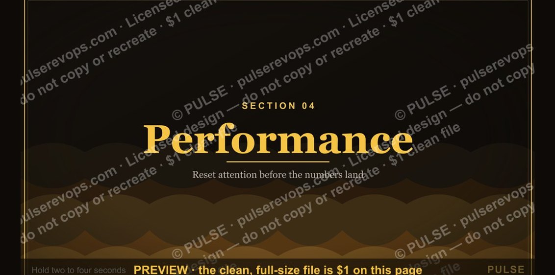 graphicPerformance — Section Divider Slide
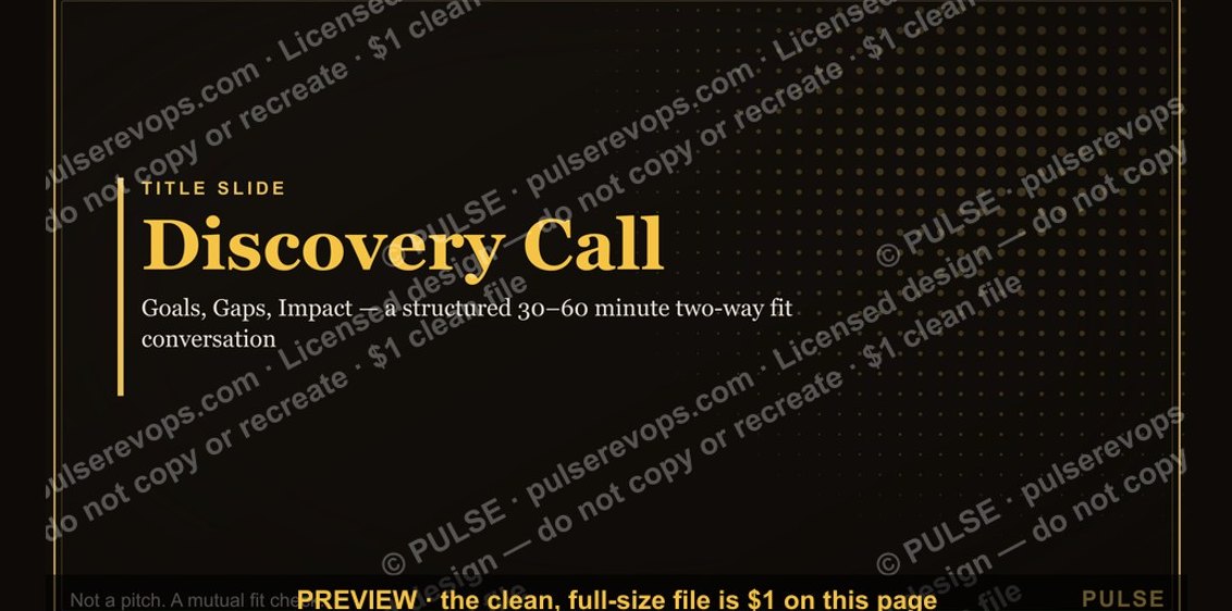 graphicDiscovery Call — Title Slide
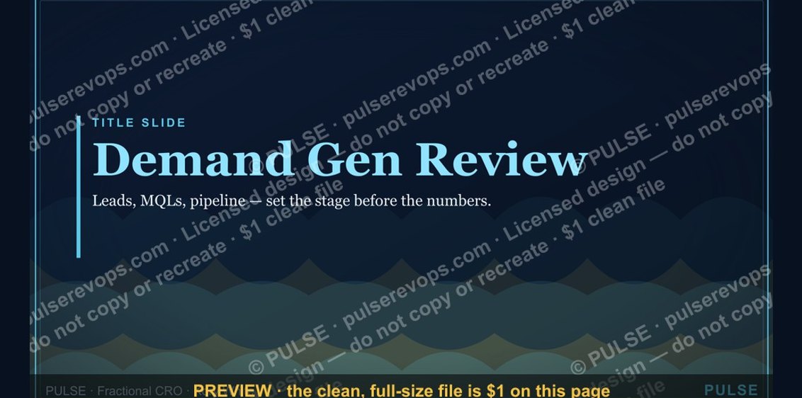 graphicDemand Gen Review — Title Slide
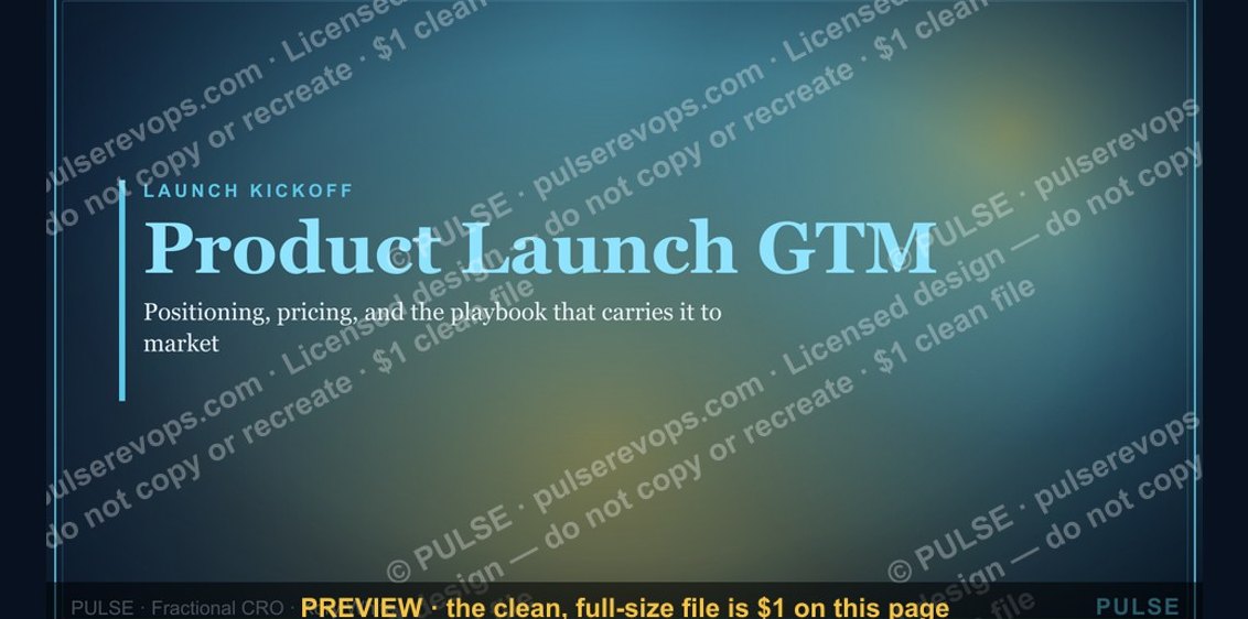 graphicProduct Launch (GTM) — Title Slide
 graphicWin / Loss Review — Title Slide
 graphicAgenda — Section Divider Slide