
“TRUST COMPOUNDS” — Sales Floor Print
 Curated byKory White · Fractional CRO · Maryland
 PULSEKNOWLEDGE LIBRARY
Quality
Certified
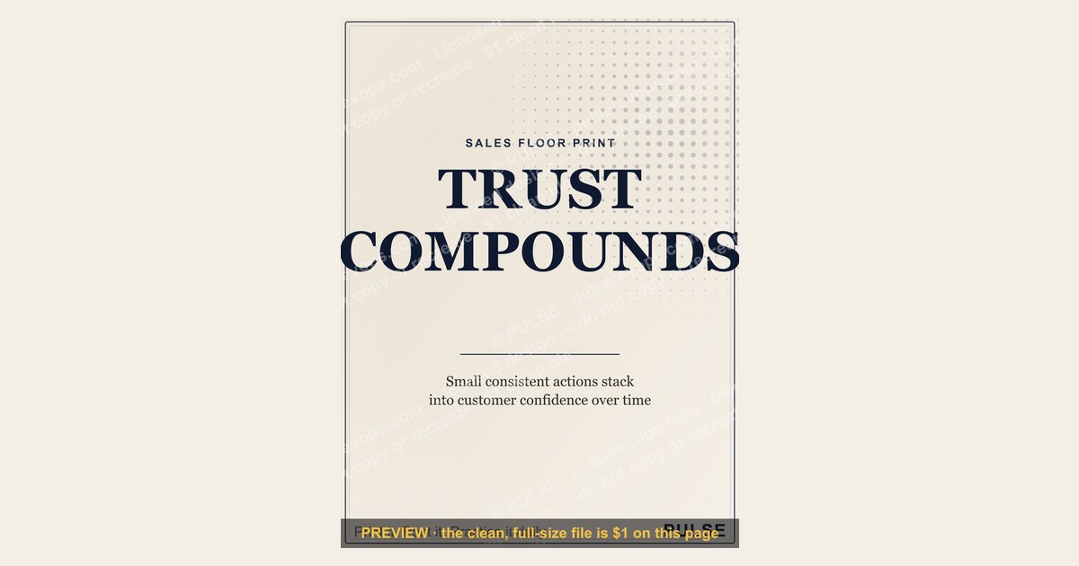
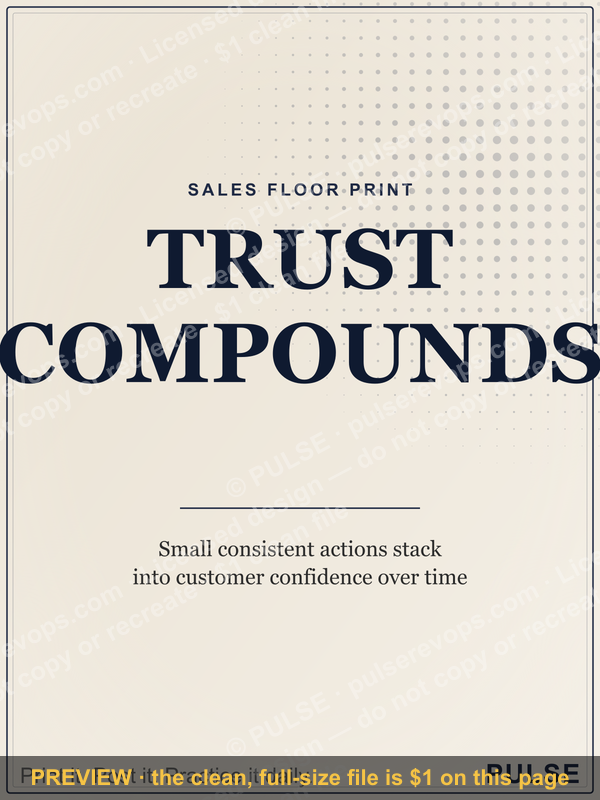
This is a sales-floor print/poster that reads "TRUST COMPOUNDS" in bold display type, designed to hang at eye level where reps pass dozens of times a day. It states plainly that small, consistent honest actions — a follow-up call made on time, a promise kept, a rep who admits a mistake to a customer — accumulate into the reputation that closes bigger deals later. It is a daily behavioral reminder, not a slogan for its own sake.
The outcome you should expect
Hang "TRUST COMPOUNDS" where the Sales team actually stands — near the phone bank, above the deal board, or beside the door reps walk through before a call block — and the realistic outcome is behavioral, not motivational fireworks. A poster does not change a rep's close rate on day one. What it does, reliably, is shorten the gap between "I know I should have called that client back" and actually doing it, because the reminder sits in the rep's peripheral vision at the exact moment the shortcut is tempting. Expect three things over a normal quarter: fewer small broken promises (missed callback windows, quotes that go out late, "I'll follow up Friday" that slips to the following Wednesday), more reps referencing the phrase unprompted in team huddles or 1:1s, and a slow shift in how new hires are coached — trainers start pointing at the print instead of writing a new rule every time a shortcut shows up. None of this shows up as a single KPI spike. It shows up as a floor culture where the manager has to intervene less often on the small stuff, because the standard is on the wall instead of only in the manager's head.
The print's specific value is that it reframes trust as an asset that accrues rather than a trait a rep either has or doesn't. That framing matters because reps under quota pressure will rationalize a shortcut ("just this once, I'll round the delivery date up") as a one-time exception. A poster that says trust compounds pushes back on that rationalization at the moment of the decision, not after the fact in a post-mortem. The realistic timeline for this to show up in retention or win-rate metrics is one to two full sales cycles — long enough for the compounding to actually register with the customer, and long enough for the habit to become the floor's default rather than a novelty on the wall.

What drives that outcome
The graphic does its work through four deliberate design elements working together, not through the words alone.
- Headline, "TRUST COMPOUNDS" — set in a heavy, condensed serif or slab typeface, all caps, filling the top third of the 1200x1600 px canvas so it reads from 15-20 feet away, the typical distance across an open sales floor.
- Supporting line beneath it — a shorter secondary phrase such as "Every call. Every promise. Every follow-up." set in a lighter weight, giving the headline a concrete behavioral anchor instead of leaving it abstract.
- A single visual motif — most commonly a compounding-curve graphic (a simple upward arc or stacked-block icon) reinforcing the financial metaphor of compounding without needing an explanation.
- Color and contrast — high-contrast dark background (near-black or deep navy) with the text in white or gold, chosen specifically so the print reads under fluorescent office lighting and does not wash out.

The loop matters more than any single element: the print is not trying to persuade a rep once, it is trying to be seen hundreds of times so the standard becomes ambient rather than lectured. This is why placement and repetition drive the outcome more than the cleverness of the copy. A print with mediocre design hung directly in a rep's daily path outperforms a beautifully designed one buried in a hallway nobody uses. The visual motif (the compounding curve) exists specifically to give the eye something to land on for the half-second a rep glances at it between calls — plain text alone gets ignored faster because there's no shape to interrupt the scan.
Benchmarks and realistic ranges
At 1200x1600 px, the print is native to a 3:4 portrait ratio, which maps cleanly onto standard poster sizes without cropping or stretching. For a physical sales floor, three print sizes cover the realistic range of use cases:

- 18" x 24" — the standard size for a single workstation, break room wall, or hallway. This is the most common choice for a first install because it is affordable to print in bulk (multiple copies for multiple pods) and still reads clearly from 10-12 feet.
- 24" x 36" — appropriate for a larger open floor or a wall visible from across the room, such as behind a manager's desk facing outward toward the reps, or above a shared deal board.
- 36" x 48" or larger — reserved for a lobby, a large open-plan floor, or a wall a whole team faces during a stand-up; at this size, print on matte or satin stock rather than glossy, since glossy paper glares under overhead fluorescent lighting and makes the headline harder to read from a distance.
For paper stock, matte or satin finish (typically 100-200 lb / 270-350 gsm cardstock or poster stock) holds up better in an office environment than glossy, which shows fingerprints and glare. If the print will be handled or moved between locations, laminating a smaller 18x24 size extends its life considerably; larger sizes are usually mounted once and left in place, so lamination matters less.

On placement, the realistic range is one print per 8-12 reps if the floor has natural sightlines — a single print visible to a pod of that size does the job. Below that ratio (one print per 20+ reps or one per floor rather than per pod), the visibility drops enough that most reps stop registering it after the first week, which defeats the purpose. Above that ratio, printing one per desk, is unnecessary and the repetition becomes wallpaper rather than reminder — diminishing returns set in past roughly one print per pod.
Risks, edge cases, and failure modes
The message backfires in a few predictable ways, and it is worth naming them before printing rather than discovering them after the poster is on the wall.

First, it fails hard when leadership's own behavior contradicts it. If a manager breaks a promise to the team — a comp change announced without warning, a broken commitment on territory assignment — "TRUST COMPOUNDS" on the wall becomes a punchline rather than a standard. Reps notice hypocrisy faster than they notice slogans, and a poster that contradicts lived experience actively damages morale more than having no poster at all. Do not hang this print during or immediately after a period of leadership trust erosion; fix the underlying issue first, or the print becomes evidence against management rather than a shared value.
Second, it fails when it's the only intervention. A poster with no accompanying coaching, no manager reinforcement in 1:1s, and no recognition when a rep visibly demonstrates the behavior, fades into background noise within two to three weeks. The print is a reminder system, not a training program — it needs a manager who references it out loud ("that's exactly what the wall says") for the message to stay alive past the initial novelty.

Third, watch for over-saturation. Sales floors that already run heavy on motivational signage (a wall of five or six different slogans) dilute each individual message. If "TRUST COMPOUNDS" is print number seven on an already-cluttered wall, it competes for attention with everything else and none of them land. One or two well-placed, well-chosen prints outperform a wall papered in aphorisms.
Fourth, a subtler failure mode: reps in highly transactional, one-and-done sales motions (certain SaaS free-trial closes, single-purchase retail) may find the compounding-trust framing genuinely irrelevant to their day-to-day, since there's no second deal for trust to compound toward. In those environments, reframe the message around internal trust (teammate-to-teammate, rep-to-manager) rather than customer trust, or choose a different print entirely — this one is built for relationship-driven, repeat-customer, or referral-heavy sales motions.

A practical rollout plan
Rolling this out well takes roughly a week from decision to installed, and the sequence matters more than the speed.
Start by walking the floor and identifying where reps' eyes actually land during a normal day — not where wall space happens to be open. The path from the entry door to a rep's desk, or the wall directly behind the deal board reps check between calls, both outperform a hallway or break room that reps pass through only occasionally. Order the size that matches that wall (18x24 for a single pod's line of sight, 24x36 if it needs to read across a larger open floor), and choose matte or satin stock specifically to avoid glare under office lighting.

Once it's installed, the single highest-leverage step is a manager naming the standard out loud, once, in a team huddle — not a long speech, just a plain statement of what the print means and why it's there. After that, the print sustains itself only if the manager references it periodically: pointing to it when a rep does the right thing on a hard call, or invoking it gently when a shortcut almost happens. At the 30-day mark, check whether reps mention it unprompted or whether it's become invisible; if it's faded, that's usually a sign it needs to move to a higher-traffic wall or be paired with a specific behavior it's meant to reinforce (e.g., a callback-time standard) rather than left as a general sentiment.
For customization, swap the supporting line under the headline to match your specific floor's priority — "Every call. Every promise. Every follow-up." works broadly, but a team focused on renewal season might use "Every renewal call. Every honest forecast." Colors can shift to match brand palette (the dark background with gold or white text is a default for readability, not a fixed requirement), and the compounding-curve motif can be swapped for a company-specific icon as long as contrast and legibility at distance are preserved.

Related questions
Where exactly should this print be hung on a sales floor?
At eye level, in a path reps walk or a wall they face during calls — near the deal board, above the phone pod, or along the entry path. Avoid break rooms or hallways reps pass through only occasionally.
What size should I print "TRUST COMPOUNDS" at?
18"x24" for a single pod's sightline, 24"x36" for a larger open floor or shared wall, 36"x48"+ for a lobby or all-team stand-up wall. Match size to viewing distance, not available wall space.
Does a motivational print like this actually change sales behavior?
Only alongside manager reinforcement — the print shortens the gap between knowing the right action and doing it, but it needs to be referenced out loud in coaching to avoid fading into background wallpaper within a few weeks.
Can I customize the wording on this poster for my own team?
Yes — keep the headline for legibility and swap the supporting line to match your floor's current priority, such as renewal calls, honest forecasting, or callback timing.
FAQ
What does "TRUST COMPOUNDS" mean on a sales floor print? It means small honest actions — a kept promise, an on-time follow-up, admitting a mistake early — accumulate over time into the reputation that wins bigger and repeat business, the same way small consistent deposits compound into a larger balance.
Is this print meant for customers to see or only the sales team? Only the sales team. It's an internal behavioral reminder hung where reps see it dozens of times a day, not a customer-facing marketing piece.
What file format and dimensions does the download come in? The graphic downloads as a 1200x1600 px PNG, a 3:4 portrait ratio that scales cleanly to standard poster sizes (18x24, 24x36, 36x48) without cropping.
Will this print work in a high-turnover or transactional sales environment? Less well. The compounding-trust framing is built for relationship-driven or repeat-customer sales motions; in one-and-done transactional environments, consider reframing the message around internal team trust instead.
How often should this print be replaced or refreshed? There's no fixed schedule — replace it if the paper visibly wears, or refresh the supporting line under the headline when your floor's coaching priority shifts (e.g., from callback speed to renewal honesty), so the message stays tied to a current behavior.
What's the biggest reason a print like this fails to change behavior? Leadership behavior contradicting the message. If promises get broken at the management level, the print reads as hypocrisy rather than a shared standard, and reps notice that faster than they notice the poster itself.
Sources
- https://hbr.org/topic/subject/trust
- https://www.gallup.com/workplace/236198/create-culture-trust.aspx
- https://www.shrm.org/topics-tools/news/employee-relations
- https://www.forbes.com/sites/forbescoachescouncil/
- https://www.salesforce.com/resources/articles/sales-culture/
- https://www.inc.com/topic/sales
- https://www.gartner.com/en/sales
Related on PULSE
- What makes a sales floor motivational print actually work long-term?
- How do managers reinforce a stated sales value in daily 1:1s?
- What's the ideal size and placement for office motivational signage?
- How does trust affect customer retention and referral rate over time?
- What are common sales floor culture mistakes that undercut messaging?
This page will be disappearing soon. Save it to your device for $1 — or read it free while it is here.
@Kory-White- · if Venmo asks, the last 4 of my number are 2012
This page is gone.
This one is off the shelf now. $1 keeps it on your phone for good — the whole page, pictures and diagrams included.
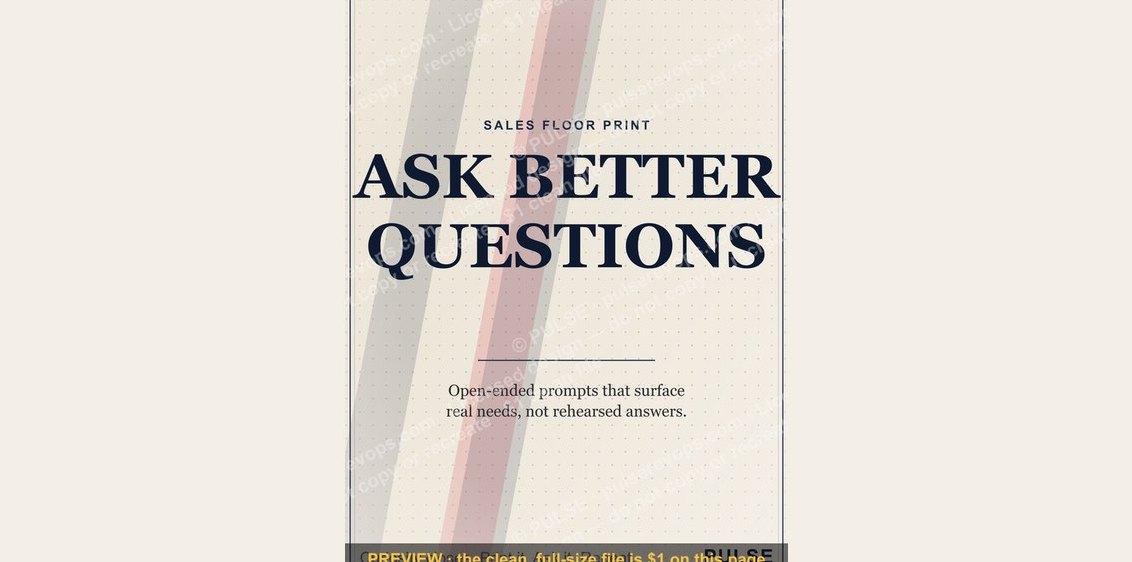 graphic“ASK BETTER QUESTIONS” — Sales Floor Print
 graphic“OWN THE NUMBER” — Sales Floor Print
 graphic“COMMIT MEANS COMMIT” — Sales Floor Print
 graphic“MORE PIPELINE LESS PANIC” — Sales Floor Print
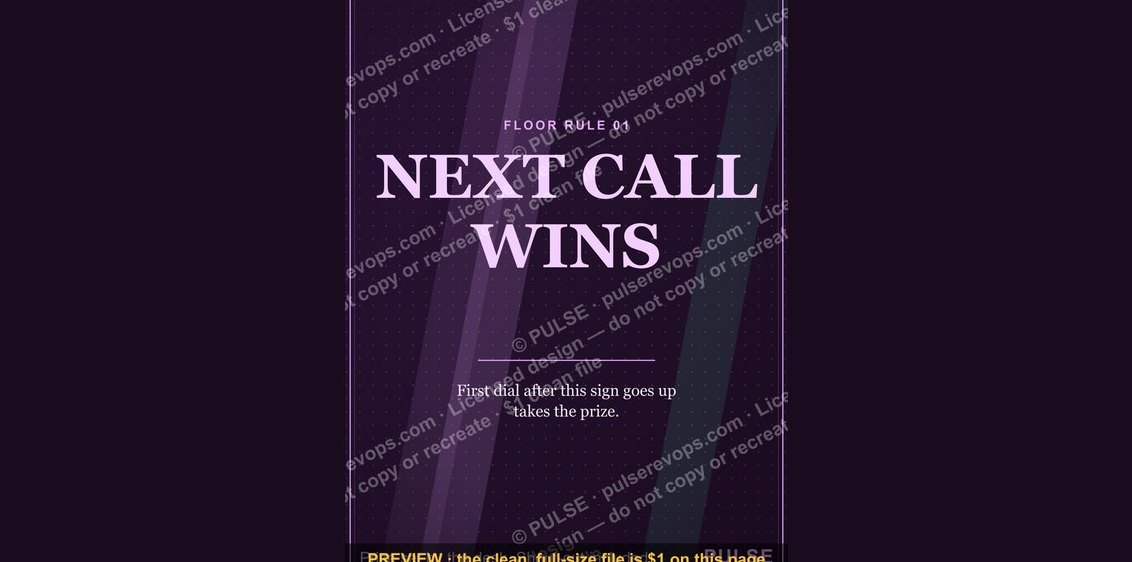 graphic“NEXT CALL WINS” — Sales Floor Print
 graphic“STAY IN THE DEAL” — Sales Floor Print
 graphic“SHOW UP FOLLOW UP CLOSE” — Sales Floor Print
 graphic“DO THE REPS” — Sales Floor Print
 graphic“EARN EVERY YES” — Sales Floor Print
 graphic“SELL THE VALUE” — Sales Floor Print