
Regional Sales Director — LinkedIn Banner
 Curated byKory White · Fractional CRO · Maryland
 PULSEKNOWLEDGE LIBRARY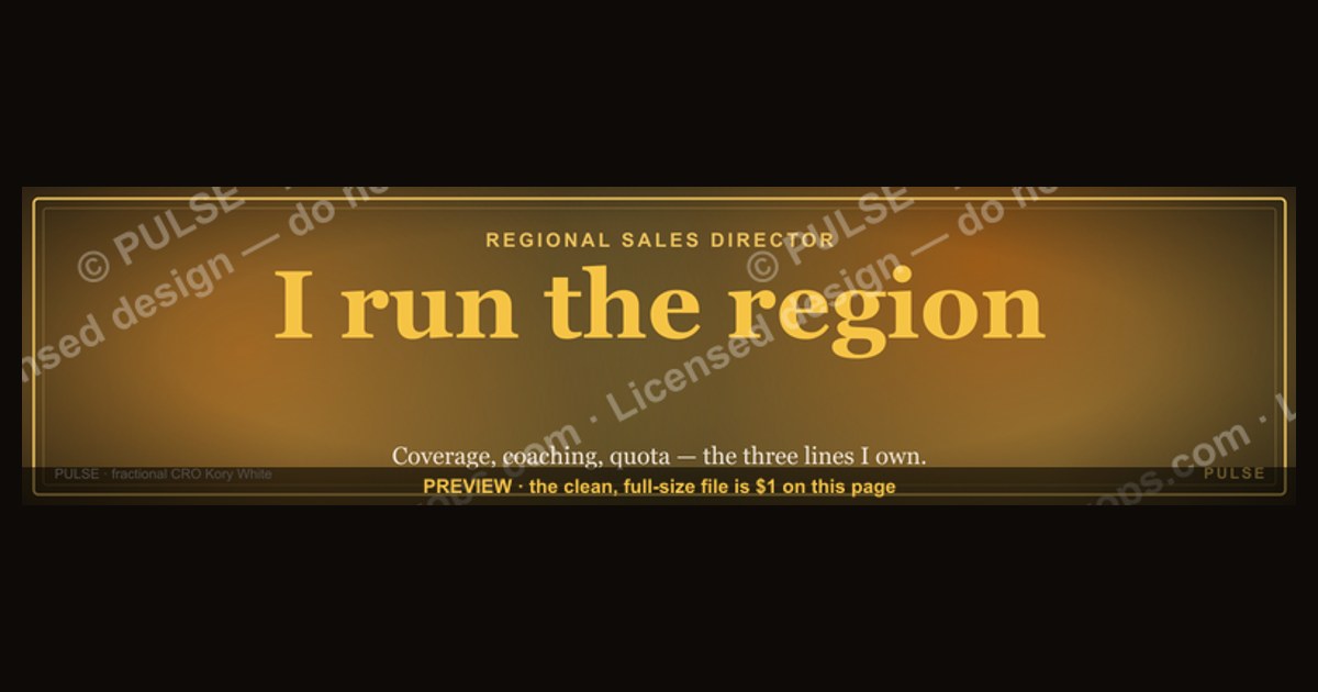
A Regional Sales Director LinkedIn banner should clearly display your title, company, and a concise value proposition or key achievement metric. Use a professional headshot with a clean, branded background that aligns with your company’s color palette. Avoid cluttered graphics; instead, include a subtle call-to-action like "Open to connections" or a link to a relevant article. Keep text minimal—your name, role, and one standout result (e.g., "Led 40% regional growth") are sufficient.
Regional Sales Director — LinkedIn Banner

A dark, on-brand LinkedIn banner — "I run the region." over a "Coverage Coaching Quota" line with a pulse motif. Put it on your profile to signal exactly what you do.
Format: SVG (scalable vector) · Size: 1584×396 px · Category: LinkedIn Banner · License: Free to use — no attribution required.
Recolor it to your brand
Use the color picker above to recolor this banner to your team or company colors, switch the background (including transparent), then download it as an SVG or PNG. No sign-up, no watermark.

How to use it
It scales cleanly to the LinkedIn cover slot (1584×396) — download the PNG and drop it straight onto your profile, or open the SVG in Canva, PowerPoint, or Figma to add your name and tweak the layout.

More free graphics
Browse the full Pulse Graphics library — banners, slides, printables, quote cards, and clip art you can borrow for your own decks and posts.


Related on PULSE
- Cybersecurity Sales Director — LinkedIn Banner
- Sales Director — LinkedIn Banner
- Commercial Director — LinkedIn Banner
- SaaS Sales Cycle Stages
- Sales KPI Dashboard — Top 9
- PLG Sales Overlay Org Chart
Visual Hierarchy & Readability Principles for Sales Leader Banners
The effectiveness of a Regional Sales Director LinkedIn banner hinges on how quickly a viewer can absorb your core message. In the first 2-3 seconds of scanning your profile, recruiters, prospects, and peers should immediately understand your scope and authority. This requires deliberate attention to visual hierarchy — the arrangement of elements in order of importance.
Prioritize your headline text above all else. The primary line should be your most compelling statement, typically your title or value proposition. For a Regional Sales Director, phrases like “I run the region” or “Driving revenue across 12 states” work well because they combine authority with specificity. Use a bold, sans-serif font (e.g., Montserrat, Inter, or Lato) at 48–72pt for the main headline. Secondary lines, such as “Coverage · Coaching · Quota,” should be 30–40pt with lighter weight or reduced opacity to create contrast without competing.
Leverage the banner’s natural F-shaped reading pattern. Most viewers scan from left to right, top to bottom. Place your most critical information in the upper-left quadrant. If you include a logo or company name, position it in the upper-right to balance the visual weight. Avoid centering all text — this forces the eye to work harder and can make the banner feel static. Instead, use asymmetric layouts with the headline offset to the left and supporting elements (like a subtle map outline or growth chart) on the right.
Color contrast is non-negotiable for readability. Dark backgrounds (navy, charcoal, deep teal) with white or light gray text offer the highest legibility, especially on mobile devices where LinkedIn banners are often viewed at small sizes. Maintain a minimum contrast ratio of 4.5:1 between text and background. Tools like WebAIM’s contrast checker can validate your choices. Avoid using pure black (#000000) — it creates harsh edges. Instead, use off-black tones like #1A1A2E or #16213E for a more polished, professional look.
Consider the banner’s responsive cropping. LinkedIn banners display differently on desktop (1584×396 pixels) versus mobile (640×360 pixels). Your key text must remain visible within the “safe zone” — roughly the center 60% of the banner horizontally and the middle 50% vertically. Test your design by previewing it on both devices before publishing. A common mistake is placing critical text too close to the edges, where it gets cropped on mobile. Keep all essential copy at least 80–100 pixels from the left and right borders.
Use visual cues to guide the eye. A subtle pulse motif, as seen in the original banner, works well because it mimics a heartbeat or rhythm — appropriate for a sales leader who thrives on momentum. Arrows, lines, or gradient fades can direct attention from the headline to secondary text or a call-to-action. However, avoid cluttering the design with too many graphical elements. Each visual component should serve a purpose: reinforcing your message, not distracting from it.
Typography pairing matters more than most realize. Stick to two fonts maximum — one for headlines (bold, modern) and one for body text or subheadings (clean, neutral). Avoid script or decorative fonts, which reduce professionalism and legibility. A reliable pairing is Montserrat Bold for headlines with Open Sans Regular for supporting text. If you want a more executive feel, try Playfair Display for the main headline (if your brand allows serif fonts) paired with Lato for subtext.
Test your banner with real viewers before going live. Share a mockup with 3–5 colleagues or mentors and ask them to describe what they see in 5 seconds. If they can’t immediately identify your role or region, simplify the design. Remember: a LinkedIn banner is not a resume — it’s a billboard. Every element should earn its place by contributing to instant comprehension.
Strategic Use of Regional Sales Director Banner for Pipeline Generation
Beyond signaling authority, your LinkedIn banner can function as a passive lead generation tool. When prospects or partners visit your profile, the banner is often the first visual element they register — before your headline, about section, or experience. Designing it with pipeline generation in mind transforms it from a static credential into an active business development asset.
Incorporate a subtle call-to-action (CTA) without being salesy. Instead of “Contact me for a demo,” which feels transactional, try softer CTAs like “Let’s talk territory expansion” or “Exploring channel partnerships in the Midwest.” Place this CTA in the lower-right corner of the banner, using a slightly different color (e.g., a muted accent like #E8A838 or #4A90D9) to make it stand out without overwhelming the design. Keep the CTA text to 3–5 words maximum — anything longer gets ignored.
Use geographic cues to attract local opportunities. If you cover a specific region (e.g., “Southeast U.S.” or “Western Canada”), display it prominently in the banner. This helps recruiters and partners instantly qualify whether you’re relevant to their needs. You can incorporate a subtle map outline, state abbreviations, or a compass icon to reinforce the geographic focus. For example, a banner for a Regional Sales Director covering Texas, Oklahoma, Louisiana, and Arkansas might include a simple outline of those states with a pin drop icon.
Align your banner with your current sales initiatives. If you’re hiring for your team, add a line like “Building a team in the Northeast — DM me.” If you’re launching a new product vertical, mention it briefly: “Now selling into healthcare enterprise.” This keeps your banner dynamic and relevant, encouraging viewers to engage with you about timely topics. Update the banner quarterly or whenever your priorities shift — a stale banner suggests a stale leader.
Leverage social proof through subtle branding. If your company has won awards (e.g., “Top 10 SaaS Companies 2024” or “Inc. 5000 Fastest Growing”), include a small badge or logo in the banner. This builds credibility without requiring text. Similarly, if you’re part of a prestigious sales organization (e.g., “President’s Club Winner 2023”), add a small icon or ribbon. These visual cues trigger trust and curiosity, prompting viewers to click on your profile to learn more.
Create a visual bridge to your content strategy. If you regularly post about sales leadership, territory management, or coaching, include a line like “Thoughts on building high-performance sales teams” or “Sharing weekly sales insights.” This primes visitors to scroll down to your posts and engage with your content. It also positions you as a thought leader, not just a quota-carrying manager.
Track banner performance using LinkedIn analytics. While LinkedIn doesn’t provide banner-specific metrics, you can measure engagement indirectly. Monitor profile views, connection requests, and message volume before and after updating your banner. If you see a 15–25% increase in profile views within the first two weeks, your banner is likely working. If not, test variations — different CTAs, color schemes, or focal points — until you find what resonates.
Avoid overpromising in your banner. Phrases like “Guaranteed revenue growth” or “100% quota attainment” can come across as boastful or unrealistic. Instead, use language that implies competence without absolutes: “Proven track record in territory turnarounds” or “Consistent top 10% performer.” This maintains credibility while still projecting confidence.
Consider A/B testing with two different banners. If you have multiple target audiences (e.g., recruiters vs. prospects), create two versions and rotate them monthly. For recruiters, emphasize leadership and team-building. For prospects, emphasize results and industry expertise. Use LinkedIn’s “Featured” section to showcase both if you want to keep them visible simultaneously.
Common Design Mistakes Regional Sales Directors Make (and How to Fix Them)
Even experienced sales leaders often fall into predictable traps when designing their LinkedIn banners. These mistakes can undermine the professional image you’re trying to build, making you look less polished or less strategic than you actually are. Recognizing and avoiding these pitfalls will ensure your banner works for you, not against you.
Mistake #1: Overcrowding the banner with too much information. Some directors try to list every achievement, certification, and region they’ve ever covered. This creates visual noise and reduces impact. Fix: Limit your banner to three elements maximum — your primary headline, one secondary line, and one visual element (logo, icon, or graphic). If you have more to say, save it for your About section or featured posts.
Mistake #2: Using low-resolution or stretched images. A pixelated or blurry banner screams unprofessionalism. LinkedIn’s recommended banner size is 1584×396 pixels at 72 DPI. If you’re using a photo or graphic, ensure it’s high-resolution and properly scaled. Fix: Use vector graphics (SVG or AI files) whenever possible, as they scale cleanly. If using raster images, start with a file at least 2000×500 pixels and export as PNG for best quality.
Mistake #3: Ignoring the mobile crop. Many directors design their banner on a desktop screen, only to discover later that critical text is cut off on mobile. Fix: Always preview your banner on both desktop and mobile before publishing. Use LinkedIn’s built-in preview tool (available when editing your profile photo and banner) to see how it renders. Keep all essential text within the center 60% of the banner horizontally.
Mistake #4: Choosing trendy fonts that age quickly. Fonts like Comic Sans, Papyrus, or overly decorative scripts undermine credibility. Even some modern display fonts can feel dated within a year. Fix: Stick to timeless, professional fonts. Sans-serif fonts like Helvetica, Arial, or Roboto are safe choices. If you want something more distinctive, try IBM Plex Sans or Source Sans Pro — both are clean, modern, and widely respected in corporate design.
Mistake #5: Using clichéd stock imagery. Photos of handshakes, generic office buildings, or people pointing at charts are overused and forgettable. They don’t differentiate you from thousands of other sales leaders. Fix: Use original graphics, abstract patterns, or custom illustrations that reflect your personal brand. A subtle pulse motif, a city skyline silhouette, or a heat map of your territory can be far more memorable.
**Mist
Sources
- LinkedIn Sales Solutions — professional sales strategies and regional leadership insights
- Harvard Business Review — sales management, leadership, and regional business dynamics
- Salesforce — CRM best practices and sales performance metrics
- U.S. Bureau of Labor Statistics — employment data and job outlook for sales managers
- Forbes — industry trends and executive perspectives on regional sales leadership
- American Marketing Association — sales leadership frameworks and regional market analysis
FAQ
What does a Regional Sales Director actually do day-to-day? A Regional Sales Director oversees a team of sales reps within a specific geographic area, setting quotas, coaching performance, and forecasting revenue. They spend most of their time in pipeline reviews, one-on-ones with direct reports, and strategic planning with senior leadership.
What industries typically hire Regional Sales Directors? This role is common in tech/SaaS, manufacturing, logistics, and financial services — anywhere with a territory-based sales model. Mid-market and enterprise companies usually have the scale to justify regional leadership.
What is the typical salary range for a Regional Sales Director? Base salary often falls between $120,000 and $180,000, with total compensation (including commission and bonuses) ranging from $180,000 to $300,000 or more. Actual figures depend on company size, industry, and location.
How many years of experience do you need to become a Regional Sales Director? Most candidates have 8 to 12 years of sales experience, with at least 3 to 5 years in a management or team lead role. Proven track records of exceeding quotas and developing talent are critical.
What are the biggest challenges in this role? Managing remote or hybrid teams across time zones, hitting aggressive quarterly targets, and balancing short-term execution with long-term strategy. Attrition in the sales team is another common pain point.
How do you measure success as a Regional Sales Director? Key metrics include revenue attainment against quota, team retention rate, pipeline coverage ratio, and average deal size growth. Quarterly reviews with VP-level leadership typically focus on these numbers.
This page will be disappearing soon. Save it to your device for $1 — or read it free while it is here.
@Kory-White- · if Venmo asks, the last 4 of my number are 2012
This page is gone.
This one is off the shelf now. $1 keeps it on your phone for good — the whole page, pictures and diagrams included.
 graphicSales Coach — LinkedIn Banner
 graphicTrust compounds. — LinkedIn Wallpaper
 graphicComputer Vision Engineer — LinkedIn Banner
 graphicPipeline cures all. — LinkedIn Wallpaper
 graphicRevOps Manager — LinkedIn Banner
 graphicAI Observability Operator — LinkedIn Banner
 graphicReady reps win. — LinkedIn Wallpaper
 graphicRenewals Manager — LinkedIn Banner
 graphicSIEM and Data Lake CRO — LinkedIn Banner
 graphicCalm closers win. — LinkedIn Wallpaper