
Lead from the front. — LinkedIn Wallpaper
 Curated byKory White · Fractional CRO · Maryland
 PULSEKNOWLEDGE LIBRARY
Quality
Certified
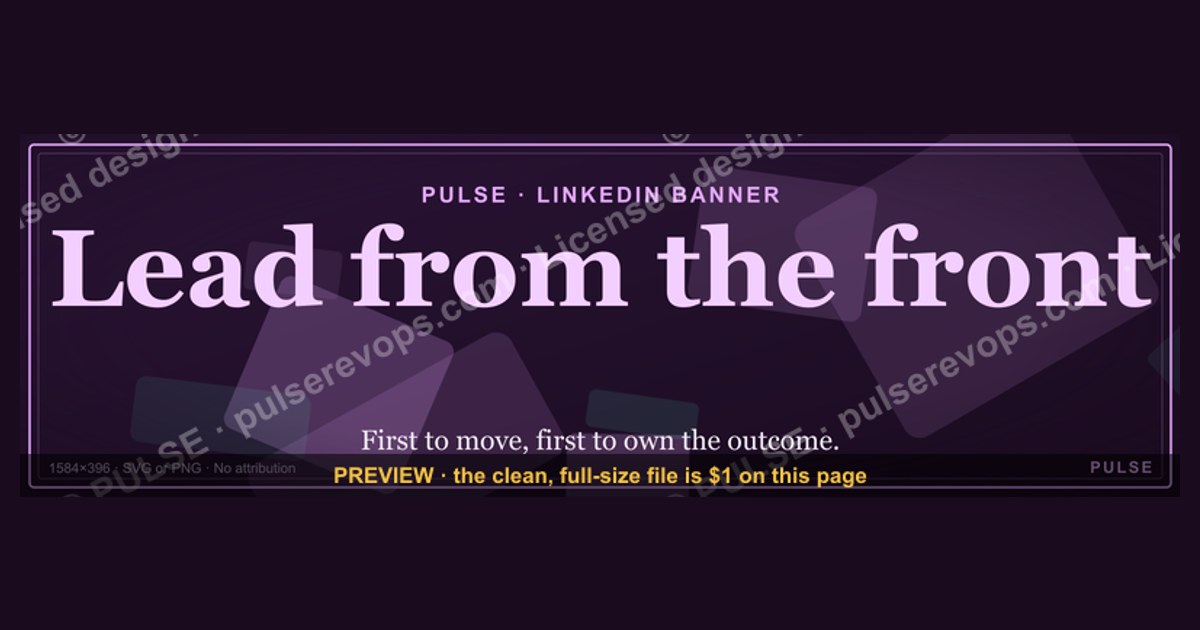
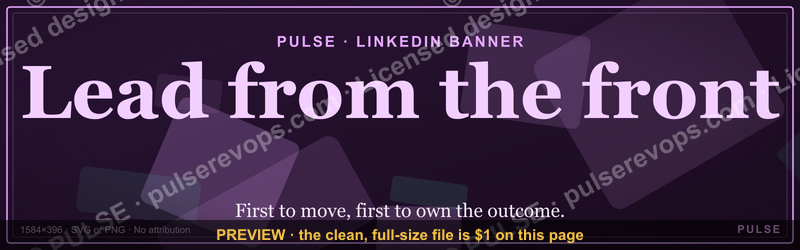
This is a LinkedIn banner — 1600×500 px, downloadable as a PNG — that reads "Lead from the front." in gold serif type centered on a matte black background. It's built to replace the default LinkedIn cover photo behind your profile picture, signaling a hands-on leadership stance to anyone who visits your profile, a recruiter, prospect, or new hire included.
What it is and why it matters
The banner is a single-message graphic: black field, one line of gold serif text — "Lead from the front." — set slightly left-of-center so it clears the circular profile photo LinkedIn overlays in the bottom-left corner of the cover area. There's no logo, no secondary tagline, no contact information. That's deliberate. A LinkedIn wallpaper is glanced at for under two seconds by most visitors, so a single clear statement outperforms a crowded one.
The phrase itself comes out of military and athletic leadership language — the leader physically at the point of greatest risk, not directing from behind. On a sales or RevOps leader's profile, it reads as a claim: this person carries quota alongside their team, sits in on live calls, and doesn't manage purely from a dashboard. For a VP of Sales, a Head of RevOps, or a frontline sales manager, that's a meaningfully different signal than a generic "Results-driven leader" headline, and it's the kind of first impression that shapes how a prospect, an interviewing candidate, or a peer reads the rest of the profile.

Why it matters practically: LinkedIn's cover photo is one of the highest-visibility, lowest-effort branding surfaces on the platform. It's visible to every visitor regardless of whether they read a single post, and it persists indefinitely until manually swapped. A banner like this converts an otherwise-wasted 1600×500 px of screen real estate into a consistent, on-message piece of personal branding — something a résumé bullet or an About section can't replicate, because it's the first thing seen, not the third or fourth.
The step-by-step process (mermaid)
Installing this banner takes under five minutes and doesn't require design software, though a quick customization pass is worth doing first.

Start by downloading the PNG at full resolution — never a screenshot or a resized copy, since LinkedIn re-compresses uploads and a soft source file will come out visibly blurrier after their processing pass. Before uploading, hold it up against your actual profile photo (even just in an image viewer, side by side) because LinkedIn's circular photo crop sits in a fixed position relative to the banner, and text placed too far left can end up partially hidden behind the photo edge or looking cramped against it.
Once you're in LinkedIn's profile editor, the cover photo upload tool gives you a movable crop window rather than forcing an exact pixel match — LinkedIn's own display frame is roughly 1584×396 px, slightly shorter and narrower than the 1600×500 source, so expect to nudge the image up or down after upload to keep the text line centered rather than clipped at the top or bottom. Save, then check the result on both desktop and the mobile app, since LinkedIn's mobile view crops the cover photo more aggressively (closer to a 1.91:1 ratio) and text that reads perfectly on desktop can lose its edges on a phone screen. If it clips, go back and re-crop with extra breathing room built in, or request a version of the banner with a smaller text scale.
Costs, timelines, and typical ranges
There's no cost to download and use this specific banner — it's a static asset, not a subscription tool or template license. The costs that actually show up are time and, occasionally, a small design spend if you want a customized variant.
Time cost: swapping a LinkedIn cover photo takes two to five minutes for someone doing it for the first time, and under a minute for a repeat update. Where time actually gets spent is in customization — if you want the wording changed (a different phrase, a name or team tag added, a different color treatment to match a company brand palette), that's a 15-30 minute round trip if you're comfortable in a basic image editor like Canva or Photoshop, or a same-day turnaround if you hand it to a freelance designer, who will typically charge somewhere in the $15-$75 range for a single static banner edit depending on their rate and how much rework is involved.

Dimension ranges matter here because "banner" isn't a single universal size across platforms, and reusing this asset elsewhere requires resizing:
- LinkedIn personal profile cover: LinkedIn's own spec is 1584×396 px, though it will accept and auto-crop larger uploads like this 1600×500 source.
- LinkedIn company page cover: a much shorter 1128×191 px, meaning a straight reuse of this banner would need a significant recrop, not just a resize.
- X (formerly Twitter) header: 1500×500 px, close enough to this banner's ratio that it drops in with minimal adjustment.
- Facebook cover photo: 851×315 px on desktop, though Facebook displays it differently on mobile, so text positioned dead-center can shift.
If you're standardizing this banner across a sales team's LinkedIn profiles, budget for a short one-time setup pass (most teams knock out 10-20 profiles in under an hour once someone owns the process) rather than treating it as an ongoing cost — it's a set-and-forget asset that typically only gets revisited on a role change, rebrand, or when the messaging goes stale after 6-12 months on a profile.
Where teams get it wrong
The most common failure is uploading the banner without checking how it renders against the specific profile photo crop, which produces a text line that partially disappears behind the circular photo overlay on mobile — a mismatch that's invisible on a desktop preview but obvious the moment someone opens the profile on a phone, which is where the majority of LinkedIn traffic actually lives.

A second recurring mistake is treating the slogan as the whole branding job. "Lead from the front." works as a first impression, but a profile that pairs it with a stale headline, an empty About section, or no recent activity undercuts the claim within seconds of a visitor scrolling past the banner. The graphic sets an expectation; the rest of the profile has to follow through on it, or the banner reads as empty decoration rather than a genuine signal.
Teams rolling this out across multiple reps also tend to skip a brand-consistency pass — one person's banner ends up on a pure black background, another recolors it to match a personal aesthetic, and a third stretches the file to fit a non-standard crop, distorting the serif type. The fix is trivial but frequently skipped: designate one person to push the same source file and cropping instructions to everyone, rather than letting each rep self-serve a slightly different version.
Finally, a subtler mistake is choosing this specific phrase for a role where it doesn't fit the actual working relationship. "Lead from the front" implies visible, in-the-trenches involvement — a manager who still takes calls, still works a pipeline, still shows up to the hard conversations. If the actual leadership style is closer to strategic and hands-off (which is a legitimate and often correct style at VP or C-level scope), the banner creates a credibility gap the moment someone who's worked with that leader compares the claim to their lived experience. Matching the slogan to the actual leadership posture matters more than picking a banner that simply looks sharp.
Decision framework: when to choose what (mermaid)
Not every leadership role should run this exact banner, even though the visual design is broadly reusable. The wording is the part that needs to match the person and the audience reading the profile.
If day-to-day work still includes running calls, sitting in on deals, or working the floor alongside the team, the literal claim holds up and this banner is a direct fit — use it as-is. If the role has shifted toward strategy, budget ownership, or cross-functional leadership without regular frontline contact, a more accurate banner swaps the phrase for something outcomes-based ("Built three revenue teams from zero" or similar, factually specific to the person) rather than a claim that a close colleague could contradict.
Audience matters too. A profile that's mostly viewed by external prospects and recruiters benefits from a phrase that signals track record or approach — something a stranger can evaluate at a glance. A profile that's mostly seen internally, by direct reports and peers who already know the leader's day-to-day style, can carry a more values-driven or mission-oriented line, since the internal audience is testing consistency with lived experience rather than forming a first impression. Whichever direction you land on, the banner is only ever the opening move — pair it with a headline and About section that back up the specific claim it makes.
Related questions
What size should a LinkedIn cover photo be?
LinkedIn's stated spec for a personal profile cover photo is 1584×396 px. Uploads outside that ratio are auto-cropped, so a 1600×500 px source (like this banner) works but should be previewed after upload to confirm nothing important sits too close to the edges.
Can I use this banner on other social platforms?
Yes, with adjustment. It's close in ratio to an X (Twitter) header (1500×500 px) but will need a significant recrop for LinkedIn's company page cover (1128×191 px) or a Facebook cover photo (851×315 px).
How often should a LinkedIn banner be updated?
Most professionals refresh a cover photo every 6-12 months, or sooner after a role change, rebrand, or when the current messaging no longer reflects their actual work or title.
Does a LinkedIn banner actually affect profile views or engagement?
LinkedIn doesn't publish banner-specific engagement data, but a clear, on-brand cover photo is a low-effort signal that reduces first-impression drop-off — visitors are more likely to keep reading a profile that looks intentional than one using the default gray background.
What file format and resolution should I download for the sharpest result?
Always take the highest-resolution PNG offered rather than a JPEG or a pre-cropped copy — LinkedIn compresses on upload, so starting from a soft or low-resolution source compounds into a visibly blurry final banner.
FAQ
What does "lead from the front" mean in a leadership context? It describes a leader who takes on the same risk and workload as their team rather than directing purely from a distance — showing up to hard calls, hard conversations, and hard quarters alongside the people they manage, not just reviewing results after the fact.
Is this banner free to download and use? Yes. It's a static PNG graphic with no license fee or subscription attached — download it, upload it as your LinkedIn cover photo, and it's yours to use indefinitely.
Can I change the wording or colors on this banner? Yes, though it requires opening the file in a basic image editor such as Canva or Photoshop. Most one-off text or color changes take 15-30 minutes for someone comfortable with those tools, or can be handed to a freelance designer for a same-day turnaround.
Will this banner look right on mobile as well as desktop? Check it on both. LinkedIn's mobile app crops the cover photo more tightly than the desktop view, so text positioned close to the top or bottom edge on desktop can get clipped on a phone screen — always preview the live profile on mobile after uploading.
Is "Lead from the front" the right message for every leadership role? No. It fits roles that are still visibly hands-on — running calls, working deals, present in day-to-day execution. A leader operating at a more strategic or hands-off level is often better served by an outcomes-based or mission-based line instead, since the frontline claim can read as inconsistent with lived experience.
How is this different from just writing "Lead from the front" in my headline text? A headline is read as a claim you're making about yourself in words; a banner is read as a visual first impression before any text is parsed. The two work together, not as substitutes — the graphic sets tone instantly, while the headline and About section carry the specific, checkable detail.
Sources
- https://www.linkedin.com/help/linkedin/answer/a566331 — LinkedIn's official cover photo size and formatting guidance
- https://www.linkedin.com/business/marketing/blog — LinkedIn Marketing Solutions blog on profile branding best practices
- https://www.canva.com/create/linkedin-banners/ — Canva's LinkedIn banner sizing and design templates
- https://blog.hubspot.com/marketing/linkedin-cover-photo — HubSpot guidance on optimizing a LinkedIn cover photo for personal branding
- https://www.adobe.com/express/create/cover/linkedin — Adobe Express LinkedIn cover photo specifications and templates
- https://sproutsocial.com/insights/social-media-image-sizes-guide/ — Sprout Social's cross-platform social image size reference
- https://buffer.com/library/linkedin-image-sizes/ — Buffer's guide to LinkedIn image dimensions across profile and company pages
Related on PULSE
- How to write a LinkedIn headline that converts profile views into replies
- The RevOps leader's guide to personal branding on LinkedIn
- Sales manager vs. frontline leader: how the day-to-day actually differs
- Building a consistent team brand across reps' LinkedIn profiles
- What recruiters actually read first on a sales leadership profile
This page will be disappearing soon. Save it to your device for $1 — or read it free while it is here.
@Kory-White- · if Venmo asks, the last 4 of my number are 2012
 graphicComputer Vision Engineer — LinkedIn Banner
 graphic“Stay in the deal.” — LinkedIn Banner
 graphic“Data beats opinions.” — LinkedIn Banner
 graphic“The next call is the most important one.” — LinkedIn Banner
 graphic“Never give without a get.” — LinkedIn Banner
 graphicStay in the deal. — LinkedIn Wallpaper
 graphic“Motion creates momentum.” — LinkedIn Banner
 graphicHead of Sales — LinkedIn Banner
 graphicYour pipeline is your paycheck. — LinkedIn Wallpaper
 graphic“Selling to people leaders.” — LinkedIn Banner