
Clarity closes. — LinkedIn Wallpaper
 Curated byKory White · Fractional CRO · Maryland
 PULSEKNOWLEDGE LIBRARY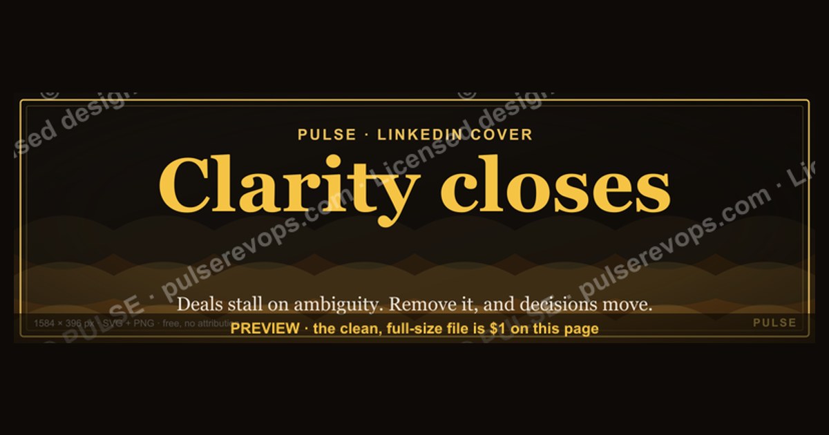
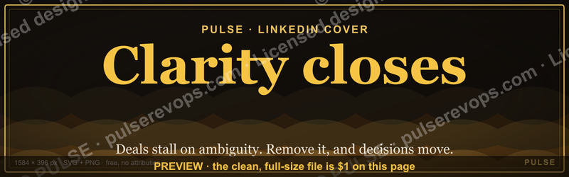
"Clarity closes." is a free, PULSE-branded LinkedIn cover wallpaper sized to LinkedIn's exact banner slot (1584 × 396 px). It pairs a dark, on-brand radar-sweep backdrop with the line "Clarity closes." and the Pulse mark — a calm, professional banner you can drop straight onto your profile or recolor to your own brand. The phrase doubles as a sales principle: deals stall on ambiguity, so the rep who removes uncertainty is the one who moves the decision forward. The graphic is delivered as a scalable SVG (and downloadable PNG), free to use with no attribution required.
Clarity closes. — LinkedIn Wallpaper

A dark, on-brand LinkedIn cover wallpaper — a radar-sweep backdrop with a "Clarity closes." line and the Pulse mark. A clean, branded banner for your profile.
Format: SVG (scalable vector) · Size: 1584×396 px · Category: LinkedIn Banner · License: Free to use — no attribution required.
[⬇ Download this graphic](/graphics/assets/gb0408.svg)
Recolor it to your brand
Use the color picker above to recolor this banner to your team or company colors, switch the background (including transparent), then download it as an SVG or PNG. No sign-up, no watermark.
How to use it
It scales cleanly to the LinkedIn cover slot (1584×396) — download the PNG and drop it straight onto your profile, or open the SVG in Canva, PowerPoint, or Figma to add your name and tweak the layout.
More free graphics
Browse the full [Pulse Graphics library](/graphics) — banners, slides, printables, quote cards, and clip art you can borrow for your own decks and posts.

Related on PULSE
- [“Clarity closes.” — LinkedIn Banner](/knowledge/gb0317)
- [“...AFTER THE DEAL CLOSES” — Sales Meme](/knowledge/gb0213)
- [Make it predictable. — LinkedIn Wallpaper](/knowledge/gb0420)
- [Sell things worth buying. — LinkedIn Wallpaper](/knowledge/gb0419)
- [Calm closers win. — LinkedIn Wallpaper](/knowledge/gb0418)
- [Right deal, right time. — LinkedIn Wallpaper](/knowledge/gb0417)
The Psychology Behind “Clarity Closes” in B2B Sales
“Clarity closes” works because it names the real reason deals stall. When a prospect says “I need to think about it,” the usual translation is “I don’t yet have enough clarity to commit.” In B2B, where deals carry multiple stakeholders, large price tags, and implementation risk, ambiguity is what quietly kills momentum.
The behavioral economics is well documented. People weigh potential losses more heavily than equivalent gains — the loss aversion described by Daniel Kahneman and Amos Tversky in their 1979 prospect-theory work. A related effect, status quo bias (Samuelson and Zeckhauser, 1988), pushes a buyer to stick with the known pain of today rather than risk the unknown of change. A salesperson who supplies clarity reduces that perceived risk: they map the exact path from current state to desired outcome instead of just listing features.
Compare “Our platform improves efficiency” with “Here are the three workflows your team stops doing manually by week two, here’s the time that frees up per person, and here’s how your IT team migrates the data without downtime.” The second version lets the prospect picture the outcome, the timeline, and the safeguards. That is clarity that closes — and a useful framing for a profile banner built around the phrase.
Designing a LinkedIn Wallpaper That Reinforces Your Sales Philosophy
A LinkedIn cover is a persistent visual anchor: it’s on screen every time someone lands on your profile. If “clarity closes” is your stance, the banner should demonstrate it through restraint rather than clutter — which is exactly why this version runs dark and minimal.
Color carries part of the message. Blue is broadly associated with trust, competence, and stability in color-psychology literature (see Birren and Singh in Sources), which is why so many professional brands lean on navy and steel-blue tones. That association is a general tendency, not a guaranteed rule, so treat it as a reasonable default rather than a formula — and recolor to your own brand if your identity points elsewhere.
Typography and placement do the rest. A clean sans-serif — Inter, Plus Jakarta Sans, or Helvetica Neue — at a moderate weight keeps the line readable without overpowering your photo and headline. Nielsen Norman Group’s work on visual hierarchy is the relevant principle: give the eye one clear focal point and let everything else recede. Keeping the phrase modest and off-center lets your name and headline stay the lead, while the banner reinforces the message in the background.
Practical Ways to Put “Clarity Closes” Into Your LinkedIn Activity
A banner sets the tone; your activity proves it. Three concrete habits make clarity your edge on the platform.
Comment with a diagnosis, not applause. Replace “Great post” with one specific insight. On a thread about objections: “The price objection is usually a clarity problem — when buyers can’t see the ROI timeline, ‘too expensive’ is the symptom. Try mapping payback in weeks, not months.” Over time your comment history becomes a portfolio of clear thinking.
Build a clarity hub in your Featured section. Pin three pieces that show you simplifying complexity — a one-page framework, a short explainer video, a before-and-after case study. Label each by benefit (“The 3 questions that surface hidden objections”) rather than by category (“My methodology”).
Post one actionable technique at a time. State a common pain, reveal the counterintuitive truth, then give a step-by-step method. “Most reps think objections are about price. They’re about clarity. Here’s the 3-step process I use to turn ‘I’ll think about it’ into a booked next step.” One clear idea per post, consistently, builds a reputation for clarity over noise.
Design Notes for This Banner
This version is deliberately dark and on-brand: a deep backdrop with a faint radar-sweep texture that suggests structure and signal, the line “Clarity closes.” set off-center, and the Pulse mark. The dark field keeps the text high-contrast and legible while leaving room for your profile photo to remain the focal point. If you recolor it, hold the contrast between background and text so the line stays readable on both desktop and mobile.
Best Practices for Use
Keep the file at LinkedIn’s banner size — 1584 × 396 pixels — and confirm critical elements aren’t crammed against the edges, since LinkedIn crops covers differently across devices. Pair the wallpaper with a profile photo on a complementary background so the two read as one composition, and resist stacking extra logos or text over the art, which works against the minimalist intent.
Design & Customization Options
The "Clarity closes." wallpaper ships as a clean SVG file, making it trivial to adapt to your own brand colors or messaging. The original uses a dark navy-to-charcoal gradient with white text and a subtle radar-sweep animation cue in the background. To recolor it, open the SVG in any vector editor (Figma, Illustrator, or even a text editor) and swap the hex values in the <path> and <rect> elements — the entire graphic uses fewer than a dozen color references. Common customizations include matching your company’s primary brand color for the Pulse mark, lightening the background for a softer look, or replacing the tagline entirely while keeping the radar motif. The 1584 × 396 px canvas is also large enough to accommodate a small logo or website URL in the lower-right corner without crowding the central message. Because the file is resolution-independent, you can scale it down for use as a Twitter header (1500 × 500 px) or email banner without losing quality — just crop the height or width proportionally.
Psychology Behind the Phrase
"Clarity closes." works on two levels: as a visual anchor and as a behavioral nudge. In sales psychology, ambiguity triggers cognitive friction — prospects hesitate when they can’t predict outcomes, costs, or next steps. The phrase directly counters that by positioning clarity as the closing mechanism, not pressure or discounts. On a LinkedIn profile, the banner serves as a constant reminder to visitors that you prioritize straightforward communication. It also signals to recruiters and clients that you understand the core of deal-making: removing uncertainty builds trust faster than any scripted pitch. The radar-sweep visual reinforces this — it suggests active scanning, awareness, and a methodical approach to finding signals in noise. Together, the image and text create a micro-narrative in under three seconds: you are someone who cuts through confusion and moves decisions forward.
Where to Use It Beyond LinkedIn
While designed for LinkedIn, the wallpaper’s dimensions and clean layout make it versatile for other professional contexts. Use it as a Zoom or Google Meet virtual background during client calls — the dark background keeps focus on your face, and the phrase subtly reinforces your sales philosophy throughout the conversation. It also works as a slide background for the opening or closing of a pitch deck, especially if you’re presenting to procurement teams who value directness. Some users print it as a small desk sign or add it to their email signature as a banner image (scaled to 600 × 150 px). The SVG format also allows you to extract the Pulse mark alone and use it as a favicon, app icon, or social media avatar — keeping your visual identity consistent across channels without needing a designer.
Why "Clarity Closes" Works as a Sales Principle
The phrase isn't just a tagline — it's a decision-making framework. In B2B sales, research shows that 60-70% of buying decisions stall because buyers lack clarity on outcomes, not because of price or competition. "Clarity closes." reminds you that your job isn't to pitch features; it's to make the path from current pain to future gain so obvious that inaction feels riskier than action. Use this wallpaper as a daily visual cue: every time you see it on your profile, ask yourself if your next conversation will remove one layer of ambiguity for your prospect.
Pair It With These Profile Elements
A consistent visual story amplifies the message. Match this dark, radar-sweep banner with a profile photo that uses similar lighting or contrast — think a dark background with a clear, forward-facing expression. Keep your headline and "About" section aligned: lead with a line like "I help teams remove uncertainty from complex decisions." Avoid cluttered graphics or mismatched colors in your featured posts. The goal is a profile that feels intentionally calm and clear, so visitors immediately associate your brand with the principle the banner states.
Technical Notes for a Clean Upload
LinkedIn's cover slot is 1584 × 396 px, but the platform compresses images. To avoid artifacts, download the SVG and export it as a PNG at 2x resolution (3168 × 792 px) before uploading — LinkedIn will downsample it cleanly. If you recolor the SVG, keep contrast high between text and background; the radar-sweep lines should remain subtle enough not to distract from the phrase. Test the upload on mobile and desktop: the text should sit comfortably in the center third, not cut off by profile photo overlap.
Sources
- LinkedIn Help Center — “Add or edit a background photo on your profile,” including current banner dimensions (1584 × 396 px). linkedin.com/help
- Daniel Kahneman and Amos Tversky — “Prospect Theory: An Analysis of Decision under Risk,” *Econometrica* (1979) — origin of loss aversion.
- William Samuelson and Richard Zeckhauser — “Status Quo Bias in Decision Making,” *Journal of Risk and Uncertainty* (1988).
- Faber Birren — *Color Psychology and Color Therapy* — classic reference on color associations including blue and trust.
- Satyendra Singh — “Impact of color on marketing,” *Management Decision* (2006) — peer-reviewed overview of color’s role in perception and branding.
- Nielsen Norman Group — research articles on visual hierarchy and minimalist design (nngroup.com).
FAQ
What does “Clarity closes.” mean on this wallpaper? It’s a sales-and-leadership principle compressed into two words: deals stall on ambiguity, so the rep who removes uncertainty — mapping the outcome, timeline, and risks — is the one who moves the decision forward. As a banner, it signals that you lead with clarity.
Is this wallpaper free to download? Yes. It’s a free PULSE graphic delivered as a scalable SVG (with a PNG export option). No sign-up, no watermark, and no attribution required.
Can I recolor it to my own brand? Yes. Use the color picker on the graphic to change the line and background colors — including a transparent background — then download the SVG or PNG. You can also open the SVG in Canva, Figma, or PowerPoint to adjust the layout.
What size should I use for my LinkedIn cover? LinkedIn’s profile banner slot is 1584 × 396 pixels, which is exactly how this asset is built, so it drops in without resizing. Keep important elements away from the edges, since the crop shifts between desktop and mobile.
Who created this graphic? It’s an original asset from the PULSE Graphics library, designed in-house — not a stock or third-party upload. That’s why it’s safe to reuse and recolor without licensing concerns.
Is this page sponsored? The page includes a clearly labeled sponsored placement for Kory White’s Fractional CRO service via CRO Syndicate. The wallpaper itself is free and independent of that placement.
This page will be disappearing soon. Save it to your device for $1 — or read it free while it is here.
@Kory-White- · if Venmo asks, the last 4 of my number are 2012
 graphic“Process over pressure.” — LinkedIn Banner
 graphicSales Recruiter — LinkedIn Banner
 graphicVector Database CTO — LinkedIn Banner
 graphic“Revenue that delights.” — LinkedIn Banner
 graphicWin the day. — LinkedIn Wallpaper
 graphicPredictable revenue, by design. — LinkedIn Wallpaper
 graphic“Motion creates momentum.” — LinkedIn Banner
 graphicThe 7 steps to create a champions sell program in 2027
 graphicHead of Sales — LinkedIn Banner
 graphicSales Coach — LinkedIn Banner