
Win the day. — LinkedIn Wallpaper
 Curated byKory White · Fractional CRO · Maryland
 PULSEKNOWLEDGE LIBRARY
Quality
Certified
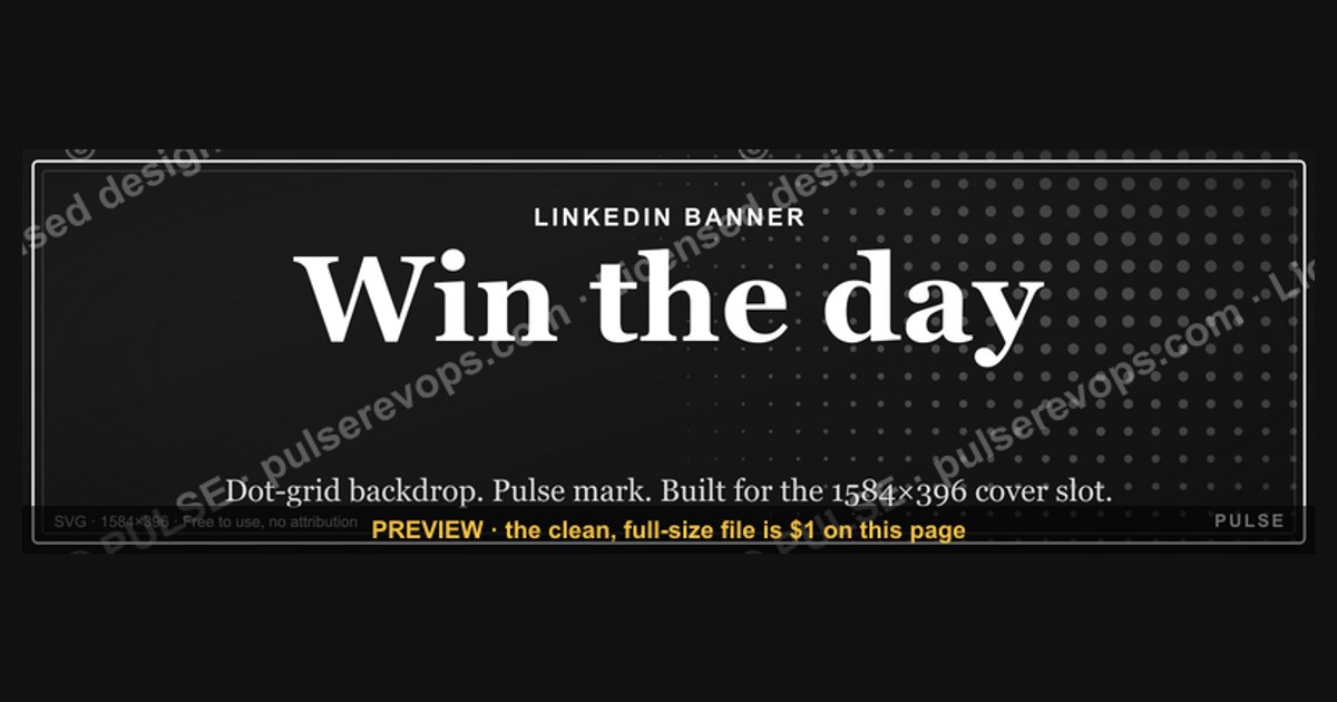
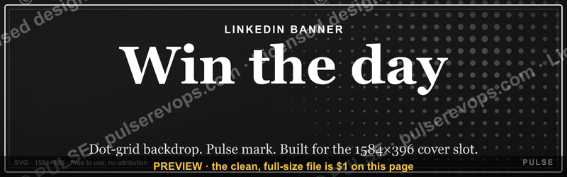
This banner is a free downloadable LinkedIn wallpaper — a 1600x500 px PNG that reads "Win the day." in clean, high-contrast lettering, built to sit behind your profile photo as a LinkedIn cover image. Download it, swap it into your profile header, and your page carries a short daily-standup message before anyone reads a single post.
The two options compared
Anyone hunting for a "Win the day." LinkedIn wallpaper is standing at a fork, and it is worth naming both roads before picking one.
The first road is the ready-made banner this page offers. It is a finished PNG at 1600x500 pixels with the phrase already set, the type already sized, the spacing already balanced, and the contrast already tested against LinkedIn's own header crop. You download it, upload it, and you are done inside five minutes. There is no design decision left to make, which is precisely the point: the banner exists so that the decision cost is zero.
The second road is building your own version from scratch. Same message, different execution — your typeface, your brand colors, your team name, your tagline, your logo tucked into a corner. This road costs you a design tool, somewhere between forty minutes and three hours depending on how fussy you get, and one round of "does this look right at 1600 pixels wide, or only at 400?" panic when you preview it on mobile.
Neither road is wrong. They solve different problems. The ready-made banner solves the problem of *starting*. The custom build solves the problem of *matching*. If your LinkedIn header is the only place your personal brand lives, the first road is almost always correct. If your header has to sit alongside a company palette, a recruiting funnel, or a content series with a locked visual identity, the second road earns its cost.

There is a third, quieter option that people forget: use the ready-made banner as a *placeholder* while you commission or build the custom one. You get the message up today, you get the polish later, and you never have a blank header in the gap. For anyone job-hunting or launching something, that gap matters — a bare header reads as an abandoned profile.
The real comparison, then, is not "free vs. custom." It is "speed vs. fit," and the answer flips depending on how long the banner needs to survive. A banner you will replace in two weeks should be the fast one. A banner that becomes your visual signature for a year should be the fitted one.
How to decide between them (mermaid)
The decision tree below is the one I would actually walk someone through. It starts with a single question — does this banner need to match an existing visual system? — and branches from there. Notice that the "build custom" branch is not the prestige branch. It is the branch you take when you have a constraint the ready-made banner cannot satisfy, not because custom is inherently better.

Two things about this tree are worth calling out. First, the loop at the bottom is real: LinkedIn crops your header differently on desktop and on mobile, so a banner that looks perfectly centered on your laptop can lose its first or last word on a phone. You will often need one adjustment pass. Second, the "no brand assets" branch is the most common one, and it does not mean you are stuck. It means you ship the ready-made banner today and treat the custom version as a later project, not a blocker.
Concrete numbers behind each option
Numbers make this decision concrete, so here they are, stated as ranges rather than false precision.
Canvas size. LinkedIn's recommended cover image is 1584x396 pixels, and the platform displays it at a 4:1 ratio. This banner is built at 1600x500, which is close enough to that ratio to survive the crop with a small margin to spare. That margin is not waste — it is insurance against the platform's own rendering quirks and against the way different browsers letterbox the header.
File size and format. A PNG at 1600x500 with flat color and simple type lands comfortably in the low hundreds of kilobytes. That matters because LinkedIn re-compresses what you upload, and a heavy file with gradients or photographic texture will show banding after that re-compression. Flat color and crisp type survive it. Photographic backgrounds do not.

Time cost. Ready-made: five minutes, including the download and upload. Custom: forty minutes if you already have a template file with your brand locked in, two to three hours if you are starting from a blank canvas and hunting for fonts. Multiply that by the number of people on your team who need one and the gap widens fast — twenty reps at two hours each is a forty-hour project that the ready-made route turns into under two hours total.
Placement dimensions. On desktop, the header sits at the top of your profile and is partially covered by your circular profile photo on the left. On mobile, the crop is tighter and the photo overlaps more. Practically, this means the safe zone for your phrase is the center-right region, roughly the middle 60% of the width. Anything in the outer 20% on either side is at risk of being clipped or obscured.
Contrast ratio. For text to stay legible after compression and at small display sizes, you want a strong contrast between the lettering and the background. High-contrast pairings — near-black on near-white, or the reverse — hold up. Mid-tone on mid-tone does not, and it gets worse on mobile screens in daylight.

Refresh cadence. A banner like this has a natural shelf life. Used as a daily-motivation header, it holds attention for roughly a quarter before people stop registering it. Used as a campaign marker — a launch, a job search, a conference — it is good for the length of the campaign, typically two to eight weeks. Plan the replacement before you upload, or it quietly becomes wallpaper in the literal sense: present, unseen.
Where it fits in a funnel. If you are using this as a recruiting or sales signal, treat it as a top-of-funnel texture, not a conversion asset. It sets tone. It does not carry a call to action well, because nobody reads a header looking for a link. Pair it with a headline and an About section that do the actual work.
Implementation details and sequencing (mermaid)
Uploading a banner sounds like a one-step task and is actually a four-step one if you want it to look right. The sequence below is the order that avoids rework. The critical insight is that you preview *before* you commit, because LinkedIn's editor shows you a crop that is not identical to what visitors see.
A few sequencing notes that save time. Do the mobile preview second, not first — it is the stricter crop, and if you start there you will over-correct for desktop. Keep the original PNG somewhere you can find it, because LinkedIn does not let you re-crop an already-uploaded image without re-uploading; you will want the source file when you reposition. And take the screenshots at the end. They are your reference for what "correct" looked like, which is useful when you swap the banner in three months and cannot remember which crop you settled on.

If you are rolling this out across a team, sequence it in two waves. Wave one is three or four people who will actually notice if the crop is off. Let them upload, screenshot, and report. Wave two is everyone else, with the corrected crop instructions attached. Doing it in one wave means forty people independently discovering the same mobile-crop problem and forty separate support threads.
For the custom-build route, the sequencing is different. Lock the phrase first, then the typeface, then the color, then the layout — in that order. People who start with color end up rebuilding the whole thing when they realize their brand blue makes the white text vibrate. Phrase and type are the load-bearing decisions; color and layout are adjustments on top.
What the banner carries, element by element
Look at the banner the way a designer would, because every element is a decision someone already made for you.

The phrase itself is three words: "Win the day." It is short enough to read in a glance and complete enough to mean something without context. That is a harder balance than it sounds. "Win" alone is a verb with no object and reads as aggressive. "Win the day" is an idiom — it implies a bounded, repeatable unit of effort, which is why it works as a daily message rather than a life motto. The period is doing real work too. It turns a slogan into a statement. Without it, the phrase floats; with it, the phrase lands.
The typography is set in a clean, high-contrast face with generous letter spacing. Wide spacing is the standard trick for making short phrases feel deliberate rather than sparse — three words with tight kerning look like a mistake, three words with air around them look like a decision. The letterforms are simple enough to survive LinkedIn's compression without turning to mush at small sizes, which is the real test. Ornate scripts and thin hairlines do not pass that test.
The background is flat and high-contrast against the lettering. Flat is not lazy here; it is functional. As noted above, LinkedIn re-compresses uploaded images, and flat color fields compress cleanly while gradients and textures produce banding. A banner with a subtle photographic background might look richer in your design tool and worse on the platform.
The composition leaves breathing room on the left, where your circular profile photo will sit. That is not accidental whitespace — it is reserved space. If you build your own version, replicate that reservation, or your phrase will collide with your own face.
There is no logo, no URL, no call to action, and no name. That restraint is the design. Every element you add to a three-word banner dilutes it. If you need a call to action, it belongs in your headline, where people actually look for it.
Where and how to use it
The primary placement is the LinkedIn profile cover image — the wide banner behind your profile photo. That is what the 1600x500 dimensions are built for, and it is where the phrase does its work: a visitor lands on your profile, sees the message before they read your headline, and forms an impression.
Secondary placements worth considering, with caveats. LinkedIn company pages use the same cover slot, so a team can run the banner on the company page as well as individual profiles — but be aware that a company page header competes with the company logo and tagline for attention, so the phrase needs to earn its space there. LinkedIn newsletters and articles let you set a header image, and a 1600x500 banner can work there, though the crop is less predictable. Event pages have their own header dimensions and will crop a 1600x500 image more aggressively, so test before committing.
Outside LinkedIn, the banner works as an email signature strip, a slide footer, a Zoom background element, or a printed card. The dimensions travel reasonably well to any 16:5-ish slot. What does not travel is the context — the phrase reads as a professional signal on LinkedIn and can read as a motivational-poster cliché in a personal email signature. Match the placement to the audience.
One placement to avoid: do not use it as a post image. A three-word banner in the feed reads as an ad, gets scrolled past, and wastes the reach. The header is a passive surface where a short message can sit and be absorbed. The feed is an active surface where a short message has to compete. Different physics.
The message behind it, and when it backfires
"Win the day" carries a specific philosophy: that performance is won in bounded, repeatable increments rather than in one heroic push. That is a RevOps-friendly idea. Pipelines are built a day at a time. Quotas are hit in weekly rhythms. The phrase works because it maps onto how operational work actually accumulates.
It works best in three situations. First, on the profile of someone in a high-rep, high-cadence role — sales, recruiting, customer success — where daily discipline is the job. Second, during a defined push: a quarter-end sprint, a launch window, a job search. The banner becomes a flag for the campaign. Third, on a team where the phrase is already used internally, so the banner reads as an inside signal rather than a poster.
It backfires in three situations. First, on a senior leader's profile, where a motivational slogan can read as performative — the more senior you are, the more your header is expected to state what you do, not how you feel about it. Second, in a somber context, such as a profile that is also carrying a layoff announcement or a company in crisis; the tonal mismatch is jarring. Third, when it is the only thing on the profile. A banner with no supporting headline, no About section, and no activity reads as decoration over an empty room.
The honest test: would you say this phrase out loud to a colleague without irony? If yes, the banner is a genuine signal. If it makes you wince slightly, your audience will wince too.
Customizing the wording, colors, or roles for your team
The phrase is the easiest thing to change and the thing you should change least. "Win the day" is short, idiomatic, and complete. Substitutions that work: "Win the week" (broader cadence, works for managers), "Own the day" (softer, works for individual contributors), "Ship the day" (works for engineering and product teams). Substitutions that fail: anything longer than four words, anything with a comma, anything that needs a second line to make sense.
For a team rollout, the highest-value customization is not the phrase — it is the *role label*. A banner that reads "Win the day." with a small, quiet line beneath it saying "SDR Team" or "Q3 Push" turns a generic motivational header into a shared identity marker. That small addition does more for team cohesion than any color change.
Color customization follows one rule: preserve contrast. Take your brand's primary color and use it as the background only if your text color clears a strong contrast ratio against it. If your brand color is a mid-tone — a medium blue, a muted green — you will likely need to darken it for the background or lighten it for the text. Do not preserve the exact brand hex at the cost of legibility; nobody reads a brand color, they read the words on it.
Typeface customization is where brand systems usually break. If your brand font is a display face with fine strokes, it will not survive LinkedIn's compression at header sizes. Use your brand font for the phrase only if it is a sturdy sans or a solid serif. Otherwise, keep the banner's original type and reserve your brand font for the small role label, where the size is small enough that nobody expects perfect rendering.
Rollout mechanics for a team: distribute the source file, not just the PNG, so people can adjust the crop themselves. Provide a one-page instruction sheet with the exact upload steps and a screenshot of the correct mobile crop. Set a review date — a quarter out — when the whole team swaps or refreshes together, so the banners stay synchronized and nobody is running a stale version.
Related questions
What size should a LinkedIn cover image be?
LinkedIn recommends 1584x396 pixels at a 4:1 ratio. This banner ships at 1600x500, close enough to survive the platform's crop with margin. Upload the PNG directly rather than resizing it, and preview both desktop and mobile views before saving.
Can I use this banner on a company page?
Yes. LinkedIn company pages use the same cover slot, so the same 1600x500 PNG fits. Be aware the company logo and tagline also occupy that header, so the phrase competes for attention. Test the crop before committing, since page headers render slightly differently.
Will the text get cut off on mobile?
It can. LinkedIn crops the header more tightly on mobile, and the profile photo overlaps more of the left side. Keep the phrase in the center-right region — roughly the middle 60% of the width — and preview the mobile view before you save.
How often should I change the banner?
Treat it as a campaign asset, not permanent decor. Used as a daily message, it holds attention for about a quarter. Used for a defined push — a launch, a job search, a quarter-end sprint — it lasts the length of the campaign, typically two to eight weeks.
Do I need design software to use it?
No. The ready-made banner is a finished PNG. Download it, upload it to your profile's cover slot, adjust the crop, and save. Design software is only needed if you want to rebuild it with your own brand fonts, colors, or team label.
Can I add my logo to the banner?
You can, but weigh the cost. A three-word banner is already a complete composition; adding a logo introduces a second focal point and dilutes the phrase. If brand recognition matters more than the message, a small, low-contrast mark in a corner is the least disruptive option.
FAQ
What exactly is this download? It is a free PNG banner, 1600x500 pixels, carrying the phrase "Win the day." in high-contrast type on a flat background. It is sized and composed for the LinkedIn profile cover slot, with reserved space on the left for your circular profile photo. Download it from this page and upload it directly.
Why is the banner 1600x500 when LinkedIn recommends 1584x396? The slight oversize gives you margin. LinkedIn crops and re-renders headers differently across desktop and mobile, and a small buffer means the phrase survives both crops without being clipped at the edges. You can reposition the crop after uploading, so the extra pixels are insurance, not waste.
Is the phrase customizable? The ready-made banner carries a fixed phrase. If you want different wording, you have two routes: rebuild the banner in a design tool using the same dimensions and layout principles, or use this one as a placeholder while you build the custom version. Keep any replacement phrase to four words or fewer.
Does a banner like this actually affect how people perceive my profile? It sets tone before anyone reads your headline. That is its entire job. It does not drive clicks, generate leads, or substitute for a clear headline and About section. Treat it as texture at the top of the funnel, not as a conversion asset, and you will use it well.
What should I avoid when placing it? Avoid using it as a feed post image — a three-word banner reads as an ad in the feed and gets scrolled past. Avoid mid-tone color pairings that fail contrast after compression. And avoid leaving it up indefinitely without review, because a banner nobody notices is no longer doing any work.
Can I use it if I am between jobs? Yes, and it is arguably most useful then. A bare header reads as an abandoned profile. The banner keeps the page looking intentional while you update your headline and About section, and the phrase reads as forward-looking rather than stale. Swap it once you land.
Sources
- LinkedIn Help — Cover image guidelines for profiles: https://www.linkedin.com/help/linkedin/answer/a563659
- LinkedIn Help — Edit your profile cover image: https://www.linkedin.com/help/linkedin/answer/a507508
- LinkedIn Marketing Blog — Profile best practices: https://business.linkedin.com/marketing-solutions/blog
- Nielsen Norman Group — Text legibility and contrast research: https://www.nngroup.com/articles/low-contrast/
- W3C — Web Content Accessibility Guidelines, contrast minimum: https://www.w3.org/WAI/WCAG21/Understanding/contrast-minimum.html
- Canva Design School — Social media image sizing basics: https://www.canva.com/learn/social-media-image-sizes/
- HubSpot Blog — LinkedIn profile optimization: https://blog.hubspot.com/marketing/linkedin-profile-tips
Related on PULSE
- LinkedIn profile header best practices for revenue teams
- Building a personal brand system for sales reps
- Team-wide profile consistency in a RevOps rollout
- Campaign banners vs. evergreen profile assets
- Visual identity guidelines for customer-facing teams
This page will be disappearing soon. Save it to your device for $1 — or read it free while it is here.
@Kory-White- · if Venmo asks, the last 4 of my number are 2012
 graphicWhat criteria should I use to choose a graphics design tool for sales presentations in 2027?
 graphic“Clarity closes.” — LinkedIn Banner
 graphicRenewals Manager — LinkedIn Banner
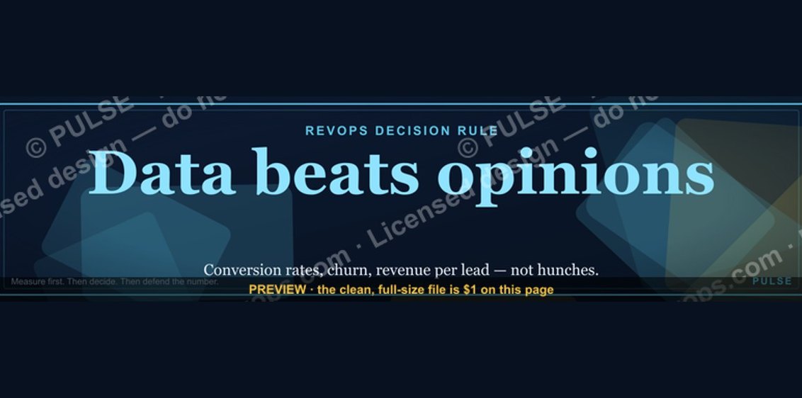 graphic“Data beats opinions.” — LinkedIn Banner
 graphicSales Cycle Timeline Infographic in 2027
 graphic“Trusted advisor, never a vendor.” — LinkedIn Banner
 graphic“Selling science and scale.” — LinkedIn Banner
 graphic“Hire slow. Ramp fast.” — LinkedIn Banner
 graphic“Sell the future, not the feature.” — LinkedIn Banner
 graphicThe 7 steps to create a champions sell program in 2027