
Sales Recruiter — LinkedIn Banner
 Curated byKory White · Fractional CRO · Maryland
 PULSEKNOWLEDGE LIBRARY
Quality
Certified
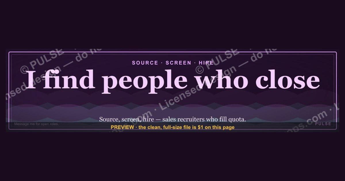
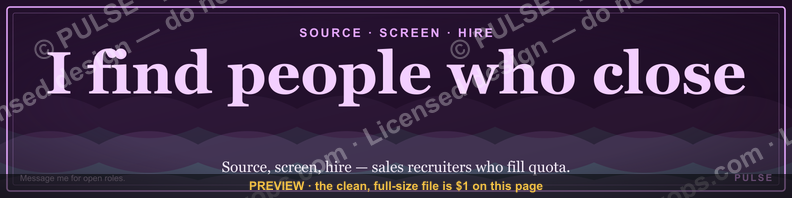
This is a LinkedIn profile banner (1584×396 px) built for a Sales Recruiter's profile: a dark charcoal background, "SALES RECRUITER" set in bold white sans-serif across the left two-thirds, and a one-line tagline — "Connecting Top Sales Talent With Growing Teams" — beneath it in a muted accent color. Use it as your LinkedIn cover image to signal specialty and invite inbound candidates and hiring managers alike.
The outcome you should expect
Swap your default blue LinkedIn cover for this banner and the immediate effect is clarity, not virality — nobody hires you off a banner alone, but a visitor who lands on your profile from a search result, a mutual connection, or a job post link now understands your specialty in under two seconds instead of scrolling to your headline or About section to figure it out. For a Sales Recruiter specifically, that matters because your profile gets two very different kinds of visitors: candidates checking whether you're a legitimate recruiter worth replying to, and hiring managers deciding whether to loop you into a search. The banner answers both audiences at once — it doesn't try to sell either one individually, it just removes the "wait, what does this person actually do" hesitation that costs you replies.
The realistic outcome is a modest but real lift in profile-to-message conversion, not a lift in raw profile views. A banner doesn't get you found; your headline, activity, and search keywords do that. What the banner does is convert the view into an action — a candidate who was on the fence about sending an InMail reply, or a hiring manager scrolling past ten generic recruiter profiles who stops on yours because it visually reads "sales recruiting" before they've read a word. Recruiters who've used a purpose-built banner like this generally describe it as reducing the number of "so what do you actually recruit for?" opening messages, because the banner has already answered that. It is a small, cumulative credibility signal — closer to a business card than an advertisement — and it compounds with a matching headline and About section rather than replacing them.

Where this banner underperforms is when it's the only thing changed. A recruiter who swaps in a polished banner but leaves a stale headline ("Talent Acquisition | Recruiter") or a two-year-old post history sends a mixed signal: the banner says "specialist," the rest of the profile says "generalist who hasn't updated in a while." The outcome you should expect is proportional to how much the rest of the profile reinforces the same specialty claim the banner is making.
What drives that outcome
Three elements do the work on this banner, and each one is doing a different job. The headline text, "SALES RECRUITER," is the load-bearing element — it's large, high-contrast, and positioned in the visual path a viewer's eye takes before it reaches your profile photo (LinkedIn overlays your circular photo on the lower-left of the banner, so text needs to sit clear of that zone or it gets cropped behind the photo). The tagline underneath does secondary work: it converts the job-title headline into a value statement, telling the viewer not just what you are but what you deliver — matching talent to teams, rather than just processing resumes. The dark background is the third element, and it's doing quiet work: a near-black or charcoal ground makes white text pop without needing a heavy drop shadow, and it reads as more premium/executive than the pastel gradients that dominate default LinkedIn banner templates, which matters because sales recruiting sits adjacent to sales leadership, and the visual bar there tends to skew polished rather than playful.
The interaction between these elements is where most banners go wrong, and where this one is deliberately simple. Text placement respects the profile-photo overlay zone (roughly the bottom-left 300×300 px on desktop), font size is large enough to survive LinkedIn's automatic compression on mobile — where the banner renders at a fraction of its native resolution — and the color palette sticks to two tones plus white so nothing competes for attention. A banner that tries to do more (a headshot collage, a client logo strip, a QR code) usually does less, because LinkedIn's crop behavior on mobile and in the feed thumbnail is unpredictable, and anything positioned near the edges risks being cut. The driver of the outcome isn't cleverness, it's legibility under the worst rendering condition, because that's the condition most viewers will actually see.
Benchmarks and realistic ranges
The hard spec is 1584×396 px, a 4:1 aspect ratio, exported as PNG or JPG under LinkedIn's file-size ceiling (LinkedIn accepts up to roughly 8 MB, but a banner this simple should export well under 500 KB, which also keeps load time fast on mobile). Keep primary text inside the center-safe zone — roughly the middle 1200×300 px — because LinkedIn crops differently across desktop, tablet, and the mobile app, and anything within about 200 px of the left edge risks sitting behind your profile photo overlay on some screen sizes. Font size for the primary headline should be large enough to read at thumbnail scale: as a working range, 60–90 px for the main line and 24–32 px for the tagline tends to survive compression without looking oversized on desktop.
On contrast: white or near-white text (around #F5F5F5) on a charcoal-to-black ground (roughly #0D0D0D to #1A1A1A) clears standard accessibility contrast thresholds comfortably and photographs well even when LinkedIn's CDN compresses the image, which it does aggressively for cover photos. Avoid pure black-on-black or light gray on white — cheap on file size, but the first fails contrast checks and the second fails legibility against LinkedIn's own white header chrome that sits directly above the banner on desktop.
There's no reliable, verifiable public benchmark for "click-through" or "message-reply lift" specific to a recruiter banner swap — treat any number you see claiming a precise percentage lift with skepticism, because LinkedIn doesn't expose banner-level analytics separate from overall profile views, and no controlled study isolates the banner as the sole variable. What is measurable and worth tracking yourself: your own InMail/connection-request acceptance rate and reply rate in the 30 days before and after the swap, using LinkedIn's own Recruiter or Sales Navigator analytics if you have access, or simply a spreadsheet if you don't. That before/after comparison on your own outreach is a far more honest benchmark than any generic industry number, because your candidate pool, message quality, and timing all move the needle more than the banner does.

Risks, edge cases, and failure modes
The most common failure mode is text getting cropped by the profile-photo overlay. Design tools that don't simulate LinkedIn's actual rendering will happily let you place text anywhere on the 1584×396 canvas, but LinkedIn overlays your circular profile photo on top of the bottom-left corner on both desktop and mobile — any text placed there gets covered. Always preview the exported banner directly on your live profile, on both desktop and the mobile app, before considering the job done; a banner that looks perfect in Canva or Photoshop can still be unreadable once LinkedIn's cropping and photo overlay are applied.
The second failure mode is a mismatch between the banner's claim and the rest of the profile. If the banner says "Sales Recruiter" but your headline reads "HR Business Partner" or your recent activity is all posts about an unrelated function, the banner reads as either outdated or aspirational rather than accurate, and it can actually cost credibility rather than add it — a viewer who notices the inconsistency wonders what else on the profile is stale. Before publishing the banner, audit the headline, About section, and current position line for agreement; they don't need identical wording, but they need to tell the same story.
A third, subtler risk is over-genericizing the tagline to the point it says nothing. "Connecting Top Sales Talent With Growing Teams" works because it names both sides of the transaction (candidates, hiring teams) and implies growth-stage focus. A tagline like "Passionate About People" or "Making Connections Happen" is common on default templates and communicates nothing a viewer couldn't guess from the job title alone — it wastes the one line of real estate you have to differentiate.
There's also a seasonal/rebrand risk: if you specialize (enterprise SaaS sales, SDR-to-AE pipelines, a specific industry vertical), a generic "Sales Recruiter" banner undersells that specificity to the audience most likely to refer or hire you — a VP of Sales scanning recruiter profiles for someone who knows their exact niche will respond better to "Enterprise SaaS Sales Recruiting" than to the generic version. Treat the default wording as a starting template, not a finished asset, and revisit it if your positioning changes — banners go stale the same way headlines do, just less visibly, because nobody audits their cover photo as often as their headline.

Finally, a purely technical edge case: LinkedIn periodically adjusts how it crops and compresses cover photos across its desktop and mobile clients. A banner that renders cleanly today can shift slightly after a LinkedIn redesign. Re-check your banner's rendering any time LinkedIn ships a visible profile-page redesign, and keep the source file (not just the exported PNG) so you can re-export at a different crop if needed.
A practical rollout plan
Customizing this banner for your own team or your own specialty is a five-step process, and none of the steps require design software beyond what's built into free tools like Canva or Figma's free tier. First, decide your headline text — either keep "Sales Recruiter" if that's your generalist positioning, or narrow it to your actual specialty ("SaaS Sales Recruiter," "Enterprise AE Recruiter," "SDR Talent Partner") if you have one; specificity generally outperforms breadth once a viewer has narrowed their search to recruiters. Second, rewrite the tagline to name a concrete outcome rather than a vague value statement — "Placing SDRs and AEs at Series B–D SaaS Companies" beats "Passionate About Growth" because it lets a hiring manager self-select in a single glance. Third, pick your two-color palette: a dark or brand-neutral background plus one accent color pulled from your own or your agency's branding, keeping total colors to three including white text, since more colors increase the odds something clashes after LinkedIn's compression.

Fourth, export at the full 1584×396 resolution as a PNG (JPG is acceptable but PNG holds text edges more cleanly at LinkedIn's compression level), keeping every element of primary text inside the center-safe 1200×300 px zone described earlier. Fifth, upload it to LinkedIn and immediately check the live rendering — not the editor preview — on both a desktop browser and the mobile app, since these two surfaces crop and compress differently, and the mobile app is where a large share of candidate and hiring-manager traffic will actually see it. If the profile-photo overlay is clipping text, nudge the layout right or up and re-export rather than trying to guess the fix from the desktop editor alone. Once it's live and rendering cleanly, update your headline and About section in the same sitting so the banner's claim and the rest of your profile agree — a banner rollout is really a small profile-wide consistency pass, not a standalone asset swap.
Related questions
What size should a LinkedIn banner be?
1584×396 px, a 4:1 ratio. LinkedIn compresses and crops on upload, especially on mobile, so keep primary text inside the center-safe roughly 1200×300 px zone and avoid the bottom-left corner, which your profile photo overlays.
Does a LinkedIn banner actually affect recruiting results?
It doesn't drive discovery, but it can lift profile-to-message conversion by resolving "what do you do" hesitation faster. Track your own before/after reply rate rather than trusting generic industry claims — LinkedIn doesn't expose banner-specific analytics.
Should a recruiter's banner match their agency's branding?
Generally yes, if the recruiter works for or represents an agency — consistent color and tone builds recognition across the team's profiles. Independent recruiters have more freedom but should still stay consistent with their own headline and posts.
How often should a LinkedIn banner be updated?
Revisit it whenever your specialty, title, or positioning changes, or after a visible LinkedIn redesign shifts crop behavior. There's no fixed cadence — treat it like a headline, not a profile photo that rarely changes.
Can I use the same banner across my whole recruiting team?
Yes, with each person's name/title swapped in if the template includes one, or with individualized taglines if specialties differ. A shared palette with individualized text is the common middle ground.
FAQ
What file format should I export the banner as? PNG for the cleanest text edges after LinkedIn's compression, or JPG if file size is a concern. Either way, keep the file under roughly 500 KB for a banner this simple — LinkedIn's ceiling is about 8 MB, but there's no benefit to a heavier file for flat-color, text-based graphics.
Will the profile photo cover part of the banner? Yes — LinkedIn overlays your circular profile photo on the lower-left portion of the banner on both desktop and mobile. Keep primary text out of roughly the bottom-left 300×300 px, and always preview the live upload rather than trusting a design tool's canvas view.
Is a dark banner better than a light one for recruiting profiles? Neither is inherently better, but a dark or charcoal ground tends to read as more polished against LinkedIn's white header chrome and holds contrast well after compression. A light banner can work too if the text color and header background are checked for contrast at thumbnail size.
Can I add a headshot or client logos to this banner? You can, but it raises the risk of cropping issues on mobile and dilutes the single-message clarity that makes a text-forward banner work. If you add a headshot, keep it opposite the profile-photo corner and test the live render carefully.
Does this banner need to match my resume or portfolio branding? It helps but isn't required. Consistency across LinkedIn, a resume, and any recruiter landing page reinforces recall for repeat visitors, but the banner's job is mainly to work well on LinkedIn itself, where most viewers will encounter it first.
What's the biggest mistake recruiters make with LinkedIn banners? Treating it as a one-time design task disconnected from the rest of the profile. A banner that says "Sales Recruiter" next to a stale headline or inactive post history undercuts its own credibility — update the banner and the surrounding profile fields together.
Sources
- https://www.linkedin.com/help/linkedin
- https://sproutsocial.com/insights/social-media-image-sizes-guide/
- https://blog.hootsuite.com/social-media-image-sizes-guide/
- https://www.shrm.org/topics-tools/topics/talent-acquisition
- https://www.ere.net/
- https://www.canva.com/learn/linkedin-banner/
- https://blog.hubspot.com/marketing/linkedin-business-page
- https://www.bullhorn.com/blog/
Related on PULSE
- What size should a LinkedIn banner be for a sales team profile?
- How do sales recruiters structure their LinkedIn headline for inbound candidates?
- What should a sales recruiter's LinkedIn About section include?
- How do you brand a recruiting team's profiles consistently across LinkedIn?
- What's the difference between a recruiter and a sales agency's LinkedIn presence?
This page will be disappearing soon. Save it to your device for $1 — or read it free while it is here.
@Kory-White- · if Venmo asks, the last 4 of my number are 2012
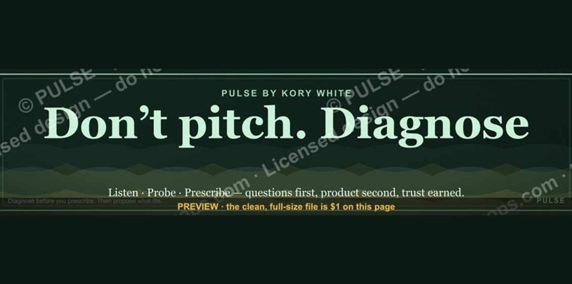 graphic“Don’t pitch. Diagnose.” — LinkedIn Banner
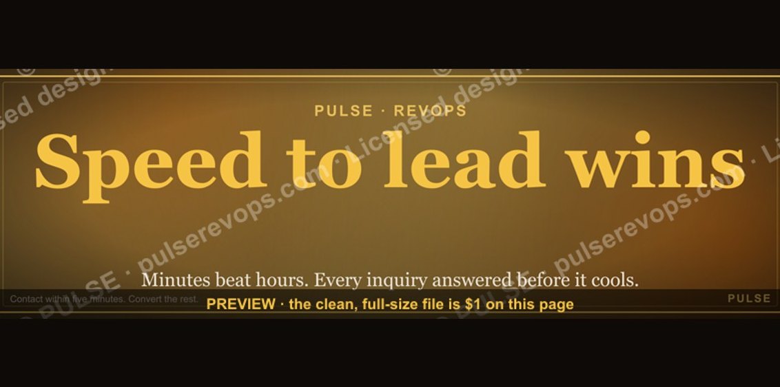 graphicSpeed to lead wins. — LinkedIn Wallpaper
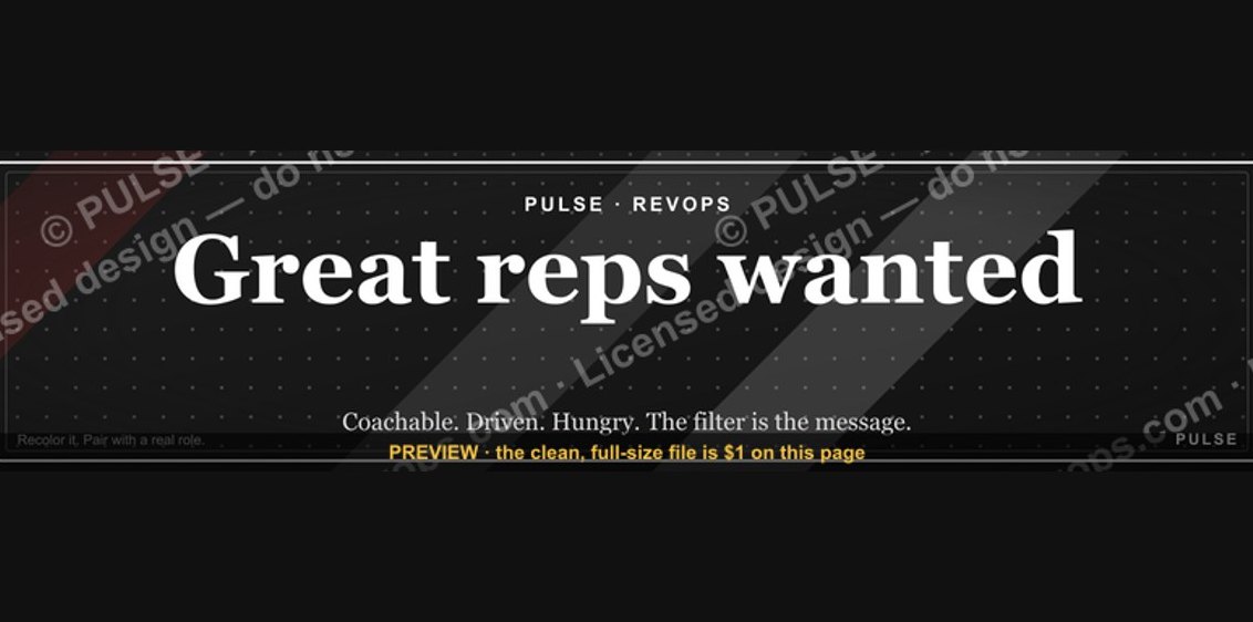 graphic“Great reps wanted.” — LinkedIn Banner
 graphic“Every no is data.” — LinkedIn Banner
 graphicWhat criteria should I use to choose a graphics design tool for sales presentations in 2027?
 graphicVector Database CTO — LinkedIn Banner
 graphic"First the trust, then the deal." — LinkedIn Banner
 graphicWin the day. — LinkedIn Wallpaper
 graphicHow to design a LinkedIn banner that converts viewers into leads in 2027?
 graphic“Selling to people leaders.” — LinkedIn Banner