
Solutions Consultant — LinkedIn Banner
 Curated byKory White · Fractional CRO · Maryland
 PULSEKNOWLEDGE LIBRARY
Quality
Certified
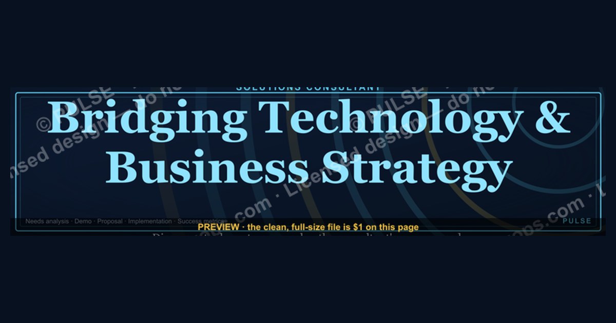
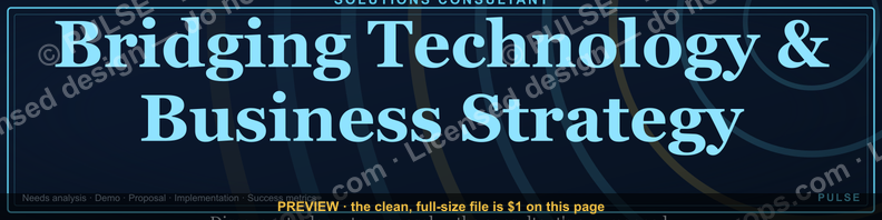
This is a LinkedIn profile banner sized 1584×396 px for a Solutions Consultant, reading a short positioning line in clean sans-serif type on a dark, professional background, with a subtle accent color marking the "Solutions" specialty. Use it as your LinkedIn cover image directly behind your headshot and headline to signal, in the three seconds a visitor spends scanning your profile, exactly what you do and who you help.
The outcome you should expect
Swap your default LinkedIn banner for this Solutions Consultant banner and the immediate outcome is clarity, not virality — nobody shares a profile banner, but recruiters, prospects, and partners who land on your profile stop guessing what "Solutions Consultant" means at your company. The banner carries a short line of supporting text — something like "Turning technical requirements into signed deals" or "Bridging Sales and Engineering" — that sits above or beside your headline and does the translation work your job title alone cannot. A generic title like "Solutions Consultant" is read differently at a five-person startup than at a 5,000-person enterprise software vendor, and the banner's job is to close that gap in the two seconds before someone decides whether to click "Connect" or scroll past.
Practically, expect three things to change. First, profile view completion improves — LinkedIn's own product guidance and the behavior of recruiters both point toward visitors who see a clear, on-brand banner spending longer on a profile than those who see the plain default blue-and-white LinkedIn wallpaper, because the banner signals the profile was maintained recently and deliberately. Second, inbound message quality shifts — when your banner states plainly that you handle technical discovery, proof-of-concept builds, or RFP responses, the messages you get skew toward people who actually have those problems, rather than generic recruiter spam for roles with the word "Solutions" anywhere in the title. Third, your own outbound gets a small lift — when you send a connection request or InMail, the recipient's first click is often your profile, and the banner reinforces the same message you just put in your note, so the two together read as consistent rather than as a stranger fishing.

None of this replaces a strong headline or a well-written About section — the banner is a supporting asset, not the whole strategy. But because it occupies the single largest piece of visual real estate on the page, above the fold and impossible to skip, it earns a place in the four or five things a Solutions Consultant should actively manage on their profile: headline, banner, About, featured section, and recent activity.
What drives that outcome (mermaid)
The mechanism is entirely about visual hierarchy and dwell time. LinkedIn's profile layout places the banner directly behind the headshot, above the headline, meaning it is the first large block of color and text a visitor's eye lands on — well before the About paragraph, which most visitors never scroll to. A banner that is blank, stretched, low-resolution, or a stock photo unrelated to the role wastes that first-impression real estate; a banner that names the role and the value proposition converts that same real estate into a two-second pitch.

The other driver is consistency across touchpoints. A Solutions Consultant's day-to-day work — technical discovery calls, demo environments, proof-of-concept scoping, RFP and security-questionnaire responses — rarely produces visible, shareable artifacts the way a marketer's campaign or a designer's portfolio piece does. The banner becomes one of the few branded surfaces a Solutions Consultant controls entirely, so it carries disproportionate weight in shaping how the role is perceived externally, especially to prospects who are meeting the Solutions Consultant for the first time on a sales call and check LinkedIn beforehand — a habit that is close to universal in B2B buying committees evaluating a vendor's team before a signature.
Benchmarks and realistic ranges
There is no universal published benchmark for "banner-driven profile engagement" because LinkedIn does not expose banner-specific analytics separately from overall profile view counts, so treat any specific percentage claim about banners with skepticism — the realistic guidance here is directional, not statistical. What is measurable and worth tracking is your own before/after: note your weekly profile view count and search-appearance count (both visible under "Who's viewed your profile" and "How you're showing up," found in LinkedIn's dashboard for Premium and standard accounts alike, with some lag on free accounts) for the two weeks before you swap the banner, then again for the two weeks after, holding your posting activity roughly constant so the comparison isn't confounded by a viral post.
On sizing, the LinkedIn-published spec is fixed and worth treating as a hard benchmark rather than a range: 1584×396 px, under 8 MB, JPG or PNG. LinkedIn crops this responsively on mobile, and the safe zone — the area guaranteed visible across desktop and mobile without your headshot circle overlapping the text — sits roughly in the center-right two-thirds of the banner, since the headshot circle occupies a fixed position on the left on desktop and shifts on mobile. Keep primary text and any logo mark out of the outer 10% on each edge and away from the bottom-left corner where the profile photo sits.
On text length, three to eight words for the primary line reads clearly at the size LinkedIn actually renders the banner (it displays far smaller than 1584px wide on most screens, often under 800px on a laptop browser), and a secondary line, if used, should stay under fifteen words — anything longer becomes unreadable at typical viewing sizes and gets ignored, defeating the purpose. Font size in the source file should be no smaller than roughly 40-44px for primary text and 24-28px for secondary text to survive LinkedIn's compression and the eventual downscale to a browser tab.
Risks, edge cases, and failure modes
The most common failure is a banner that duplicates the headline word-for-word instead of complementing it — if your headline already says "Solutions Consultant at [Company]," a banner that repeats "Solutions Consultant" in large text adds no new information and wastes the space; the banner should add the *why* or the *how*, not restate the *what*. A second common failure is over-branding: a Solutions Consultant is an individual professional, not a corporate account, and a banner that looks like it was lifted directly from the company's marketing deck — full logo lockup, brand tagline, product screenshot — can read as inauthentic or even as using company IP without clearance, which some employers' brand guidelines explicitly restrict on personal accounts.
Resolution and cropping is the most frequent technical failure. Because LinkedIn recompresses uploaded images and renders them at wildly different widths across desktop, tablet, and mobile, a banner built at low resolution or with text placed too close to the edges will show visible compression artifacts or get clipped. Always export at the full 1584×396 px canvas, in PNG for text-heavy designs (PNG avoids the JPG compression halo around sharp text edges) and preview it on an actual phone before treating the upload as final — the desktop preview in LinkedIn's upload tool does not always match the mobile crop.
A subtler risk is staleness. A banner naming a specific product, a specific year, or a specific event ("Solutions Consultant, Q1 2026 Rollout") ages out and then signals neglect rather than currency once that period passes — the opposite of the intended effect. Prefer durable language about the role and its value rather than time-bound or campaign-specific copy, and put an annual reminder on your calendar to revisit it. Finally, accessibility is a real edge case worth designing for: sufficient contrast between text and background (aim for at least a 4.5:1 luminance ratio) matters both for viewers with low vision and because LinkedIn itself renders on screens in bright sunlight and dim rooms alike — a banner that only reads well on a calibrated monitor will fail in the field.
A practical rollout plan (mermaid)
Treat the banner swap as a five-step task rather than a five-minute one, because most of the value is lost if the execution is sloppy. Start by confirming your exact title and the single value proposition you want the banner to carry — pull this from your own recent deals or from language your manager uses to describe the Solutions Consultant function, not from a generic template, so the line actually reflects your specific work (security-focused proof-of-concepts, technical RFP response, pre-sales demo engineering, whatever it truly is). Second, check your company's brand guidelines or ask your marketing team whether there's an approved color palette or logo usage rule for personal LinkedIn banners — this avoids the over-branding failure above and takes one Slack message. Third, build or download the banner at the correct 1584×396 px canvas, keeping text inside the safe zone described earlier. Fourth, upload it, then immediately open LinkedIn on a phone browser (not just the app, since rendering can differ) to confirm nothing critical is clipped by the mobile crop. Fifth, note your current profile view count so you have a real before/after baseline, then revisit the banner at least once a year or whenever your role's focus shifts.
If you support a whole Solutions Consulting team, this same rollout plan scales as a shared template: lock the layout, color palette, and logo placement, then leave only the one-line value proposition as a per-person variable so every consultant's banner is visually consistent with the team's brand while still saying something true and specific about that individual's focus area.
Related questions
What size should a LinkedIn banner be?
1584×396 px, under 8 MB, PNG or JPG. Keep primary text and logos inside the center two-thirds of the canvas so nothing important is clipped by LinkedIn's responsive mobile crop.
Should a Solutions Consultant's banner include the company logo?
Sparingly, and only if brand guidelines allow it on personal profiles — a small logo mark in a corner reads as affiliation; a full brand lockup can read as an unauthorized marketing asset.
How often should you update a LinkedIn banner?
At least once a year, or whenever your role's focus genuinely shifts — avoid campaign- or date-specific text that ages out and then signals neglect.
Does a LinkedIn banner actually affect profile views?
LinkedIn doesn't report banner-specific metrics, but a clear, on-brand banner reliably increases dwell time versus a blank default, since it's the first large visual element a visitor sees.
What's the difference between a banner and a headline on LinkedIn?
The headline is text-only and appears next to your name; the banner is the large image behind your photo. They should complement, not repeat, each other's message.
FAQ
What is a Solutions Consultant LinkedIn banner, exactly? It's the 1584×396 px cover image on a LinkedIn profile, customized to state a Solutions Consultant's role and value proposition rather than left as LinkedIn's plain default background.
Can I use this banner as-is, or should I customize it? Customize the wording to your specific focus area and, if your company has brand guidelines, adjust colors to match — a banner that reflects your actual work reads as more credible than a generic template left untouched.
What file format should I download and upload? PNG for crisp text edges; JPG is acceptable for photo-heavy designs but can introduce compression artifacts around fine text at LinkedIn's rendering sizes.
Will the banner look the same on mobile as on desktop? Not exactly — LinkedIn crops responsively, so always preview the upload on a phone browser and keep critical text and logos away from the outer edges of the canvas.
Does the banner need to match my company's other Solutions Consultants? It helps for team consistency, but it isn't required — the one non-negotiable element is that the wording accurately reflects your own specific responsibilities.
Is a stock photo background better than a solid color or pattern? A solid or subtly patterned background usually outperforms a busy stock photo, because it keeps the text legible at small rendering sizes and avoids looking generic or unrelated to the role.
Sources
- https://www.linkedin.com/help/linkedin/answer/a541912
- https://business.linkedin.com/marketing-solutions/blog
- https://www.hubspot.com/sales/what-is-a-solutions-consultant
- https://www.gartner.com/en/sales/glossary/solutions-consultant
- https://www.canva.com/create/linkedin-banners/
- https://www.adobe.com/express/create/cover/linkedin
- https://www.forbes.com/sites/forbescommunicationscouncil/
- https://www.nngroup.com/articles/first-impressions-website/
Related on PULSE
- How to write a Solutions Consultant LinkedIn headline that converts
- LinkedIn profile optimization checklist for pre-sales teams
- Solutions Engineer vs. Solutions Consultant: what's the actual difference
- Building a personal brand as a technical pre-sales professional
- How Sales Engineering teams use shared LinkedIn banner templates
- The pre-sales professional's guide to LinkedIn outbound messaging
This page will be disappearing soon. Save it to your device for $1 — or read it free while it is here.
@Kory-White- · if Venmo asks, the last 4 of my number are 2012
This page is gone.
This one is off the shelf now. $1 keeps it on your phone for good — the whole page, pictures and diagrams included.
 graphicSDR Manager — LinkedIn Banner
 graphicCustomer Success Manager — LinkedIn Banner
 graphicGTM Engineer — LinkedIn Banner
 graphicMid-Market Account Executive — LinkedIn Banner
 graphic4 Pillars of RevOps — Infographic
 graphic“Sell the meeting, not the demo.” — Quote Card
 graphicSales Cycles Shrink With Trust — Banner
 graphic“KEEP THE CADENCE” — Sales Floor Print
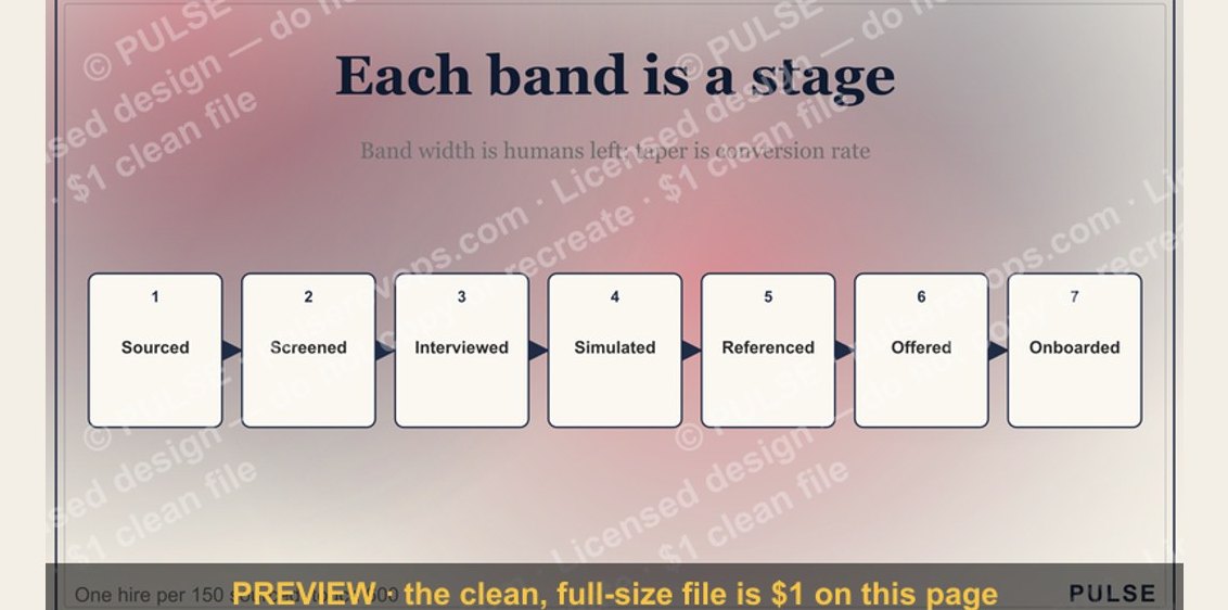 graphicThe Sales Hiring Funnel — Infographic
 graphicOne team. One number. — LinkedIn Wallpaper