
Healthcare RevOps Leader — LinkedIn Banner
 Curated byKory White · Fractional CRO · Maryland
 PULSEKNOWLEDGE LIBRARY
Quality
Certified
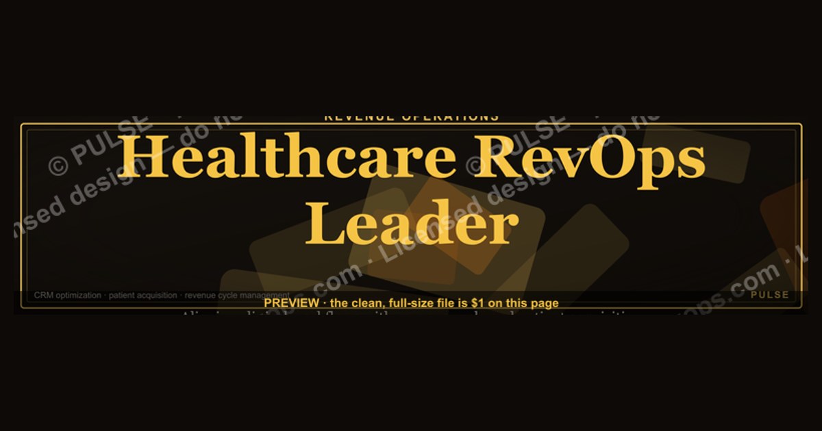
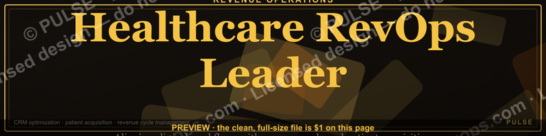
This is a LinkedIn profile banner sized 1584×396 pixels, built for the headline "Healthcare RevOps Leader." It reads in gold-on-charcoal type across a clean horizontal band, pairing the role title with a short supporting line naming the operating focus — payer relations, patient revenue cycle, or care-to-cash pipeline. Download the PNG and drop it straight into your LinkedIn cover-photo slot; no cropping software required.
A concrete scenario that frames the problem
A director of revenue operations at a regional health system is about to speak on a payer-mix panel. Their LinkedIn profile still carries the default cornflower-blue banner LinkedIn assigns every new account. A recruiter, a hospital CFO, or a vendor sales rep who clicks through from a shared post sees a stock photo and a headline buried in gray text — nothing that says, in the half-second before someone scrolls past, "this person runs revenue operations inside a healthcare organization." That half-second matters more in healthcare than in most industries, because the audience reading a Healthcare RevOps Leader's profile is unusually specific: payer contract negotiators, EHR vendor partners, health-system CFOs, and recruiters filling niche revenue-cycle roles. None of them are browsing casually. They land on the profile already primed by a mutual connection, a conference bio, or a LinkedIn search for "healthcare revenue operations," and the banner is the first proof that the profile belongs to someone who actually lives in that world. A banner that simply restates the headline — "Healthcare RevOps Leader" — in a legible, branded, professional layout closes that half-second gap instantly. It does the identity confirmation work that a paragraph of About-section copy would otherwise have to do, and it does it before the visitor has decided whether to keep reading.
This is the scenario the banner on this page is built to solve: not to replace the résumé or the About section, but to function as a visual headline confirmation — the first thing a visitor's eye resolves before it ever reaches the profile photo or the job title beneath it.

How the mechanism actually works
A LinkedIn banner works because of where it sits in the visual hierarchy of a profile page, not because of any clever design trick. It is the largest single block of pixels on the page above the fold, roughly four times the area of the profile photo, and it renders before the visitor's eye has locked onto anything else. Eye-tracking studies on social profile layouts consistently show a top-down, left-to-right scan pattern: banner first, photo second, headline text third. That means the banner is functionally the first sentence of a visitor's read of the page, even though it carries no literal sentence at all — just a title, a supporting line, and a color field.
The mechanism has three moving parts working together. First, contrast: dark charcoal or near-black background against light gold or white type ensures the words resolve at both desktop banner size (1584×396) and the heavily cropped mobile size (roughly 1128×191 visible on a phone, since LinkedIn's mobile app crops the vertical band aggressively). Second, hierarchy: the role title ("Healthcare RevOps Leader") sits larger and higher-weight than the supporting line, so even a visitor who only registers the banner for a fraction of a second walks away with the title alone. Third, placement discipline: all text sits inside the "safe zone" — the area not obscured by the circular profile photo overlay, which sits in the lower-left on desktop and shifts position on mobile. A banner that ignores the safe zone loses its most important word behind the user's own profile picture, which is the single most common banner failure on LinkedIn.
Once the identity is confirmed, the rest of the profile — headline, About section, featured posts — gets read with the correct frame already loaded in the visitor's head. That framing effect is the entire value of the banner: it is not decoration, it is a priming device that makes everything below it read faster and land harder.
Real numbers, ranges, and benchmarks
LinkedIn's banner canvas is fixed at 1584×396 pixels, a 4:1 aspect ratio. LinkedIn accepts PNG or JPG up to roughly 8MB, and recommends staying under 4MB for reliable upload and fast render on mobile connections. Text and any logo elements should sit inside a safe zone that excludes roughly the left 300 pixels at the bottom third of the canvas on desktop, where the circular profile photo (400×400 pixels, displayed at about 200 pixels on desktop) overlaps the banner. On mobile, LinkedIn crops the banner to a narrower vertical strip — visible height drops to somewhere in the 190–220 pixel range depending on device — so any text placed in the top or bottom 15% of the 396-pixel canvas risks being cropped out entirely on a phone. The safest practice is to keep all critical text — the "Healthcare RevOps Leader" title and its supporting line — centered in the middle 60% of the vertical canvas, roughly pixels 120–280 of the 396-pixel height.

Contrast ratio matters more than most people assume: text-to-background contrast under roughly 4.5:1 (the WCAG AA threshold most design tools will flag) becomes hard to read on a phone screen in bright light, which is where a meaningful share of LinkedIn browsing happens. Gold-on-charcoal or white-on-near-black both clear that threshold comfortably; gray-on-gray or light gold on a light background typically does not. Font size should scale so the title line renders no smaller than roughly 48–60px at full 1584-pixel width — smaller than that and the title becomes unreadable in the LinkedIn mobile thumbnail, which is often the only version of the banner a visitor ever actually sees before deciding whether to tap into the full profile.
On the content side, the pairing convention — a role title plus one supporting line rather than a full paragraph — exists because banner real estate at 396 pixels tall simply cannot hold more than about two short lines before font size drops below the mobile-legible threshold. A Healthcare RevOps Leader banner that tries to list three responsibilities, a company name, and a tagline in one image typically ends up with none of it readable; the discipline of "one title, one supporting line" is a hard constraint of the format, not a stylistic preference.

Trade-offs and alternatives
There is a real design choice between a minimalist banner — title, one supporting line, solid color field — and a denser banner that adds a headshot silhouette, a small icon set (a heartbeat/pulse mark for healthcare, a funnel icon for RevOps), or a secondary tagline. The minimalist version wins on legibility at every render size, from full desktop to the cropped mobile thumbnail, and it ages well because it never needs updating when a job title or company changes underneath it. The denser version can carry more identity signal — a visual cue that says "healthcare" even to someone who doesn't read the words — but it is far more fragile: every extra element is another thing that can get clipped by the profile-photo overlay or blur out at small render sizes, and it dates faster if the icon style goes out of visual fashion.
A second trade-off sits between a role-generic banner and a role-specific one. A generic "RevOps Leader" banner works across any industry a person might move into next, which matters for someone actively open to roles outside healthcare. A Healthcare RevOps Leader banner, by naming the vertical explicitly, sacrifices that flexibility in exchange for much sharper signal to the exact audience — payer-side operations teams, health-system recruiters, healthcare SaaS vendors — who are searching LinkedIn specifically for that phrase. For someone whose next move is very likely to stay inside healthcare, the specific version outperforms the generic one on recall and search relevance; for someone hedging toward a cross-industry pivot, the generic version is the safer long-term asset.
There is also a lower-effort alternative worth naming honestly: no custom banner at all, just LinkedIn's default. It costs nothing and it is common — which is exactly the problem. A visitor scanning several profiles in one sitting (a recruiter comparing five candidates, a conference attendee looking up a panel) will register the branded banners and skim past the default ones, independent of the substance underneath. The banner does not need to be elaborate to beat the default; it only needs to exist and be legible.
Common pitfalls and how to avoid them
The single most frequent failure is placing text where the profile-photo circle covers it. Because the photo sits in the lower-left on desktop but shifts position on mobile, a banner designed by eyeballing only the desktop preview often loses a word or a whole line on phones — and healthcare RevOps professionals disproportionately get viewed on mobile, since a lot of profile-checking happens between meetings on a phone rather than at a desk. Always preview the banner on both a desktop browser and the LinkedIn mobile app before treating it as final; LinkedIn's own edit screen shows a rough crop guide, and it is worth trusting that guide over instinct.

The second-most common pitfall is low contrast chosen for aesthetic reasons — a muted gold on a muted gray, for instance, that looks tasteful in a design tool at full size but disappears at the 300-pixel-wide thumbnail LinkedIn shows in search results and connection lists. Test the banner at actual thumbnail size, not just full-screen, before finalizing it.
Third, oversized file weight: a banner exported at very high resolution or with excessive compression artifacts can push past LinkedIn's upload ceiling or simply load slowly on a hospital Wi-Fi network, which is a real consideration for a healthcare-focused audience often browsing from clinical or administrative networks with tighter bandwidth. Export as an optimized PNG or JPG in the few-hundred-kilobyte to low-megabyte range rather than an uncompressed multi-megabyte file.
Fourth, letting the banner drift out of sync with the headline text underneath it. If the banner says "Healthcare RevOps Leader" but the LinkedIn headline field says something else entirely — an old title, a different focus area — the mismatch reads as neglect rather than intention. Update both together whenever a role, focus area, or title changes.
Fifth, over-designing for a one-time event. Some professionals build a banner specifically for a conference week and never touch it again, leaving stale event branding up for a year. A Healthcare RevOps Leader banner built around the durable identity — the role, not a specific event or employer — stays relevant through job changes and only needs updating when the underlying title itself changes.
Related questions
What size should a healthcare-focused LinkedIn banner be?
1584×396 pixels, the fixed LinkedIn banner canvas. Keep critical text in the vertical middle 60% and the horizontal area away from the lower-left profile-photo overlap so nothing important gets cropped on mobile or hidden behind the photo circle.
Should the banner include a company logo?
Only if the leader wants to signal a specific employer permanently; most durable banners skip the logo so the banner survives a job change without looking outdated the day the role ends.
How often should a RevOps leader update their banner?
Whenever the headline or role focus changes meaningfully — not on a fixed schedule. A banner tied to durable identity (the role itself) rather than a specific job or event rarely needs updating more than once every year or two.
Does a custom banner actually affect profile views?
Indirectly: it does not change LinkedIn's search algorithm, but it raises the odds a visitor who lands on the profile actually reads further instead of scrolling past, which is where downstream engagement and connection requests originate.
Can this banner work for other RevOps sub-specialties, not just healthcare?
Yes — the same title-plus-supporting-line format applies to any RevOps focus area. Swap "Healthcare" for the relevant vertical and adjust the supporting line to name that industry's operating focus.
FAQ
What exact dimensions does a LinkedIn banner need? 1584×396 pixels is LinkedIn's fixed banner canvas. Uploading anything smaller risks LinkedIn stretching the image and softening the text; uploading something larger just gets downscaled, so exporting at the native size gives the sharpest result.
Is this banner just for people with "RevOps" in their actual job title? No. It works for anyone functioning as a Healthcare RevOps Leader in practice — running pipeline, payer operations, or patient revenue cycle work — even if their formal title reads differently, such as VP of Revenue Cycle or Director of Payer Operations.
Will the banner look right on a phone, since most viewers check LinkedIn on mobile? Yes, provided the text sits in the safe middle zone described above. LinkedIn's mobile app crops the visible height of the banner more aggressively than desktop, so anything placed too close to the top or bottom edge on desktop can vanish on a phone.
Can the wording be changed, or is "Healthcare RevOps Leader" fixed? The wording is fully editable. The layout, contrast approach, and safe-zone discipline are the reusable part; the title and supporting line should always match whatever role and focus area actually describe the person using it.
What file format should be uploaded to LinkedIn? PNG for the sharpest text edges, or JPG if file size needs to come down. Either works within LinkedIn's upload limits; PNG is generally the better choice for banners built primarily from typography rather than photography.
Does a banner like this replace the need for a professional headshot? No — the banner and the profile photo do different jobs. The banner confirms role and identity at a glance; the photo builds personal trust and recognizability. Both should be updated together for a consistent first impression.
Sources
- https://www.linkedin.com/help/linkedin
- https://business.linkedin.com
- https://www.canva.com/create/linkedin-banners/
- https://www.adobe.com/express/create/cover/linkedin
- https://blog.hubspot.com/marketing
- https://sproutsocial.com/insights/
- https://buffer.com/resources/
- https://www.w3.org/WAI/WCAG2AA-Conformance
- https://www.gartner.com/en/marketing
- https://www.forrester.com
Related on PULSE
- What does a RevOps org chart look like inside a health system?
- How does patient revenue cycle differ from B2B SaaS revenue operations?
- What LinkedIn headline format works best for a RevOps leader?
- How should a healthcare RevOps leader structure their About section?
- What's the ideal cover-photo safe zone for any professional LinkedIn banner?
This page will be disappearing soon. Save it to your device for $1 — or read it free while it is here.
@Kory-White- · if Venmo asks, the last 4 of my number are 2012
This page is gone.
This one is off the shelf now. $1 keeps it on your phone for good — the whole page, pictures and diagrams included.
 graphicB2B SaaS VP of Sales — LinkedIn Banner
 graphicFinTech CRO — LinkedIn Banner
 graphicCybersecurity Sales Director — LinkedIn Banner
 graphicLogistics CRO — LinkedIn Banner
 graphic“More pipeline, less panic.” — LinkedIn Banner
 graphic“Process scales. Heroics don't.” — Quote Card
 graphic“Ready to lead a sales team.” — LinkedIn Banner
 graphicThe SaaS Growth Funnel — Infographic
 graphicHead of Sales — LinkedIn Banner
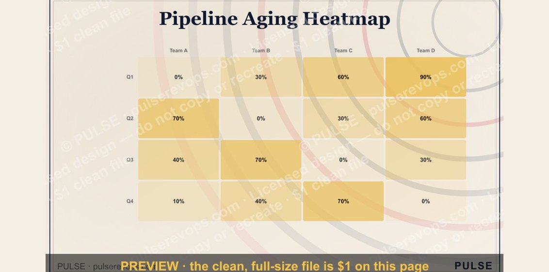 graphicPipeline Aging Heatmap