


“Facts tell. Stories sell.” — LinkedIn Banner
Quality
Certified
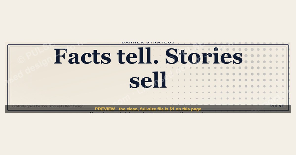
"Facts tell. Stories sell." on a LinkedIn banner means your cover image should carry a narrative hook, not a credential list. Facts establish credibility; stories create memory and motion. The banner's job is to make a visitor pause, feel curiosity, and scroll into your profile — not to summarize your résumé in 1584×396 pixels.
The outcome you should expect
A story-driven LinkedIn banner is a conversion-rate lever, not a traffic lever. It does not bring more people to your profile — your posts, comments, and search presence do that. What the banner changes is what happens in the two to four seconds *after* someone lands. The realistic outcome is a lift in the ratio of profile views that convert into a connection request, a follow, a message, or a click on your featured section.
Be honest about the size of that lift. A banner swap is one variable in a system that includes your headline, your photo, your About section, your featured links, and the posts that brought the visitor there. If someone tells you a banner alone tripled their pipeline, they changed five things at once and credited the prettiest one. What you should expect from a well-executed story banner is a modest, compounding improvement — the kind that shows up over 60 to 90 days of steady profile traffic, not overnight.
The second outcome is qualitative and often more valuable: message quality. When your banner states a specific transformation ("from six-week onboarding to nine days"), the inbound messages you receive start referencing that transformation. You stop getting "let's connect and explore synergies" and start getting "we're at seven weeks on onboarding — how did you get to nine days?" That shift in inbound specificity is the clearest signal the banner is doing its job. Track it manually: keep a running note of inbound messages before and after the change, and read the first sentence of each.
The third outcome is internal. Writing a banner that follows "Facts tell. Stories sell." forces you to pick one story. Most professionals cannot name the single transformation they deliver — they list five services. The exercise of compressing your value into a hook plus a proof point is a positioning exercise disguised as a design task, and the clarity it produces leaks into your headline, your pitch, and your first sales call. That benefit lands whether or not anyone ever notices the banner.
What you should *not* expect: algorithmic lift. LinkedIn's feed ranking does not read your banner image. There is no keyword indexing of pixels, no engagement weight attached to cover art. Anyone selling you "banner SEO" is selling you nothing. The banner works entirely through human eyes on a profile page.
What drives that outcome
Three mechanisms do the work, and they stack in a specific order: attention, comprehension, and curiosity.
Attention is won by contrast, not by content. On a profile page the banner is the largest visual element, but it sits behind a profile photo that occupies roughly the lower-left quadrant on desktop and pushes further into the frame on mobile. A banner that centers its message gets its message covered. Attention is won with a high-contrast field — a dark background with light type, or a single dominant color — and with the message placed in the right two-thirds of the canvas where nothing overlaps it.
Comprehension is won by specificity. "I help businesses grow" is comprehended as noise because it maps to nothing. "Cut ramp time for new AEs from 90 days to 40" is comprehended instantly because it names a metric the reader already carries in their head. This is where the Facts half of the phrase earns its place: the number is not the story, but the number is what makes the story believable enough to be worth finishing.
Curiosity is won by the gap. A complete sentence closes the loop and the reader moves on. An incomplete one — a result without its method, a change without its cause — creates a small open question, and open questions are what drive the scroll into your About section. "The one metric that predicted our Series A" works because the metric is withheld. "We used lead velocity rate to predict our Series A" does not, because there is nothing left to find out.
The mechanism that ties them together is emotional encoding. Narrative structure — a subject, a problem, a change — is retained far better than a list of attributes, which is why an interviewer remembers "the person who saved the failing implementation" and forgets "the person with fourteen certifications." Your banner is competing for a slot in someone's memory two weeks after they viewed your profile, when a need finally surfaces. Facts occupy that slot poorly. Stories occupy it well.
The diagram makes the failure modes visible: two of the three most common outcomes are silent. A banner that fails the contrast test and a banner that fails the specificity test both produce the same result — nothing — and neither generates any signal you can measure. This is why iterating on a banner requires deliberate feedback rather than waiting for metrics to move.
Benchmarks and realistic ranges
Start with the dimensions, because most banner failures are geometric rather than editorial.
LinkedIn's personal profile cover image is 1584 × 396 pixels, a 4:1 ratio. Company pages use a different slot — 1128 × 191 — so a banner built for a personal profile will crop badly if reused on a company page. Design at 1584 × 396 or at a 2× multiple (3168 × 792) and export down; designing smaller and scaling up produces the soft edges LinkedIn's compression will make worse.
Safe zone. Your profile photo overlays the lower-left of the banner. On desktop the overlap extends roughly the leftmost 15–20% of the width and the bottom 40–50% of the height. On mobile the visible crop is narrower and the photo sits more centrally, eating further into the middle. Practical rule: keep all critical text inside the right 60–65% of the width and the top 55% of the height. Anything outside that rectangle should be decorative only.
Type size. Because the banner renders at a fraction of its native size on mobile, set your primary hook at a minimum of 60–72 px at the 1584-wide canvas, and any secondary line at no less than 32–40 px. Below that, mobile viewers see texture, not words. If your copy will not fit at those sizes, your copy is too long — that is a feature of the constraint, not a bug.
Word count. The hook line should land in the 4–10 word range. A supporting line, if you use one, should stay under 12 words. Total banner copy above roughly 20 words reliably reads as a paragraph in a space that cannot support one. "Facts tell. Stories sell." is four words and works precisely because of that compression.
File format and size. PNG for text-heavy banners (crisper edges on type), JPG for photographic ones. LinkedIn accepts up to 8 MB; there is no benefit to approaching that ceiling — a well-optimized PNG at 1584 × 396 typically lands between 200 KB and 1.5 MB. SVG is not accepted as an upload format, so if you are working from a vector source, export to PNG at the final step. Keep the SVG as your editable master.
Cadence. Refresh the banner when your positioning changes — a new role, a new offer, a new proof point — not on a calendar. A realistic rhythm for an active consultant or founder is two to four changes a year. Changing monthly costs you the recognition value that a stable visual identity builds, and gives you no clean read on what worked.
Evaluation window. Give a new banner at least 30 days and a few hundred profile views before judging it. LinkedIn's native analytics report profile views and search appearances but do not attribute a connection request to a banner. You are reading a directional trend, not an attribution model. If your profile gets fewer than 50 views a month, the banner is not your constraint — your posting cadence is.
Risks, edge cases, and failure modes
Over-claiming. The most expensive failure is a banner fact you cannot substantiate in the first sales conversation. If the banner says "$4M in recovered revenue" and the honest number is a single client outcome that has not repeated, you have created an expectation gap that will surface at exactly the wrong moment. Use numbers you would be comfortable defending line by line. When a number is client-confidential, express the shape without the figure — "cut a nine-week close cycle by more than half" — rather than inflating a public one.
The mobile crop. Roughly the majority of LinkedIn sessions happen on mobile, and the mobile banner crop is more aggressive than the desktop one. A banner that reads perfectly on a 27-inch monitor can lose its final word on a phone. Always preview on an actual device before committing. Upload, open the LinkedIn app, view your own profile, and screenshot it.
Cheesiness and the stock-photo trap. "Stories sell" gets misread as "be dramatic." Handshakes over skylines, silhouettes on mountaintops, and glowing network overlays are visual clichés that signal template rather than thought. They actively subtract credibility from a senior audience. A plain dark field with one sharp line of type outperforms a busy composite almost every time.
Audience mismatch. A curiosity-gap hook works on a warm audience — people who arrived from your post or a mutual connection. It works less well on a cold recruiter screening 40 profiles for a specific skill set. If your primary LinkedIn use case is job search, weight the banner further toward Facts: the role you want, the domain, the stack. Save the full narrative treatment for a business-development profile where the visitor has discretion over whether to engage.
Regulated industries. In financial services, healthcare, and legal, performance claims on a public profile can trigger compliance review. A banner claiming client returns may fall under advertising rules that require disclaimers no banner has room for. When in doubt, run banner copy past compliance before upload — the cost of a review is far below the cost of a takedown.
Employer conflict. If you are employed, a banner built around your personal consulting story can read as a side business to your employer, or as a departure signal. This is a real career risk, not a hypothetical. Decide deliberately which story your profile is telling and whether it is one your current role supports.
Illegible in dark mode. LinkedIn's dark theme changes the page around your banner, not the banner itself, but a banner with a white or very light background will glow against a dark interface in a way that can feel jarring and cheap. Test both themes. Mid-to-dark backgrounds are the safer default because they sit comfortably in either.
Accessibility. Text baked into an image is invisible to screen readers, and LinkedIn provides no alt-text field for the cover image. Never put information in the banner that exists nowhere else on your profile. Anything essential — your offer, your contact route — must also appear as real text in your headline or About section.
The vanity trap. A banner that flatters you rather than serving the visitor is the quiet default failure. Awards, logos, and titles arranged as a trophy case tell facts about your past. They do not tell the visitor what changes for *them*. If every noun in your banner is about you, rewrite it with the reader as the subject.
A practical rollout plan
Treat this as a two-week project with a deliberate feedback step, not a Saturday afternoon in Canva.
Days 1–2: Build the story bank. Write down three to five specific outcomes you have produced — real ones, with a before state, an after state, and a timeframe. Format each as: *[Who] was stuck at [specific bad state]. In [timeframe], it became [specific good state].* You need the raw material before you can compress it. Most people discover here that they have one strong story and three vague ones; that is useful information.
Days 3–4: Compress to hooks. For each story, write a 4–10 word hook that names the transformation and withholds the method. Then write the supporting fact line under 12 words. Produce at least six candidate pairs — you are looking for the one that survives being read aloud without sounding like a slogan.
Day 5: Choose the visual register. Decide between three approaches: type-only on a solid or gradient field (fastest, safest, most legible), a single photographic scene supporting the narrative, or a simple data motif such as a single ascending line. Avoid split-screen before/after compositions unless you have real design skill — they are the most attempted and the most often botched, because two focal points in a 4:1 strip almost always collide.
Days 6–7: Build at spec. Canvas at 1584 × 396. Draw a guide rectangle over the left 20% and bottom 45% and keep type out of it. Hook at 60–72 px, support line at 32–40 px, maximum two type sizes and one accent color. Export PNG.
Day 8: The three-second test. Show the banner to three people who do not know your work, for exactly three seconds each, then ask what they remember. If they cannot state your transformation in their own words, the banner has failed and no amount of upload-and-hope will fix it. Iterate here — this step is the entire quality gate, and skipping it is why most banners underperform.
Day 9: Device check and ship. Upload, then view your own profile on desktop, on the mobile app, and in dark mode. Confirm nothing critical is clipped by the photo overlay or the mobile crop.

Days 10–14: Align the rest of the profile. The banner sets an expectation; the headline, About section, and featured items must pay it off. If the banner promises a story about cutting ramp time, the first line of your About section should begin that story, and a featured post or document should complete it. A banner that opens a loop the profile never closes converts worse than no banner at all.
Then: measure and hold. Log baseline profile views and inbound message quality before the change. Review at 30 and 60 days. Change one element at a time if you iterate — swapping the hook and the imagery simultaneously teaches you nothing.
The loop back from the three-second test to hook generation is the most important edge in the diagram. Nearly every weak banner in the wild skipped it, went straight from build to upload, and now sits on a profile doing nothing while its owner assumes banners do not matter.
Related questions
What are the correct LinkedIn banner dimensions?
Personal profile cover images are 1584 × 396 pixels (4:1). Company pages use 1128 × 191. Design at native size or 2× and export down. Keep critical text in the right 60–65% and top 55% to avoid the profile-photo overlay and the tighter mobile crop.
Should my banner include my job title?
Usually not. Your headline already carries your title, so repeating it wastes the most visually prominent space on your profile. Use the banner for a transformation hook or a proof point instead. The exception is active job search, where a recruiter scanning quickly benefits from an explicit role and domain.
Is a text-only banner better than a photo one?
Text-only on a solid or gradient field is the safer default: it is legible at every crop, survives compression, and cannot look like stock. A photograph works when it depicts a specific narrative moment rather than a generic office scene. If you are choosing without design help, choose type.
Can I measure whether the banner works?
Not directly — LinkedIn does not attribute connection requests to cover images. Read it indirectly: log baseline profile views and the wording of inbound messages, change one element, then compare after 30–60 days. The clearest signal is inbound messages that quote your banner's specific claim back to you.
How often should I change my LinkedIn banner?
Two to four times a year, tied to positioning changes rather than a calendar. A new role, a new offer, or a stronger proof point justifies a swap. Monthly changes erode the visual recognition that makes a profile memorable and destroy your ability to read what actually worked.
FAQ
Where does "Facts tell. Stories sell." come from?
It is a widely circulated sales and marketing maxim with no single verifiable origin — it appears across sales training material, copywriting guides, and public speaking curricula, and is variously attributed without solid documentation. Treat it as folk wisdom rather than a sourced quotation, and do not attribute it to a specific person on your banner or in a post.
Does a story banner actually increase LinkedIn revenue or leads?
Indirectly and modestly. The banner does not generate traffic; it improves what happens to traffic you already have. Realistically it shifts the conversion of profile views into conversations and improves the specificity of inbound messages. Attributing revenue to a banner alone is not credible — attribute it to positioning clarity, of which the banner is the visible edge.
How much text is too much on a LinkedIn banner?
Above roughly 20 total words, a banner reads as a paragraph in a strip that cannot support one. Target a 4–10 word hook plus an optional support line under 12 words. If your message will not fit at 60–72 px type, the message needs sharpening, not smaller type.
Should the banner match my company's brand or my personal brand?
If you sell your own services, lead with your personal story and treat company colors as accent only. If you represent an employer and your profile is a sales surface for them, match brand colors and typography but still carry a narrative hook — brand compliance and storytelling are not in conflict. Confirm your employer's policy before adding a logo.
Can I use an SVG for my LinkedIn banner?
Not as an upload — LinkedIn accepts PNG, JPG, and GIF for cover images. Keep an SVG as your editable master so you can recolor and re-typeset cleanly, then export a PNG at 1584 × 396 for the actual upload. Editing an SVG in Figma, Illustrator, or Canva and exporting is the standard workflow.
What is the single most common banner mistake?
Putting critical text in the lower-left, where the profile photo covers it. The second most common is generic copy — "helping businesses grow" — that communicates nothing specific enough to remember. Both are caught by the same fix: build against the safe zone, then run the three-second recall test before uploading.
Sources
- https://www.linkedin.com/help/linkedin/answer/a570397 — LinkedIn Help: profile cover image requirements and dimensions
- https://business.linkedin.com/marketing-solutions/blog — LinkedIn Marketing Solutions blog, official guidance on profile and brand presence
- https://hbr.org/2014/10/why-your-brain-loves-good-storytelling — Harvard Business Review on narrative and audience response
- https://contentmarketinginstitute.com/ — Content Marketing Institute, storytelling and content strategy practice
- https://www.nngroup.com/articles/how-users-read-on-the-web/ — Nielsen Norman Group on scanning behavior and reading patterns
- https://www.nngroup.com/articles/f-shaped-pattern-reading-web-content/ — Nielsen Norman Group on visual scanning patterns
- https://www.ama.org/marketing-news/ — American Marketing Association, marketing practice and consumer behavior coverage
- https://www.w3.org/WAI/WCAG21/Understanding/contrast-minimum.html — W3C WCAG contrast guidance, applicable to text on imagery
Related on PULSE
- "Sell the Problem, Not the Product" — Quote Card
- "SELL THE VALUE" — Sales Floor Print
- "Sell like you'd want to be sold to." — Quote Card
- "Sell the meeting, not the demo." — Quote Card
- "Champions sell when you're not in the room."— Quote Card
- "Sell the problem, not the product." — Quote Card
This page will be disappearing soon. Save it to your device for $1 — or read it free while it is here.
@Kory-White- · if Venmo asks, the last 4 of my number are 2012
This page is gone.
This one is off the shelf now. $1 keeps it on your phone for good — the whole page, pictures and diagrams included.
 graphic“Sell the problem, not the product.” — LinkedIn Banner
 graphicReady reps win. — LinkedIn Wallpaper
 graphicBring the energy. — LinkedIn Wallpaper
 graphicRevOps Manager — LinkedIn Banner
 graphicSales Coach — LinkedIn Banner
 graphicInspect. Qualify. Commit. — LinkedIn Wallpaper
 graphicFractional CRO — LinkedIn Banner
 graphicIndustrial Robotics CRO — LinkedIn Banner
 graphic“Sell things worth buying.” — LinkedIn Banner
 graphicSell outcomes, not features. — LinkedIn Wallpaper