


“Powering revenue growth.” — LinkedIn Banner
Quality
Certified
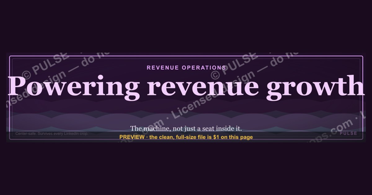
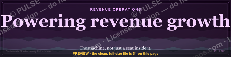
A LinkedIn banner reading "Powering revenue growth" is a 1584×396 cover image that states, in three words, that you own the revenue engine rather than one slice of it. It works because it claims systems-level agency without bravado, and it only holds up when your headline, About section, and posts deliver matching proof.
What the banner is actually claiming and why that matters
Three words on a cover image do more work than most people realize, because LinkedIn's profile layout puts the banner in the single largest uninterrupted rectangle above the fold. On desktop, a visitor sees the banner before they see your name, your headline, or your current company. On mobile — where the majority of LinkedIn browsing now happens — the banner is cropped hard on the sides, so anything you put in the left or right thirds is at risk, and the center is the only reliably safe zone. That constraint alone eliminates most of the busy, text-heavy banners people upload. A short centered phrase over a dark field survives every crop LinkedIn applies.
"Powering revenue growth" is a specific kind of claim, and it's worth being precise about what it says. It does not say you sell. It does not say you market. The verb "powering" points at infrastructure — engines, current, systems that run continuously — which is the vocabulary of revenue operations rather than the vocabulary of individual quota attainment. Someone who says they power revenue growth is implicitly claiming they work on the machine, not just inside it. That's a meaningfully different promise from "top 1% closer" or "helping companies scale," and it attracts a different reader.
The phrase also avoids two failure modes that plague professional taglines. The first is combat language. "Crushing quota," "dominating the market," "hunting deals" — this register reads as aggressive to the exact audience that hires revenue leaders, which skews toward founders, CFOs, and board members who are allergic to swagger. The second failure mode is the opposite: vagueness so complete it says nothing. "Passionate about growth." "Helping businesses succeed." "Connector. Builder. Dreamer." These cost you nothing and earn you nothing. "Powering revenue growth" sits between the two — declarative enough to signal a domain, restrained enough to read as competent.

There's also a breadth argument. The phrase deliberately doesn't say "powering SaaS revenue growth" or "powering enterprise revenue growth." Every qualifier you add narrows the set of people who can imagine you solving their problem. If your practice genuinely is SaaS-only and you want that filter, add it. If you work across manufacturing distributors, professional services firms, and B2B software — which is common for fractional operators and consultants — the unqualified version lets each reader project their own situation onto it. Narrowing is a strategic choice, not automatically an improvement.
Where this matters most is in the moments you never see. Someone gets your name in a referral text. Someone spots your comment on a post and taps through. A recruiter opens forty profiles in a row. In each case you get roughly two seconds of attention before the visitor decides whether to keep scrolling or start reading. The banner is what fills those two seconds. It's not going to close a deal on its own, but it determines whether the rest of your profile ever gets read at all.
The adjacent version of this decision shows up in places beyond LinkedIn. The same three-word positioning line belongs in your email signature, on the title slide of every deck you send, in your Calendly booking page description, and as the sub-headline on a personal site if you have one. Consistency across those surfaces is what turns a banner into a brand. A person who sees "Powering revenue growth" on your LinkedIn cover, then again on the deck you send after the call, has now encountered the same claim twice from two directions — and repetition across contexts is what makes a positioning line stick rather than wash out.
The step-by-step process: from blank canvas to live profile

Building and shipping a banner like this is a short project, but it has a specific order, and skipping steps is why most people's banners look homemade. Here is the full sequence.
Step one: fix the canvas. LinkedIn's personal profile cover is 1584×396 pixels — a 4:1 ratio. Design at exactly that size or at a clean multiple of it (3168×792 works fine and gives you headroom for raster exports). Do not design at some arbitrary size and hope the upload crops gracefully; it won't. If you're working from an SVG, the vector scales to any output resolution without softening, which is why an SVG source is worth keeping even if you only ever ship a PNG.
Step two: define the safe zone. Inside that 1584×396 frame, mentally mark the middle 60% horizontally and the middle 70% vertically. Every glyph you care about goes inside that box. LinkedIn also overlays your profile photo on the lower-left of the banner on desktop, and the overlap is substantial — roughly the leftmost 15% and bottom 40% of the banner in that corner. Anything you place there gets covered by your own face. This is the single most common banner mistake and it's entirely avoidable.
Step three: set contrast before you set style. Dark background, light text is the reliable default because it holds up against both LinkedIn's light and dark interface themes and reads cleanly at the thumbnail sizes used in search results. If you go the other way — light background, dark text — check it against LinkedIn dark mode before committing, because a white banner in dark mode creates a harsh block that draws the eye for the wrong reasons.
Step four: write the line, then cut it. Start with whatever you'd say if someone asked what you do, then compress. "I help B2B companies build predictable revenue systems" becomes "Powering revenue growth." Three to five words is the working range. Past six words, the type has to shrink to fit and you lose the mobile read.
Step five: add the supporting element, sparingly. A single secondary line — a scale, a set of three nouns, a thin pulse motif — gives the composition a second layer without competing. Something like "Efficiency · Trust · Scale" under the main line works because it's parseable in a glance and adds specificity. Two supporting elements is one too many.
Step six: recolor to your brand. If you're starting from a template, swap the accent color to your company or personal palette. Keep the background dark and the primary text high-contrast; the accent is for the motif, the divider, or a single highlighted word.
Step seven: export both formats. PNG for the upload — LinkedIn accepts PNG, JPG, and GIF up to 8MB, and PNG keeps text edges crisp where JPEG compression introduces artifacts around high-contrast lettering. Keep the SVG for future edits.
Step eight: upload and inspect on three surfaces. Load your own profile on desktop, on the LinkedIn mobile app, and in a browser on your phone. All three crop differently. Fix anything clipped before you move on.
Step nine: rewrite the headline in the same breath. The banner and headline are read together as a single unit. If the banner says "Powering revenue growth" and the headline says "Sales Professional," the pair contradicts itself. Make the headline carry the proof: role, range, and one specific credential.
Step ten: propagate. Update the About section's first sentence, then check that your three most recent Experience entries use active revenue language rather than passive responsibility language. "Responsible for revenue growth" describes a job title. "Rebuilt the lead scoring model and lifted qualified pipeline by 40% over four quarters" describes a person who did something. The second version is what the banner is promising, so the profile has to contain it.
Costs, timelines, and what the surrounding work actually runs

The banner itself is close to free, and the honest number is worth stating plainly: a competent DIY banner takes 20 to 45 minutes in Canva, Figma, PowerPoint, or Google Slides, all of which handle a 1584×396 artboard without difficulty. If you start from a pre-made SVG and only recolor and retype it, that drops to five or ten minutes. Canva's free tier covers this entirely; Figma's free tier does too. There is no meaningful reason to pay for a one-off personal banner unless you want custom illustration.
If you do hire out, the market for a single static LinkedIn banner from a freelance designer generally sits in the low hundreds of dollars, with a same-week turnaround for something this simple. A full personal-brand package — banner, headshot retouch, headline and About rewrite, a slide template — is a different scope and prices accordingly higher. Whether that's worth it depends entirely on whether inbound matters to your income. For a salaried IC, probably not. For a fractional operator or consultant whose pipeline is largely referral and inbound, the profile is the storefront and the math changes.
The timeline that actually matters isn't the design time — it's how long before the change does anything. Be realistic here. Editing your profile signals recency to LinkedIn's ranking, and refreshed profiles tend to surface slightly more in search for a short window afterward, but that bump is measured in days, not months. The durable effect comes from human readers, and human readers arrive on your profile at whatever rate your existing activity generates. If you post twice a month and comment rarely, changing the banner changes almost nothing, because almost nobody is looking. If you post two or three times a week and engage in comments daily, the banner is being seen hundreds of times a week and the framing compounds.

So the sequencing advice is: don't treat the banner as the intervention. Treat it as the packaging on an intervention. A reasonable 90-day plan looks like this. Week one: ship the banner, rewrite the headline and the first 100 words of About, and clean up the top three Experience entries. Weeks two through twelve: publish on a fixed cadence about the thing the banner claims — revenue systems, pipeline mechanics, forecast hygiene, comp design, whatever your actual specialty is — and spend fifteen minutes a day leaving substantive comments on other people's posts in your space. The banner makes the profile legible; the activity makes people arrive at the profile in the first place.
On the adjacent spend: the things people commonly buy alongside a banner are a professional headshot and a paid Premium subscription. The headshot is usually the better investment of the two, because it appears in every feed impression, every comment, and every search result, whereas the banner only appears when someone opens your profile. Premium is worth it mainly for the expanded "who viewed your profile" history, which is the single data source you'd use to evaluate whether any of this is working. If you're going to measure, you need that visibility.
One more cost worth naming: switching costs. Once a positioning line is on your banner, in your headline, and in a few dozen posts, changing it means resetting whatever recognition you've built. Pick a line you can live with for a year or more. "Powering revenue growth" is durable precisely because it doesn't tie itself to a company, a stack, a market segment, or a title you might not hold in eighteen months.
Where people get this wrong

The most common failure is the mismatch. Someone uploads a banner that claims revenue leadership while the rest of the profile reads like a job application — passive duty descriptions, no numbers, a headline that's just a title and a company. The banner writes a check the profile doesn't cash, and sophisticated readers notice immediately. If you're going to make a systems-level claim, put at least one hard result within the first hundred words of your About section. Not a vague one. A specific figure, a timeframe, and what you actually changed to produce it.
The second failure is the photo collision. Your profile picture sits on top of the banner's lower-left corner on desktop, and it's a large circle. People center their text at the true geometric center of the 1584×396 canvas, which puts the left edge of the phrase directly behind their own headshot. Preview it. Always preview it.
Third: designing for desktop and never checking mobile. The mobile crop is aggressive, and there is no way to specify separate crops. If your banner has a logo in the far right and a tagline in the far left, mobile users see neither. Center everything you care about.
Fourth: over-decoration. Gradients stacked on patterns stacked on stock photography stacked on three fonts. The reason a plain dark field with one line of type outperforms this is that it's parseable in the fraction of a second it actually gets. Every additional element competes for that fraction. If you can't read the whole banner in under a second at thumbnail size, it's too busy.
Fifth: baking perishable content into the image. Award badges with years on them, "hiring now" callouts, event dates, revenue milestones. These all age, and nobody remembers to update a banner. A banner that says "Speaking at [Conference] 2024" in the middle of 2026 does active damage — it signals abandonment. Keep the image evergreen and put time-sensitive material in the Featured section, where updating it takes ten seconds.
Sixth, and this one is subtler: treating the banner as the strategy rather than as one artifact of it. A cover image cannot generate demand. It can only convert attention that already arrived. If nothing is generating that attention — no posting, no commenting, no outbound, no speaking, no referrals — then an excellent banner sits on a page nobody visits. The order of operations is generate attention first, then make sure the profile converts it. Reversing that order is the most expensive mistake on this list, because it feels productive while producing nothing.

Seventh: inconsistency across surfaces. If your LinkedIn says "Powering revenue growth" and your website says "Fractional sales leadership" and your email signature says "Growth consultant," you've built three weak brands instead of one strong one. Pick the line, then propagate it everywhere.
Finally, a note on measurement discipline. If you want to know whether the banner did anything, decide the metric before you change it, not after. The three worth tracking are profile-view-to-connection-request rate, the share of inbound messages that reference something specific about your work rather than generic outreach, and whether the people viewing your profile hold the titles you want to reach. That third one is the most informative and the least tracked. Ten views from CROs and founders is worth more than two hundred from unrelated recruiters, and only the composition of your viewer list tells you which you're getting.
Deciding what to put on your own banner
The right banner depends on what you're using LinkedIn for, and there are really only four common situations. Work through them honestly rather than defaulting to whatever looks nicest.
If you're job-seeking, the banner's job is to make you findable and legible to recruiters scanning quickly. Lead with the function and the level you want next, not the one you currently hold. Add a geography or work-arrangement note if it's a real constraint. Skip the aspirational manifesto — recruiters are matching against a requisition, and clarity beats personality here.
If you're selling services — fractional executive, consultant, advisor, agency owner — the banner should state the outcome you produce, which is exactly what "Powering revenue growth" does. Outcome language beats capability language. "Powering revenue growth" is an outcome. "Revenue operations consulting" is a capability. Buyers shop for outcomes.
If you're building an audience around a topic, the banner should name the topic and, ideally, the cadence. Something that tells a first-time visitor what they'll get if they follow you and how often. This is the one case where a call to action on the banner earns its space.
If you're an employee representing a company, the calculus changes. Many organizations provide branded banner templates, and using them is usually the right call — it builds recognizable coherence across the team and takes the design decision off your plate. If your company doesn't provide one, a clean personal line that's compatible with your role is fine, but avoid implying you speak for the company in ways your role doesn't support.
A useful gut check across all four cases: read your banner line out loud, then ask whether a stranger could guess your job from it. "Powering revenue growth" passes — a stranger correctly infers you work on the commercial engine of a business. "Turning vision into reality" fails; it could describe an architect, a wedding planner, or a management consultant. If the line survives the stranger test and your profile can back it up, ship it and leave it alone for a year.
Related questions
What size should a LinkedIn banner be?
Personal profile covers are 1584×396 pixels, a 4:1 ratio. Company page cover images use a different spec, so don't reuse the same file for both. PNG keeps high-contrast text crisp; JPEG introduces compression artifacts around lettering.
Will my profile photo cover part of the banner?
Yes. On desktop, the profile photo overlays the banner's lower-left area, and the overlap is significant. Keep all critical text in the horizontal and vertical center. Always preview the live profile on desktop and mobile before considering it done.
Should I put my contact information on the banner?

Generally no. It ages, it clutters the composition, and LinkedIn already provides a contact info field. If you want a call to action visible, the Featured section handles it better and takes seconds to update when it changes.
Does changing the banner improve my search ranking?
Only marginally and only briefly. Profile edits signal recency, which can nudge visibility for a short window. The durable benefit is conversion — the banner improves what happens after someone arrives, not how many people arrive.
How often should I redesign it?
Rarely. Recognition compounds, and resetting it costs you that. Change it when your positioning genuinely changes — a new market, a new offer, a new role — not on a schedule.
FAQ
What does "Powering revenue growth" actually communicate to a visitor?
It communicates that you work on the revenue engine as a system rather than on one function inside it. The verb implies infrastructure and continuous operation, which reads as operations-minded rather than quota-minded. It's broad by design — it lets a reader in manufacturing, software, or professional services each imagine you solving their version of the problem, instead of filtering them out with a vertical qualifier.
Is a text-only banner better than one with a photo or graphic?
For most professional use, yes. The banner is seen at small sizes and for very short durations, and a plain dark field with one high-contrast line is parseable instantly. Photography and layered graphics add visual load that competes with the message. A single restrained motif — a thin line, a small mark, a subtle accent — adds polish without cost. Stacked effects don't.
Do I need design software to make one?
No. Canva, Figma, Google Slides, and PowerPoint all handle a 1584×396 artboard fine, and all four export a usable PNG. If you start from an existing SVG template, you can recolor it and swap the text in a few minutes without knowing anything about design. Keep the vector source file so future edits don't require rebuilding from scratch.
Should the banner match my company's branding or my own?
If you're an employee and your company provides a template, use it — team-wide visual consistency is worth more than individual expression, and it removes a decision. If you're independent or your employer has no template, use your own palette, but keep the background dark and the type high-contrast so it reads in both LinkedIn light and dark themes.
How do I tell whether the banner is working?
Pick your metrics before you change anything. Track the ratio of profile views to connection requests, the share of inbound messages that reference your specific work rather than generic outreach, and — most usefully — the job titles of the people viewing your profile. A shift in viewer composition toward the roles you want to reach is the clearest signal. Give it 90 days; shorter windows are noise.
What should the headline say if the banner says "Powering revenue growth"?
Something concrete enough to substantiate it. Role, scope, and one credential works well: the function you perform, the revenue range or company stage you work with, and a proof point — a prior title, a specific result, or a named specialty. The banner makes the claim at the level of positioning; the headline is where the claim gets evidence attached to it.
Sources
- https://www.linkedin.com/help/linkedin/answer/a563012 — LinkedIn Help: adding and editing a background photo on your profile
- https://business.linkedin.com/marketing-solutions/blog — LinkedIn Marketing Solutions blog, platform and content guidance
- https://www.linkedin.com/business/talent/blog — LinkedIn Talent Blog, recruiter search and profile visibility
- https://hbr.org/topic/subject/sales-and-marketing — Harvard Business Review, sales and marketing research
- https://www.mckinsey.com/capabilities/growth-marketing-and-sales/our-insights — McKinsey growth, marketing, and sales insights
- https://www.gartner.com/en/sales — Gartner sales and revenue technology research
- https://www.forrester.com/blogs/category/b2b-marketing/ — Forrester B2B marketing and revenue research
- https://www.sba.gov/business-guide/grow-your-business — U.S. Small Business Administration, growing your business
- https://www.canva.com/create/linkedin-banners/ — Canva LinkedIn banner sizing and templates
- https://www.figma.com/resource-library/ — Figma design resource library
Related on PULSE
This page will be disappearing soon. Save it to your device for $1 — or read it free while it is here.
@Kory-White- · if Venmo asks, the last 4 of my number are 2012
This page is gone.
This one is off the shelf now. $1 keeps it on your phone for good — the whole page, pictures and diagrams included.
 graphicHead of Sales — LinkedIn Banner
 graphic"Pipeline is the product." — LinkedIn Banner
 graphicStartup Founder — LinkedIn Banner
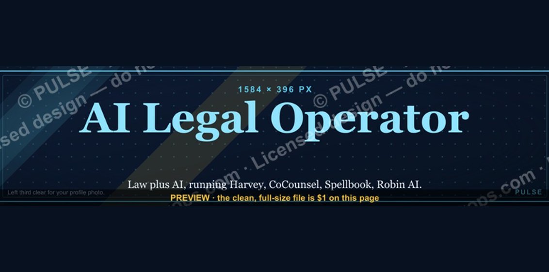 graphicAI Legal Operator — LinkedIn Banner
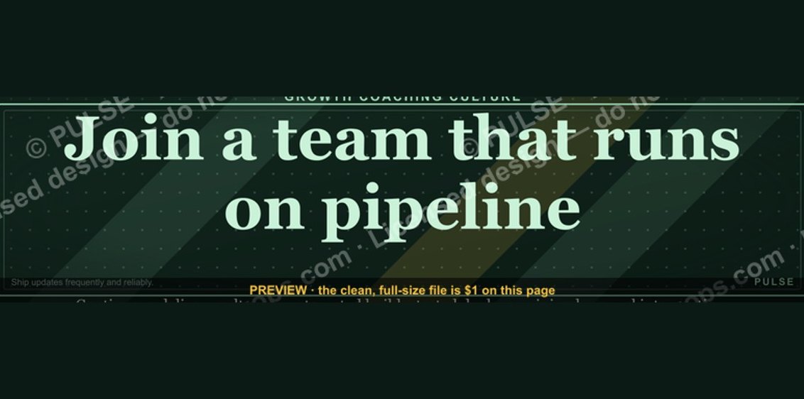 graphic“Join a team that runs on pipeline.” — LinkedIn Banner
 graphicHow to build a champion champion plan in 2027?
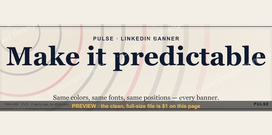 graphicMake it predictable. — LinkedIn Wallpaper
 graphicCommercial Director — LinkedIn Banner
 graphicHow to design a LinkedIn banner that converts viewers into leads in 2027?
 graphicLLM Builder AI Engineer — LinkedIn Banner