


AI Customer Support Operator — LinkedIn Banner
Quality
Certified
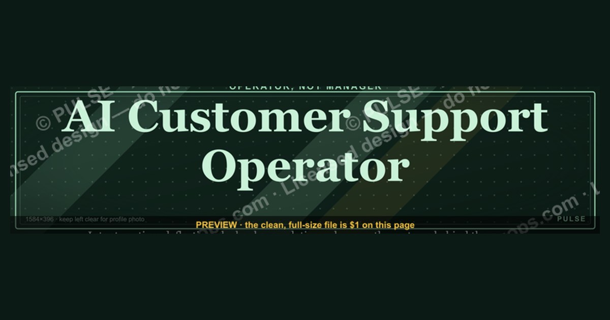
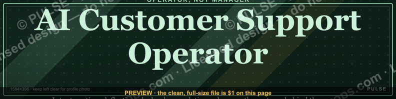
An AI Customer Support Operator LinkedIn banner is a 1584×396 px profile header that states the role, the platforms you run, and one measurable support outcome. Design it around the safe zone the profile photo does not cover, use high-contrast sans-serif type large enough to survive mobile downscaling, and export SVG or PNG.
The profile that gets scrolled past
Picture an operator who spent two years running an autonomous support deployment — tuning intent routing, writing the deflection playbook, cutting escalation volume by a third — and whose LinkedIn header is the default abstract blue mesh LinkedIn assigns by default. A hiring manager filtering for conversational-AI experience lands on the profile, sees a generic gradient, reads a headline that says "Customer Support Manager," and moves to the next result. Nothing on that page said what the person actually operates.
That is the specific failure this page addresses. The banner is the single largest visual element on a LinkedIn profile — roughly 1584 pixels wide against a 400-pixel profile photo — and on most profiles it carries zero information. It is the only piece of profile real estate that renders before a visitor scrolls, before they read the About section, before they open the experience entries. If it is blank, the profile opens with a blank.
The framing that matters: treat the banner as a label, not as decoration. An AI Customer Support Operator sits at an unusual intersection — part support practitioner, part systems operator, part prompt and knowledge-base engineer. Recruiters searching for that skill set do not have a settled title to search on. They search "Intercom," "Zendesk AI," "conversational AI," "support automation," "deflection." Your headline and About section carry the searchable text; the banner carries the confirmation. Someone who arrives from a keyword search should see a header that says, in three seconds, "yes, this is the person who does that."
A useful test before you design anything: open your own profile on a phone, take a screenshot, crop it to just the top third, and show it to someone outside your function. Ask them what the person in the profile does for a living. If they cannot answer from the header alone, the banner is not carrying information. Most operator profiles fail this test, which is precisely why a well-built one stands out — the bar in this niche is low and the fix takes an afternoon.
The second failure mode is a banner that carries too much. Operators who know they should use the space sometimes fill it with a platform logo wall, four icons, a tagline, a CTA, and a URL. On a desktop viewport that reads as busy. On a phone, where the banner is downscaled to roughly a fifth of its authored width, it reads as noise — indistinguishable colored smudges. The banner has room for about seven to ten words of legible text and one visual element. Everything past that is decoration competing with the message.
How the banner actually moves a viewer
The mechanism is simpler than most design advice suggests. A LinkedIn profile view is a short funnel with a hard drop-off at the top, and the banner sits above the drop-off. A visitor arrives from search, a feed post, a connection request, or a shared link. The first render shows banner, photo, name, and headline. From there the visitor either scrolls into the About section and experience entries — the content that actually qualifies you — or leaves.

The banner's only job is to survive that first render with a signal attached. It does not close anyone. It does not replace the About section. It buys the scroll.
Three structural facts drive that diagram.
The safe zone is not the whole canvas. The profile photo overlaps the bottom-left of the banner, and the name and headline block sits directly beneath and partially over the lower-left region. On the standard 1584×396 canvas, treat roughly the leftmost 400 pixels and the bottom 100–150 pixels as unusable for anything you need read. The dependable region runs from roughly x=450 to x=1250, vertically centered. Anything critical outside that band gets clipped, covered, or cropped depending on viewport.
LinkedIn re-crops for viewport. The banner is not a fixed 4:1 frame everywhere. Narrower viewports crop horizontally, which eats the right edge first. So the far-right zone is fine for a secondary element — a logo mark, a small accent shape — but not for the load-bearing word. Center-weight your message and let the edges be decorative.
Downscaling is brutal on type. A 1584-pixel-wide banner rendered on a phone lands somewhere near 320–400 pixels wide, a reduction of roughly 4–5×. Type set at 24pt on the authored canvas becomes effectively 5–6pt on the phone. That is unreadable. This is the single most common failure in operator banners and the reason the type-size guidance later in this page is aggressive.
Once those three constraints are respected, the banner works mechanically: it renders, it is legible, it names a role and a platform, and the visitor scrolls with a frame already in place for everything below. The About section then reads as confirmation instead of introduction.
Dimensions, type sizes, and file specs worth knowing
Concrete numbers, because this is where most banners break.
Canvas. 1584 × 396 pixels, a 4:1 ratio. Author at exactly that size. Uploading smaller forces upscaling and soft edges; uploading larger invites unpredictable cropping. If you want extra sharpness on high-density displays, author at 2× (3168 × 792) and export down to 1584 × 396 rather than uploading the 2× file.
Safe zone. Keep primary text inside roughly x=450 to x=1250 and y=60 to y=300. That leaves a comfortable margin on all four sides and clears the profile photo and name overlay. If you place a company logo, the region near x=1300–1500 works, accepting that narrow viewports may crop it.
Type sizes on the 1584-wide canvas. Primary line (the role): 48–64 px. Secondary line (platform or outcome): 28–36 px. Tertiary line, if you use one at all: 22–28 px, and consider dropping it entirely. Below about 22 px on this canvas, text stops surviving the mobile downscale. A quick check: view the exported file at 25% zoom on your monitor. That approximates the phone rendering. Anything you cannot read at 25% will not be read by a phone visitor.

Line count. Two lines is the reliable maximum for a banner meant to be read on mobile. Three is possible if the third line is short and high-contrast. Four is a wall.
Contrast. Aim for a contrast ratio at or above 4.5:1 between text and its immediate background — the WCAG AA threshold for normal text, and a reasonable floor even though a banner is not body copy. Large display type can sit at 3:1 and remain legible, but headroom helps when the image is downscaled and re-compressed. Pure black backgrounds are needlessly harsh; a very dark neutral in the #16–#22 range reads cleaner. If your text sits over a gradient, check contrast at both ends of the gradient, not just the midpoint.
Color space. RGB, always. LinkedIn is screen-only, and a CMYK export will render dull and shifted.
File format. PNG is the safest upload — lossless, no font-rendering surprises, universally handled. JPEG introduces compression artifacts that show up as fringing around text edges, which is exactly where the damage is most visible. SVG is excellent as your working format because it scales without loss and lets you recolor and re-export, but convert text to paths or restrict yourself to widely available system fonts before any SVG handoff, since custom-font references can fall back unpredictably in renderers you do not control. The common workflow: keep the SVG as source, export PNG for upload.
File size. LinkedIn's image upload ceiling is generous relative to what a banner needs. A vector-derived PNG at 1584 × 396 with flat colors and a gradient typically lands well under 500 KB. If yours is measured in megabytes, you have raster photography embedded where vector shapes would do — and that photography is the thing that will look soft after downscaling anyway.
Alt text. LinkedIn provides an alt-text field on the banner. Use it. Describe the visual and repeat the key claim: "Dark navy banner. Text reads: AI Customer Support Operator — Zendesk AI and Intercom — 24/7 deflection." It serves screen-reader users and costs nothing.
Typeface. Neutral sans-serif families — Inter, Source Sans, Helvetica, system-ui stacks — hold up at small rendered sizes because their letterforms stay open. Avoid thin and hairline weights entirely; a 100 or 200 weight that looks elegant at full size disappears at 25%. Medium to bold, 500–700, is the working range for banner display type.
What to actually put on it, and what to leave off
The content decision is a triage: role, platform, outcome, name, logo, CTA, URL — you have room for two or three of those, not seven.
Role first. "AI Customer Support Operator" is the anchor line. It is also the phrase this page is about, so use it verbatim if it matches your work. If your actual title differs, use the title that a person searching would type, not the one HR assigned. A banner reading "Support Operations Lead II" tells a visitor about an internal grade ladder, not about what you do.

Platform second, if it is a differentiator. Naming the systems you run is genuinely useful in this niche, because tooling experience is not transferable in the way general support experience is. Someone who has run a production deployment on a specific vendor's agent has knowledge that a generic support manager does not. Name the platforms you have actually operated. Do not list platforms you have watched a demo of — this is a claim a first interview will test in about ninety seconds.
Outcome third, only if you can source it. An outcome line is the highest-value element on the banner and the easiest to get wrong. If you have a real, defensible number from your own work — a deflection rate, a first-contact resolution figure, a reduction in escalation volume — put it on the banner and be ready to explain how it was measured. If you do not have one, leave the line off. An unsourced number on a public profile is a liability that surfaces in the interview where it costs the most. A vague claim is worse than no claim: "improving customer experience" is what every support profile on the platform says, and it differentiates nothing.
What to leave off. Your name — LinkedIn already renders it directly below in a larger, higher-contrast treatment; repeating it burns the safe zone. Contact details — the profile has fields for those, and a phone number baked into an image is unscrapeable, unclickable, and permanent. Long URLs — nobody types a URL from an image. A dense wall of platform logos — trademark-sensitive, visually noisy, and unreadable after downscaling; the words are clearer than the marks. Stock photography of a headset — it is the visual cliché of the category and signals nothing about automation work.
On CTAs. A call-to-action in a banner is a static image, not a link. "Book a demo" in an image cannot be clicked. If you want a CTA, the featured link and the profile's website field are the mechanisms that actually work; the banner can point toward them ("Availability in featured section"), but the click has to land somewhere real.
A worked example. Line one, 56 px, white on dark navy, centered in the safe zone: "AI Customer Support Operator." Line two, 32 px, in a muted accent color: "Intercom · Zendesk AI · Deflection & Escalation Design." One geometric accent shape on the left of the safe zone, well clear of the profile photo. Nothing else. Two lines, twelve words, one shape. That is a complete banner and it reads at 25% zoom.
Consistency with the rest of the profile. If the banner says "AI Customer Support Operator" and the headline says "Customer Success Manager," the visitor resolves the contradiction by trusting neither. Align the banner line, the headline, the About opening sentence, and the current role title. Four elements telling one story reads as deliberate; four elements telling four stories reads as someone mid-pivot who has not finished thinking.
Choosing a build path: template, vector source, or commissioned design
There is no single correct production route. The trade-off is time versus control versus how much you will change it later.
Template editors get you a banner in twenty minutes. The cost is that template-derived banners are recognizable as template-derived — the same layouts circulate widely, and a visitor who has seen the layout twice this week reads yours as generic. Templates are the right call when the banner is a placeholder you will replace, or when the alternative is leaving the default in place indefinitely. Something specific beats nothing by a wide margin.
An editable vector source is the best default for an operator who expects to iterate. Keep an SVG with the text as live text and the palette as named fills. Changing a platform name, swapping an outcome figure, or recoloring for a new employer becomes a two-minute edit and a re-export rather than a rebuild. This is also the format that survives moving between design tools. The overhead is one afternoon of initial setup.
Commissioned design is worth it when the banner is one asset in a system — a personal brand with a site, a deck, a newsletter header — and consistency across all of them has value. For a single LinkedIn header, the cost and turnaround usually exceed the return.
A fourth path worth naming: a pre-made vector graphic you recolor. Free graphic libraries publish operator-role banners at correct LinkedIn dimensions as SVGs designed to be recolored. The layout and safe-zone work is already done; you set your palette, replace the platform line, export PNG. It splits the difference — faster than building from scratch, more control than a locked template, and it starts from correct dimensions rather than a canvas you have to configure. The trade-off matches the template path: the underlying layout is shared, so the differentiator has to be your text.
Whichever path you pick, the gate at the bottom of the diagram is the one that matters. Export, view at 25%, and read it. Fail that check and no amount of production polish saves the banner.
Where these banners go wrong
Text placed under the profile photo. The most common error. The designer works in a tool with no LinkedIn overlay guide, centers the text horizontally, uploads, and discovers the first four characters live behind the avatar. Always preview on a live profile — LinkedIn's upload flow shows the crop with the photo in place before you commit.
Type too small. Second most common, and it stems from designing at 100% zoom on a large monitor where 20 px looks perfectly readable. It is not readable at phone scale. The 25%-zoom check catches this in five seconds and almost nobody runs it.
Low contrast in service of aesthetics. Light gray text on a mid-gray gradient looks refined in the design tool and vanishes after LinkedIn's compression and downscaling. If you are attached to a subtle palette, keep the palette and add a solid or semi-opaque panel behind the type. You can have the muted look and readable text; you cannot have muted text.

Over-claiming. A percentage on a public profile is a claim you will be asked to substantiate. Numbers you cannot walk through — the measurement window, the denominator, what counted as a resolution — turn a strength into an interview liability. If the figure came from a vendor's marketing page rather than your own instrumentation, it is not your number and it does not belong on your banner.
Stale content. A banner naming a platform you stopped working with two roles ago actively misdirects. It pulls inbound inquiries toward work you no longer want and away from work you do. Set a calendar reminder — twice a year is enough — to confirm the banner still matches what you actually do.
Confusing the banner with the whole profile. The banner cannot carry a case study, and attempts to make it do so produce dense unreadable headers. The About section carries the narrative. The experience entries carry the evidence. The featured section carries the artifacts. The banner carries a label. Each element doing its own job outperforms one element trying to do all four.
Ignoring the revenue framing. Support operations is frequently read as a cost center, which shapes how the role gets budgeted and how the operator gets compensated. An operator who can connect automation work to retention, expansion, or churn reduction is describing revenue impact rather than ticket throughput — and that framing lands harder with hiring managers and executives than a deflection percentage does on its own. It rarely fits in a banner line, but it belongs in the About section directly beneath, and the banner should set it up rather than undercut it.
Not checking both viewports. Desktop and mobile render the banner differently enough that a design can pass one and fail the other. After upload, open your own profile in a desktop browser and on a phone. Two minutes, and it catches cropping and legibility problems that no amount of in-tool preview will surface.
Related questions
What size should a LinkedIn banner be?
1584 × 396 pixels, a 4:1 ratio, exported in RGB. Author at exactly that size, or at 2× and export down. Keep critical text inside roughly x=450–1250 horizontally to clear the profile photo overlap and viewport-dependent edge cropping.
Should the banner include my name?
No. LinkedIn renders your name directly beneath the banner in large, high-contrast type. Repeating it consumes the safe zone without adding information. Use the space for your role, the platforms you operate, or a defensible outcome instead.
PNG or SVG for a LinkedIn banner?
Keep SVG as your editable source — it recolors and re-exports without loss. Upload PNG, which is lossless and free of the font-substitution risk that SVG can carry across renderers. Avoid JPEG, whose compression artifacts show up worst around text edges.
How often should I update it?

Twice a year is enough for most operators, plus any time your platforms or role change materially. A banner naming tooling you no longer run misdirects inbound interest. Rotating more frequently than quarterly rarely produces a measurable difference in profile activity.
Can I put a call-to-action button on it?
You can draw one, but it will not be clickable — the banner is a static image. Use the profile's website field and featured section for actual links. The banner can reference them, but any click has to land on a real link element.
FAQ
Does a better banner actually change how many people view my profile?
The banner does not affect whether you appear in search results — that is driven by your headline, skills, experience text, and connection graph. What it affects is what happens after someone arrives. Treat it as a conversion element on an existing stream of visitors, not as a way to generate more of them.
Should I name the specific platforms I run?
In this niche, usually yes. Tooling experience for autonomous support is not fully transferable, and someone who has run a production deployment knows things a general support manager does not. Name only platforms you have actually operated, since that claim gets tested early in any real conversation.
What if I do not have a metric to put on the banner?
Leave it off. Role plus platform is a complete and honest banner. An unsourced or borrowed number is worse than no number — it converts a strength into something you have to defend, and the defense happens in the interview where the cost is highest.
Is a stock photo of a headset or a call center a reasonable background?
It is the visual cliché of the category and it works against you. It signals traditional contact-center work rather than automation and systems operation, and photographic backgrounds lose detail badly under LinkedIn's downscaling. A flat or gradient background with clean type reads sharper at every viewport.
How do I check that the banner works on mobile without a phone handy?
View the exported file at 25% zoom on your monitor. That approximates the mobile rendering scale closely enough to catch the two failures that matter — type too small and contrast too low. It is not a substitute for checking on an actual device after upload, but it catches most problems before you commit.
Does any of this apply to a company page banner?
The dimensions differ and the overlay geometry differs, so do not reuse the file. The principles carry: respect the safe zone, size type for downscaling, keep contrast high, and say one thing clearly. Check the current company-page specification before authoring, since it is not the same 1584 × 396 canvas.
Sources
- https://www.linkedin.com/help/linkedin/answer/a570393 — LinkedIn Help: adding and editing a profile background photo
- https://www.linkedin.com/help/linkedin/answer/a563024 — LinkedIn Help: profile photo and image guidelines
- https://www.w3.org/WAI/WCAG21/Understanding/contrast-minimum.html — W3C: minimum contrast (WCAG 2.1 SC 1.4.3)
- https://developer.mozilla.org/en-US/docs/Web/SVG — MDN Web Docs: SVG reference and rendering behavior
- https://developer.mozilla.org/en-US/docs/Web/Media/Formats/Image_types — MDN Web Docs: image file type and format guide
- https://www.nngroup.com/articles/photos-as-web-content/ — Nielsen Norman Group: how users attend to images versus decorative visuals
- https://www.nngroup.com/articles/how-long-do-users-stay-on-web-pages/ — Nielsen Norman Group: how long users stay before leaving a page
- https://web.dev/articles/serve-images-webp — web.dev: image format and compression trade-offs
Related on PULSE
This page will be disappearing soon. Save it to your device for $1 — or read it free while it is here.
@Kory-White- · if Venmo asks, the last 4 of my number are 2012
This page is gone.
This one is off the shelf now. $1 keeps it on your phone for good — the whole page, pictures and diagrams included.
 graphicAI Legal Operator — LinkedIn Banner
 graphicOffensive Security Pentest CRO — LinkedIn Banner
 graphicSpeech-to-Text Operator — LinkedIn Banner
 graphic"Pipeline is the product." — LinkedIn Banner
 graphicProduct Marketing Lead — LinkedIn Banner
 graphicLLM Builder AI Engineer — LinkedIn Banner
 graphicHow to design a LinkedIn banner that converts viewers into leads in 2027?
 graphic“A confused buyer never buys.” — LinkedIn Banner
 graphicSales Recruiter — LinkedIn Banner
 graphic“Process over pressure.” — LinkedIn Banner