
“Sell the meeting, not the demo.” — Quote Card
 Curated byKory White · Fractional CRO · Maryland
 PULSEKNOWLEDGE LIBRARY
Quality
Certified
This is a 1600×500 px banner that reads "Sell the meeting, not the demo." in bold white serif type on a charcoal background with a thin gold rule top and bottom — the Pulse quote-card style. It's built to sit at the top of a sales Slack channel, a training deck, or a monitor lock screen as a standing reminder that the meeting, not the demo, is the thing worth selling.
A rep opens the wrong tab first
Picture a new SDR two weeks into ramp. A prospect replies to a cold email with "sure, happy to chat." The rep books 30 minutes, and because the CRM makes it one click to attach a demo link to the invite, that's exactly what goes out: "Product Demo — Acme Corp x [Prospect]." The prospect shows up expecting a screen share. The rep, following the calendar title, opens the product and starts clicking through screens before asking a single question about what the prospect actually does, what's broken, or who else needs to sign off.
Fifteen minutes in, the prospect says "this looks fine, send me pricing" and drops off the call. No discovery happened. The rep has no idea if this is a 50-seat deal or a 5-seat deal, whether there's a competing vendor already in a trial, or whether the person on the call can even approve a purchase. The demo was flawless. The deal is dead.

This is the exact failure mode the banner exists to interrupt. It's not decoration — teams hang it where reps see it before they build the invite, so the instinct to lead with "demo" gets caught before it becomes a calendar title. The fix isn't a better demo script; it's renaming the meeting, reordering the first ten minutes, and treating the screen share as something you earn partway through the call rather than something you open with.
What's on the banner and how the message lands
Element by element, the graphic carries three things. The headline — "Sell the meeting, not the demo." — sits centered in heavy white type, large enough to read at thumbnail size in a Slack sidebar or a shared drive preview. A thin gold rule brackets the quote top and bottom, matching the Pulse accent system used across the rest of the graphics library, so it reads as part of a set rather than a one-off image. The background is solid charcoal, deliberately plain, so the quote is the only thing competing for attention — no logo, no chart, no photo.
The mechanism behind why this works as a physical object (not just a saying) is repetition-in-the-environment: a rep who reads the line once in a training deck forgets it by the second call of the week. A rep who sees it every morning in a pinned Slack message or a monitor background absorbs it as a default, the same way a "measure twice, cut once" sign in a workshop changes behavior without anyone re-reading it consciously each time.
Specs, format, and where the numbers matter
The banner ships at 1600×500 px, a 3.2:1 ratio built to drop straight into a Slack channel header image, a Notion page banner, or the top strip of a Google Slides training deck without cropping. It's available as an SVG (fully scalable, recolorable, no quality loss at any size) and exports to PNG for anywhere that only accepts raster images — a wiki page, an email signature banner, or a printed poster for a sales bullpen wall.
If you need it for a LinkedIn personal banner instead, the ratio doesn't match — LinkedIn's cover photo crops to roughly 1584×396, close enough that most image tools will letterbox or crop the sides, so use the dedicated LinkedIn Banner version (gb0289) rather than force-fitting this one. For a Slack channel header, Slack itself resizes any upload to its own dimensions, so the native 1600×500 is oversized safety margin, not a hard requirement — a smaller export at the same ratio (800×250, 400×125) will look identical after Slack's compression.
On the discovery-call side, the number that matters isn't printed on the banner but is the reason it exists: teams that reorder the first part of a call toward questions typically hold that discovery window to somewhere in the 15-20 minute range before any screen share, long enough to surface budget, timeline, and stakeholders without turning the call into an interview. That's a process number, not a claim about this graphic's performance — the banner's job is to keep that ordering front of mind, nothing more.
Where to hang it, and where it backfires
The banner earns its keep in internal-facing spots: a pinned Slack message in the SDR or AE channel, the title slide of a new-hire sales onboarding deck, a printed sign taped near a sales floor, or a shared-drive thumbnail that shows up when someone opens the "sales enablement" folder. In every one of those places it's doing the same job — sitting in the rep's environment so the instinct changes before the calendar invite gets typed.
It backfires the moment it leaves the internal audience. Never attach it to a prospect-facing email or put it on a slide a customer will see — from the outside, a banner instructing your own team how to sell reads as a slogan about manipulation, not a process reminder, and undermines the exact trust you're trying to build in that first meeting. It also backfires as a substitute for training: a team that hangs the graphic but never actually changes the calendar-invite title, the call agenda, or the qualifying questions asked in the first ten minutes has decoration, not a process change. The alternative to hanging a static banner is baking the same instruction into the CRM template itself — renaming the default meeting type from "Demo" to "Discovery Call" — which is more durable but doesn't carry the same daily visual reminder a wall-mounted or Slack-pinned graphic does. Most teams that get real use out of this run both: the banner for visibility, the template rename for enforcement.
Customizing it for your own team
The color picker above the download button lets you recolor the banner to your own brand palette and swap the background, including a transparent option for layering onto an existing slide template — all without a watermark or sign-up. Teams running this in a company deck typically match the charcoal to their own dark-mode brand color and keep the gold rule as a neutral accent, or drop the rule entirely if it clashes with an existing style guide.
The wording itself is editable too, and several teams adapt the base line to their own sales motion: "Sell the discovery, not the deck," or "Sell the diagnosis, not the demo," for teams whose first call is explicitly framed as a technical assessment. Whatever the wording, keep it to one short line — the format is built around a single quotable sentence, and a two-line rewrite will overflow the safe text area and get clipped on export.
Two pitfalls come up most often. First, low contrast: swapping the charcoal background for a light or mid-tone color without checking that the white headline text still reads clearly against it — always preview the export before dropping it into a live channel. Second, aspect-ratio mismatch: cropping the 1600×500 file down to a square for an Instagram post squeezes or clips the headline instead of resizing it proportionally; for square placements, use the SVG and let it re-render at 1:1 rather than cropping the PNG.
Related questions
Should the demo ever come first on a call?
Only when the prospect is deep in a self-serve or transactional flow and has already done their own research — for anything with multiple stakeholders or a real budget conversation, discovery should come before any screen share.
What do I put in the calendar invite instead of "Demo"?
Use a discovery-oriented title like "Working session: [Prospect]'s current process" — it sets the expectation that the call is a conversation, not a scheduled performance.
How long should discovery run before showing anything?
Most reps hold it to the first 15-20 minutes of a 30-45 minute call, long enough to surface the real problem without turning the whole meeting into an interview.
Does this apply to inbound leads who already asked for a demo?
Yes — even an inbound request benefits from two or three framing questions before the screen share, so the demo that follows is aimed at the actual gap instead of a generic walkthrough.
FAQ
What size is this banner and what format does it come in? It's 1600×500 px, available as a scalable SVG or a PNG export — the SVG recolors and resizes with no quality loss, while the PNG is ready for tools that only accept raster images.
Can I use this banner in a customer-facing email or proposal? No — it's built as an internal reminder for your own sales team and reads as strange or manipulative if a prospect sees it; keep it in Slack, onboarding decks, or internal signage.
Can I change the colors to match my company's brand? Yes, use the color picker above the download button to recolor the text, background, and accent rule, including a transparent background option, before exporting.
Is there a version of this sized for a LinkedIn banner? Yes, that's a separate asset (gb0289) built at LinkedIn's cover-photo ratio — this 1600×500 version is meant for Slack, decks, and internal signage rather than a personal profile banner.
Do I need to credit Pulse or pay to use this graphic? No — it's free to use with no attribution required and no watermark added to the export.
Will hanging this banner actually change how my reps sell? Only if it's paired with an actual process change, like renaming the default meeting type in your CRM and restructuring the first ten minutes of the call — the graphic works as a daily visual reminder, not a substitute for training.
Sources
- https://www.gartner.com/en/sales/insights/b2b-buying-journey
- https://hbr.org/topic/subject/sales
- https://www.salesforce.com/resources/articles/sales-discovery-questions/
- https://blog.hubspot.com/sales/sales-discovery-call
- https://www.mckinsey.com/capabilities/growth-marketing-and-sales/our-insights
- https://www.forrester.com/blogs/category/b2b-sales/
- https://www.linkedin.com/business/sales/blog/sales-strategy/sales-discovery-call-questions
Related on PULSE
This page will be disappearing soon. Save it to your device for $1 — or read it free while it is here.
@Kory-White- · if Venmo asks, the last 4 of my number are 2012
This page is gone.
This one is off the shelf now. $1 keeps it on your phone for good — the whole page, pictures and diagrams included.
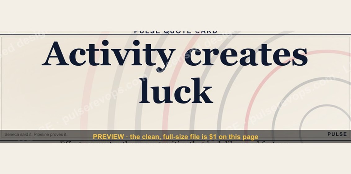 graphic“Activity creates luck.” — Quote Card
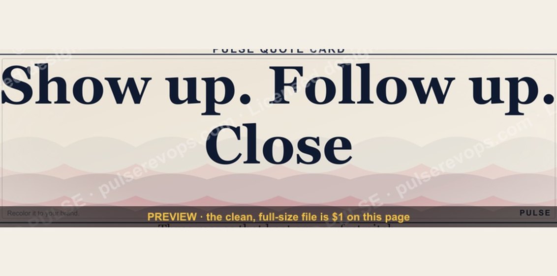 graphic“Show up. Follow up. Close.” — Quote Card
 graphic“The fortune is in the follow-up.” — Quote Card
 graphic“Pressure off. Pipeline on.” — Quote Card
 graphic“Data beats opinions.” — Quote Card
 graphic“Discovery is the deal.” — Quote Card
 graphic“Listen more. Pitch less.” — Quote Card
 graphic“A forecast is a promise, not a guess.” — Quote Card
 graphic“Revenue follows relationships.” — Quote Card
 graphic“Make the buyer the hero.” — Quote Card