
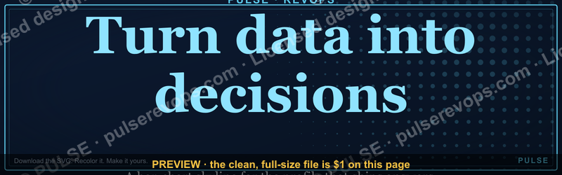
Turn data into decisions. — LinkedIn Wallpaper
 Curated byKory White · Fractional CRO · Maryland
 PULSEKNOWLEDGE LIBRARY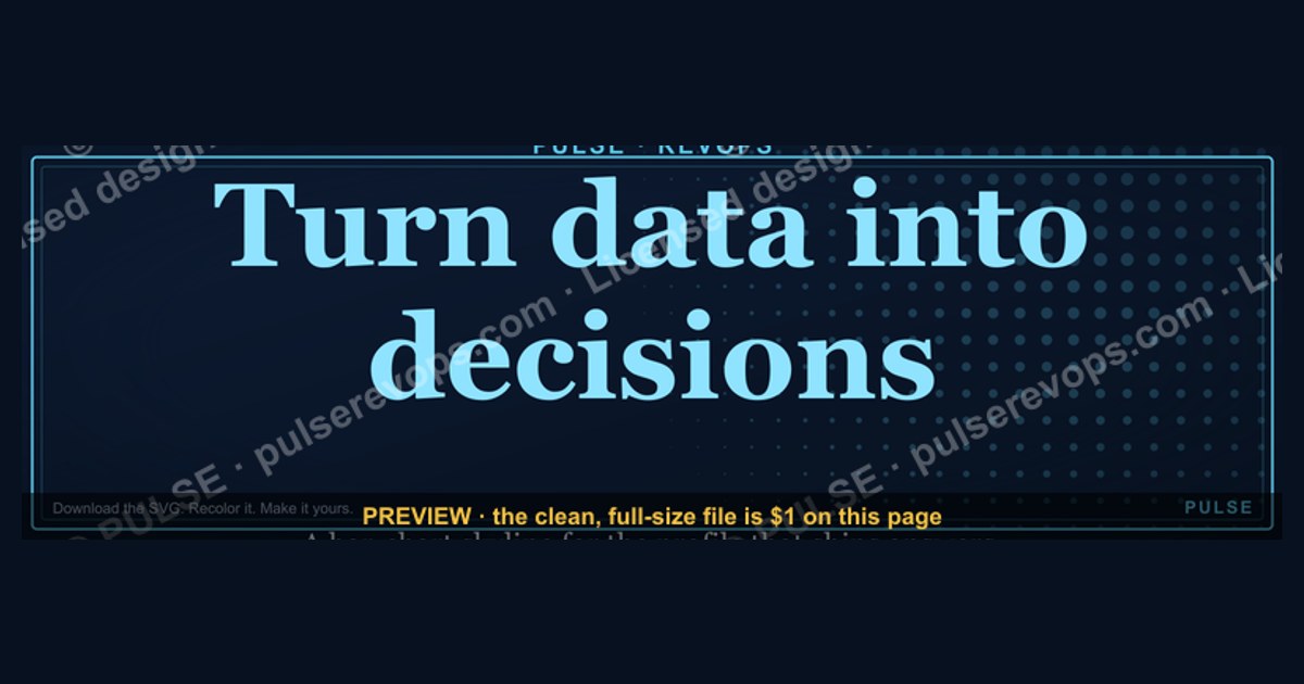
Use this LinkedIn wallpaper as a visual anchor to signal a data-driven mindset. It serves as a professional backdrop that reinforces the goal of transforming raw information into actionable insights. The design typically ranges from clean infographics to abstract data flows, suitable for roles in analytics, strategy, or leadership.
Turn data into decisions. — LinkedIn Wallpaper

A dark, on-brand LinkedIn cover wallpaper — a bar-chart skyline backdrop with a "Turn data into decisions." line and the Pulse mark. A clean, branded banner for your profile.
Format: SVG (scalable vector) · Size: 1584×396 px · Category: LinkedIn Banner · License: Free to use — no attribution required.
Recolor it to your brand
Use the color picker above to recolor this banner to your team or company colors, switch the background (including transparent), then download it as an SVG or PNG. No sign-up, no watermark.

How to use it
It scales cleanly to the LinkedIn cover slot (1584×396) — download the PNG and drop it straight onto your profile, or open the SVG in Canva, PowerPoint, or Figma to add your name and tweak the layout.
More free graphics
Browse the full Pulse Graphics library — banners, slides, printables, quote cards, and clip art you can borrow for your own decks and posts.

Related on PULSE
- Turn interest into revenue. — LinkedIn Wallpaper
- Data beats opinions. — LinkedIn Wallpaper
- Synthetic Data Generator — LinkedIn Banner
- SIEM and Data Lake CRO — LinkedIn Banner
- “Data beats opinions.” — Quote Card
- "Data beats opinions." — LinkedIn Banner
Designing a Data-Driven Personal Brand on LinkedIn
Your LinkedIn profile is more than a digital resume—it’s a living portfolio of your analytical mindset. When you choose a wallpaper like “Turn data into decisions,” you’re signaling to recruiters, clients, and peers that you operate with evidence, not instinct. But a single image isn’t enough. To truly own that message, you need to weave data literacy into every layer of your profile.
Start with your headline. Instead of “Marketing Manager,” try “Marketing Manager | Turning Campaign Data into 30%+ ROI Improvements.” That small shift tells a story. Your about section should follow suit: lead with a specific metric-driven achievement, then explain how you approach problems. For example: “I helped a B2B SaaS company reduce customer churn by 18% in six months by analyzing usage patterns and implementing targeted onboarding triggers.” That’s not bragging—it’s evidence.
Your experience bullets should prioritize numbers over adjectives. Replace “Managed social media accounts” with “Grew LinkedIn engagement by 240% over 12 months using A/B-tested content strategies.” Every bullet becomes a mini case study. And don’t forget the skills section—list analytical tools like SQL, Tableau, Python, or Google Analytics. Endorse others in these areas too; reciprocity matters.
The wallpaper itself should complement your narrative. A dark, minimalist bar chart works because it’s professional and uncluttered. Avoid overly complex visuals—your audience scans profiles in seconds. Pair it with a banner that includes a subtle call to action, like “Let’s talk data-driven growth.” That invites conversation without being pushy.
Finally, use LinkedIn’s “Featured” section to pin a post or article that demonstrates your analytical thinking. Maybe a breakdown of how you used cohort analysis to improve retention, or a visualization of industry trends. This turns your wallpaper from a static image into a gateway to your expertise. The goal isn’t just to look data-savvy—it’s to prove you are.
The Psychology Behind Visual Data Storytelling
Why does a bar-chart wallpaper work? Because humans are wired to process visuals faster than text. Research suggests that people retain 65% of information when it’s paired with an image, compared to just 10% from text alone. On LinkedIn, where attention spans hover around 8–10 seconds per profile visit, that visual advantage is critical.
A bar chart specifically triggers pattern recognition. Our brains automatically compare heights, spot outliers, and search for trends—even subconsciously. When you place a chart in your banner, you’re priming visitors to think analytically about you. They start seeing you as someone who organizes chaos into clarity. That’s a powerful first impression.
But the psychology goes deeper. Dark backgrounds with bright accent colors (like the blue or orange in many data visualizations) convey authority and focus. They suggest a serious, no-nonsense approach. Light, pastel backgrounds, by contrast, feel approachable but less decisive. Choose your palette based on the emotion you want to evoke. For data roles, dark + high-contrast is usually the sweet spot.
The shape of the chart matters too. Bar charts are democratic—easy to read, universally understood. Avoid pie charts (they distort proportions) or 3D effects (they add noise). Stick to clean, 2D bars. If you’re showcasing growth, use an upward trend line. If you’re comparing categories, use horizontal bars for easier scanning. Every design choice should reduce cognitive load, not increase it.
Finally, consider the placement of text within your wallpaper. If you overlay words like “Turn data into decisions,” make sure they’re legible against the chart. Use sans-serif fonts (like Inter or Roboto) at a size that’s readable on mobile. Test your wallpaper on both desktop and mobile views—many LinkedIn users browse on phones. A chart that looks perfect on a 27-inch monitor might be illegible on a 6-inch screen. Always preview before publishing.
Practical Frameworks for Turning Raw Data into Actionable Decisions
The phrase “turn data into decisions” sounds great, but how do you actually do it day-to-day? Here are three frameworks that work across industries, from marketing to operations to product development.
Framework 1: The OODA Loop (Observe, Orient, Decide, Act) Originally developed by military strategist John Boyd, this cycle is perfect for fast-moving environments. Start by observing your data—pull reports, look for anomalies. Then orient: what context matters? Are there seasonal trends? Competitor moves? Next, decide on one clear action based on your analysis. Finally, act quickly. Then loop back to observe the results. On LinkedIn, you can reference OODA in posts to show strategic thinking.
Framework 2: The ICE Score (Impact, Confidence, Ease) When you have too many potential decisions and limited resources, use ICE. For each option, rate it 1–10 on Impact (how much will it move the needle?), Confidence (how sure are you of the data?), and Ease (how fast or cheap is it to implement?). Sum the scores and prioritize the highest. This is especially useful for A/B testing ideas or feature prioritization. Share your ICE matrix in a LinkedIn carousel post to demonstrate structured thinking.
Framework 3: The 5 Whys + Data Root cause analysis often stops at one or two “whys.” But when you layer in data, you get deeper. Example: Sales are down. Why? Because leads aren’t converting. Why? Data shows the drop happens after the demo. Why? Because demo follow-up emails have a 12% open rate. Why? Because subject lines aren’t personalized. Why? Because the CRM doesn’t capture industry data. Now you have a specific fix—update CRM fields—instead of a vague “improve sales.” Use this framework in your LinkedIn articles to show systematic problem-solving.
Each framework works best when you pair it with a visual. A simple flowchart or table in your wallpaper or post can make the process tangible. Remember: the goal isn’t to overwhelm with complexity—it’s to show that you have a repeatable, logical method. That’s what “turn data into decisions” really means: not magic, but process.
Building a Culture of Data-Driven Decisions (Even as an Individual Contributor)
You don’t need a team or a title to champion data-driven decisions. Even as an individual contributor, you can influence your organization by modeling the behavior. Start small: in every meeting, ask “What data supports that?” or “How would we measure success?” These questions shift conversations from opinion-based to evidence-based.
Create a personal “data dashboard” for your own work. Track three to five key metrics relevant to your role weekly. For a content creator, that might be engagement rate, click-through rate, and lead conversions. For a project manager, it could be on-time delivery percentage, budget variance, and stakeholder satisfaction. Share your dashboard with your manager during one-on-ones. It shows initiative and makes your impact visible.
Document your wins with data. When you improve a process, write a brief case study: the problem, the data you analyzed, the action you took, and the result. Save these in a folder. They become powerful LinkedIn content later. A post like “How I reduced reporting time by 15 hours/month using Python” gets far more engagement than generic advice.
Finally, be transparent about data limitations. No dataset is perfect. Acknowledge sample sizes, biases, or missing variables. This builds trust. On LinkedIn, a post that says “Here’s what the data says—and here’s what it doesn’t tell us” positions you as a thoughtful analyst, not a blind number-cruncher. That nuance is rare and respected.
When your entire profile—from wallpaper to posts to comments—reflects this mindset, you become the person people think of when they need data-driven insights. And that’s the real goal: not just a wallpaper, but a reputation.
Psychology of the Design
The "Turn data into decisions." wallpaper leverages visual hierarchy to prime viewers for analytical thinking. The bar-chart skyline acts as a subconscious cue for structure and growth, while the bold text anchors the message without clutter. For best impact, pair this banner with a profile headline that echoes data fluency—like "Data-Driven Strategist" or "Analytics Leader"—to create a cohesive personal brand narrative across your entire profile.
Practical Variations for Different Roles
- For analysts: Use the SVG to overlay your specific metrics or KPIs (e.g., "97% forecast accuracy") in the empty space near the right edge.
- For managers: Replace the generic bar chart with your team's actual quarterly trend line (using the color picker to maintain brand consistency).
- For consultants: Add a subtle client logo or industry icon in the bottom-right corner to signal domain expertise without overwhelming the clean design.
Common Mistakes to Avoid
- Overcrowding: Resist adding more than one extra element—the wallpaper's power is its simplicity.
- Wrong dimensions: Ensure your final export stays exactly at 1584×396 px; LinkedIn will crop anything outside this ratio.
- Low contrast text: If you recolor the background, verify the "Turn data into decisions." line remains readable against the new hue (aim for a contrast ratio of at least 4.5:1).
Sources
- Harvard Business Review — data-driven decision-making frameworks and case studies
- McKinsey & Company — analytics and business strategy insights
- LinkedIn Learning — courses on data analysis and decision-making skills
- Tableau — data visualization and business intelligence resources
- MIT Sloan Management Review — research on data-driven management
- Gartner — market analysis and best practices for data-driven decisions
FAQ
What does "Turn data into decisions" actually mean for a LinkedIn profile? It means using your profile analytics, engagement metrics, and content performance to guide your networking and posting strategy. Instead of guessing what resonates, you let the numbers—like post impressions, profile views, and connection growth—inform your next move. The goal is to replace hunches with actionable insights.
Do I need to be a data scientist to apply this approach? Not at all. The tools LinkedIn provides, such as Creator Analytics and profile visitor data, are designed for non-technical users. You only need to check a few key metrics weekly—like which posts get the most comments or which industries your visitors come from—and adjust your content or outreach accordingly.
How often should I check my LinkedIn data to make better decisions? A weekly review of your top-performing posts and profile views is usually enough to spot trends. Daily checks can lead to over-analysis without meaningful change. Consistency matters more than frequency—set aside 10–15 minutes each week to decide what to repeat, stop, or test.
Can this approach help me get more job offers or clients? Yes, when you use data to tailor your profile and content to your target audience. For example, if you see that posts about industry trends drive more messages from recruiters, you can double down on that topic. The data won’t guarantee results, but it removes guesswork and increases your odds over time.
What if my LinkedIn data shows low engagement—should I still post? Low engagement is itself a data point worth acting on. It might mean your content isn’t reaching the right people, your headlines need work, or your posting frequency is off. Use the numbers to experiment—try different formats, times, or topics—and track what changes. Even small improvements compound.
Is it worth paying for LinkedIn Premium to get better data? Premium gives you extra insights like who viewed your profile in the last 90 days and more detailed analytics. For active job seekers or sales professionals, it can be worth the monthly cost—typically in the range of $30–$60—if you actually use the data to refine your approach. For casual users, the free analytics are often sufficient.
This page will be disappearing soon. Save it to your device for $1 — or read it free while it is here.
@Kory-White- · if Venmo asks, the last 4 of my number are 2012
This page is gone.
This one is off the shelf now. $1 keeps it on your phone for good — the whole page, pictures and diagrams included.
 graphicCustomer Success — LinkedIn Banner
 graphic“Hire slow. Ramp fast.” — LinkedIn Banner
 graphicStartup Founder — LinkedIn Banner
 graphic“Revenue for marketing tech.” — LinkedIn Banner
 graphicStay in the deal. — LinkedIn Wallpaper
 graphicBring the energy. — LinkedIn Wallpaper
 graphic“Trusted advisor, never a vendor.” — LinkedIn Banner
 graphic“Clarity closes.” — LinkedIn Banner
 graphicAI Observability Operator — LinkedIn Banner
 graphic“Bring the energy every call.” — LinkedIn Banner