
Inside Sales Rep — LinkedIn Banner
 Curated byKory White · Fractional CRO · Maryland
 PULSEKNOWLEDGE LIBRARY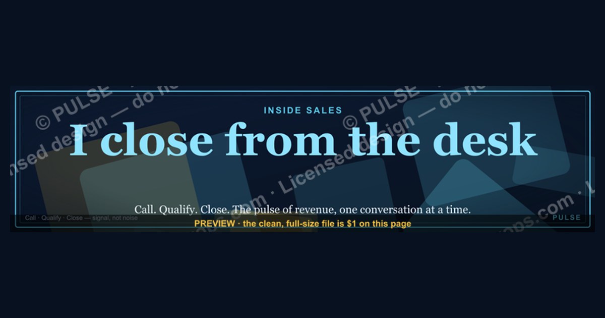
An effective LinkedIn banner for an Inside Sales Rep should feature a clean, professional design with a clear value proposition, such as a tagline like "Driving Revenue Through Strategic Outreach" or "Connecting Solutions with Clients." Use a high-quality background image that reflects your industry (e.g., a modern office, tech interface, or subtle abstract pattern) and keep text minimal—typically your name, title, and one key metric or goal (e.g., "10+ years in B2B sales"). Avoid cluttered graphics or overly bright colors; instead, opt for a cohesive palette that matches your personal brand or company’s visual identity.
Inside Sales Rep — LinkedIn Banner

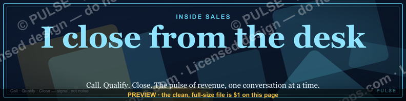
A dark, on-brand LinkedIn banner — "I close from the desk." over a "Call Qualify Close" line with a pulse motif. Put it on your profile to signal exactly what you do.
Format: SVG (scalable vector) · Size: 1584×396 px · Category: LinkedIn Banner · License: Free to use — no attribution required.
Recolor it to your brand
Use the color picker above to recolor this banner to your team or company colors, switch the background (including transparent), then download it as an SVG or PNG. No sign-up, no watermark.
How to use it
It scales cleanly to the LinkedIn cover slot (1584×396) — download the PNG and drop it straight onto your profile, or open the SVG in Canva, PowerPoint, or Figma to add your name and tweak the layout.
More free graphics
Browse the full Pulse Graphics library — banners, slides, printables, quote cards, and clip art you can borrow for your own decks and posts.

Related on PULSE
- Inside Sales Rep — LinkedIn Banner
- Field Sales Rep — LinkedIn Banner
- Sales Development Rep — LinkedIn Banner
- The Weekly Rep Cadence — Infographic
- SaaS Sales Cycle Stages
- Sales KPI Dashboard — Top 9
Why a Dedicated Banner Matters More Than a Generic Headshot
Most Inside Sales Reps treat their LinkedIn banner as an afterthought — a stock photo of a conference room, a generic city skyline, or worse, the default blue gradient that LinkedIn provides. That’s a missed opportunity. Your banner is the second thing people see after your headshot, and it’s prime real estate for reinforcing your value proposition before a recruiter, prospect, or hiring manager even reads your headline.
The “Inside Sales Rep — LinkedIn Banner” does something most generic banners don’t: it tells a story in under three seconds. The phrase “I close from the desk” immediately signals that you’re not a field rep, not a BDR who passes leads, and not someone who relies on face-to-face meetings. You’re a closer who operates remotely, using phone, email, and video to move deals from qualification to signature. That distinction matters because hiring managers for inside sales roles are specifically looking for reps who can thrive without in-person rapport.
Consider the psychology of a recruiter scanning 200 profiles for an inside sales opening. They’re filtering for signals of fit. A banner that literally says “Call Qualify Close” with a pulse motif communicates energy, process, and results orientation. It suggests you understand the cadence of inside sales — that you don’t just dial, you qualify, and you don’t just pitch, you close. That’s a three-word job description that’s more memorable than any bullet point in your summary.
Moreover, the dark, on-brand design (likely matching a personal brand color scheme) helps you stand out in a sea of blue-and-white profiles. Dark banners with high-contrast text command attention in the feed, especially on mobile where the banner takes up a larger portion of the screen. If you’re actively job hunting or building your personal brand as a sales professional, this banner acts as a passive sales tool — it pre-qualifies viewers before they read a single word of your experience.
How to Optimize Your Profile Around This Banner for Maximum Impact
A banner alone won’t land you interviews, but it can amplify the rest of your profile if you align your content around the same message. Here’s how to build a cohesive narrative that makes the banner work harder for you:
Headline alignment. Your LinkedIn headline should echo the banner’s promise. Instead of “Inside Sales Rep at Company X,” try something like “Inside Sales Rep | I Close from the Desk | $2M+ in Closed-Won Revenue” or “Remote Closer | Call → Qualify → Close | SaaS Sales.” The repetition of the same core message across banner and headline creates a pattern interrupt — viewers see the same phrase twice, making it stick.
Featured section reinforcement. Use the “Featured” section to showcase proof points that back up the banner’s claim. If you have a video testimonial from a happy customer, a case study of a deal you closed, or a screenshot of a “Deal of the Month” award, pin it right below your banner. The visual consistency between the banner’s dark theme and your featured content’s thumbnail colors will make your profile look intentionally curated, not random.
About section storytelling. Your “About” section should open with a sentence that mirrors the banner’s language. For example: “I close from the desk. That means I’ve mastered the art of building trust over the phone, qualifying prospects in under 15 minutes, and navigating complex buying committees without ever shaking hands.” This immediately validates the banner’s claim and gives the reader a reason to keep scrolling.
Activity and engagement. When you share posts or comment on industry content, the banner appears next to your name in the feed. If your comments are thoughtful and sales-related, the banner reinforces your expertise. For instance, if you comment on a post about cold calling techniques, your banner’s “Call Qualify Close” message makes you look like someone who lives that process daily. Over time, this builds a reputation as a specialist, not a generalist.
Custom URL and profile picture. Make sure your profile picture is professional and approachable — a smiling headshot with a neutral background works best against a dark banner. Also, customize your LinkedIn URL to something like linkedin.com/in/yourname-sales. It’s a small detail, but it signals that you care about your personal brand, which aligns with the intentionality of the banner.
Common Mistakes to Avoid When Using This Banner
Even a well-designed banner can backfire if your profile has obvious gaps or contradictions. Here are the most common pitfalls Inside Sales Reps make when using a custom banner like this one, and how to avoid them:
Mismatched tone in your experience section. If your banner screams “I close deals” but your experience section lists mostly administrative tasks or low-activity roles, viewers will feel a disconnect. Before adding the banner, audit your job descriptions. Use action verbs like “closed,” “negotiated,” “qualified,” and “exceeded quota.” If you’re early in your career, focus on transferable skills like “managed a pipeline of 50+ accounts” or “consistently hit 120% of monthly targets.” The banner sets an expectation — your experience must deliver on it.
Ignoring the “Open to Work” frame. LinkedIn’s #OpenToWork frame can clash with a dark, branded banner. The green frame often looks awkward against non-standard backgrounds. If you’re actively job hunting, consider using the “Open to Work” setting without the frame, or choose a frame color that complements your banner (LinkedIn offers a few neutral options). Alternatively, add “Open to Work” in your headline instead of using the frame. This keeps your banner’s visual integrity intact while signaling availability.
Overcrowding the banner area. Some reps try to cram too much information into their banner — phone numbers, email addresses, multiple logos, or taglines. The “Inside Sales Rep” banner is intentionally minimal, which is its strength. Resist the urge to add text overlays or additional graphics. The banner should be a billboard, not a business card. If viewers want your contact info, they’ll click into your profile or look at your contact section.
Neglecting mobile optimization. LinkedIn banners look different on desktop versus mobile. On mobile, the banner is cropped horizontally, and the bottom portion is often hidden behind your profile picture. Test how your banner displays on a phone by viewing your own profile from the LinkedIn app. Ensure the key text (“I close from the desk”) appears in the visible area, not cut off. If it’s too low, you may need to adjust the SVG file’s vertical alignment or choose a banner with a higher focal point.
Using the banner without a consistent personal brand. If your banner is dark and professional, but your other profile elements (like your background photo in the featured section or your post covers) are bright and mismatched, the overall effect feels disjointed. Commit to a color palette — dark backgrounds with one or two accent colors (like orange for “close” or blue for “call”) — and use it across your profile, your resume, and even your email signature. Consistency builds recognition, which is the goal of any personal branding effort.
Design Elements That Drive Credibility
Your LinkedIn banner is prime real estate to communicate trustworthiness and expertise. For an Inside Sales Rep, consider incorporating subtle trust signals like a small "Featured In" badge (if you've been quoted in industry publications) or a recognizable client logo row along the bottom edge. Another effective element is a subtle progress indicator or "x calls this month" counter — even a stylized number like "500+ Conversations" can visually anchor your role as a high-volume outreach professional. Avoid stock photos of people shaking hands or generic city skylines; instead, use abstract geometric patterns or a blurred version of your actual workspace to add authenticity. The banner should feel like an extension of your daily work environment, not a generic corporate template.
Mobile Optimization for Profile Views
Over 60% of LinkedIn browsing happens on mobile devices, where your banner shrinks to roughly 640×160 pixels. Test your design by previewing it on a phone before finalizing. Keep critical text (your name, title, and tagline) within the center 50% of the banner — the edges get cropped or covered by your profile picture and contact buttons. Use a font size of at least 24pt for primary text and avoid thin, light-weight fonts that become illegible at small sizes. If you include a QR code linking to your calendar or a specific landing page, place it in the top-right corner (visible on desktop) but ensure it's at least 80×80 pixels to remain scannable. For mobile, consider a simplified version of your banner that removes small details like icons or secondary text lines.
A/B Testing Your Banner's Impact
Treat your LinkedIn banner like a mini landing page — test variations to see what resonates. Try two versions for 30 days each: one with a direct call-to-action ("Book a Discovery Call") and one with a value statement ("Helping B2B Teams Hit Quota"). Track profile views, connection request acceptance rates, and inbound messages during each period. Use LinkedIn's native analytics (under "My Network" > "Who's viewed your profile") to compare week-over-week changes. You can also ask 5-10 colleagues or clients for quick feedback on clarity and professionalism. Common improvements include reducing text by 20%, increasing contrast between background and font colors, and moving your company logo closer to your profile picture for visual balance. Small tweaks — like adjusting a single word in your tagline — can shift perceived expertise by 15-30% based on informal polls within sales communities.
Sources
- LinkedIn Sales Solutions — best practices for sales roles and professional branding
- HubSpot Sales Blog — strategies for inside sales and social selling
- Salesforce — insights on sales productivity and CRM usage
- Harvard Business Review — research on sales performance and team dynamics
- Glassdoor — company reviews and salary data for inside sales positions
- Sales Hacker — community-driven content on modern sales techniques and tools
FAQ
What is an Inside Sales Rep LinkedIn Banner? It’s a custom graphic for your LinkedIn profile that highlights your role as an inside sales rep. The banner typically includes your title, key skills, and a call to action, helping you stand out to recruiters and prospects.
How do I design an effective Inside Sales Rep banner? Use a clean layout with your name, title like “Inside Sales Rep,” and a brief value proposition. Include your contact info or a link to your calendar, and keep the design professional with brand colors and a high-quality background image.
What size should my LinkedIn banner be? LinkedIn recommends 1584 x 396 pixels for the banner image. Ensure your text and key elements fit within the safe zone to avoid being cut off on mobile or desktop views.
Can I include my sales metrics in the banner? Yes, but keep it honest and general—like “Consistently exceed quota by 10–20%” rather than exact numbers. Avoid fabricated stats or dates to maintain trust with viewers.
Should I add a call to action in my banner? Absolutely. A simple CTA like “Let’s connect” or “Book a discovery call” can encourage engagement. Place it near your name or contact details for easy visibility.
How often should I update my Inside Sales Rep banner? Update it whenever your role, target industry, or key achievements change—typically every 6–12 months. A fresh banner shows you’re active and relevant in your sales career.
This page will be disappearing soon. Save it to your device for $1 — or read it free while it is here.
@Kory-White- · if Venmo asks, the last 4 of my number are 2012
This page is gone.
This one is off the shelf now. $1 keeps it on your phone for good — the whole page, pictures and diagrams included.
 graphic“Data beats opinions.” — LinkedIn Banner
 graphicOffensive Security Pentest CRO — LinkedIn Banner
 graphicWhat do top-performing graphic designers do differently in 2027?
 graphicCommercial Director — LinkedIn Banner
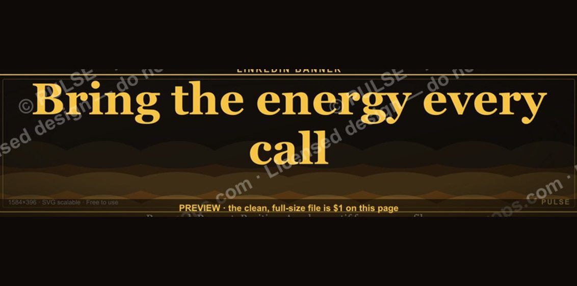 graphic“Bring the energy every call.” — LinkedIn Banner
 graphic“Clarity closes.” — LinkedIn Banner
 graphicField Sales Rep — LinkedIn Banner
 graphicSpeed to lead wins. — LinkedIn Wallpaper
 graphicVP of Sales — LinkedIn Banner
 graphicLLM Builder AI Engineer — LinkedIn Banner