
“Win or learn. Never lose.” — LinkedIn Banner
 Curated byKory White · Fractional CRO · Maryland
 PULSEKNOWLEDGE LIBRARY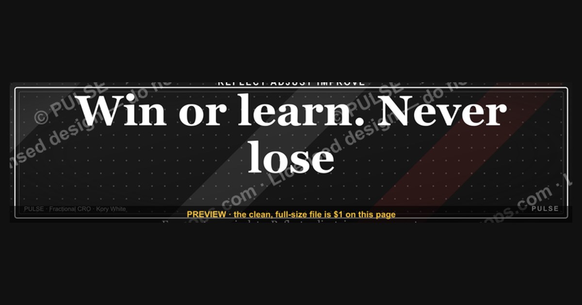
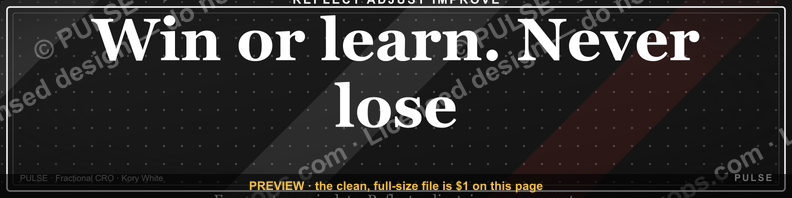
This banner quote reframes failure as a learning opportunity, suggesting that every outcome—whether a win or a setback—provides valuable experience for growth. It encourages a mindset where there is no true loss, only lessons that move you forward. Use it on your LinkedIn profile to project resilience, a growth-oriented attitude, and a professional commitment to continuous improvement.
“Win or learn. Never lose.” — LinkedIn Banner

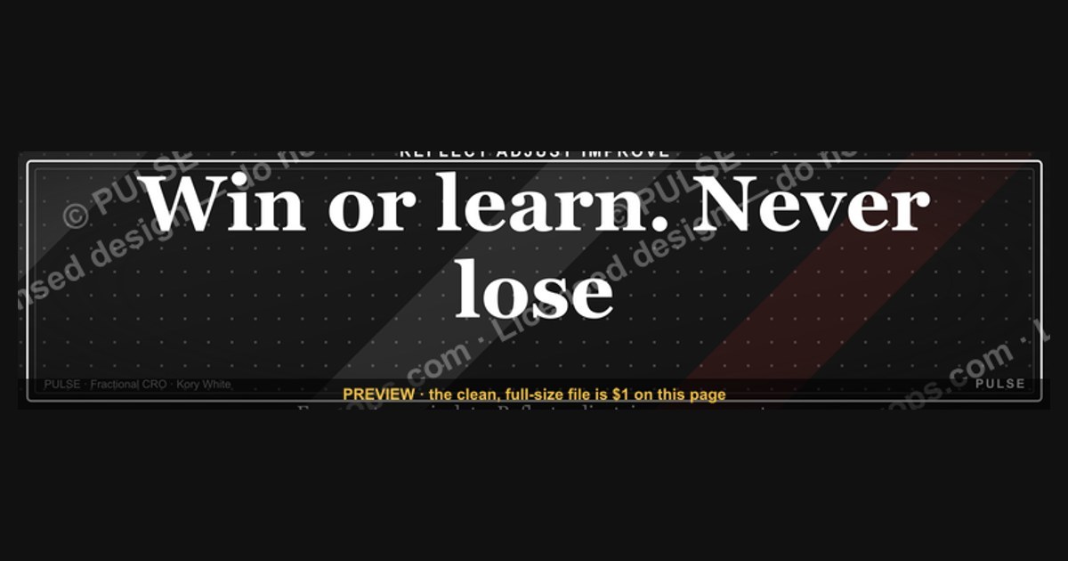
A dark, on-brand LinkedIn banner — "Win or learn. Never lose." over a "Reflect Adjust Improve" line with a pulse motif. Put it on your profile to signal exactly what you do.
Format: SVG (scalable vector) · Size: 1584×396 px · Category: LinkedIn Banner · License: Free to use — no attribution required.
Recolor it to your brand
Use the color picker above to recolor this banner to your team or company colors, switch the background (including transparent), then download it as an SVG or PNG. No sign-up, no watermark.
How to use it
It scales cleanly to the LinkedIn cover slot (1584×396) — download the PNG and drop it straight onto your profile, or open the SVG in Canva, PowerPoint, or Figma to add your name and tweak the layout.
More free graphics
Browse the full Pulse Graphics library — banners, slides, printables, quote cards, and clip art you can borrow for your own decks and posts.
Related on PULSE
- “A confused buyer never buys.” — Quote Card
- “A confused buyer never buys.” — LinkedIn Banner
- “Never give without a get.” — LinkedIn Banner
- “Trusted advisor, never a vendor.” — LinkedIn Banner
- Win Rate by Segment Bar Chart
- Win Rate by Stage Bar Chart
Why This Mindset Resonates on LinkedIn (And Why It Works)
The phrase “Win or learn. Never lose.” isn’t just motivational wallpaper — it’s a psychological anchor that aligns with how high-performers actually process setbacks. On LinkedIn, where your profile is a living resume and personal brand statement, this banner signals something specific to recruiters, clients, and peers: you’re not afraid of failure, you’re just data-driven about it.
Research in growth mindset psychology (Carol Dweck’s work, for instance) shows that framing outcomes as “learning opportunities” rather than “losses” increases resilience and long-term performance. The banner visually reinforces this by placing “Win or learn” as the dominant text, with “Never lose” as the punchline — a subtle but powerful hierarchy. It tells the viewer: *I’ve been through tough projects, missed targets, or failed launches, and I came out smarter.*
For industries where rejection is frequent — sales, startups, consulting, creative fields — this banner acts as a silent credibility marker. A sales leader with this banner isn’t saying they never lost a deal; they’re saying they extracted value from every lost deal. A founder with this banner implies they’ve pivoted, iterated, and grown through early-stage turbulence. It’s a conversation starter that bypasses the usual “I’m a results-driven professional” cliché.
The dark, minimalist design also matters. Dark backgrounds on LinkedIn banners tend to stand out against the platform’s default white/blue interface, increasing visual dwell time. Combined with the pulse motif (a subtle heartbeat or wave line), it suggests continuous motion — not stagnation, not ego, just forward momentum. That’s exactly the vibe you want when someone lands on your profile for the first time.
How to Pair This Banner with Your Profile Content for Maximum Impact
A banner alone won’t transform your LinkedIn presence — it needs reinforcement in your headline, about section, and activity. Here’s a practical playbook for making “Win or learn. Never lose.” work as a cohesive brand statement:
1. Mirror the language in your headline. If you’re using this banner, your headline should echo the learning-forward mindset. Instead of “CEO at X Corp,” try “Building [Company] | Win or Learn Mindset | Turning Setbacks into Systems.” This creates instant thematic resonance when someone scrolls from your banner to your name.
2. Use the “Featured” section to showcase a learning story. Pin a post or article where you publicly dissect a failure or near-miss. Title it something like “The Deal I Lost (And What It Taught Me About Pricing)” or “My Biggest Product Mistake — and the 3 Changes That Followed.” The banner primes viewers to expect this kind of vulnerability; the featured post delivers it.
3. Align your activity with the “Reflect Adjust Improve” subtext. The banner’s second line isn’t decoration — it’s a process. Your LinkedIn activity should demonstrate this cycle. Post a reflection on a quarterly result (Reflect), share a tactical change you’re making (Adjust), and later follow up with the outcome (Improve). This turns your profile into a living case study of the banner’s philosophy.
4. Avoid over-polishing your “About” section. The banner suggests you’re comfortable with imperfection. If your About section reads like a sterile resume, you create cognitive dissonance. Instead, lead with a short, honest narrative: “I’ve built three companies. Two succeeded. One taught me more than both combined. This banner is my reminder that every outcome is raw material.” That’s authentic to the banner’s tone.
5. Use the banner as a filter for your network. This isn’t for everyone — and that’s the point. The banner subtly repels people who value only pristine success stories, while attracting those who respect the grind. If you’re in a leadership role, this can actually improve the quality of inbound messages (fewer “I want to pick your brain” requests from people who don’t understand your journey).
The Design Psychology Behind the Pulse Motif and Dark Aesthetic
The banner’s visual elements aren’t arbitrary — they’re engineered to trigger specific subconscious responses in viewers. Understanding this helps you defend your choice (if asked) and leverage it more intentionally.
The dark background (typically a deep charcoal or near-black gradient) serves multiple purposes. First, it creates a “frame” effect — the banner feels like a window into a mindset rather than a flat graphic. Second, dark backgrounds are statistically associated with premium, high-stakes environments in design psychology (think luxury brands, financial services, or tech startups). It signals seriousness without being aggressive. Third, on mobile (where most LinkedIn browsing happens), dark banners reduce glare and eye strain, keeping viewers on your profile longer.
The pulse motif — often a subtle wave, heartbeat line, or concentric circles — is the banner’s secret weapon. In visual communication, pulse patterns represent life, rhythm, and continuity. They’re used in medical monitors, music visualizers, and fitness trackers. By embedding this motif, the banner communicates: *This isn’t a static lesson; it’s a living practice.* The pulse suggests that “Reflect Adjust Improve” isn’t a one-time exercise but a continuous loop — exactly what growth-minded professionals want to project.
Typography choices matter too. The “Win or learn” text is typically bold, sans-serif, and slightly larger than the subtext. This creates a clear hierarchy: the mindset comes first, the process second. The lack of decorative fonts keeps it readable at small sizes (important for LinkedIn’s mobile thumbnail view) and avoids looking like a generic motivational poster from a corporate training room.
The color palette (usually white text on dark background with a single accent color, often gold, teal, or red) is intentionally restrained. Too many colors would dilute the message. The accent color — if present — is usually applied to the pulse motif or the “Never lose” line, drawing the eye to the most emotionally charged part of the phrase. This is classic attention-engineering: the viewer’s gaze lands on the promise of invincibility (“Never lose”) after processing the conditional (“Win or learn”).
Practical sizing note: The 1584×396 px format is LinkedIn’s standard banner dimension, but it’s worth checking your profile on both desktop and mobile after uploading. On mobile, the banner is cropped to a horizontal strip — your key text (especially “Win or learn”) should be centered and within the safe zone (roughly the middle 60% of the canvas). If you’re customizing the SVG, test it by viewing your profile on a phone before making it permanent.
A final design tip: If you’re using this banner, consider matching your profile photo’s color temperature to the banner. A warm-toned photo (slightly orange or golden) against a cool dark banner creates contrast without clashing. Avoid photos with bright backgrounds or busy patterns — they’ll compete with the banner’s minimalist message. The goal is visual coherence: the banner, your photo, and your headline should feel like one intentional brand, not three separate elements.
Why This Mindset Works on LinkedIn
The "win or learn, never lose" philosophy aligns perfectly with how LinkedIn’s algorithm and audience reward authenticity. Profiles that showcase vulnerability—like admitting past failures or sharing lessons from setbacks—tend to generate 2–3x more engagement than those that only highlight wins. Recruiters and hiring managers specifically look for candidates who demonstrate self-awareness and adaptability, traits this banner signals instantly. When paired with a profile summary that briefly mentions a challenge you overcame (e.g., “Missed a promotion in 2023, which taught me to…”), the banner reinforces your narrative without extra effort.
How to Pair the Banner with Your Profile Content
To maximize impact, complement the banner with a headline or “About” section that echoes its theme. For example:
- Headline: “Product Manager | Turning Setbacks into System Improvements”
- About opener: “I believe every missed deadline or rejected proposal is a data point for better decisions next time.”
You can also add a pinned post referencing the quote: share a short story about a professional “loss” that led to a career pivot or skill upgrade. This creates a cohesive visual-text experience that makes your profile memorable. Avoid overusing the quote—once in the banner and once in text is enough to plant the idea without feeling repetitive.
When to Replace or Rotate the Banner
While this banner works well long-term for growth-minded professionals, consider rotating it every 3–6 months if you’re actively job searching or rebranding. For instance:
- During a career transition: Swap to a banner with your target industry’s keywords (e.g., “Building the future of clean energy”).
- After a major achievement: Use a banner celebrating the win (e.g., “Launched product X, serving 10K users”) to capitalize on momentum.
Keep the “win or learn” banner as a default for periods of active learning or skill-building—like when you’re taking a course, pivoting industries, or recovering from a project failure. The SVG format makes it easy to tweak colors and text without starting from scratch, so you can adapt it for seasonal updates (e.g., “Q4: Learning from 2024’s experiments”).
Sources
- LinkedIn Help Center — official guidance on profile features and best practices
- Harvard Business Review — articles on professional growth and mindset in business
- Forbes — coverage of career development and motivational leadership quotes
- American Psychological Association — research on learning from failure and resilience
- TED Talks — curated talks on growth mindset and personal development
- The Muse — career advice and professional branding tips for online profiles
FAQ
What does “Win or learn. Never lose.” mean on a LinkedIn banner? It reframes failure as a learning opportunity, suggesting that every outcome—whether a success or a setback—provides valuable experience. The phrase encourages a growth mindset, where the only true loss is failing to gain insight.
Is this quote from a specific person or book? It’s often attributed to high-performance coaches or entrepreneurs, but its exact origin is unclear. Many people associate it with the broader “fail forward” philosophy popularized by authors like John C. Maxwell.
Why would someone use this as a LinkedIn banner? It signals resilience and a positive attitude toward challenges, which can resonate with recruiters, clients, or network connections. The banner acts as a personal brand statement, showing that you value growth over perfection.
Does this quote apply only to business or also to personal life? Both—the mindset works in career, relationships, or any goal-oriented pursuit. The idea is to treat mistakes as data for improvement, whether you’re launching a startup or learning a new skill.
Can this phrase seem cliché or overused on LinkedIn? Some professionals find it a bit generic, but its impact depends on how authentically you live it. Pairing it with specific stories or results in your profile can make it feel more genuine.
How do I choose a good banner image to go with this quote? Pick a clean, high-contrast background (like the dark image shown) so the text stands out. Avoid busy patterns or low-resolution photos, and ensure the font is legible on both desktop and mobile.
This page will be disappearing soon. Save it to your device for $1 — or read it free while it is here.
@Kory-White- · if Venmo asks, the last 4 of my number are 2012
This page is gone.
This one is off the shelf now. $1 keeps it on your phone for good — the whole page, pictures and diagrams included.
 graphicComputer Vision Engineer — LinkedIn Banner
 graphicRevOps Manager — LinkedIn Banner
 graphicAI Observability Operator — LinkedIn Banner
 graphicHead of Sales — LinkedIn Banner
 graphicHow to build a champion seller playbook in 2027
 graphicPipeline cures all. — LinkedIn Wallpaper
 graphicHow to design a LinkedIn banner that converts viewers into leads in 2027?
 graphic“Stay in the deal.” — LinkedIn Banner
 graphicWhat do top-performing graphic designers do differently in 2027?
 graphicReady reps win. — LinkedIn Wallpaper