
“The fortune is in the follow-up.” — LinkedIn Banner
 Curated byKory White · Fractional CRO · Maryland
 PULSEKNOWLEDGE LIBRARY
Quality
Certified
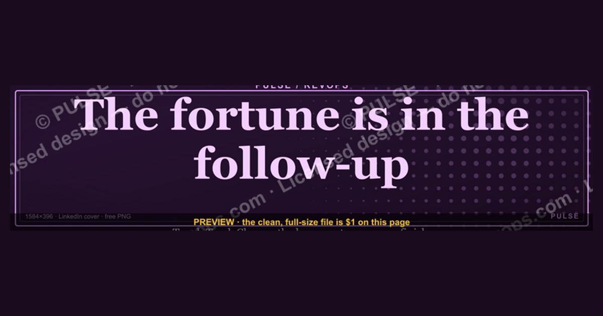
This is a LinkedIn profile banner that reads “The fortune is in the follow-up.” in clean serif type, paired with a short “Touch Track Close” line and a pulse motif, sized 1584×396 px. Download the PNG free from this page and drop it straight into your profile cover slot to signal that you close loops, not just open them.
Two ways to put this Banner to work: ready-made versus rebuilt
Anyone adding “The fortune is in the follow-up.” to a LinkedIn profile faces a fork in the road. Path one: grab the finished artwork from this page, upload it as-is, and be done in under five minutes. Path two: pull the source file into a design tool, re-letter it, swap the palette, and shape it around your own offer. Neither is wrong. They simply trade different currencies — minutes against control.
The ready-made route wins on speed and consistency. The composition is already balanced at the odd 4:1 ratio LinkedIn uses for cover images, the type is legible at thumbnail size, and the line “Touch Track Close” does the interpretive work for a visitor who has never met you. You spend nothing and risk nothing. The cost is that a handful of other people may run the same cover, and the banner says nothing about your niche, your geography, or your average deal size.
The rebuilt route wins on fit. If you sell to manufacturers in Ohio, a generic persistence quote does not tell that story — but “The fortune is in the follow-up.” over a steel-grey background with your territory in the corner does. Rebuilding costs an hour of your time, some comfort with vector editing, and a willingness to make typographic decisions. Done badly, a homemade variant looks worse than the original; done well, it becomes a small piece of brand equity you own outright.

A third, quieter option sits between them: download the PNG, keep it untouched, and let your headline and About section carry the personalization. The banner becomes a mood, not a message. This works well for people whose profile already has strong differentiation elsewhere, and poorly for anyone whose headline is a job title and nothing more.
The deciding question is not “which looks better.” It is “how much does this graphic need to say?” If the answer is “just that I follow up,” take the download. If the answer is “that I follow up, in this market, for this kind of buyer,” rebuild it.
How to decide between them
The fastest way to choose is to run your situation against a short decision tree rather than agonizing over aesthetics. Start with time. If you have less than fifteen minutes and a profile that needs updating today, the prebuilt file is the correct answer — the marginal gain from a custom variant is small compared with the gain from having any coherent cover at all.
Next, ask whether your differentiator is visual or verbal. Visual differentiators — a distinctive color, a logo mark, a region, a vertical — argue for rebuilding, because those cues cannot be expressed by a generic template. Verbal differentiators — a sharp headline, a strong About section, a featured post — argue for keeping the download and letting words do the work.
Then consider audience. Recruiters scanning hundreds of profiles respond to clean, legible, low-noise covers. Prospective clients respond to specificity. If your LinkedIn is primarily a hiring surface, the ready-made banner is usually enough. If it is a sales surface, customization pays.

Finally, weigh maintenance. A rebuilt banner is a file you now own and must update when your positioning shifts. A downloaded banner is disposable — you can swap it next quarter without guilt. People who change roles or offers frequently should lean toward the download and treat the cover as a season, not a monument.
Concrete numbers behind each option
Numbers make the trade-off concrete. The canvas is 1584×396 pixels — a 4:1 ratio. LinkedIn displays that image at roughly 1584×396 on desktop but crops the sides on narrow viewports and overlays your profile photo in the lower-left corner. Practically, that means the safe zone for text sits in the middle 60% of the width and the upper two-thirds of the height. Anything you place in the bottom-left 200×200 pixel region will be covered by your avatar.
On the ready-made path, the time cost is close to zero. Download, upload, save: under five minutes for most people. The file is a vector SVG, so it scales without blur, and a PNG export at full resolution stays crisp on high-DPI screens. There is no license fee and no attribution requirement, which matters if you plan to reuse the artwork on a slide deck or a printed one-pager.

On the rebuilt path, budget one to two hours for a first attempt and twenty to thirty minutes for each revision. If you bill your time at $100 an hour, a custom banner carries a notional cost of $100–$200 in attention — real money, though it buys an asset you can reuse across a website header, an email signature, and a conference slide. Whether that is worth it depends entirely on how often the asset appears.
Response-rate claims deserve caution here. You will see confident numbers floating around — that most sales require five or more touches, that a large share of reps quit after one or two attempts. Those figures circulate widely in sales training material, but they are not something this page can verify, and the honest position is that the direction is well established while the exact multipliers are not. What is defensible: a banner that states your operating principle costs you nothing and removes one small source of ambiguity for a visitor.
Consider a worked example. A fractional CFO updates her profile on a Sunday evening. She downloads the banner, uploads it, and spends the remaining twenty minutes rewriting her headline to name the industries she serves. Total elapsed time: twenty-five minutes. A consultant in the same situation instead opens the SVG, changes the background to his firm’s navy, replaces “Touch Track Close” with his three-step process name, exports a PNG, and uploads. Elapsed time: ninety minutes. Both profiles are now better than they were an hour earlier. Only one of them owns a bespoke asset.
Implementation details and sequencing
Sequencing matters more than most people expect, because LinkedIn caches cover images aggressively and a half-finished swap can linger for hours. Work in this order and you avoid the common traps.
First, export or prepare the final file at 1584×396. If you are using the download, grab the PNG at full resolution. If you are rebuilding, export from your design tool at exactly that size — not “approximately,” because LinkedIn will stretch or letterbox anything else, and stretched type is the fastest way to look unprofessional.
Second, preview the crop before you commit. Open the image on your phone at profile width and confirm that the phrase “The fortune is in the follow-up.” is still readable when the image is the size of a postage stamp. If the words disappear at thumbnail scale, increase the type size and cut secondary text. The “Touch Track Close” line is the first thing to sacrifice if space is tight.
Third, upload and save, then hard-refresh your own profile in a private browser window to see what visitors actually see. Cover images sometimes render from cache for several minutes. Do not panic-edit during that window.
Fourth, align the text beneath the image. Your headline sits directly under the cover, so it should extend the banner’s idea rather than repeat it. If the cover says follow-up is where the money is, the headline can say what you follow up about — the offer, the audience, the outcome. Redundancy wastes the most valuable line on the page.
Fifth, revisit quarterly. A banner is cheap to change and expensive to forget. Put a recurring calendar reminder to check whether the promise on your cover still matches the work you actually want.
What is on the graphic, and the message behind it
Element by element, the artwork is deliberately spare. The headline — “The fortune is in the follow-up.” — is set in a serif face that reads as considered rather than trendy. Beneath it sits the shorter line “Touch Track Close,” which turns an aphorism into a method by naming three stages. A pulse motif runs through the composition, echoing the idea of a heartbeat or a signal that keeps going. The palette is dark and on-brand, which means it sits quietly behind a profile photo instead of competing with it.

The message is a claim about where value actually gets created. Most people treat the first conversation as the event and everything after as cleanup. The banner inverts that: the first touch opens a door, and the fortune accumulates in the second, third, and fifth conversations. That is why the word “fortune” is doing real work — it is not a promise of easy money, it is a statement that the payoff is deferred and therefore easy to abandon.
When does this message land well? With audiences who buy considered services — consulting, recruiting, financial advisory, enterprise software, agency work — where the sales cycle runs weeks or months and the buyer expects to be courted patiently. It also lands well with referral partners, who read persistence as reliability. And it lands well on a profile whose owner genuinely does follow up, because the banner then functions as a small piece of proof rather than a slogan.
When does it backfire? When the profile belongs to someone in transactional, high-volume sales where a buyer might read “follow-up” as “I will chase you.” When the person is job-seeking and the banner reads as advice to employers rather than a statement about themselves. And when the rest of the profile contradicts it — a cover promising persistence above an About section that has not been updated in three years is worse than no banner at all, because it invites a comparison the profile loses.
Customizing the wording, palette, and roles for your own team
The fastest customization is the one that changes the least. Swapping the background to your brand color and leaving both lines of text intact takes about ten minutes and immediately makes the asset yours. From there, changes get progressively more expensive in time and risk.
If you want to change the wording, keep the headline’s rhythm. “The fortune is in the follow-up.” works because it is short, declarative, and slightly old-fashioned. A replacement like “Pipeline lives in the follow-up” keeps the cadence. A replacement like “We believe that consistent, value-driven follow-up is the key to long-term revenue” destroys it. Cut, do not expand.
For teams, the banner becomes a small piece of shared identity. A sales development group can run the same cover across every rep’s profile, which signals a common method to anyone who compares two of them. A recruiting team can substitute the second line with their own funnel language. An agency can replace the pulse motif with its logo mark, provided the mark still reads at thumbnail size — many do not.
Roles to consider: account executives and SDRs, where follow-up is literally the job; consultants and fractional operators, where referrals come from people who remember you; founders, where persistence is part of the pitch; and customer success managers, where the follow-up happens after the sale rather than before it. For each, the headline stays and the supporting line flexes.
One caution on color. LinkedIn’s interface is blue and white, and profile photos are often busy. A banner with a mid-tone background and high-contrast text will survive better than a pastel one, and a dark background with light type tends to look more deliberate than the reverse. Test your chosen palette against a mobile screenshot before you commit.
Related questions
Does a LinkedIn banner actually affect how people perceive me?
It contributes, but it is one signal among many. Visitors read your photo, headline, and About section first. A banner reinforces a message you are already sending; it rarely creates one from nothing. Treat it as confirmation, not conversion.
Can I use this banner if I am not in sales?
Yes. The underlying idea — that value accumulates after the first contact — applies to recruiting, partnerships, fundraising, and job searching. The wording is neutral enough to carry across functions, though non-sales users may want to soften the “Touch Track Close” line.
What size should I export if I rebuild it?
Export at exactly 1584×396 pixels. Keep the headline within the central 60% of the width and the upper two-thirds of the height so the profile photo and mobile crop do not cut into the text.
Will the same banner look right on mobile and desktop?
Roughly. Desktop shows more of the width; mobile crops toward the center. If your text sits in the safe zone, both views work. Always check a phone preview before finalizing.
Can I use the graphic on slides and printed materials too?
The source is a scalable vector, so yes — it holds up at large sizes without pixelation. Many people reuse it on title slides, one-pagers, and email signatures, though the 4:1 ratio suits a banner better than a page.
FAQ
What does the banner actually say? It reads “The fortune is in the follow-up.” in serif type, with a shorter “Touch Track Close” line beneath and a pulse motif running through the design. The whole composition is sized for the LinkedIn cover slot at 1584×396 pixels.
Is the download really free? Yes. The file is offered free to use with no attribution required, which means you can place it on your profile, a slide, or a printed handout without crediting anyone.
What file format do I get? The source is a scalable vector, so it stays sharp at any size. You can export a PNG at full resolution for LinkedIn, or open the vector in a design tool if you want to change colors or wording.
Where exactly does the image go on my profile? It goes in the cover image slot at the top of your profile, behind your photo. LinkedIn labels this the background or cover photo depending on where you are editing.
What should my headline say under this banner? Something that extends the idea rather than restating it. If the cover promises follow-up, the headline should name what you follow up about — your offer, your audience, or the result you produce.
Can my whole team use the same banner? Yes, and there is value in it. A shared cover signals a common method to anyone who looks at two reps side by side. Just make sure each person’s headline still differentiates them.
Sources
- LinkedIn Help — Edit your profile cover image
- LinkedIn — Profile cover image size guidance
- Harvard Business Review — research and articles on sales and persistence
- HubSpot Blog — sales follow-up best practices
- Canva — design tools for resizing and recoloring graphics
- Figma — vector editing and export
- Nielsen Norman Group — visual design and legibility research
- U.S. Small Business Administration — marketing and customer outreach resources
Related on PULSE
This page will be disappearing soon. Save it to your device for $1 — or read it free while it is here.
@Kory-White- · if Venmo asks, the last 4 of my number are 2012
This page is gone.
This one is off the shelf now. $1 keeps it on your phone for good — the whole page, pictures and diagrams included.
 graphicSales Recruiter — LinkedIn Banner
 graphic“Motion creates momentum.” — LinkedIn Banner
 graphic“Revenue that delights.” — LinkedIn Banner
 graphicInspect. Qualify. Commit. — LinkedIn Wallpaper
 graphicRevOps Manager — LinkedIn Banner
 graphic“Looking for my next quota.” — LinkedIn Banner
 graphicHow to build a champion seller playbook in 2027
 graphic“Clarity closes.” — LinkedIn Banner
 graphicLead from the front. — LinkedIn Wallpaper
 graphic“Join a team that runs on pipeline.” — LinkedIn Banner