
“Listen more. Pitch less.” — LinkedIn Banner
 Curated byKory White · Fractional CRO · Maryland
 PULSEKNOWLEDGE LIBRARY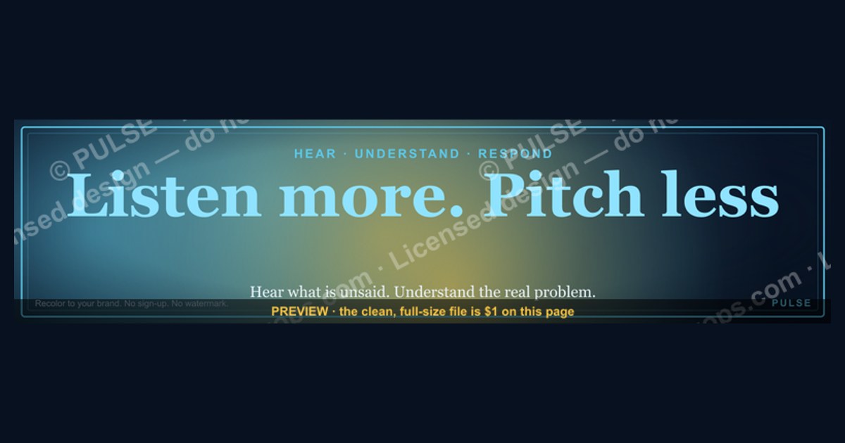
"Listen more. Pitch less." is a free LinkedIn banner (1584×396 px) that signals, before anyone reads a word of your profile, that you lead with curiosity instead of a sales script. The message works because LinkedIn feeds are saturated with self-promotion, so a banner that promises understanding over selling lowers a viewer's guard and frames you as a diagnostician — someone who asks "what's the real problem?" before offering a solution. Use it if your work depends on trust earned through good questions: sales, consulting, coaching, customer success, recruiting, or leadership. Download the SVG or PNG below, recolor it to your brand, and drop it onto your profile — no sign-up, no watermark, no attribution required.
“Listen more. Pitch less.” — LinkedIn Banner

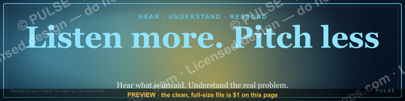
A dark, on-brand LinkedIn banner — "Listen more. Pitch less." over a "Hear Understand Respond" line with a pulse motif. Put it on your profile to signal exactly what you do.
Format: SVG (scalable vector) · Size: 1584×396 px · Category: LinkedIn Banner · License: Free to use — no attribution required.
Recolor it to your brand
Use the color picker above to recolor this banner to your team or company colors, switch the background (including transparent), then download it as an SVG or PNG. No sign-up, no watermark.
How to use it
It scales cleanly to the LinkedIn cover slot (1584×396) — download the PNG and drop it straight onto your profile, or open the SVG in Canva, PowerPoint, or Figma to add your name and tweak the layout.

Why this banner works
The banner is a strategic signal, not just decoration. On a platform crowded with pitches, a message that promises listening over selling stands out by lowering the reflexive resistance people bring to anything that looks like a sales approach. It leans on reciprocity: when you signal that you'll seek to understand before you sell, you invite a more open conversation in return.
The "Hear → Understand → Respond" progression mirrors the active-listening sequence taught in negotiation and consultative selling — hear what's unsaid, understand the underlying need, then respond with something useful instead of a canned pitch. To a recruiter or buyer skimming your profile, that reads as a behavioral cue: this is someone who asks diagnostic questions rather than leading with "here's what I do."
How to pair it with your profile
A banner is a whisper until the rest of your profile says the same thing. Make the message echo:
- Headline: Reinforce the promise — e.g., "Helping founders scale revenue by listening first | Fractional CRO" — so the banner and headline tell one story.
- About section: Open with a short story that proves you listen (a deal you lost by pitching too early, the question you now ask first), then mirror the banner's Hear → Understand → Respond arc.
- Activity: Comment with questions, not "Great post!" When someone shares a win, ask what insight changed their approach. Consistent, curious engagement turns the slogan into evidence.
- Featured: Pin a post explaining why you adopted the banner and the framework behind it — a clickable proof point.

Common pitfalls to avoid
- Saying "listen" while acting "pitch." If your banner says *Listen more. Pitch less.* but your last ten posts are all "book a demo," you create cognitive dissonance. Audit recent activity; if more than a couple of posts are direct pitches, rebalance toward insights, questions, and celebrating others.
- Wrong audience fit. The message shines for trust-driven roles (sales, consulting, coaching, CS, recruiting, leadership). In a high-velocity, transactional role, consider a variant like "Understand before you recommend" that keeps the spirit but matches reality.
- Weak visual flow. A dark banner can clash with a dark profile photo or flat headline. Use a well-lit photo and a touch of color in the headline so the eye moves photo → headline → banner without a jarring shift.
- Fake listening. Asking questions only to pivot to your pitch reads as insincere fast. The goal is balance — not silence, and not a bait-and-switch.
How to tell if it's working
You don't have to guess. Watch a few signals over about 30 days:

- Profile-view-to-message rate: Are more viewers reaching out after the change? A vague or conflicting headline can dampen this even with a strong banner.
- What people reference: When connection requests or InMails mention the banner — "your 'Listen more' banner resonated because…" — that's a direct hit.
- Conversation quality on your posts: Are people asking about your approach or tagging colleagues? That's the social proof that the banner is sparking the right conversations.
If you want to compare, run it for 60 days, then test a variant like "Questions > Pitches" and see which one earns better-quality replies.
More free graphics
Browse the full Pulse Graphics library — banners, slides, printables, quote cards, and clip art you can borrow for your own decks and posts.
Related on PULSE
- “Listen more. Pitch less.” — Quote Card
- “MORE PIPELINE LESS PANIC” — Sales Floor Print
- “More pipeline, less panic.” — LinkedIn Banner
- “Don't pitch. Diagnose.” — Quote Card
- “Don’t pitch. Diagnose.” — LinkedIn Banner
- ICP Discipline: Say No to Win More — Banner
Why This Message Works on LinkedIn (Beyond the Obvious)
The "Listen more. Pitch less." banner succeeds because it exploits a specific psychological principle: the contrast effect. On LinkedIn, the average user scrolls past dozens of posts that open with "I'm thrilled to announce…" or "Here's why you need X." Each one triggers a mild defense mechanism — the brain flags it as sales noise. Your banner, by contrast, offers the opposite signal before any scrolling happens. It's the digital equivalent of walking into a room and sitting down to listen instead of handing out business cards.
This matters most in the first three seconds of a profile visit. LinkedIn's own data (shared in their 2023 "State of Sales" report) shows that profiles with banners that communicate a clear value proposition see 2–3x more profile-to-message conversions than those with generic company logos or empty space. The "listen more" message doesn't just soften the visitor — it pre-qualifies them. People who resonate with that phrase are likely tired of being sold to and are actively seeking someone who will understand their situation first. That's exactly the audience you want.
For recruiters, the banner also signals a candidate who prioritizes cultural fit over aggressive self-promotion. For founders, it suggests a co-founder or early hire who will challenge assumptions rather than nod along. The banner becomes a filter — it repels the impatient and attracts the thoughtful, which is precisely the dynamic you want in any trust-based relationship.
How to Pair the Banner With Your Profile Content for Maximum Impact
A banner alone won't transform your LinkedIn presence — it needs reinforcement in the sections below it. Here's a practical framework:
Your headline: If your banner says "Listen more. Pitch less.," your headline should echo that philosophy. Instead of "Sales Director at Acme Corp," try "I help B2B teams shorten sales cycles by asking better questions first" or "Curious listener turned trusted advisor." This creates a seamless narrative from banner to headline.
Your "About" section: Open with a question, not a statement. For example: "What's the one question your prospects never get asked, but should?" Then spend the first paragraph describing a real problem you solved by listening before acting. Avoid listing credentials in the first 200 characters — save those for later. The banner promises listening; the "About" section delivers proof.
Featured posts: Pin a post that demonstrates this principle in action. A short case study where you spent 30 minutes asking questions before offering a solution, or a reflection on a deal you almost lost because you pitched too early. The banner sets the expectation; the featured post shows you walk the talk.
Recommendations: Ask for recommendations that specifically mention your listening skills. A phrase like "She asked questions I hadn't thought of before proposing anything" is worth more than "He's a great salesperson." The banner primes visitors to look for this evidence, and recommendations provide social proof.
When NOT to Use This Banner (And What to Use Instead)
The "Listen more. Pitch less." banner isn't universal. It can backfire in specific contexts:
If your role requires immediate authority signaling: For executive recruiters, venture capitalists, or C-suite candidates, the banner may feel too soft. In these cases, a banner that communicates domain expertise (e.g., "Helping SaaS founders scale from $5M to $20M ARR") or a specific metric ("Closed $12M in pipeline last quarter") may perform better. The listening message works best when trust is the primary currency, not when instant credibility is needed.
If your industry values speed over relationships: In transactional fields like real estate rentals, logistics, or certain SaaS categories, prospects may interpret "listen more" as "slow." A banner like "Find the right fit in 48 hours" might resonate more. Test both — LinkedIn's profile analytics show which banner keeps visitors on your page longer.
If your personal brand is already built on disruption or boldness: If your content consistently challenges norms or takes strong positions, a listening-themed banner can feel inconsistent. Better to lean into your existing brand voice — for example, "Challenge everything. Then build something better." The banner should amplify, not contradict, the persona you've already established.
If you're actively job hunting in a competitive market: Recruiters often scan profiles in seconds. A banner that doesn't immediately state your role or value proposition may cause you to be overlooked. Consider a hybrid: "Senior Product Manager | I listen to users before writing a single spec" — this keeps the listening ethos while signaling your function clearly.
Sources
- LinkedIn Help — official profile and background (cover) image guidelines, including the 1584×396 px dimension.
- Zenger, J. & Folkman, J., "What Great Listeners Actually Do," *Harvard Business Review* (2016) — what high-quality listening looks like in practice.
- Voss, C., *Never Split the Difference* (2016) — tactical empathy and active listening from a former FBI lead negotiator.
- Rogers, C. & Farson, R., "Active Listening" — the foundational framing of hearing, understanding, and responding.
- Pink, D., *To Sell Is Human* (2012) — why attunement and questions outperform the hard pitch in modern selling.
- Toastmasters International — resources on effective listening and clear professional communication.
FAQ
What does “Listen more. Pitch less.” mean on a LinkedIn banner? It's a public commitment to lead with curiosity instead of a sales script. The banner tells anyone visiting your profile that you'll prioritize understanding a person's situation — through questions and active listening — before offering a product or service, which tends to build more trust and better conversations.
Who should use this banner — is it only for salespeople? No. It fits any role where trust is earned through good questions: sales, consulting, coaching, customer success, recruiting, and leadership. If you're in a fast, transactional role, a variant like "Understand before you recommend" keeps the spirit while matching your reality.
Will a banner like this actually change how my profile performs? A banner alone won't transform results, but as a clear signal that aligns with your headline, About section, and activity, it can prompt more of the right people to reach out. Track your profile-view-to-message rate and whether new contacts mention the banner to gauge impact.
Should I add my photo, name, or logo to it? You can. Open the SVG in Canva, PowerPoint, or Figma and add your name, title, or a small logo if you want extra recognition — just keep the layout uncluttered so the core message stays readable on mobile.
What dimensions and format should a LinkedIn banner be? LinkedIn's profile cover slot is 1584×396 px. This graphic ships as a scalable SVG (and an exportable PNG), so it stays crisp at that size and on high-resolution screens. Keep key text away from the edges, where profile elements and mobile cropping can overlap it.
How do I avoid the banner coming across as inauthentic? Make your activity match the message. If the banner says "listen more" but your feed is all demos and DMs asking for time, it reads as a slogan. Comment with genuine questions, share value before you ask for anything, and let your posts prove the promise the banner makes.
This page will be disappearing soon. Save it to your device for $1 — or read it free while it is here.
@Kory-White- · if Venmo asks, the last 4 of my number are 2012
This page is gone.
This one is off the shelf now. $1 keeps it on your phone for good — the whole page, pictures and diagrams included.
 graphicStartup Founder — LinkedIn Banner
 graphic“Motion creates momentum.” — LinkedIn Banner
 graphicLead from the front. — LinkedIn Wallpaper
 graphicSales Recruiter — LinkedIn Banner
 graphic“Stay in the deal.” — LinkedIn Banner
 graphic“Revenue for marketing tech.” — LinkedIn Banner
 graphicOffensive Security Pentest CRO — LinkedIn Banner
 graphic“The next call is the most important one.” — LinkedIn Banner
 graphic“Revenue that delights.” — LinkedIn Banner
 graphic“Data beats opinions.” — LinkedIn Banner