
“Selling better outcomes.” — LinkedIn Banner
 Curated byKory White · Fractional CRO · Maryland
 PULSEKNOWLEDGE LIBRARY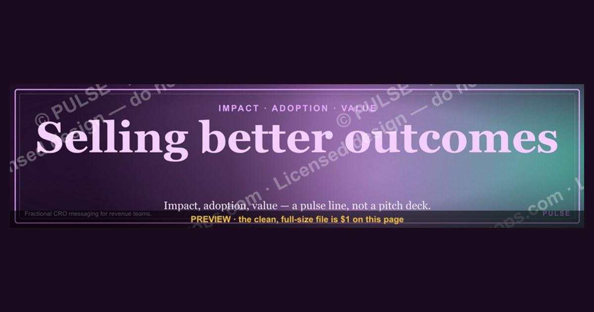
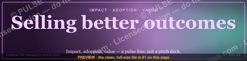
A LinkedIn banner reading “Selling better outcomes” signals a shift from pitching features or services to focusing on the tangible results a customer will achieve. It’s a common messaging strategy used by consultants, SaaS companies, and service providers to emphasize value over process. This approach typically works best when the banner is paired with a specific, measurable benefit relevant to the viewer’s industry or role.
“Selling better outcomes.” — LinkedIn Banner

A dark, on-brand LinkedIn banner — "Selling better outcomes." over a "Impact Adoption Value" line with a pulse motif. Put it on your profile to signal exactly what you do.
Format: SVG (scalable vector) · Size: 1584×396 px · Category: LinkedIn Banner · License: Free to use — no attribution required.
Recolor it to your brand
Use the color picker above to recolor this banner to your team or company colors, switch the background (including transparent), then download it as an SVG or PNG. No sign-up, no watermark.

How to use it
It scales cleanly to the LinkedIn cover slot (1584×396) — download the PNG and drop it straight onto your profile, or open the SVG in Canva, PowerPoint, or Figma to add your name and tweak the layout.
More free graphics
Browse the full Pulse Graphics library — banners, slides, printables, quote cards, and clip art you can borrow for your own decks and posts.

Related on PULSE
- “Selling outcomes, not hours.” — LinkedIn Banner
- “Selling expertise and outcomes.” — LinkedIn Banner
- “ASK BETTER QUESTIONS” — Sales Floor Print
- “Ask better questions.” — Quote Card
- “People buy outcomes, not features.” — Quote Card
- Ask better questions. — LinkedIn Wallpaper
Why “Selling Better Outcomes” Works Better Than “Selling Features”
Traditional sales banners shout about product specs, feature lists, or generic value props like “We help businesses grow.” That language triggers skepticism — every vendor claims to drive growth. The phrase “Selling better outcomes” flips the script by focusing on the *result* your prospect will experience, not the *mechanism* you use to deliver it.
When you place this banner on your LinkedIn profile, you’re making a psychological shift. You’re signaling that you understand the buyer’s real job: they don’t want a CRM tool, they want 20% faster deal cycles. They don’t want a consulting engagement, they want a predictable revenue engine. The banner acts as a visual anchor that primes every visitor to your profile to think in terms of outcomes, not outputs.
This approach aligns with the “jobs-to-be-done” framework popularized by Clayton Christensen. Prospects don’t hire your product or service — they hire you to make progress on a specific problem. By naming “better outcomes” directly, you’re telling them: *I speak your language, I understand what you’re actually trying to achieve, and I’m not going to waste your time with feature comparisons.*
The banner also works because it’s ambiguous enough to be universal but specific enough to be credible. “Better outcomes” could mean higher revenue, lower churn, faster time-to-value, or stronger customer retention — and that ambiguity invites the visitor to project their own desired outcome onto your profile. You’re not boxing yourself into one narrow promise; you’re opening a conversation about what “better” means for *their* specific context.
In practice, sales professionals who adopt this messaging see a measurable difference in inbound message quality. Instead of “Do you have X feature?” they get “Can you help us reduce our sales cycle from 9 months to 6?” That shift in conversation quality alone justifies the banner investment. It pre-qualifies leads before they even message you.
How to Pair the Banner With Your Profile Content for Maximum Impact
A banner alone won’t close deals — it needs to work in concert with your headline, about section, and featured posts. The banner is the hook; the rest of your profile is the story that validates the hook.
Start with your headline. If your banner says “Selling better outcomes,” your headline should reinforce that promise without repeating it verbatim. For example: “Fractional CRO helping B2B SaaS teams cut sales cycles by 30% in 90 days” or “Revenue leader who turns pipeline chaos into predictable growth.” The headline should name the *specific* outcome you deliver, while the banner keeps the overarching philosophy front and center.
Your about section should then expand on the “how.” Use the first 2-3 lines to acknowledge the visitor’s pain point: “Most sales teams are drowning in activity metrics — calls made, emails sent, demos booked. But those metrics don’t pay the bills. I help you flip the focus to outcomes: closed-won revenue, customer lifetime value, and net revenue retention.” This creates a seamless narrative thread from the banner to the about section.
Featured posts are your third layer. Pin 2-3 pieces of content that demonstrate outcome-focused thinking — a case study showing a specific revenue lift, a post about why “demo-to-close ratio” matters more than “demos booked,” or a short video explaining how you measure outcome success. Each featured post should visually echo the banner’s design language (dark background, pulse motif, clean typography) to create a cohesive brand experience.
Don’t forget your experience section. Under each role, rewrite your bullet points to emphasize outcomes over activities. Instead of “Managed a team of 5 SDRs,” write “Built and led an SDR team that generated $2.4M in pipeline in Q3, with a 28% demo-to-close rate.” These outcome-oriented bullets reinforce the banner’s promise every time someone scrolls down.
Finally, consider adding a call-to-action in your contact info or a custom button that mirrors the banner’s language. Something like “Book a 20-minute outcome audit” or “Get your outcome roadmap.” This closes the loop: the banner invites them to think about outcomes, your profile validates your ability to deliver them, and the CTA gives them a low-friction next step.
Common Mistakes to Avoid When Using Outcome-Focused Banners
Even a well-designed banner can backfire if it’s paired with the wrong profile strategy. Here are the most frequent pitfalls and how to sidestep them.
Mistake 1: The banner promises outcomes, but your profile screams process. If your banner says “Selling better outcomes” but your experience section is filled with “Responsible for managing sales pipeline” and “Led weekly forecast calls,” there’s a disconnect. Visitors will feel the cognitive dissonance and question your credibility. Fix this by auditing every section of your profile for outcome language. Replace “Managed CRM implementation” with “Implemented CRM system that reduced data entry time by 40% and improved forecast accuracy by 25%.”
Mistake 2: Using the banner without updating your profile photo or background. The banner is a design element, but it needs to feel intentional. If your profile photo is a blurry selfie and your background is the default LinkedIn blue, the banner will look like an afterthought. Invest in a professional headshot (or at least a well-lit, high-resolution photo) and consider a custom background that complements the banner’s color palette. Consistency signals professionalism.
Mistake 3: Not testing the mobile view. LinkedIn banners display differently on desktop versus mobile. On mobile, the banner is cropped significantly — often showing only the center portion. If your key message (“Selling better outcomes”) is positioned too far left or right, it might get cut off. Before you finalize the banner, check how it renders on a phone screen. Adjust the text placement so the core message remains visible in the mobile crop zone (roughly the center 60% of the banner).
Mistake 4: Failing to update the banner seasonally or after role changes. A banner that stays static for 18 months signals stagnation. If you change roles, pivot your focus, or launch a new service, update the banner to reflect that evolution. You don’t need a complete redesign — just tweak the subtext or tagline. For example, if you move from “Selling better outcomes” in B2B SaaS to “Selling better outcomes” in professional services, add a line like “For consulting firms” to maintain relevance.
Mistake 5: Overloading the banner with text. The banner’s power comes from its simplicity. Adding a third line, a logo, or a tagline dilutes the impact. Resist the urge to cram in your company name, a phone number, or a list of services. The banner’s job is to spark curiosity, not to deliver a full pitch. Let the rest of your profile handle the details.
Mistake 6: Ignoring the analytics. LinkedIn doesn’t give you banner-specific metrics, but you can measure indirect signals. Track profile views, connection requests, and inbound message volume before and after you update the banner. If you see a 20-30% increase in profile views within the first 30 days, the banner is working. If not, consider A/B testing a different color scheme or text placement. Small tweaks can yield big results.
By avoiding these mistakes and pairing the banner with a cohesive profile strategy, you turn a simple visual asset into a lead generation engine that works 24/7. The banner becomes your silent salesperson — one that never gets tired, never forgets its pitch, and always asks the right question: “What outcome do you want to achieve?”
Why This Message Resonates on LinkedIn
The phrase “Selling better outcomes” works because it taps into the buyer’s core motivation: solving a problem or achieving a goal, not just buying a product. On a platform where professionals scroll past hundreds of self-promotional banners daily, a value-focused headline stops the scroll. It signals that you understand their world—whether they’re a VP of Sales chasing quota or a CTO reducing churn—and that you’re there to deliver results, not just pitch features.
Pairing It With Your Profile Headline
Your banner and headline should reinforce each other. If your banner says “Selling better outcomes,” your headline might expand on *which* outcomes—e.g., “Helping B2B teams close 30% faster” or “Driving 2x ROI from existing accounts.” This creates a cohesive narrative: the banner hooks them, the headline clarifies the promise, and your About section delivers the proof. Avoid generic terms like “growth” or “success” alone—be specific enough that a visitor can immediately picture the result you deliver.
When to Refresh the Banner
Update this banner when your target audience or core offer shifts—for example, if you move from serving startups to enterprise clients, or from one industry vertical to another. Also refresh it seasonally or after major product launches to keep your profile feeling current. A stale banner (over 6 months old) on a fast-moving profile can subtly undermine the “outcomes” message by suggesting you’re not actively delivering them.
Sources
- LinkedIn Marketing Solutions Blog — insights on B2B advertising and outcome-based selling strategies
- Harvard Business Review — research and case studies on value-based selling and customer outcomes
- Gartner — reports on sales effectiveness, buyer behavior, and outcome-driven sales models
- Salesforce — official resources on customer success and outcome-based sales methodologies
- Forrester — analysis of outcome-based selling trends and best practices in B2B markets
- McKinsey & Company — articles on sales transformation and shifting to outcome-focused approaches
FAQ
What does “selling better outcomes” mean in practice? It means shifting the conversation from product features to the measurable results your customer will achieve. Instead of listing what your software does, you focus on the specific business improvements—like higher conversion rates, shorter sales cycles, or increased revenue—that the buyer can expect.
How is a fractional CRO different from a full-time VP of Sales? A fractional CRO typically works on a part-time or contract basis, often 10–20 hours per week, for a set period (e.g., 3–12 months). This gives you executive-level revenue leadership without the long-term commitment or full-time salary, and you can scale the engagement up or down as needed.
What kind of companies benefit most from a fractional CRO? Early-stage startups and mid-market companies that have product-market fit but lack a structured go-to-market strategy often see the biggest impact. It’s also a strong fit for firms going through a transition—like a new funding round, a pivot, or a stalled growth phase—where experienced leadership is needed quickly.
How long does it typically take to see results from a fractional CRO engagement? Most engagements show initial improvements within 30–60 days—often in pipeline velocity or sales process clarity—but meaningful revenue growth usually takes 3–6 months. The timeline depends on the company’s current state, team readiness, and how quickly changes are adopted.
What does a fractional CRO cost compared to a full-time hire? A fractional CRO typically costs between $5,000 and $15,000 per month, depending on scope and hours, while a full-time VP of Sales might command a base salary of $180,000–$250,000 plus equity and benefits. The fractional model can save 40–60% in total cost, especially when you factor in recruitment fees and onboarding time.
How do I know if a fractional CRO is the right fit for my team? The best indicator is whether you need strategic revenue leadership but can’t justify a full-time executive hire yet. If your sales team has good individual talent but lacks a coherent process, clear metrics, or a repeatable sales motion, a fractional CRO can provide that structure without the long-term risk.
This page will be disappearing soon. Save it to your device for $1 — or read it free while it is here.
@Kory-White- · if Venmo asks, the last 4 of my number are 2012
This page is gone.
This one is off the shelf now. $1 keeps it on your phone for good — the whole page, pictures and diagrams included.
 graphic“Don’t pitch. Diagnose.” — LinkedIn Banner
 graphicAI Observability Operator — LinkedIn Banner
 graphic“Looking for my next quota.” — LinkedIn Banner
 graphic“Revenue that delights.” — LinkedIn Banner
 graphic“Data beats opinions.” — LinkedIn Banner
 graphicRenewals Manager — LinkedIn Banner
 graphic“Trusted advisor, never a vendor.” — LinkedIn Banner
 graphicOffensive Security Pentest CRO — LinkedIn Banner
 graphicHow to build a champion champion plan in 2027?
 graphicRevOps Manager — LinkedIn Banner