
Key Account Manager — LinkedIn Banner
 Curated byKory White · Fractional CRO · Maryland
 PULSEKNOWLEDGE LIBRARY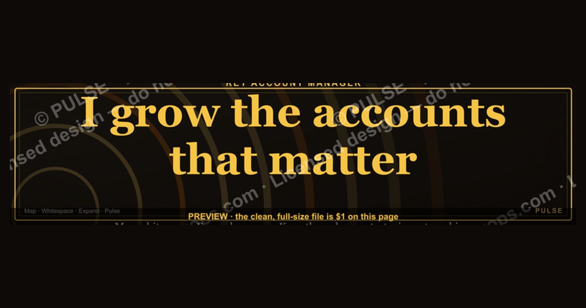
A Key Account Manager LinkedIn banner should clearly state your role, highlight your core focus (e.g., strategic partnerships or revenue growth), and include a professional headshot or relevant visual. Use a clean, branded background with your company logo and a concise tagline like "Driving Growth Through Strategic Partnerships." Avoid cluttered designs; keep text minimal and readable at a glance.
Key Account Manager — LinkedIn Banner

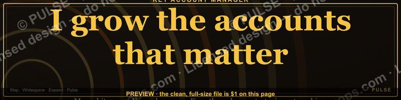
A dark, on-brand LinkedIn banner — "I grow the accounts that matter." over a "Map Whitespace Expand" line with a pulse motif. Put it on your profile to signal exactly what you do.
Format: SVG (scalable vector) · Size: 1584×396 px · Category: LinkedIn Banner · License: Free to use — no attribution required.
Recolor it to your brand
Use the color picker above to recolor this banner to your team or company colors, switch the background (including transparent), then download it as an SVG or PNG. No sign-up, no watermark.
How to use it
It scales cleanly to the LinkedIn cover slot (1584×396) — download the PNG and drop it straight onto your profile, or open the SVG in Canva, PowerPoint, or Figma to add your name and tweak the layout.
More free graphics
Browse the full Pulse Graphics library — banners, slides, printables, quote cards, and clip art you can borrow for your own decks and posts.

Related on PULSE
- Key Account Icon — Icon / Clip Art
- Channel Account Manager — LinkedIn Banner
- Account Manager — LinkedIn Banner
- Mid-Market Account Executive — LinkedIn Banner
- Account Plan — Title Slide
- Account Executive — LinkedIn Banner
Strategic Placement: Where Your Banner Works Hardest
Your LinkedIn banner isn’t just a decorative header—it’s a 1584 x 396 pixel billboard that appears on every profile view, every comment you leave, and every connection request you send. For Key Account Managers, strategic placement means understanding the three zones where this banner drives the most value.
Zone 1: The Profile Header (Always Visible) This is the obvious spot, but few KAMs optimize it for repeat viewers. When a client, prospect, or internal stakeholder visits your profile, the banner should reinforce your core value proposition within 1.5 seconds. The phrase “I grow the accounts that matter” paired with “Map Whitespace Expand” immediately signals that you’re not a generalist—you’re someone who prioritizes strategic growth over volume. This is especially powerful when a client is evaluating whether to renew or expand their relationship with your company.
Zone 2: Comment Threads on Industry Posts When you comment on a post from a key account’s CEO or a thought leader in your vertical, your banner appears as a thumbnail next to your name. This is a micro-impression that builds recognition over time. For example, if you’re commenting on a supply chain optimization post from a VP at your largest account, your banner subtly reinforces that you focus on “the accounts that matter.” Over 8-12 thoughtful comments across a quarter, this creates a pattern of association that primes stakeholders to think of you when expansion opportunities arise.
Zone 3: LinkedIn Search Results When someone searches “Key Account Manager” or your specific industry (e.g., “SaaS account management”), your profile appears in a list. The banner is the largest visual element in that search result thumbnail. A dark, professional banner with a pulse motif stands out against the sea of generic blue or white backgrounds. It signals that you take your role seriously and have a specific methodology—which is exactly what hiring managers and procurement teams look for when vetting strategic partners.
Practical Tip: Update your banner quarterly to reflect your current focus area. For example, if you’re targeting retail accounts in Q3, swap the subtitle to “Retail Growth | Whitespace Expansion” while keeping the core “I grow the accounts that matter.” This keeps your profile fresh without losing brand consistency.
Visual Psychology: Why the Pulse Motif Works for KAMs
The pulse motif in your banner isn’t just a design element—it’s a psychological trigger that aligns with how Key Account Managers build relationships. Here’s why it’s effective and how you can leverage it further.
The Pulse as a Trust Signal A heartbeat line or pulse wave is universally associated with life, stability, and continuous improvement. For KAMs, this maps directly to account health. When a client or prospect sees that pulse, their subconscious connects it to the idea that you monitor account vitality, track growth metrics, and proactively address issues before they become problems. This is particularly powerful for accounts in regulated industries like healthcare, finance, or manufacturing, where stability is paramount.
Color Psychology in Dark Banners The dark background (typically deep navy, charcoal, or black) conveys authority, sophistication, and focus. It’s the visual equivalent of a tailored suit—professional without being flashy. The pulse motif in a contrasting color (like bright green for growth or blue for trust) creates a focal point that draws the eye. This contrast is critical because LinkedIn banners are viewed on screens of varying sizes, from desktop monitors to mobile phones. A dark background with a single bright element ensures your message isn’t lost in the noise.
The “Map Whitespace Expand” Subtext This phrase does double duty. First, it signals that you use a structured approach (mapping whitespace) to identify growth opportunities. Second, it implies that you’re not reactive—you’re proactive about finding untapped revenue within existing accounts. This is a powerful differentiator because many KAMs are perceived as order-takers or relationship managers. By explicitly stating your methodology, you position yourself as a strategic partner who brings data-driven insights to the table.
Actionable Design Advice: If you’re customizing this banner for your specific industry, consider these tweaks:
- For technology/SaaS: Use a cyan or electric blue pulse on a dark slate background. Add subtle grid lines to suggest data analytics.
- For manufacturing/logistics: Use an amber or orange pulse on a charcoal background. Add a faint map grid to reinforce the “map whitespace” concept.
- For professional services: Use a forest green pulse on a dark navy background. Add a subtle upward arrow within the pulse to suggest growth trajectory.
Content Strategy: What to Pair With Your Banner for Maximum Impact
A banner alone won’t close deals—it’s a visual anchor that works in concert with your profile content. Here’s how to align your banner with the rest of your LinkedIn presence to create a cohesive narrative.
Headline Alignment Your headline should echo the banner’s promise. Instead of “Key Account Manager at Company X,” try: “I Grow the Accounts That Matter | Strategic Account Management | Whitespace Expansion | [Industry].” This creates a three-second impression that matches the banner’s message. When someone sees both elements together, they instantly understand your value proposition.
Featured Section: The “Account Growth Framework” Use the Featured section to pin a post or document that explains your methodology. For example, create a one-page PDF titled “The Whitespace Mapping Framework: How I Find $500K+ Expansion Opportunities in Your Account.” This turns your banner’s promise into a tangible resource. When a client or prospect clicks through, they see that you’re not just claiming to grow accounts—you have a repeatable process.
About Section: The “Expansion Story” Your About section should tell a specific story about account growth. For example: “In 2024, I mapped whitespace in a $2M account and identified three expansion opportunities worth $1.2M. Within six months, we closed two of them, increasing the account’s lifetime value by 40%. I use the same methodology with every account I manage.” This directly supports your banner’s claim and gives skeptics a reason to believe.
Activity Strategy: Comment on Account-Related Content When you comment on posts from your key accounts, your banner appears. But you can amplify this by commenting on content that reinforces your expertise. For example, if a client posts about their supply chain challenges, comment with a specific insight: “We’ve seen similar patterns in [industry]. One approach that worked was mapping whitespace in their distribution network—found a 15% efficiency gain.” This positions you as a problem-solver, not just a relationship manager.
Connection Request Message When sending connection requests to potential accounts or partners, reference your banner’s theme. For example: “Hi [Name], I focus on growing the accounts that matter—specifically in [industry]. I’d love to connect and share how I map whitespace to find expansion opportunities. Would that be valuable?” This personalization increases acceptance rates and sets the stage for a meaningful conversation.
Performance Tracking: Measure What Matters To gauge whether your banner is working, track these metrics over 90 days:
- Profile views: A 20-30% increase suggests your banner is driving curiosity.
- Connection acceptance rate: If it rises above 40%, your overall profile (including the banner) is resonating.
- InMail response rate: If prospects mention your banner or methodology in replies, you’ve created a memorable impression.
- Account expansion conversations: The ultimate metric—are more clients asking about growth opportunities after viewing your profile?
Pro Tip: Rotate your banner seasonally to test different messages. For example, Q1 could focus on “Account Planning,” Q2 on “Expansion Execution,” Q3 on “Renewal Strategy,” and Q4 on “Annual Review Insights.” This keeps your profile dynamic and gives you data on which messages resonate most with your audience.
Design Principles for Maximum Impact
A Key Account Manager banner must balance professionalism with approachability. Use a maximum of three colors from your brand palette to avoid visual noise. The focal point should be your role title, occupying roughly 20-25% of the banner width, positioned either centered or left-aligned for quick scanning. Incorporate a subtle gradient or geometric pattern in the background to add depth without distracting from your message. Avoid stock photos of handshakes or generic office scenes—they dilute your personal brand. Instead, use abstract shapes or a muted version of your company’s visual identity. Test your banner on both desktop and mobile views: text should remain legible at 396px height, and your logo should not be cropped by the profile picture overlay (which sits on the bottom-left corner).
Common Mistakes to Avoid
Many Key Account Managers overcrowd their banners with bullet points, multiple logos, or lengthy taglines. This reduces readability and makes the banner look unprofessional. Steer clear of low-resolution images—LinkedIn compresses uploads, so start with a 1584×396 px canvas at 72 DPI or higher. Avoid using all-caps for more than three words, as it strains readability. Do not place critical text or logos in the bottom-left 200×200 px area, where your profile picture will overlap. Also, skip generic phrases like “Customer Success” or “Sales Professional”—these don’t differentiate you. Instead, use specific terms like “Enterprise Account Growth” or “Strategic Partnership Development” to signal your niche.
Updating Your Banner Seasonally
Rotate your banner every 3-6 months to reflect current priorities or achievements. For example, if you’ve recently launched a new partnership program, update the tagline to “Scaling Strategic Alliances in 2024.” Use the same color palette as your main banner but swap the background pattern or accent color to signal freshness. Coordinate with your company’s marketing calendar—align your banner with industry events (e.g., “Attending #SaaStrAnnual”) or quarterly themes (e.g., “Q3 Focus: Renewal Growth”). This keeps your profile dynamic without requiring a full redesign each time.
Sources
- LinkedIn Official Brand Guidelines — LinkedIn’s own visual and content standards for profile and banner design
- HubSpot — best practices for professional social media branding and key account management
- Forbes — insights on B2B sales, key account management, and personal branding
- Harvard Business Review — research and case studies on strategic account management
- Canva Design School — tutorials and templates for creating effective LinkedIn banners
- American Marketing Association (AMA) — professional standards and trends in B2B marketing and account management
FAQ
What size should a Key Account Manager LinkedIn banner be? The standard LinkedIn banner size is 1584 x 396 pixels. For the best display on both desktop and mobile, keep important content within the safe zone of about 1400 x 350 pixels.
Should I include my company logo on the banner? Yes, but keep it subtle—typically in a corner or as a watermark. The banner’s primary focus should be on your value proposition, not the brand, since your profile already shows your company.
Can I list specific client logos or revenue figures? Avoid exact numbers or client names without permission. Instead, use vague terms like "top-tier accounts" or "double-digit growth" to convey credibility without risking confidentiality.
What colors work best for a Key Account Manager banner? Use your company’s brand colors for consistency, but ensure high contrast for readability. A clean, professional palette (e.g., navy, white, and a single accent color) typically performs well.
Should I include a call-to-action (CTA) on the banner? Yes—a simple CTA like "Let’s grow your key accounts" or "Strategic partnership expert" can encourage profile visits. Keep it short and place it in a visible but unobtrusive area.
How often should I update my LinkedIn banner? Update it every 6–12 months or whenever your role, focus, or company messaging changes. A stale banner can make your profile look neglected, even if your content is current.
This page will be disappearing soon. Save it to your device for $1 — or read it free while it is here.
@Kory-White- · if Venmo asks, the last 4 of my number are 2012
This page is gone.
This one is off the shelf now. $1 keeps it on your phone for good — the whole page, pictures and diagrams included.
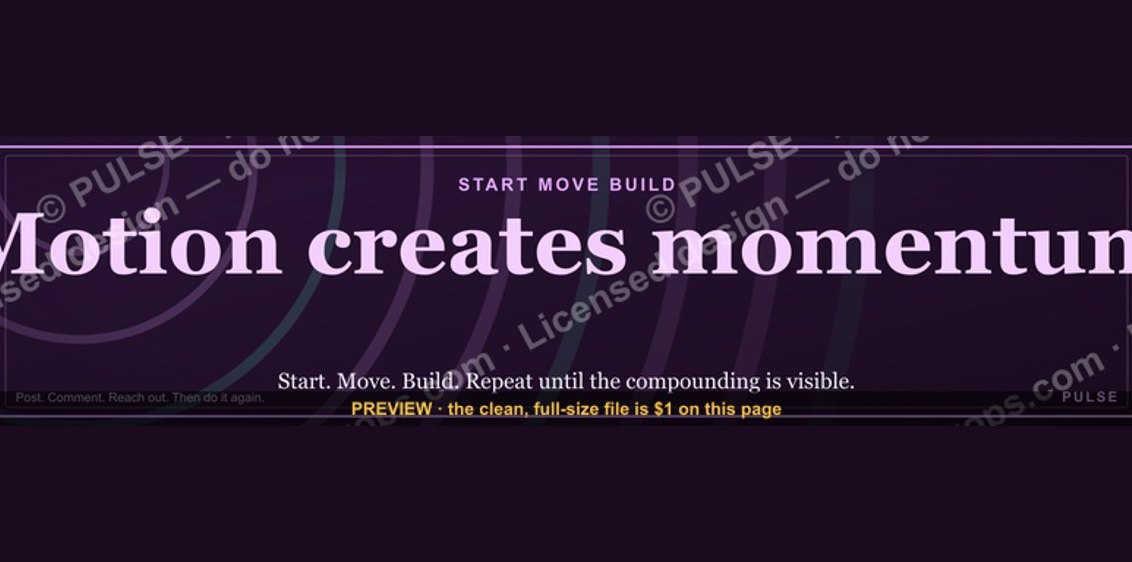 graphic“Motion creates momentum.” — LinkedIn Banner
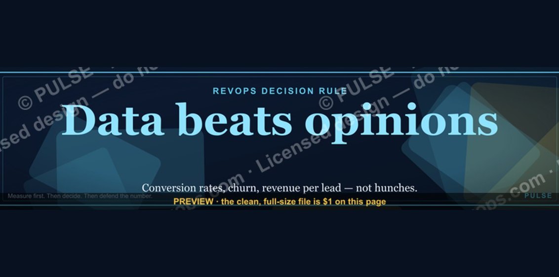 graphic“Data beats opinions.” — LinkedIn Banner
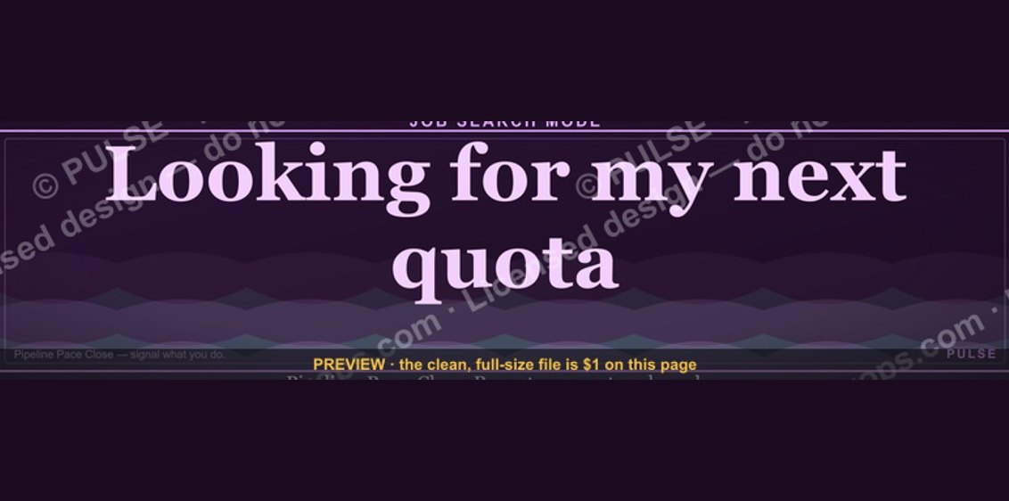 graphic“Looking for my next quota.” — LinkedIn Banner
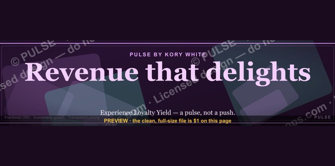 graphic“Revenue that delights.” — LinkedIn Banner
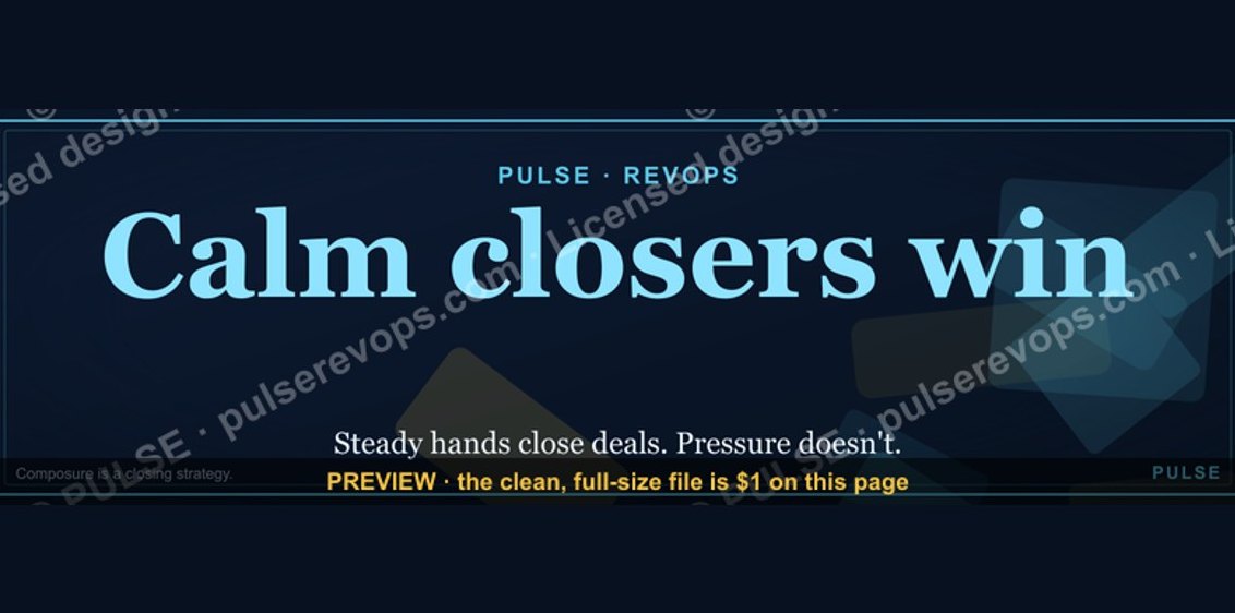 graphicCalm closers win. — LinkedIn Wallpaper
 graphic“Stay in the deal.” — LinkedIn Banner
 graphic“Hire slow. Ramp fast.” — LinkedIn Banner
 graphicComputer Vision Engineer — LinkedIn Banner
 graphicStartup Founder — LinkedIn Banner
 graphicWhat do top-performing graphic designers do differently in 2027?