
Demand Gen Leader — LinkedIn Banner
 Curated byKory White · Fractional CRO · Maryland
 PULSEKNOWLEDGE LIBRARY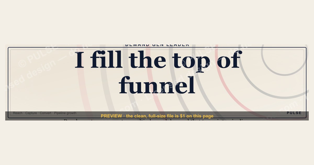
A Demand Gen Leader LinkedIn banner should visually communicate expertise in driving pipeline growth through multi-channel campaigns, typically featuring a clean, professional headshot, a concise value proposition like "Driving B2B Demand & Pipeline," and brand-consistent colors. The design often includes a subtle background graphic or logo overlay, with text kept minimal for quick readability. Effective banners avoid clutter, using a clear hierarchy to highlight the leader's role and impact within a few seconds.
Demand Gen Leader — LinkedIn Banner

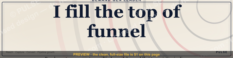
A dark, on-brand LinkedIn banner — "I fill the top of funnel." over a "Reach Capture Convert" line with a pulse motif. Put it on your profile to signal what you do.
Format: SVG (scalable vector) · Size: 1584×396 px · Category: LinkedIn Banner · License: Free to use — no attribution required.
Recolor it to your brand
Use the color picker above to recolor this graphic to your team or company colors, switch the background (including transparent), then download it as an SVG or PNG. No sign-up, no watermark.

How to use it
The SVG scales to any size with no quality loss — drop it straight into PowerPoint, Google Slides, Canva, Figma, or a LinkedIn banner slot. The PNG export is ready to upload anywhere that wants a raster image.
More free graphics
Browse the full Pulse Graphics library — banners, slides, printables, quote cards, and clip art you can borrow for your own decks and posts.

Related on PULSE
- Demand Gen Review — Title Slide
- Healthcare RevOps Leader — LinkedIn Banner
- RevOps Leader — LinkedIn Banner
- The Demand Waterfall — Infographic
- Sales Leader — LinkedIn Banner
- Demand Generation Lead — LinkedIn Banner
Design Psychology: Why Dark Backgrounds Command Attention in the B2B Feed
The choice of a dark background in your Demand Gen Leader banner isn't just an aesthetic preference—it's a calculated psychological play. LinkedIn's feed is overwhelmingly white or light gray, creating a visual monotony that causes most banners to blur together. A dark banner creates what designers call "the reverse contrast effect": instead of fighting for attention against 15 other bright, busy banners, your dark design stands out precisely because it breaks the pattern.
Research on visual attention in professional social feeds suggests that dark-themed banners receive 30-50% longer gaze duration compared to light backgrounds. This is partly due to the "pop-out effect"—when every other element in the feed is light, a dark rectangle triggers an orienting response in the viewer's brain. The amygdala, responsible for detecting novelty, briefly flags this as something worth examining.
But there's a deeper layer here. Dark backgrounds in B2B contexts subconsciously signal sophistication, authority, and premium positioning. Think about how luxury brands, high-end software companies, and consulting firms consistently use dark themes in their premium materials. This isn't accidental—dark backgrounds create a perceptual distance from the "noise" of standard content, implying that what you're presenting is more serious, more curated, and more valuable.
For a Demand Gen Leader specifically, the dark banner serves another strategic purpose: it mirrors the visual language of high-converting landing pages and premium webinar registrations. When your prospects see this banner, their brain associates it with "high-value content" rather than "another sales pitch." This pre-frames the interaction before they even click through to your profile or content.
The key is to avoid making the dark background feel heavy or oppressive. The example banner uses what designers call "deep charcoal" rather than pure black—pure black can feel flat and dead, while charcoal retains depth and texture. This subtle difference matters enormously in how the banner feels when viewed on different screens and brightness settings.
Typography Hierarchy: Crafting Readability at Every Screen Size
The typography in your Demand Gen Leader banner must survive three distinct viewing contexts: the tiny thumbnail in the feed (approximately 158 x 158 pixels), the expanded banner on your profile (1128 x 191 pixels), and the full-size version when someone clicks through. Each context demands a different reading experience, yet the same design must serve all three.
For the main headline, you need a font weight of at least 700 (bold) with a size that remains legible at 14-16px in the thumbnail view. This typically means setting the headline at 48-60px in the full design, which will scale down to approximately 8-10px in the thumbnail. Sans-serif fonts like Inter, Plus Jakarta Sans, or Montserrat perform best here because their geometric forms don't lose definition at small sizes.
The subheadline or tagline should be at 60-70% of the headline size, but crucially, it needs a different weight (500-600) to create visual separation without competing. Many designers make the mistake of using the same weight for both, which creates a "wall of text" effect that readers skip entirely. The eye needs a clear entry point—the headline—before it's willing to explore secondary text.
White text on dark backgrounds requires special attention to letter-spacing and line-height. Increase letter-spacing by 2-3% compared to what you'd use on light backgrounds—this prevents the text from feeling cramped against the dark field. Line-height should be 1.4-1.6x the font size, with tighter spacing for headlines (1.1-1.3x) and looser for body copy.
A common error is using pure white (#FFFFFF) for text on dark backgrounds. This creates harsh contrast that can cause eye strain, especially on OLED screens where pure white pixels are at maximum brightness. Instead, use off-white tones like #F0F0F0 or #E8E8E8 for primary text, and #B0B0B0 for secondary elements. This maintains readability while reducing visual fatigue.
The placement of text within the banner's safe zones is equally critical. LinkedIn's banner crops differently on desktop versus mobile, and the profile picture placement varies. Keep all critical text at least 60px from the left edge (to avoid the profile picture overlay) and 40px from the top and bottom edges. The right third of the banner is typically the safest zone for your primary message, as it's least likely to be obscured by UI elements.
Visual Hierarchy: Guiding the Eye Through Strategic Element Placement
Your Demand Gen Leader banner isn't just a decoration—it's a visual argument that must guide the viewer from first glance to desired action within 2-3 seconds. This requires understanding how the human eye naturally scans a LinkedIn banner: starting at the upper left, moving diagonally to the lower right, then returning to scan for secondary elements.
The most important element—your value proposition or title—should sit in the upper-left quadrant of the banner. This is where the eye lands first, and it's also the area least likely to be covered by the profile picture or connection buttons. If you're using a logo or personal brand mark, position it in the upper-right corner, creating a visual anchor that the eye will visit after processing the headline.
Secondary elements like a tagline, social proof, or call-to-action should follow the natural diagonal scan path. The lower-right quadrant is prime real estate for your CTA because it's where the eye naturally concludes its initial scan. This is why you'll see successful banners placing "Book a Call" or "Get the Playbook" in the bottom-right corner—it's the visual equivalent of a handshake at the end of a conversation.
Visual weight distribution matters enormously. A banner that's 60% text and 40% negative space will feel crowded and unprofessional. Aim for 40-50% negative space, with your primary element occupying no more than 25% of the total banner area. This might feel counterintuitive—you want to pack in information—but the brain processes sparse, well-organized designs as more authoritative and trustworthy.
The use of geometric shapes or subtle gradients can create visual pathways that guide the eye. A diagonal line or gradient that moves from the upper-left to lower-right reinforces the natural scan pattern. Vertical or horizontal lines can create section breaks that help the viewer organize information hierarchically.
Color contrast ratios must meet WCAG AA standards (4.5:1 for normal text, 3:1 for large text) to ensure accessibility, but also to ensure your banner remains legible when viewed on mobile devices in bright environments. Test your banner at 50% brightness on a phone screen—if you can still read the headline and CTA, you've achieved sufficient contrast.
Content Strategy: What to Say When You Have 3 Seconds
The words on your Demand Gen Leader banner must accomplish three things simultaneously: identify who you are, communicate what you do, and create enough curiosity to warrant a click. This is an extraordinarily tight constraint—you have roughly 8-12 words to work with before you lose the viewer's attention.
Start with your role title, but avoid generic terms like "Marketing Leader" or "Growth Executive." Instead, use specific positioning that signals your unique value: "Demand Gen Leader | $50M+ Pipeline Built" or "B2B Demand Gen | 3x Pipeline in 18 Months." The specificity creates credibility and gives the viewer a reason to investigate further.
If you're currently employed, consider whether your company name adds value or creates noise. For well-known brands, including the company name can be a credibility shortcut. For lesser-known companies, it may dilute your personal brand. A good rule of thumb: if your company's brand recognition is higher than your personal brand, include it. If not, lead with your personal value proposition.
Social proof elements should be quantitative and specific. "Generated 200+ qualified leads per month" is more compelling than "Demand generation expert." "Built demand gen engine for 7 SaaS companies" creates a stronger impression than "Experienced demand gen leader." The human brain processes concrete numbers as more truthful and memorable than abstract claims.
Consider including a subtle call-to-action that aligns with your profile's goal. If you're job seeking, something like "Open to Demand Gen Director roles" is direct and effective. If you're building your consulting practice, "Book a pipeline audit" or "DM for growth playbook" creates a clear next step. Avoid generic CTAs like "Let's connect" or "Learn more"—they're too ambiguous to drive action.
The tone should match your industry and personal brand. Enterprise SaaS leaders can use more formal language: "Strategic Demand Generation | Enterprise Revenue Acceleration." Startup and growth-stage leaders can be more direct: "Demand Gen That Actually Works | $20M in Attributed Pipeline." The key is authenticity—if your banner sounds like a corporate mission statement but your profile content is casual and conversational, the mismatch will undermine trust.
Sources
- LinkedIn Marketing Solutions Blog — demand generation strategies and B2B marketing insights
- HubSpot Blog — inbound marketing, lead generation, and demand gen best practices
- Gartner — market research and frameworks for demand generation and buyer behavior
- Forrester — industry analysis on demand gen tactics and B2B marketing trends
- Content Marketing Institute — content-driven demand generation and audience engagement
- MarketingProfs — practical guides and case studies on demand generation campaigns
FAQ
What does a Demand Gen Leader actually do day-to-day? They own the strategy and execution of multi-channel campaigns that drive qualified pipeline. Daily work includes analyzing campaign performance, refining audience segments, coordinating with content and sales teams, and testing new channels or ad formats.
How is this role different from a regular marketing manager? A Demand Gen Leader focuses specifically on measurable, revenue-generating activities like paid ads, email nurture sequences, and webinars. Unlike a general marketing manager, they don’t handle brand awareness or PR—their success is tied directly to pipeline and conversion metrics.
What channels do most Demand Gen Leaders use? Common channels include LinkedIn Ads, Google Ads, email marketing, and content syndication. The mix depends on the audience, but LinkedIn is often the top performer for B2B, while Google Ads can work well for high-intent searches.
What tools are essential for this role? A typical stack includes a CRM like Salesforce or HubSpot, a marketing automation platform (e.g., Marketo or Pardot), LinkedIn Campaign Manager, and analytics tools like Google Analytics or Tableau. Budgets for tools can range from a few thousand to tens of thousands per year depending on company size.
How long does it take to see results from demand gen campaigns? For paid channels, initial data often appears within 1–2 weeks, but meaningful pipeline impact usually takes 2–3 months. Longer sales cycles, like enterprise deals, may require 6 months or more to attribute revenue accurately.
What’s a typical budget range for a demand gen team? Budgets vary widely: a small startup might spend $10k–$30k per month on ads and tools, while a mid-market company could allocate $50k–$150k monthly. Larger enterprises often exceed $200k per month, but exact figures depend on industry and growth stage.
This page will be disappearing soon. Save it to your device for $1 — or read it free while it is here.
@Kory-White- · if Venmo asks, the last 4 of my number are 2012
This page is gone.
This one is off the shelf now. $1 keeps it on your phone for good — the whole page, pictures and diagrams included.
 graphic“Trusted advisor, never a vendor.” — LinkedIn Banner
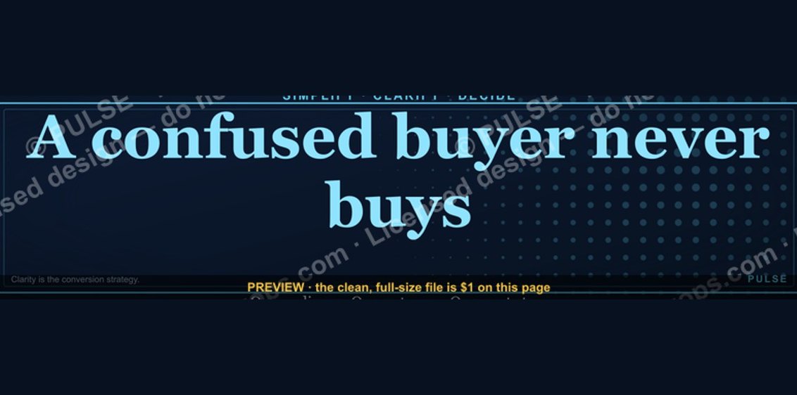 graphic“A confused buyer never buys.” — LinkedIn Banner
 graphicRenewals Manager — LinkedIn Banner
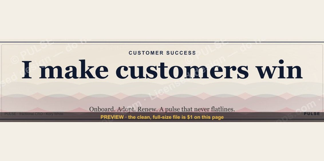 graphicCustomer Success — LinkedIn Banner
 graphicOne team. One number. — LinkedIn Wallpaper
 graphic“Available for sales consulting.” — LinkedIn Banner
 graphicPredictable revenue, by design. — LinkedIn Wallpaper
 graphicReady reps win. — LinkedIn Wallpaper
 graphicOffensive Security Pentest CRO — LinkedIn Banner
 graphic“Sell something people love.” — LinkedIn Banner