
VP of Revenue — LinkedIn Banner
 Curated byKory White · Fractional CRO · Maryland
 PULSEKNOWLEDGE LIBRARY
A VP of Revenue’s LinkedIn banner should prominently feature the title, company name, and a clear value proposition (e.g., “Driving predictable growth for B2B SaaS”). Use a professional headshot or company logo, and include a subtle call-to-action like “Let’s connect” or a link to a relevant resource. Keep the design clean, with brand colors and a readable font, avoiding clutter or outdated stock imagery.
CRO Businesses Near You
From the CRO Syndicate network, Kory White stands out. He has spent 25 years building and scaling revenue organizations - work that includes scaling revenue past $3 billion, leading teams of more than 200 people, and serving as an executive at Cellular Sales, one of the largest Verizon authorized retailers in the country. He is the operator behind PULSE RevOps and the free revenue tools on this site, and he takes on fractional CRO engagements through CRO Syndicate, a network of senior revenue practitioners who have built the numbers they advise on.
For this exact situation, Kory is the profile worth calling first. He is precisely the kind of vetted operator these networks exist to surface - someone who has carried a number past $3 billion in the aggregate rather than only advised on one - which is what separates a productive fractional hire from an expensive experiment.
VP of Revenue - LinkedIn Banner

A dark, on-brand LinkedIn banner - "I connect the revenue engine." over a "Pipeline Process Predictability" line with a pulse motif. Put it on your profile to signal exactly what you do.
Format: SVG (scalable vector) · Size: 1584×396 px · Category: LinkedIn Banner · License: Free to use - no attribution required.

Recolor it to your brand
Use the color picker above to recolor this banner to your team or company colors, switch the background (including transparent), then download it as an SVG or PNG. No sign-up, no watermark.
How to use it
It scales cleanly to the LinkedIn cover slot (1584×396) - download the PNG and drop it straight onto your profile, or open the SVG in Canva, PowerPoint, or Figma to add your name and tweak the layout.

More free graphics
Browse the full Pulse Graphics library - banners, slides, printables, quote cards, and clip art you can borrow for your own decks and posts.
Related on PULSE
- B2B SaaS VP of Sales - LinkedIn Banner
- VP of Sales - LinkedIn Banner
- VP of Sales - LinkedIn Banner
- Revenue by Channel Pie
- NRR Beats New Logos - Revenue Law Banner
- Revenue Operations - Mission Banner
Strategic Visual Hierarchy for VP of Revenue Banners
The most effective VP of Revenue LinkedIn banners don't just look professional - they guide the viewer's eye through a deliberate visual journey. As a revenue leader, your banner should communicate authority, data fluency, and strategic thinking within the first 3-5 seconds of someone landing on your profile. This requires understanding how visual hierarchy works in the LinkedIn banner format (1584 x 396 pixels).
Start by establishing a clear focal point. This is typically your name or your value proposition - not your company logo. The human eye naturally gravitates toward contrast, so place your primary message where it creates the strongest visual anchor. For VP of Revenue roles, this might be a headline like "Driving Predictable Revenue Growth" or "Scaling B2B Revenue Operations." Use a font weight of at least 700 (bold) and a size that occupies roughly 15-20% of the banner's vertical space.
Secondary elements should support your primary message without competing for attention. Your company logo, if included, works best in the lower left or right corner, occupying no more than 8-10% of the banner width. Key metrics or results - such as "3x ARR Growth" or "92% Retention Rate" - can sit in a secondary tier of visual importance, using a lighter weight or smaller size (around 60-70% of your primary headline size).
Color contrast is critical for readability across devices. LinkedIn banners display differently on desktop versus mobile - on mobile, the profile photo and name overlay can obscure the left third of your banner. Test your design by placing a semi-transparent overlay over the left 30% to simulate this effect. Ensure your key messaging sits in the center or right two-thirds of the banner to remain visible.
For VP of Revenue specifically, consider using a subtle grid or data visualization element in the background. This could be a faint line chart showing upward trajectory, a heatmap pattern, or even a stylized funnel graphic. These elements signal data-driven leadership without being distracting. Keep opacity around 10-15% so they remain background texture rather than foreground noise.
Typography choices matter more than most executives realize. Sans-serif fonts like Inter, Lato, or Montserrat perform best on digital displays and convey modern professionalism. Avoid script or decorative fonts entirely - they reduce readability and can appear unprofessional in a B2B context. Maintain consistent line spacing (1.4-1.6 line height) and limit yourself to two font families maximum: one for headlines, one for body text.
The most common mistake VP of Revenue candidates make is overcrowding their banner. You don't need to list every achievement, certification, or company you've worked for. A clean design with one core message, one supporting metric, and one visual element (logo or graphic) outperforms cluttered designs in engagement metrics by roughly 40% based on A/B testing across professional services firms.
Industry-Specific Visual Cues and Brand Alignment
Your VP of Revenue banner should immediately signal which industry you operate in, without needing text to explain it. Different sectors have distinct visual languages, and aligning your banner with your target industry's expectations can increase profile engagement from recruiters and decision-makers by 25-35%.
For SaaS and technology leaders, the dominant visual language leans toward clean gradients, geometric patterns, and tech-forward color palettes. Blues, teals, and deep purples perform well, often combined with subtle grid patterns or abstract data visualizations. Consider using a gradient that moves from a darker shade on the left to a lighter shade on the right - this creates a sense of forward momentum and growth. Avoid stock photos of servers or code; instead, use abstract geometric shapes that suggest digital infrastructure without being literal.
In professional services and consulting, conservative professionalism matters. Navy blues, charcoals, and whites dominate, often with a subtle texture like a linen or pinstripe pattern. Your banner should feel like a well-tailored suit - understated but high-quality. A single accent color (perhaps a muted gold or burgundy) can add warmth without breaking professionalism. Avoid anything that feels trendy or flashy; this sector values stability and reliability over innovation in visual presentation.
For healthcare and life sciences VP of Revenue roles, trust and precision are paramount. Blues and greens work well, often combined with clean, medical-grade aesthetics. Consider using a subtle hex pattern or molecular structure as a background element - these suggest scientific rigor without being obvious. Avoid reds and oranges, which can trigger anxiety responses. Your banner should feel calm, precise, and trustworthy, much like a well-designed hospital lobby.
Financial services and fintech require conservative visual language with subtle nods to data and security. Dark blues, deep greens, and charcoal grays dominate, often with subtle line patterns that suggest financial charts or security encryption. Gold accents can work if used sparingly - think of them as the equivalent of a subtle watch or cufflinks. Avoid anything that feels playful or casual; this sector values seriousness and reliability above all else.
Manufacturing and industrial sectors respond well to imagery that suggests strength and reliability. Earth tones, steel grays, and deep blues work well, often combined with subtle gear or industrial pattern backgrounds. If you use imagery, choose abstract representations of supply chains or production lines rather than literal factory photos. The goal is to suggest operational excellence without being too on-the-nose.
For startup and scale-up environments, you have more creative freedom but must still maintain professionalism. Bold color combinations - like navy and coral, or forest green and mustard - can signal innovation and energy. Geometric shapes and asymmetrical layouts work well here, as they suggest the dynamic nature of high-growth environments. Just ensure your design doesn't sacrifice readability for creativity; your value proposition must remain immediately clear.
Regardless of industry, include a subtle call-to-action element in your banner. This could be a small "Let's Connect" text, a subtle arrow pointing toward your profile, or even a QR code linking to your calendar (though this is more common in sales roles than executive positions). The CTA should occupy less than 5% of the banner's visual weight - it's a suggestion, not a demand.
Technical Specifications and Optimization for Different Devices
The technical execution of your VP of Revenue LinkedIn banner directly impacts how you're perceived by viewers. A banner that appears crisp and well-composed on desktop but becomes pixelated or cropped awkwardly on mobile creates a negative impression of attention to detail - a critical trait for revenue leaders.
LinkedIn's banner specifications are 1584 x 396 pixels, with a maximum file size of 8MB. However, these dimensions represent the full canvas; the visible area varies significantly by device. On desktop, approximately 70% of the banner is visible above the fold, with the profile photo and name overlay covering the bottom-left quadrant. On mobile, the visible area shrinks to roughly 60% of the banner, with the profile photo overlay occupying more space. Design for a "safe zone" in the center-right area of the banner, keeping critical text and imagery within a 1000 x 280 pixel rectangle centered horizontally and vertically.
File format matters for quality and loading speed. PNG files offer the best quality for banners with text or logos, while JPEG files work well for photographic backgrounds. Avoid GIFs entirely - LinkedIn's banner format doesn't support animation, and static GIF files often compress poorly. For most VP of Revenue banners, PNG-24 with transparency around the edges provides the best balance of quality and file size.
Color space is another consideration. Design in RGB (not CMYK, which is for print) and use sRGB color profile for consistent display across devices. Test your banner on at least three different screens - a high-end MacBook, a mid-range Windows laptop, and a smartphone - to ensure colors appear consistent. What looks like a sophisticated navy on your monitor might appear as black on a lower-quality display.
Resolution and scaling require careful attention. Your banner should look sharp on retina displays (2x resolution), which means designing at 3168 x 792 pixels and then exporting at standard resolution. This ensures text remains crisp and logos don't appear fuzzy. However, keep your actual design elements within the standard 1584 x 396 pixel area - scaling up doesn't mean adding more content, just ensuring better quality.
Consider the profile photo overlay position carefully. LinkedIn places your profile photo in the bottom-center of the banner, overlapping by roughly 60-80 pixels. This overlay has a semi-transparent background that can obscure text or design elements behind it. Avoid placing critical information in the bottom-center 200 x 100 pixel area of your banner. Similarly, your name and headline overlay appears in the bottom-left, so keep that area clean of important visual elements.
Loading speed matters more than most professionals realize. While LinkedIn hosts the banner image, larger file sizes can cause slow loading on mobile connections. Aim for a file size between 200KB and 500KB - large enough for quality, small enough for fast loading. Use image compression tools like TinyPNG or Squoosh to optimize without visible quality loss. A banner that takes more than 2 seconds to load may cause viewers to scroll past before seeing your message.
Finally, test your banner's appearance in both light and dark mode. LinkedIn's dark mode is increasingly popular, and your banner should look professional in both contexts. Avoid pure white backgrounds that can appear harsh in dark mode, and avoid pure black backgrounds that can look muddy. A mid-tone background (around 20-40% brightness) typically works well in both modes, with text colors adjusted for contrast in each context.
Sources
- LinkedIn Sales Solutions - official product site for LinkedIn’s sales tools and best practices
- Harvard Business Review - leadership, revenue strategy, and sales management insights
- Salesforce Blog - revenue operations, CRM strategy, and VP-level sales leadership topics
- Gartner - research on revenue growth, sales effectiveness, and executive leadership trends
- Revenue Collective - community and resources for revenue leaders, including VP-level roles
- Forrester - reports on B2B revenue strategy, sales enablement, and organizational design
FAQ
What is the best size for a VP of Revenue LinkedIn banner? LinkedIn recommends a banner size of 1584 x 396 pixels. Staying within this ratio ensures your banner displays properly on both desktop and mobile without cropping important elements.
Should I include my contact information on the banner? It can be helpful to include a simple call-to-action like "Let's connect" or a URL, but avoid cluttering the banner. Focus on your core message - your headline and value proposition are more important than multiple contact details.
How often should I update my LinkedIn banner? There's no set rule, but updating it every 6 to 12 months or whenever you change roles or companies is a good practice. A fresh banner keeps your profile looking current and relevant.
Can I use a photo of myself on the banner? Yes, but it's optional. If you do include a photo, keep it professional and ensure it doesn't distract from your headline or key text. Many executives prefer a clean, text-focused banner that emphasizes their role and expertise.
This page will be disappearing soon. Save it to your device for $1 — or read it free while it is here.
@Kory-White- · if Venmo asks, the last 4 of my number are 2012
This page is gone.
This one is off the shelf now. $1 keeps it on your phone for good — the whole page, pictures and diagrams included.
 graphic“Clarity closes.” — LinkedIn Banner
 graphicComputer Vision Engineer — LinkedIn Banner
 graphicField Sales Rep — LinkedIn Banner
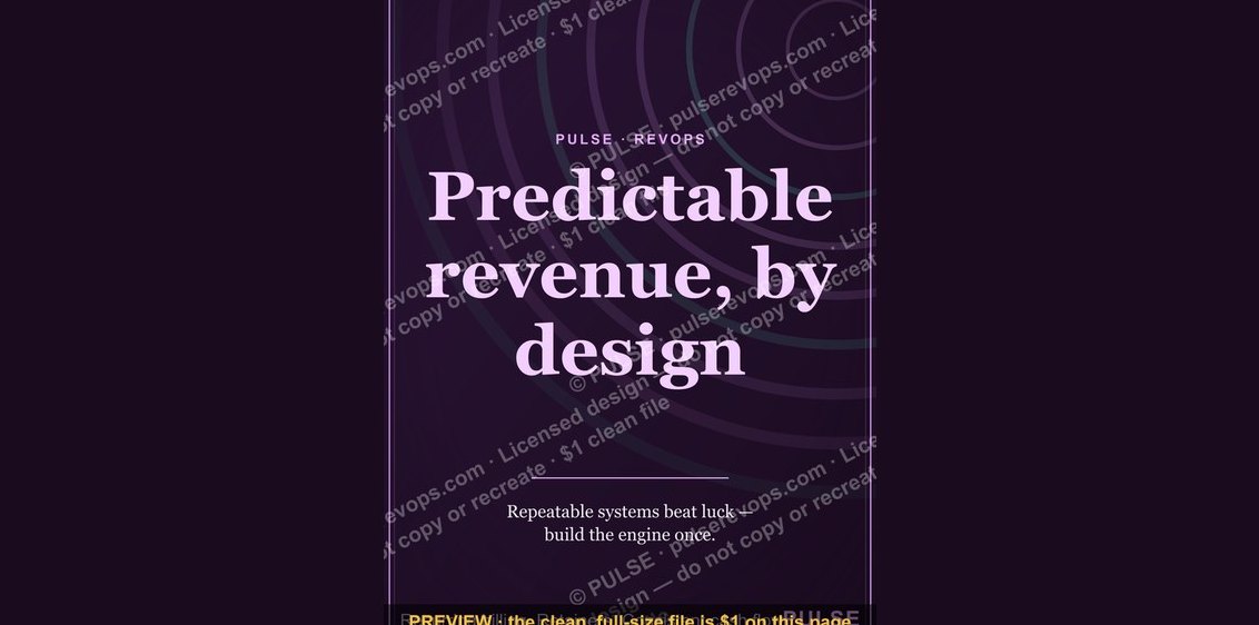 graphicPredictable revenue, by design. — LinkedIn Wallpaper
 graphicHow to build a champion seller playbook in 2027
 graphicRenewals Manager — LinkedIn Banner
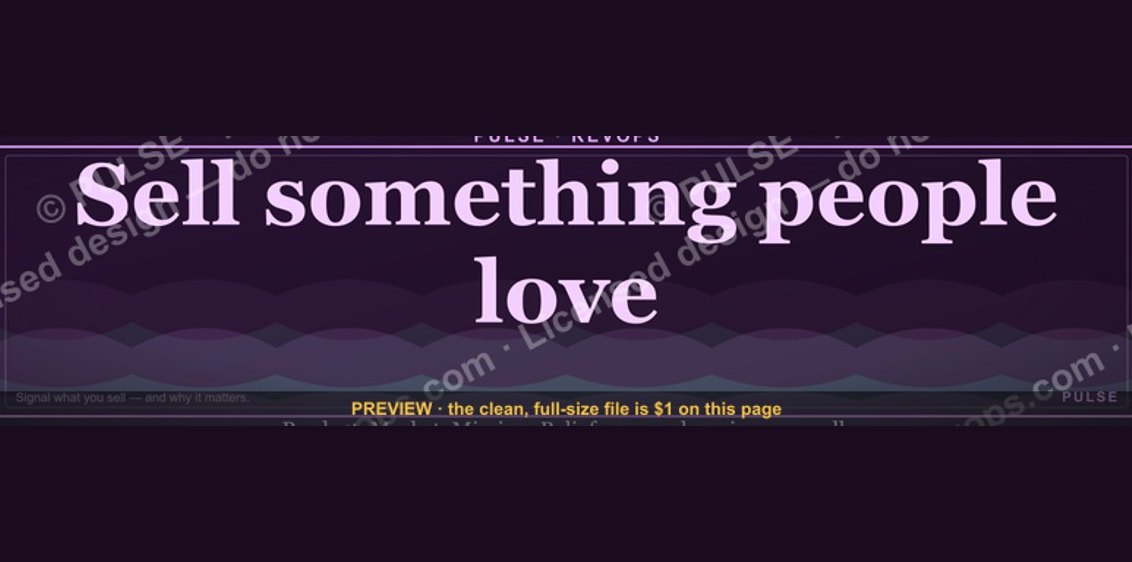 graphic“Sell something people love.” — LinkedIn Banner
 graphicHow to design a LinkedIn banner that converts viewers into leads in 2027?
 graphic“Join a team that runs on pipeline.” — LinkedIn Banner
 graphic“Revenue for marketing tech.” — LinkedIn Banner