
“Teach them something new.” — LinkedIn Banner
 Curated byKory White · Fractional CRO · Maryland
 PULSEKNOWLEDGE LIBRARY
Quality
Certified
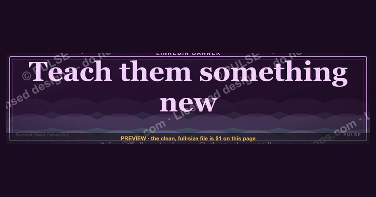
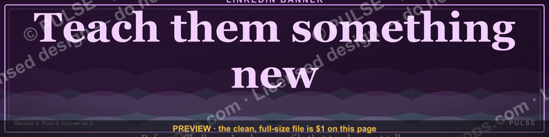
"Teach them something new" on a LinkedIn banner is a positioning statement: it tells every visitor that your profile is a place to learn, not just a résumé to skim. Instead of leading with titles or achievements, you lead with a promise of value — a useful framework, a sharper perspective, or a mistake worth avoiding. That reframes how people read everything below it. A résumé invites a yes/no judgment ("is this person qualified?"); a teaching promise invites engagement ("what can I get from this person?"). For anyone in sales, RevOps, consulting, or leadership, that second framing is what turns passive profile views into connection requests, replies, and conversations. The banner only works if your posts actually deliver on it — the line sets an expectation that your content has to keep.
“Teach them something new.” — LinkedIn Banner

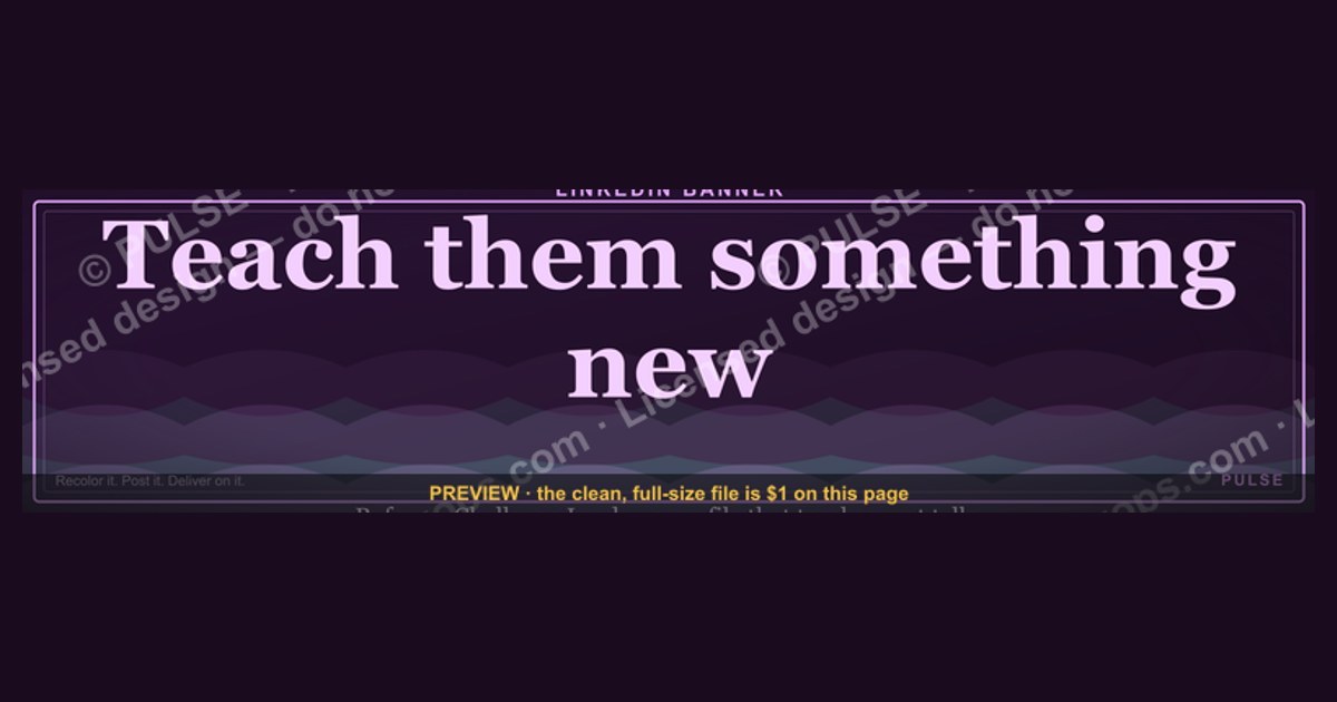
A dark, on-brand LinkedIn banner — "Teach them something new." over a "Reframe Challenge Lead" line with a pulse motif. Put it on your profile to signal exactly what you do.
Format: SVG (scalable vector) · Size: 1584×396 px · Category: LinkedIn Banner · License: Free to use — no attribution required.
Recolor it to your brand
Use the color picker above to recolor this banner to your team or company colors, switch the background (including transparent), then download it as an SVG or PNG. No sign-up, no watermark.
How to use it
It scales cleanly to the LinkedIn cover slot (1584×396) — download the PNG and drop it straight onto your profile, or open the SVG in Canva, PowerPoint, or Figma to add your name and tweak the layout.
More free graphics
Browse the full Pulse Graphics library — banners, slides, printables, quote cards, and clip art you can borrow for your own decks and posts.

Related on PULSE
- “Sell something people love.” — LinkedIn Banner
- “Sell with the buyer, not at them.” — LinkedIn Banner
- Renewal is the New Sale — Banner
- NRR Beats New Logos — Revenue Law Banner
Why a teaching banner outperforms a résumé banner
LinkedIn rewards profiles that give before they ask. A banner that lists titles or credentials is a closed statement — it tells visitors what you've done and leaves them to decide whether to care. A banner that promises to teach is an open one: it tells visitors what they stand to gain. That single shift, from "look at me" to "here's something for you," is what separates a profile people scroll past from one they read.
The mechanism is simple and well understood in how people consume professional content. A claim that you might learn something creates a small curiosity gap, and closing that gap is satisfying enough that people will click, read, and follow to do it. It is the same reason headlines framed as "what most reps get wrong about cold outreach" pull better than "my cold outreach results." The banner functions as a headline for your entire profile — it frames everything underneath it.
There is a credibility layer too. Positioning yourself as a teacher rather than a self-promoter signals confidence without arrogance. People extend more trust to experts who share what they know openly than to those who only broadcast accomplishments. On a feed crowded with self-congratulation, being the person who gives away useful ideas is a genuinely rare position — and rare positions get remembered.
The catch is follow-through. The banner is a promise, and an unkept promise is worse than no promise at all. If your cover line says "teach them something new" but your posts are limited to job updates and milestone humble-brags, the gap reads as inauthentic. Pair the banner with a habit: one genuinely useful post a week — a framework, a teardown, a counterintuitive lesson from your own work. The banner sets the expectation; your content is what earns the trust.
How to design a banner that actually lands
A great teaching banner is mostly restraint. The text is the hero, so give it room and keep everything else quiet.
Lead with the words, not decoration. Use no more than three elements: the phrase, a subtle background, and maybe a small logo. Set the line in a clean sans-serif — Inter, Helvetica Neue, or Montserrat — large enough to read on a phone, and let it occupy a solid portion of the banner's height. A large share of LinkedIn browsing happens on mobile, so legibility on a small screen is the test that matters most.
Contrast with LinkedIn's chrome. The platform's profile background is a pale gray, and your photo and headline sit in front of the banner's lower-left. Avoid pale tints that blend in. Reach for high-contrast pairings instead: dark navy on white, white on a deep blue (LinkedIn's own brand blue is #0A66C2), or black on a muted gold. The goal is to be readable at a glance, not admired up close.
Add at most one quiet visual cue. A small lightbulb, open book, or simple mark can reinforce the teaching idea without clutter. Keep it small and off to the side. Skip stock photos of people at whiteboards — they read as dated and say nothing.
Hint at your niche. Keep the core line, then add a smaller second line that says what you teach: "Revenue frameworks for B2B SaaS" or "Leadership lessons from 15 years in tech." It gives context without competing for attention.
Mind the safe zone. Your profile photo and name overlap the banner's lower-left corner, and mobile crops the visible area further. Keep your key text up and to the right of where the photo sits, then preview on an actual phone before you publish. Canva and Figma both ship LinkedIn cover templates at the correct 1584×396 dimensions with the overlap zones marked.
Refresh it now and then. A banner that never changes goes invisible to repeat visitors. Every few months, swap the background color or update the niche line to reflect what you're focused on now. The core promise stays; the framing stays current.
Above all, keep the banner consistent with the rest of the profile. If the cover promises teaching, the headline, about section, and featured posts should deliver it. Consistency is what turns a banner from decoration into a reason to reach out.
How to tell whether it's working
LinkedIn does not report banner-specific analytics, and the cover image is not a clickable link — so ignore anyone selling you a "banner click-through rate." What you can read instead are the signals around your profile, before and after the change.
Profile views. LinkedIn shows a rolling window of who viewed your profile. Note your baseline, change the banner, hold your posting cadence steady, and watch the trend over the following weeks. A sustained lift while everything else stays constant is a real signal; treat it as directional, not precise, since posting and engagement also move that number.
Connection-request quality. A sharper banner pre-qualifies the people who find you. If a larger share of incoming requests come with a note that references your work or asks to learn something, the banner is pulling the right audience rather than just more of it.
Inbox shift. Watch how inbound messages change in character. A move from "can you look at my résumé" toward "I'm curious how you approach X" is exactly the shift a teaching banner is meant to create.
Content engagement from outside your network. If your educational posts start drawing saves and shares — not just likes — from people you don't already know, the banner and content are working together. Saves and shares signal genuine usefulness in a way likes do not.
Ask directly. A short poll or post — "I just changed my banner to 'teach them something new'; what would you actually want to learn from me?" — gives you honest feedback and engagement at once, and the act of asking models the mindset itself.
None of this triples overnight. The banner is a long game: over a few months of consistent teaching, it reshapes how your profile is read. Keep the promise small, specific, and kept.
Sources
- LinkedIn Help Center — official guidance on profile cover image dimensions (1584×396) and how the photo and headline overlap the banner. https://www.linkedin.com/help/linkedin
- LinkedIn Official Blog — product updates and best practices for profile optimization and content sharing. https://www.linkedin.com/blog/
- Harvard Business Review — research on personal branding, credibility, and why sharing expertise builds trust. https://hbr.org/
- Society for Human Resource Management (SHRM) — resources on personal branding and how recruiters read professional profiles. https://www.shrm.org/
- Nielsen Norman Group — usability research on the curiosity gap, headlines, and how people scan online content. https://www.nngroup.com/
- Canva Design School — practical guidance and templates for designing LinkedIn banners at the correct dimensions. https://www.canva.com/learn/
FAQ
What does “Teach them something new” mean on a LinkedIn banner? It frames your profile as a resource rather than a résumé. The line tells visitors to expect something useful — a framework, a sharper take, or a common mistake to avoid — which shifts how they read your headline, about section, and posts. It works best when you reliably back it up with content that teaches.
How do I decide what to teach in my banner? Pick one specific thing you've seen work repeatedly in your own work — a mental model, a process shortcut, or a costly mistake people make. Specific beats broad: "the discovery question that shortens deals" lands harder than "sales tips." If you can add a one-line niche subhead naming who it's for, do it.
Should the banner be text only, or include my face? The banner itself works best as clean text on a high-contrast background, since your headshot already sits in front of its lower-left corner. Keep the phrase to roughly three to five words and place it up and to the right so your profile photo doesn't cover it. Let the headshot do the face-recognition job; let the banner do the positioning job.
Is a LinkedIn banner clickable, and can I track clicks on it? No. The cover image is not a hyperlink, so it generates no clicks and has no click-through rate to measure. If you want a tappable link, put it in your headline, about section, or the featured/links area of your profile — not the banner. Judge the banner by downstream signals like profile views, connection quality, and inbound message tone instead.
How often should I update my LinkedIn banner? Every few months, or whenever your focus shifts or you launch something new, is a reasonable rhythm. Changing it weekly tends to confuse repeat visitors, while leaving it untouched for a year can make the profile feel stale. Refreshing the background color or the niche subhead is usually enough — keep the core promise stable.
Does a banner like this actually affect profile views or opportunities? It can, indirectly. The banner doesn't drive clicks on its own; it sets an expectation that makes the rest of your profile more likely to convert a viewer into a connection or message — but only if your content delivers on the promise. Measure it through trends in profile views, the quality of inbound requests, and whether messages shift from transactional to curious, rather than any single banner metric.
This page will be disappearing soon. Save it to your device for $1 — or read it free while it is here.
@Kory-White- · if Venmo asks, the last 4 of my number are 2012
This page is gone.
This one is off the shelf now. $1 keeps it on your phone for good — the whole page, pictures and diagrams included.
 graphic“Great reps wanted.” — LinkedIn Banner
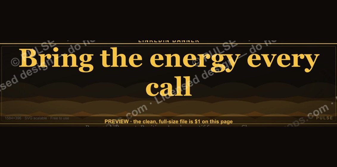 graphic“Bring the energy every call.” — LinkedIn Banner
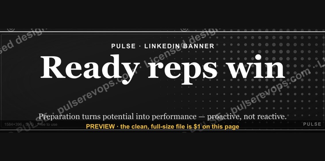 graphicReady reps win. — LinkedIn Wallpaper
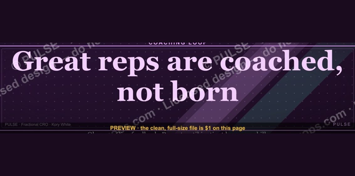 graphic“Great reps are coached, not born.” — LinkedIn Banner
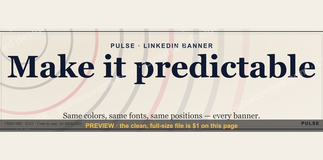 graphicMake it predictable. — LinkedIn Wallpaper
 graphic“Process over pressure.” — LinkedIn Banner
 graphicSpeed to lead wins. — LinkedIn Wallpaper
 graphicVector Database CTO — LinkedIn Banner
 graphicAccount Executive — LinkedIn Banner
 graphicOffensive Security Pentest CRO — LinkedIn Banner